In writing, your goal is to make the targeted reader get the message of your text. Thus, It is vital to choose the right fonts for your text, either for online media or print. You need to make sure to use the appropriate font choice. Take an example, you will not choose a font related to Christmas for Halloween, right? That would be so weird. For Halloween, you should go with a spooky kind of theme font.
However, note that even though you want the design to be visually attractive, you still have to pay attention to the other elements of typography. Why is good typography so crucial? Because it helps to enhance the readability and understanding of your reader so that they can get the message accurately.
10 Guides to Choose the Right Font Choice and Apply It to Your Writing
Typefaces and fonts are the major elements in typography. These two terms are often mistaken to be the same thing. So, what is the difference between typefaces and fonts? A typeface is a design style that consists of collections of fonts, and fonts refer to a specific style with different widths and weights that belong to the same typeface family.
It is not a piece of cake to decide on what font to be applied to your writing. There is a myriad of beautiful and unique fonts available today. This article hopefully can give you insight on how to start by deciding the suitable font choice and finally apply it to your writing.
Make Sure It Grabs the Attention and is Legible

How can you expect the readers to keep reading when the fonts are all the same and look boring? It will be tiresome if you only use one font throughout a long text. Try to write the content in separate text boxes and do experiments with more fonts in the same typeface. Different sizes and colors are also great for grabbing attention.
However, avoid using too many styled fonts when the content is long and heavy. You can use decorative fonts for the heading and give a white space around it to grab attention. Open areas also can be placed in the call to action part; thus, it will be easier for your targeted reader to pay attention to the prominent part of the text.
Always ask yourself whether the font is easy to read for the whole passage or only suitable in some parts. You can test the font on a blank sheet to see how it looks. Is it readable and orderly? Will it captivate your reader to read it until the end?
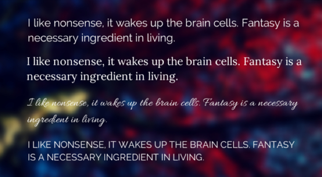
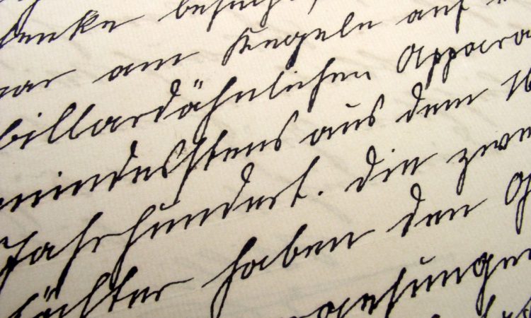
People nowadays will not spend their time trying to understand unreadable passages. Avoid uppercase, fancy fonts, and cursive script. It will be difficult to read and reduce the convenience of reading.
Notes: when choosing the fonts, you need to make sure that they will be supported in all major web browsers.
Manage the Spaces and Formatting

Elements of typography such as leading, tracking, kerning, and alignment should be examined thoroughly. When you pay detailed attention to them, it will also give a great final result. Mind the spacing either between baseline, words, or individual characters.
Good formatting will make the text appear pleasing because it is not too tight or too wide. The most common alignment used is left-aligned and left-aligned justified. Furthermore, only underline or italicize the text where necessary so it will not confuse the reader.
Make It Suitable to the Content of the Text
Learn what you have to write and ask yourself whether the font you choose is appropriate for the topic. Match it to the tone of the course. Is it a formal or casual topic? A hand-written type should not be used in a serious topic. The same goes for a text targeted to children and should use a font that is easy to read and casual.
Adjust Different Font Size

Create a hierarchy in your text to show the audience what you want to emphasize. Adjust the size; the larger, the more important it is. Thus, it will fix the attention to look at the prominent point in the passage.
Headings and subheadings will use a bigger font size than the body text. You can try with all caps (use all capital letters in a short amount of words) for headings or subheadings to emphasize the importance.
Make sure the size is suitable for both pc, smartphones, or printed media. Not too big or too small. You do not want the reader to feel displeased to see many disorganized fonts with no proper indication of which one is the main point. It will also be unpleasant if the font is too small because they have to squint their eyes.
If the font is correctly adjusted, then the reading experience also will be great. The readers will likely come back to your website. According to E-learning Heroes, the majority of web designers decided that the ideal shoot size is 16 or 21 pixels. 16+ font size is easier to read than anything under 12 points or 16 pixels. Audiences with low vision will be benefited from a bigger font size.
Emphasis on What is Important
Most people, when it comes to lengthy text, will do skimming and scanning. So, it is the UI designer’s job to give the distinction of the main point to make it easier to digest. Avoid pouring too many ideas into a paragraph or too many characters in a line.
Reduce the number of words and keep the message clear. You have to create a strong impression and give the reader what they have expected when clicking the page. Your goal is to make them get the information you want to tell them. So, do not over-complicate the content. Make it legible and readable.
Limit the Typefaces Use

Writers typically use the combination of serif versus sans-serif in a text. They both provide the best use to make pleasing legible text. Long-written text is suitable with serif typefaces such as Georgia, Times New Roman, etc. Sans-serif appears to be more clean, clear, and easy to read, like Arial, Verdana, or Tahoma.
You can also use a variety of font types that belong to the same face type. Make sure it complements one another. It is your job to try to mix and match fonts that can go well together. Generally, to make a balanced and well-formed passage, choose bold fonts for the heading and simple ones for the body text.
Less is more. Avoid complicating the text by putting too many fonts. 2 or 3 are supposed to be enough fonts in your writing. Rather than keep trying new fonts, use another variety of font styles with different weights.
Contrast the Text Color and Background

Readability is closely related to colors. Pair the font text color with a suitable background. Is black font over white background too mainstream? Try other dark colors like navy, gray, or brown. You know you will hurt the reader’s eyes to pair bright against a bright color palette.
Represent Your Brand

If you are a beginner web designer who aims to share your brand with the world, make sure the font you use will represent the character of the brand. Show the spirit of your product using the right font choice.
You have to think and plan it carefully because the font is what the reader sees and perceives. Make it memorable for them with its simplicity and uniqueness. Mainstream font choices may be forgotten easily.
Add Aesthetic Elements

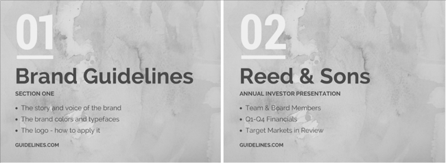
Good quality content and typography is the first thing to take care of. Then, go with some decorative font style to make your passage more alive. Decorative fonts are usually used in a small amount of text, like headings. Make your heading attractive with the right types of font styles. Make sure it is aligned with the content of the whole text.
Look Out for Inspiration
If you still have no idea where to begin, it is always a good idea to seek out inspiration. Take a look at numerous beautiful websites, newspapers, magazines, etc., that exist around you and get inspired. Note the thing that, in your opinion, is great and what is less appealing. You have to make your own decision and design your website with amazing fonts!
Deciding on what to apply with the abundance of font choices around us might be confusing, right? Try to apply these 10 tips before using the font for your website or writing. Start by asking yourself about the legibility of the fonts to seek out inspiration. We hope some of the tips will work for you!
