Looking for timeless brochure designs? You’ve come to the right article. As Harry Seidler said, “Good design doesn’t date.” When it comes to design, it is important to create a forward-thinking idea or concept. A timeless design should emerge from a balance of functionality and aesthetics, rather than succumbing to fleeting trends.
To help you create timeless brochure designs, these are important things to focus on. Plus, the most common mistakes to avoid.
Timeless Brochure Design Elements

Whether you’re creating a printed or digital brochure, strong visual principles, readability, and universal appeal are crucial. Here’s a clear breakdown of what makes your designs effective.
Clear, focused layout
To create timelessness in your design, make sure to use clean grids, white space, and consistent margins. Strong headlines, high-quality visuals, and a clear call-to-action are also key elements in timelessness. Also, pay attention to your content hierarchically, from headlines, subheads, and body copy.
Minimalist, classic typography
The second important aspect of creating timeless brochure designs is to use minimalist and classic typography. This approach prioritizes readability and clean aesthetics. A good starting point is to select a classic serif font, like Garamond, for headlines and a clean sans-serif font for body text.
Balanced color palette
In design, over coloring or using too many colors might end up ruining and overwhelming your design. It will make your design feel cluttered or unprofessional. To create a balanced color palette in your brochure designs, use two to three tints or shades and establish color hierarchy, like deciding a dominant color and using others as accents to guide the user’s eye.
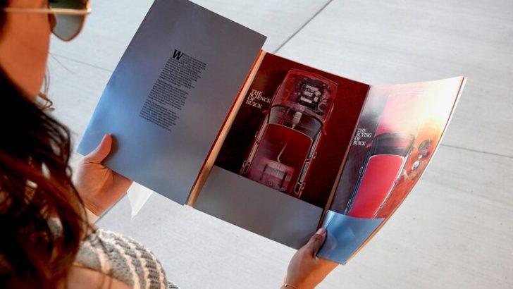
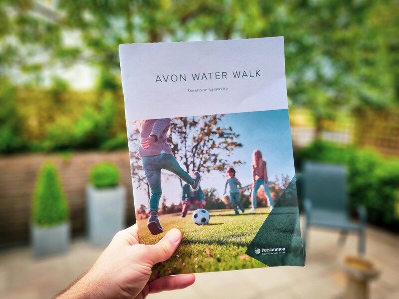
High-quality imagery
High-quality imagery is essential in design because it contributes to a timeless and impactful style. It’s best to avoid clipart and instead opt for full-bleed photos or high-resolution images that create a dramatic effect. Consider using professional photography or high-quality stock photos to enhance your design.
Consistent branding
The sixth crucial aspect in brochure design is using consistent logo placement, brand colors, and voice. This consistency is important as you try to build trust, recognition, and stronger bonding with your viewers. Determine how your brand communicates and develop it with ideal typography, color palette, and imagery.
Smart use of folds
What is your brochure type? Is it tri-fold, Z-fold, bi-fold, or gatefold? To choose the right fold style, you need to understand your brochure’s purpose, content volume, and preferred style. Each style has its own strong points. Plan your layout properly, and then you can choose the right paper.
Compelling Call to Action (CTA)
To create a captivating CTA for a timeless brochure, there are a few tips. First, use direct language and action-oriented verbs. For example, “Get started”, “Join us”, “Register”, or “Connect”. Then, brevity is key. Keep your CTA short and to the point. Avoid using complex sentences.
Print-friendly design
Finally, create a print-friendly brochure by selecting the right margins, fold format, and paper stock. Before printing your brochure, be sure to print a test copy to check for any errors in layout, typography, or color.
Common Brochure Design Mistakes to Avoid
Common mistakes exist in brochure design. Here are pitfalls to avoid when creating brochure designs.
Cluttered layout
As mentioned earlier, use a clear and focused layout. Including too many elements, such as images and text, can be visually overwhelming. This approach may cause the audience to lose interest and make it difficult for them to scan and absorb the content. Instead, opt for generous white space and a clear grid to enhance readability.
Too much text
Avoid using lengthy sentences or paragraphs in product explanations or reviews. You can try a bulleted list with concise descriptions instead. You can also try headers. Keep in mind that readers need room to breathe while absorbing your information.
Weak or missing CTA
We’ve discussed before that a short yet strong CTA is crucial. Weak CTA lead to unclear direction, missing opportunities, confusion, and ineffective marketing. When your CTA is weak, your brochure will appear less effective at achieving its goals.
Poor font choices
Choosing fonts can be quite challenging. Avoid mistakes such as using decorative fonts and excessive font styles. Additionally, steer clear of overly trendy typography that can make your design unclear. Aim to use one or two fonts and maintain a clear hierarchy.
Inconsistent Branding
Inconsistent branding in design can arise from using different color schemes, logos, and font styles compared to those featured on your website or social media. It is essential to apply your brand guidelines consistently, including colors, tone, and logos.
Low-quality images
Believe it or not, low-quality images make your brochure look less professional. Low-quality images include pixelated, blurry images, and images with a negative impression. The low quality of your brochure also reduces credibility.
Lack of visual hierarchy
Your brochure lacks visual hierarchy when all the fonts and elements look the same. When there is no clear structure, your viewers have a difficult time understanding the message you’re trying to deliver.
Poor Fold Planning
When planning brochure folds, be cautious. A poor fold can make your brochure look unappealing, ineffective, and confusing. Therefore, select your fold type carefully, test it before printing, and ensure all elements are properly aligned.
Whether in printing or digital, brochure designs with strong visuals, readability, and clear CTA will never be outdated. Hopefully, this article helps you create a brochure that is both visually attractive and delivers your information perfectly.