When it comes to developing a website, the choice of colors plays an important role in engaging your target users or visitors. Just like in the real world, colors for user interface will also guide people to perceive, predict, understand, and in the end, make a decision whether they proceed to access that particular web content or not.
Starting from that belief, the web design and engineering teams called Lyft Design develop a comprehensive tool, namely ColorBox. This tool will help you find the most accessible color scale and system to be used on your own website.
About ColorBox by Lyft Design

ColorBox is a simple, yet excellent web tool focusing on digital color scale and system. With the aim of optimizing web visual accessibility, this free web tool is designed to assist you in choosing the best color combination for the web user interface.
When using ColorBox, you can easily generate different color sets and scales to find the most suitable one for your website or digital products. With ColorBox, you don’t need to rely on manual tools or third-party devices to check color contrast and enhance the products’ visual accessibility.
How It Works
The color algorithm offered by ColorBox is originally developed by a team of web engineers and designers from Lyft Design. However, the tool’s ground principles still refer to the Web Content Accessibility Guidelines (WCAG) 2.0. It uses the WCAG outlines of accessible contrast ratios for the web interface and digital products as the main source.
Through a series of comprehensive steps involving color naming and selection, the algorithm of ColorBox is measured by accessibility scale. It concludes that every color with a score of 0-50 and 4.5:1 ratio is accessible on black, while every color with a score of 60-100 and 4.5:1 ratio is accessible on white.
How to Use It

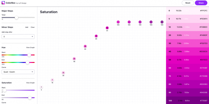
ColorBox is quite easy to use. When you visit the web tool on colorbox.io, you will immediately find a large screen divided into three parts: the color menu options on the left, the white page with a graphic display of different colors in the middle, and the actual color gradients with HEX values on the right side.
To find the suitable color palette or gradient of your choice, you need to adjust the scale on the menu options, which include the setting for:
- Steps, to determine how many steps of colors you want. This option is available in major and minor steps, ranging from 3 to 21 color gradients.
- Hue, to set the dimension of colors in their purest forms.
- Saturation, to modify the intensity or vividness of colors.
- Brightness, to adjust the lightness and darkness degree of colors.
Adjusting those features is like playing a game of colors. All you have to do is drag the scaling system until you find the most suitable color combination you are looking for. Once you’ve found it, you can use and copy HEX values shown on the right side to develop the color scales of your own.
Looking at how colors affect your target users, choosing the right color scale and combination is considered an essential matter. Therefore, if you haven’t found an accurate way to use, add, and modify color palettes and gradients while working with accessibility for your digital products, be sure to pay ColorBox a visit.
