In the past few years, the web color palettes mainly revolved around some popular shades such as green, red, and navy in CSS or orange in CSS Level 2. These days, as design continues to grow, those colors are considered old and not good enough to fulfill the designers’ needs. Aside from neutral shades like black and white, designers often avoid the default colors entirely to create new color schemes which are unique and aesthetic at the same time.
Now, another problem comes up. When generating a unique color palette for the web, you can’t just mix and match different colors at random. Sure, the colors you choose should look nice on the web; but more importantly, they should meet the requirements of accessibility.
It’s quite a conundrum if you think about it. Thankfully, a simple guide of web color palette called Colors comes to help.
Colors: A Brief Overview
Colors is a simple web guide that provides new color values to replace the default color names. Under a catching tagline “a nicer color palette for the web”, this guide aims to help web designers—or those who need a nicer color reference—in creating an entirely unique and highly accessible color combination.
Those new colors are packed in a collection of skin classes called “The New Default”. You can use these 17 color values as a prototype while designing websites, apps, and other digital products in the browser:
| Navy | #001f3f |
| Blue | #0074d9 |
| Aqua | #7fdbff |
| Teal | #39cccc |
| Olive | #3d9970 |
| Green | #2ecc40 |
| Lime | #01ff70 |
| Yellow | #ffdc00 |
| Orange | #ff851b |
| Red | #ff4136 |
| Maroon | #85144b |
| Fuchsia | #f012be |
| Purple | #b10dc9 |
| Black | #111111 |
| Gray | #aaaaaa |
| Silver | #dddddd |
| White | #ffffff |
Colors Utilities
In addition to the new color values, Colors offer a wide range of features and utilities to make you easier when using certain shades and palettes in your design. For starters, there’s a subdivision namely colors.css which contains various colors for building a prototype of HTML pages. This collection is also available in different versions, including Style, LESS, and SASS.
Moreover, the design utilities offered by Colors include:
- Borders & Text: Includes more exclusive color classes specifically designed to set colors on the text and/or border.
- SVG Fills: Allows you to adjust the color of inline SVG elements by adding a skin class.
- SVG Strokes: Provides the choice of colors for stroking inline SVG elements.
Colors A11y Stats
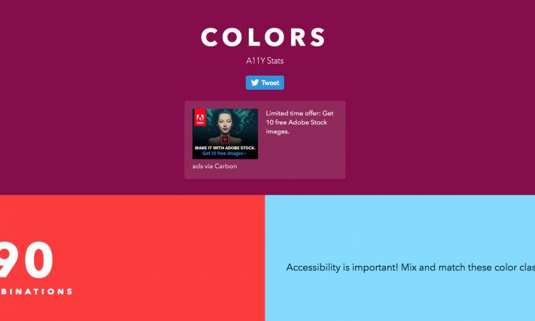
With the aim of enhancing visual accessibility through a web color palette, Colors also provide another feature called Colors A11y Stats. It contains 90 combinations of various color classes that you can mix and match to create a highly accessible theme for websites or apps.
The color combination on Colors A11y Stats are presented in different backgrounds as well as text color and size. For each combination, you can see the grade and contrast ratio according to the Web Content Accessibility Guidelines (WCAG). They are designed in such a way to be able to fall into grade AA (a minimum requirement with contrast ratio 4.5:1 and above) and AAA (an enhanced requirement with contrast ratio 7:1 and above).
In conclusion, Colors and all of its features are what you need to create a nicer and more accessible color palette for the web. By using its simple guide and scale, you can choose the most suitable color combination without spending a lot of time searching for the right one.
