Improving your grasp of design concepts is critical if you want to take your marketing abilities to the next level.
Have you ever wondered what you could do with a little more design expertise in your back pocket?
Yes, the answer is a lot.
Since not everyone is a designer, it can be difficult to describe and translate visual work into words as a designer. Not only that but receiving criticism and knowing what you’re talking about is also essential for becoming a reputable designer.
But there’s no need to be concerned. If you want to take your design company to the next level, this design terms dictionary will provide you with a crash course to better comprehend design.
4 Essential Principles of Design Terms You Must Know
What is Negative Space?
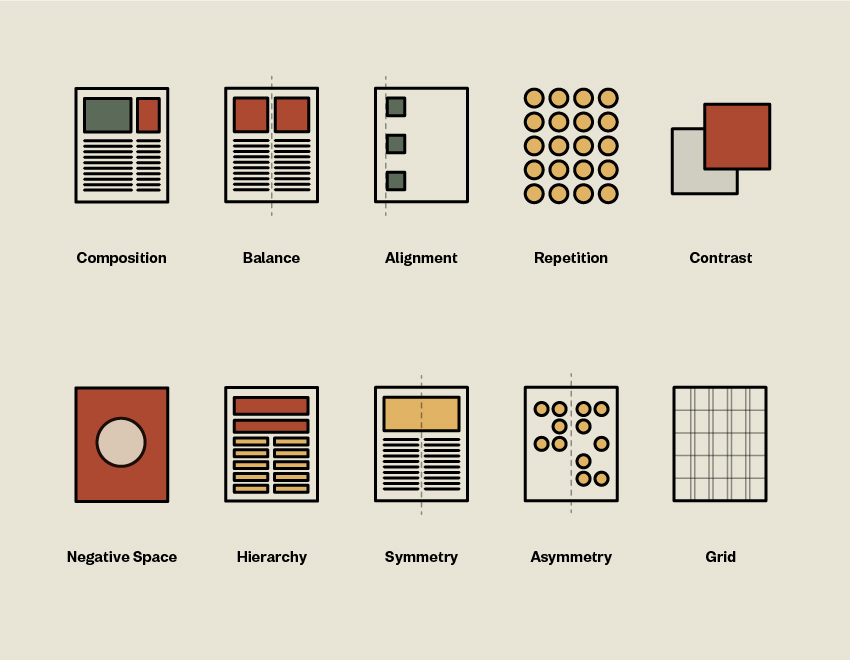
Negative space is the space that surrounds a design feature. It is used to draw attention to certain areas of a layout and zone in on a single piece.
What is Balance?
Any element on a website has visual weight, which may be influenced by its form, size, color, and texture. Some items may require a specific scale to balance a layout.
What is Alignment?
The location of the components on a layout—the way the visual elements are arranged to line up—is referred to as alignment. Alignment can be set to the left, right, justified, or centered.
What is Hierarchy?
You’ll soon learn in graphic design how to organize pieces based on their value. Hierarchy is just like what it sounds. It would be best if you used contrast in your design to generate hierarchy. If one image is larger than the other, the larger image will take precedence, and the reader will look at it first.
7 Color-Related Design Terms
How Do You Differentiate Between RGB and CMYK?
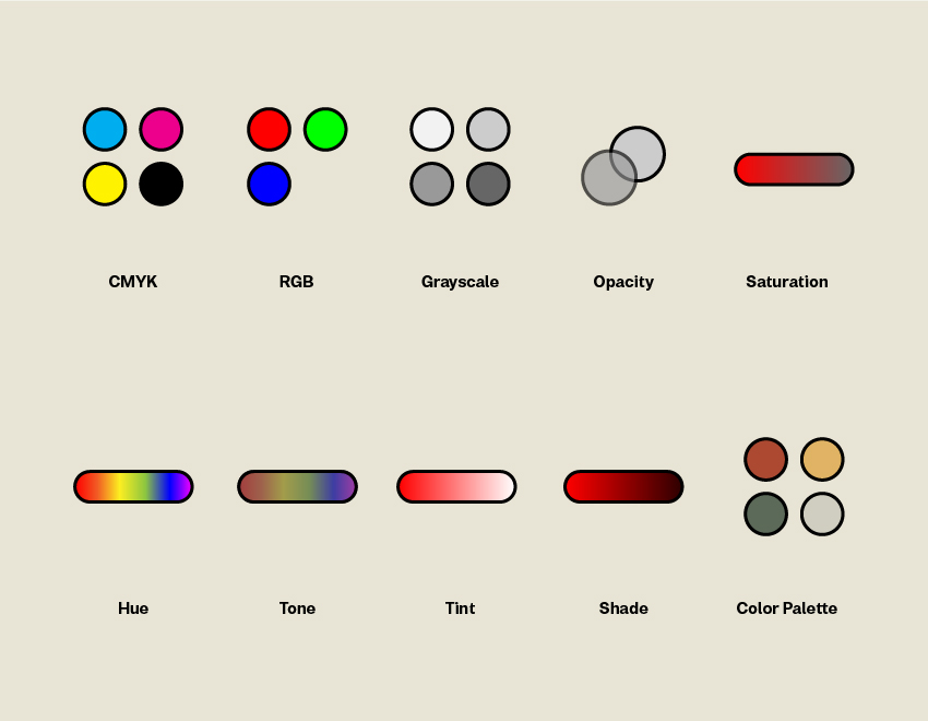
RGB colors are exclusively utilized on-screen. RGB stands for red, green, and blue, and this color mode is additive, which means that we may mimic a wider spectrum of colors by mixing these fundamental colors in different combinations.
If your design project includes the following elements, use RGB:
- web and app design
- icons, buttons
- graphics
- branding
- online logos and online advertisements
- social media images
- video
- digital graphics
- infographics
For RGB, it’s best to use JPEG, PSD, PNG, and GIF formats.
On the other hand, CMYK is an abbreviation for cyan, magenta, yellow, and key (black). These are the four most fundamental print colors. You’ll notice that CMYK colors aren’t as vivid as RGB colors. It is because CMYK is subtractive, which means that the colors operate with the reflected light.
The bottom line is that you should use CMYK for any project design that will be printed rather than seen on a screen. If you need to reproduce your design with ink or paint, the CMYK color option will produce more realistic results. As an example:
- stationery
- stickers
- business cards
- storefronts and signs
- billboards
- posters, flyers, and brochures
- t-shirts, caps, and other branded apparel
- restaurant menus
What is Greyscale?
Grayscale is a monochromatic palette that employs various shades of gray in a picture. A single picture is made up of up to 256 different grayscale combinations.
What does Opacity Mean?
This relates to an element’s level of transparency. The element is increasingly translucent as its opacity decreases. When the opacity is set to 100 percent, the item is solid.
The Difference Between Shade, Tone, Tint, and Hue
A lot of people are finding it quite challenging to differentiate between shade, tone, Tint, and hue due to its closeness. No worries, here’s an easy explanation for you to understand each of them:
Shade is when you add black to a color. Shade is the inverse of Tint—rather than lightening the color, it darkens it.
The Tint is a color that has had white applied to it to lighten and make it paler. The Tint might range from a slightly lighter color to totally white, with no color at all.
Hue is a term used to describe a pure hue that has no tint or shade. Any color on the color wheel, for example, is a hue, such as green, yellow, and blue.
The tone is a color that has gray added to it. The tone will reduce the intensity of the color and cause it to appear bland.
What is Color Palette?
A color palette is a collection of colors that may be utilized in a particular design project. This color palette often reflects a brand’s characteristics and should be chosen to complement one another.
What is Saturation?
The intensity of a color is referred to as its saturation. Saturated pictures will seem brighter and punchier. Images that have been desaturated are drab and virtually colorless.
What is Pantone?
PMS, or Pantone Matching System, is the most frequently used system for combining non-CMYK colors. Every color is designated by a number that designers can easily reference and replicate when printing.
4 Logo Terms for Any Aspiring Designer
What is Emblem?
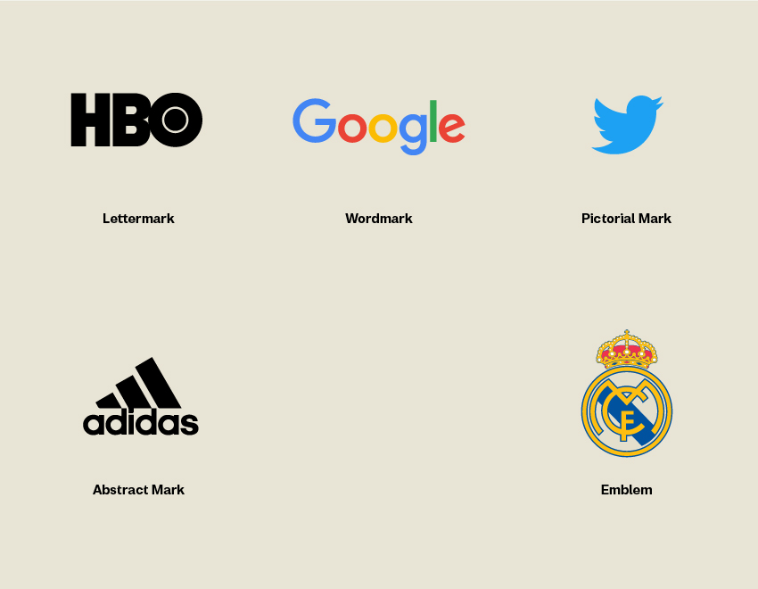
An emblem logo is a mark that contains the name of a company within a single form. Emblems aren’t only for the business sector; you’ll find them for schools and sports teams as well.
What is a Wordmark?
Rather than limiting the business name to a single letter mark, a wordmark concentrates only on it. For example, Twitter is a distinctive name on its own, but it results in a compelling wordmark when coupled with a strong typeface and blue colors.
What is Pictorial Mark?
A pictorial mark, often known as a brand mark, is a graphics-based logo. It is generally a simple and stylized icon that represents a brand. For example, Mozilla’s symbol is a fire, and it is known globally as Mozilla Firefox.
What is a Lettermark?
A lettermark is a type-based logo consisting of only a few letters. It is frequently used when a company’s name consists of two or more words. A lettermark will simplify the firm name by utilizing only its initials to abbreviate it. For example, IBM is far easier to say and remember than International Business Machines.
7 Important File Type for Designers
What is GIF?
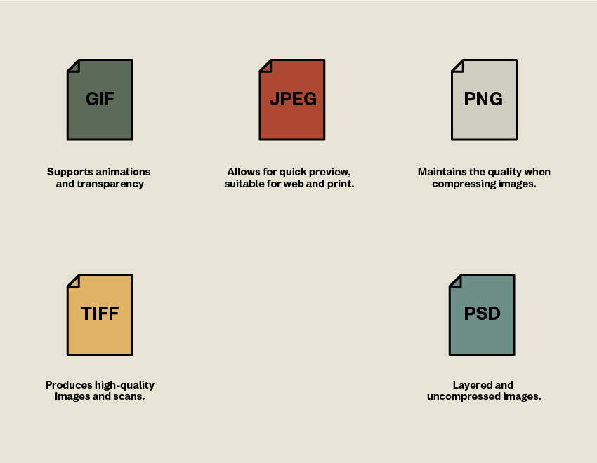
GIF is an abbreviation for Graphics Interchange Format. This file type supports transparency and animation. It can only display 256 colors, allowing for minimal file sizes. Ideal for use on the internet.
What is JPEG?
JPEG is the most well-known raster file format. Images in an email, photographs, and anything else you discover online are all acceptable. JPEG stands for Joint Photographic Experts Group. JPEG, unlike PNG, cannot be translucent. It is appropriate for both online and print.
What is PNG?
If you want to keep some picture quality whilst compressing it, PNG is the way to go. PNG is an abbreviation for Portable Network Graphics, and it was designed to improve GIF quality.
What is a PSD File?
PSD, or Photoshop Document, is the document format used by Adobe Photoshop. This version is a raster image file that has not been compressed.
What is a Raster Image?
Raster pictures are made up of a grid of pixels that make up the whole image. When you extend a raster picture, it becomes pixelated and fuzzy.
What is a Vector?
Vector graphics are constructed from tiny visuals such as points, lines, and curves. A vector’s forms utilize a mathematical equation that allows the vector to be scaled without sacrificing quality. Unlike raster images, vectors will not get fuzzy.
What is TIFF?
TIFF files are commonly used in layout design and InDesign. It is an abbreviation for Tagged Image File Format, and the format generates a higher quality image than the formats listed above.
9 Must-Know Typography Terms
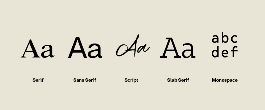
Sans Serif vs Serif
Each character has a serif, which is a little additional stroke at the end. A serif typeface is a font family that includes serifs. Because the additional stroke enables our eyes to follow the characters more readily, these fonts are typically simpler to read. Serif fonts are commonly employed for body copy since they are considered elegant and readable at various sizes.
Sans serif, on the other hand, is a character that lacks the tiny strokes at the end of each character. Sans serifs are also employed for body copy, although mostly on screen since they lack tiny features that might be difficult to portray.
What is Script Font?
Script fonts are inspired by handwriting and maybe both old and modern. They are more flowing than other conventional fonts.
What is Kerning?
Kerning is the gap that exists between two distinct characters. Certain letter pairings might produce uncomfortable gaps, and you can change the distance between them by kerning them.
What is Tracking?
Tracking, like kerning, relates to the space between characters. Tracking refers to a group of letters, whereas kerning relates to a pair of characters.
What is Monospace?
Monospace typefaces have fixed width, meaning each character takes up the same amount of horizontal space. It is common in typewriters and while entering computer codes.
What is Font Weight?
The thickness of a character to its height is referred to as its weight. A font can be found in various weights, with the most common being normal and bold. It is not uncommon to find typefaces having four to a dozen weights.
What is Lorem Ipsum?
Lorem Ipsum is a fake text or placeholder. It is frequently used in the layout of print, infographics, and online design. Lorem Ipsum’s major goal is to generate text that does not detract from the overall layout and visual hierarchy.
Even though the writing is in Latin, it has no discernible significance. It’s just used to retain a position in a file until the actual text to replace it is generated.
What is Readability?
The arrangement of typefaces and words to make written information flow in a straightforward, easy-to-read way is referred to as readability. Designers are in charge of putting together all media and design components to produce an engaging client journey. To promote readability, designers use deliberately designed design and typography to complement the message and purpose of the content.
What is Legibility?
Legibility is an important consideration in visual communications for the built environment. Signs, displays, screens, interpretative graphics, and other environmental/experiential graphics are ineffective if their messages are not legible. Legibility varies depending on viewing distance, location, typeface style, text color vs backdrop color, and other physical circumstances.
6 Design Terms Related to Images
What are Pixels?
On a computer, a pixel is the smallest fundamental unit of color that makes up a picture. You may have a high- or low-resolution image depending on how many of these small squares you use.
What is the Difference Between PPI and DPI?
PPI is an abbreviation for pixels per inch. It is a unit of measurement for defining the resolution of a screen, most frequently monitors, cameras, and scanners.
DPI, which stands for dots per inch, is identical to PPI but is used for printing. Printers generate pictures made up of tiny dots, which impact the printing quality of an image.
What is the Rule of Thirds?
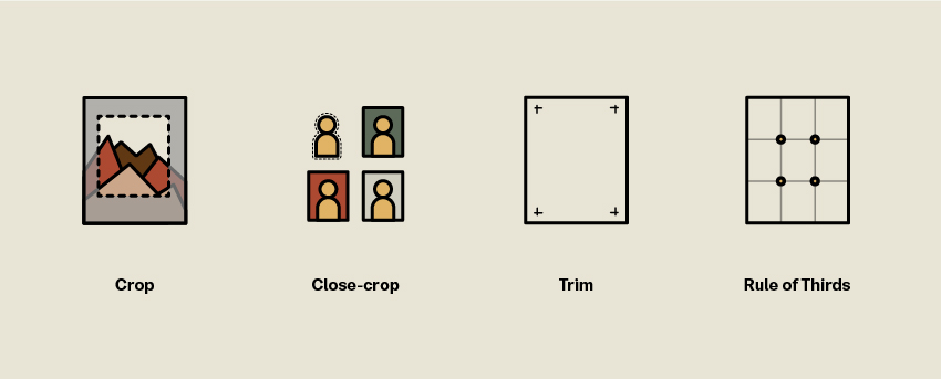
The focus points of an image or design are determined using this approach. Consider a 3×3 grid overlaid on top of a picture or design. The focus points are the four locations where the lines cross, and they are where the most significant items should be put.
What is Trim Size?
Trim size refers to the final size of a printed item after trimming. Crop markings determine the trim size on a printed page.
What is Close-Crop?
Cropping is the process of removing unwanted portions of a picture. By doing so, you may completely alter the direction, focus, and even composition of a picture. Cropping enhances an image’s frame to match your project.
Close-cropping, like cropping, refers to removing a specific piece from a picture. This is mostly done for headshots if you want to utilize a different backdrop color.
What is Resolution?
Resolution determines the file quality of an image. A high-resolution image will be sharp, with distinct borders wherever the focus is—the better the quality, the greater the resolution, and the bigger the file size. A low-resolution image produces a fragmented and fuzzy picture.
Conclusion
Those are some of the most commonly used design terms in store. Be it related to typography, color, or the principal terms, prepare yourself with this knowledge to succeed further as a designer!
