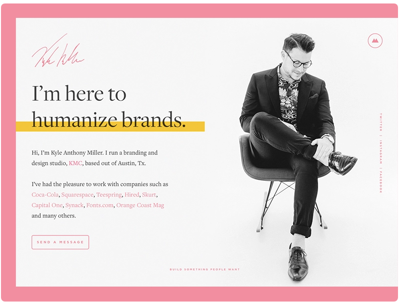
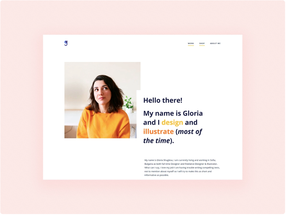
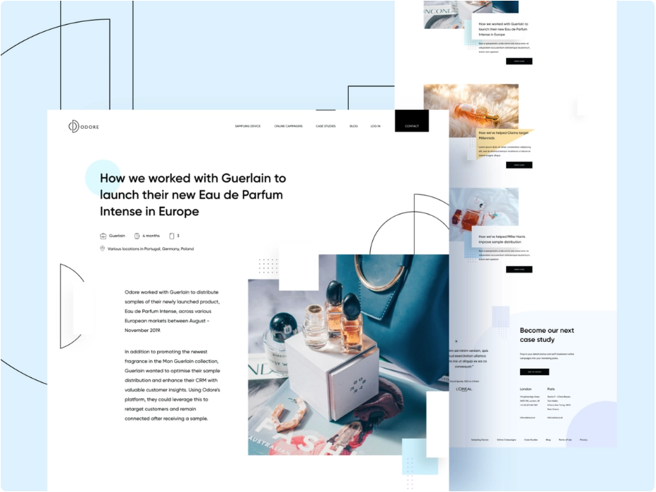
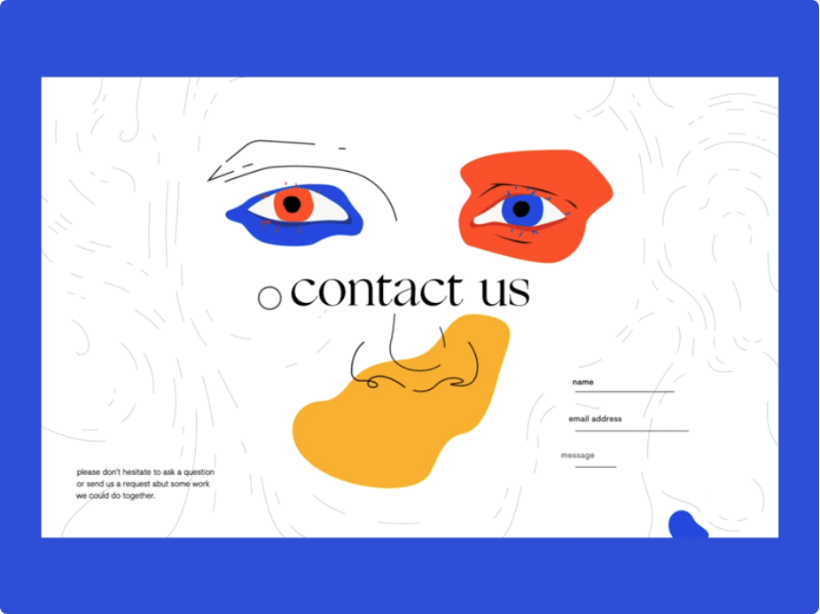
Whether you are an emerging artist or a seasoned veteran in the graphic design industry, you want to flex your various works to the public. Better known as a portfolio, the assorted collection of some of your best works showcases not only your designs but, more importantly, was meant to show off your capabilities as an artist. However, creating a masterpiece of graphic design and arranging a portfolio are entirely different skillsets an artist must master. We have rounded up some graphic design portfolio tips you can use to showcase and appeal to more clients.
Identify Your Target Audience
We get it; you want to flex your design skills and capabilities. However, arranging a portfolio is not as simple as showing off some muscle. You need first to identify your intended audience, as a different group of people might interpret your portfolio quite differently.
If potential clients or hiring managers are your top priority, it is best to include other assets like your resume, list of services, price list, and case studies. You may also include previous clients’ testimonials if you have any. You can also put the process of creating certain works to demonstrate your working style and rhythm.
If your portfolio is dedicated to building your brand image, then run wild. Showcase your finest works, show off your styles, boost your skills, so on and so forth.
Less is More – Curate Your Showcase
While we encourage you to show off, that does not mean you can throw everything into your portfolio. Think of it as your museum or a prestigious art gallery. You have to show the finest, the best of the best. If your work is varied either in art style or genre, show only the strongest piece from each category.
Curating your portfolio ensures that it does not end up like some random landfill. Also, a well-concept and well-curated portfolio might attract more people to see it. It is because the audience feels like they are communicating with you through your works. If you want your audience to relate to your work, you might want to apply our next graphic design portfolio tips.
Build A Narrative
Just like in museums or art galleries, audiences might be captivated by your works, but it’s often not enough to get them hooked. You need an accompanying narrative to enrich your design portfolio further. The narrative could be anything as long as it’s in line with the work presented. And by narrative, it does not necessarily mean a short essay, either.
It can be the work-in-progress stages from sketches to finishing, with a short caption explaining that piece. If it’s in video format, you can insert a voice-over of you explaining what techniques you utilized, the reason behind your creative decisions, or perhaps the step-by-step process itself.
Stay Up to Date
Our next graphic design portfolio tip tries to explain why your portfolio needs to be updated regularly: relevance. That artwork you did five years ago sure looks stunning, but potential clients or employers want to know how well your design skills have improved during that timeframe. It is also a way to measure your growth, how well you have improved, etc.
One of the easiest ways to show your improvement is by recreating an older artwork using your current style. You might be surprised at how much you have improved throughout the years.
Another way to flex your upgraded skills is by comparing your key projects in a timely interval. For example, starting with the major project from two years ago, you gradually show off your finished projects every six months up to the most recent one.
Make It Mobile-friendly
You want as many people to look at your portfolio as it will increase the chance of landing new projects or getting hired as a professional designer in a company. That’s why you arrange your portfolio in the form of a website. If this is the case, there is one thing you need to consider before launching your web: make it mobile-friendly.
With how fast our society is moving, not everyone has the time and resources to open your website on a personal computer. However, most people do own a smartphone. We all are used to accessing content on the go with our smartphones, so deploying a mobile-friendly portfolio website is a top priority.
Insert a Call-to-Action
You have identified your targeted audience, you have curated you’re your showcase, you have included accompanying narratives, you have made your website mobile-friendly, and then what? What do you want your audience to do?
Inserting a call-to-action (or CTA) is in line with our first tip above. Tell potential customers how exactly they can commission you. Convince hiring managers on why they should hire you. Whatever it is, make sure you write a concise call to action that directs people to take that action.
We hope you find our graphic design portfolio tips useful. Now, go and arrange those beautiful designs in an eye-catching portfolio!


