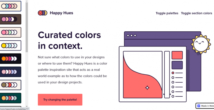
Your design project is now down to coloring, and you’re thinking about using some new hues for it. Perhaps you aren’t sure what colors to use there and need that spark of inspiration. Where can you find or create a color palette with an easy-to-navigate user interface?
Say hi, then, to Happy Hues!
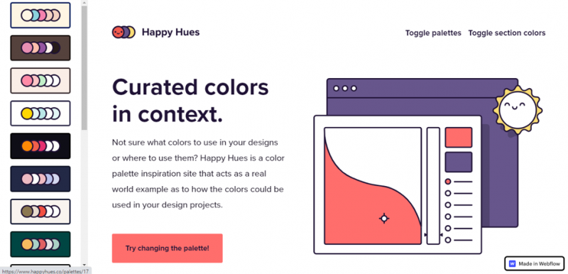
Happy Hues has that smiley and friendly logo clearly determining the excitement of playing with colors and digital designs. As a color palette inspiration site, Happy Hues indeed strives to be the “real world example as to how the colors should be used in your design projects”.
When users have no idea how to apply a color palette to their designs, Happy Hues helps by not only providing them color palette inspiration but also demonstrating them. In a real example, how those colors can be used for their illustrations, headlines, backgrounds, etc.
Right from the get-go, users will see the scroll-able Toggle Palettes on the left pane. When users click the Try Changing the Palette button, the webpage will change into a dominantly blue color set. Click on one of the palettes on the left pane, and then the page will change into that as well.
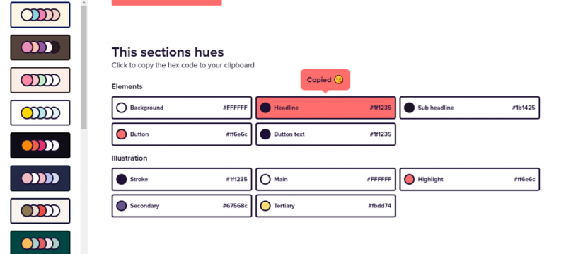
Scrolling down, users will find This Section’s Hues, detailing the Elements and Illustrations on the first section that can be copied to users’ computer clipboard.
The webpage currently has five Sections: preface, Color Terminology, the Psychology of Color, Who’s Behind Happy Hues, and footer. All Sections will have This Section’s Hues to enable users to gain information and copy the color code fast.
This straightforward feature won’t let users have to scroll the page vigorously to find the colors. If desired, users can easily turn this feature off by clicking the Toggle Section Colors on the top right corner.
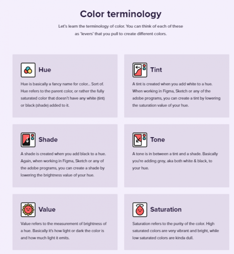
The Color Terminology provides nice introductory explanations about terms commonly found in digital designs: Hue, Tint, Shade, Tone, Value, and Saturation. Advanced designers can skip this and copy the Section’s Hues, but beginners or amateurs may love this carefully-crafted boxes during the scroll.
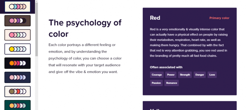
Another section dedicated to explaining colors is the Psychology of Color. Happy Hues believes that “by understanding the psychology of color, you can choose a color that will resonate with your target audience and give off the vibe and emotion you want.” The color list includes Red, Yellow, Blue, Green, Orange, Purple, White, and Black—and all indeed are a nice read, too.
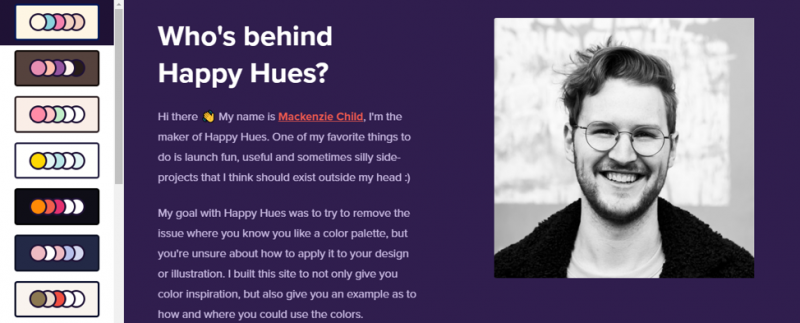
Who’s behind Happy Hues? This section gives users a close look at Mackenzie Child, who started Happy Hues after discovering the “struggle”: when designers often know if a color palette is aesthetically pleasing but might not really know how to go about using the palette colors to their designs or illustrations. Lastly, on the page is the social media account and websites of Mackenzie Child.
Main Features:
- Straightforward, one-page interface
- Growing color palette collections carefully curated by the page owner
- Newsletter subscription
We hope the reviews on the happyhues.co above give clear information and inspiration you need!
