We live in a digital world, where many pieces of data are waiting for us to read and digest. However, for those who are pretty busy with numerous responsibilities, whether you’re office employees or mothers engaged with domestic affairs, a display of information that is brief and easy to grasp rapidly is required.
As a response, it is not surprising that the design business, particularly illustration, shows a potential upward trend. Aside from that, some matters cannot be expressed in words, so illustrations are used to fill in the blanks. And as it evolved, isometric illustration emerged, which we will explore this time, especially why we love it. Without further ado, let’s get into it.
The Superb Matchmaking Colours with Futuristic Shapes
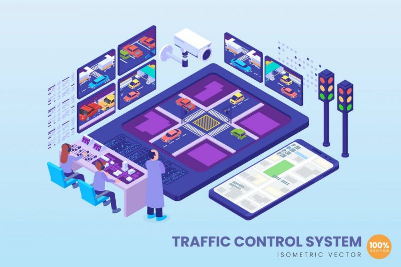
It is undeniable that isometric illustration appears comparable to 3D illustration at first glance. That’s not completely wrong; it’s just that it appears to be constructed on a 2D surface, so it doesn’t look very lifelike, but it’s pleasant to look at. Not to mention, the colour gradations used make it look lovely, making it perfect for the UI display, which is an important asset in today’s digital age.
The Diversity of Its Applications
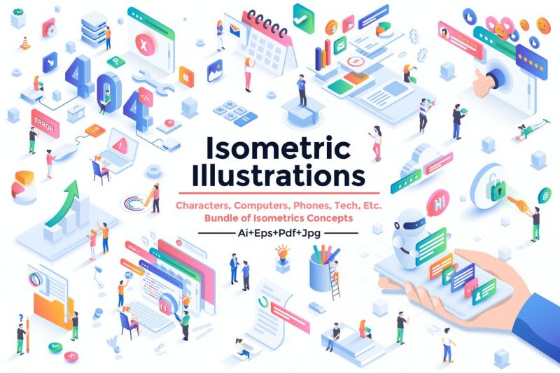
The isometric illustration can be applied for a wide range of purposes. For example, for the sake of games—which uses this sort of illustration and presentation purposes—we all know that PowerPoint presentations are a trend in the business world and spruce up the visuals of a website on its landing page.
Furthermore, this kind of design is also applicable to infographics that can help you convey a more straightforward message, a fresh way to deliver information to your employees or the world.
Particularly Unique
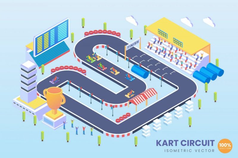
An isometric illustration provides something distinctive, making it visually appealing and easy to explore. This sort of artwork gives a broad perspective, so you can still find a space to develop your creativity; because it is created using projection techniques, which allow you to translate 3D objects that are put on a flat plane.
Amazing Way to Make Images Pop
You might say that isometric illustration is a derivation of 3D design, so this form of illustration has a depth to develop as well. As an outcome, even though the object is created in 3D on a flat surface, it retains the perception that the image is popping or springing, with shadow lines attached to the side.
So, you can still see that the object was developed using the isometric projection technique, that it can be seen from multiple angles and makes it easier for users to run an app with an isometric UI.
Great to Create Details Design
The isometric illustration is one of the most suitable design styles for creating miniatures of an architectural design. Using the gradation technique we outlined previously, the design features will be more evident and easy to recognize. As a result, this phase will be quite crucial for a building designer or an architect. Furthermore, this makes it easy for a developer to visualize the implications of the work they will execute in the environment.
It can be concluded that an isometric illustration is a type of design that has been around for a while, dating back to the early production of the Marble Madness arcade game with its perplexing block layout or the Farmville game that was our favourite at the time.
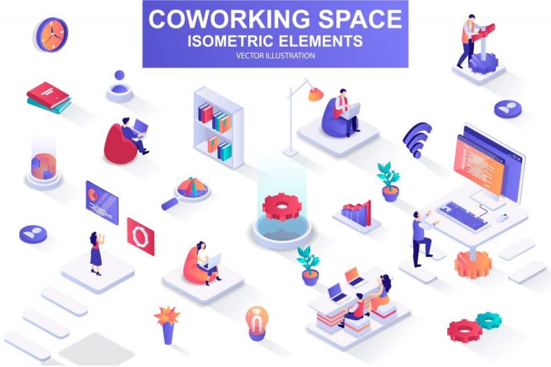
Then, in response to the impacts of enormous digitalization, this sort of design was tweaked and enhanced until it became what we see today. It is perfect for those of you who prefer a simple interface with depth. It also allows us to improve the aesthetic of our slideshows with easy-to-recognize icons.


One Comment