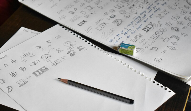
When discussing logo designs, what first comes to mind is mostly about brands. The fact is that a logo is a visual representation of a brand. Although a logo is only part of a large branding package, it represents a brand’s overall identity.
There are actually various types and styles of logo designs. If you are working on your design, here are the types and styles of logo designs you should know. Additionally, learn about common mistakes in logo design.
Logo Design Types

There are five types of logo design, each with its own unique power and advantages. Let’s take a deeper look at the types of logo designs.
Wordmark
The first type is wordmark, which is also known as logotype. This type is a text-based logo to highlight and focus on the brand’s title. Since it is a text-based design, wordmark strengthens in typography, color, and spacing.
The purpose is to come up with a unique and unforgettable presentation of the brand. While some logo designs showcase icons or symbols, a wordmark is not accompanied by any additional graphical elements.
This type is best for brands with distinctive or short names. Some big brands using wordmark are Visa, Google, Coca-Cola, Disney, Prada, FedEx, eBay, DKNY, and Sony.
Lettermark
A lettermark, also known as a monogram, is a typographic logo that utilizes a company’s or brand’s initials or a shortened version of its name to create a unique and memorable mark. This design type is particularly effective for brands or companies with long or complex names, as it allows people to remember them more easily.
Lettermarks emphasize stylized fonts and letter combinations, often enhanced by powerful colors to create a striking visual identity. Their simplicity makes them easy to recognize and adaptable across various media formats.
Some well-known examples of brands that use lettermarks include IBM (International Business Machines), CNN (Cable News Network), and NASA (National Aeronautics and Space Administration).
Brandmark
Different from wordmark and lettermark, brandmark doesn’t use any text. Instead, they use only an icon or symbol to represent a brand. They solely rely on images to communicate the brand’s identity and evoke remembrance.
Without having to see the name of the brand, the brandmark can be easily recognized by people. The examples of brandmark type are Apple, Instagram, Nike, Starbucks, Shell, Netflix, Mercedes, Toyota, and Honda.
Combination Mark
While brandmark only relies on image or icon, combination mark uses both a wordmark or lettermark (text) and a pictorial mark or image. Using this type, the logo designs feature the brand’s name and related visual details together.
The combination of text and symbol helps to strengthen brand identity and creates a more memorable logo. Well-known companies or brands using a combination mark type are Lacoste, Burger King, Adidas, Ralph Lauren, NBA, Amazon, and WWF.
Emblem
The next logo designs style is emblem. An emblem style marries text and imagery within a well-defined shape like a seal, crown, or badge. The well-defined shape is to spark a sense of authority, tradition, or heritage, making this style perfect for organizations like universities, schools, or sports teams.
The strong point of an emblem is the sense of strength, trustworthiness, and classicism. Some companies, brands, or organizations that use this style are Harvard, Harley-Davidson, and Porsche.
Logo Design Styles

After learning about types of logo designs, we now move on to logo design styles. Logo design styles refer to the overall look and feel of a logo. While logo types describe the structure, logo styles showcase the aesthetic choices.
Minimalist (Modern)
Many brands’ logos utilize a minimalist style. They prioritize simplicity with the use of clean lines, a limited color palette, lots of white space, and simple design. Minimalist style delivers sleek, sophisticated, and contemporary vibes. Notable examples include the logos of Apple and Uber.
Vintage / Retro
Vintage and retro logo design styles aim to evoke a sense of nostalgia by incorporating design elements reminiscent of past eras, primarily from the 1920s to the 1970s. This style conveys feelings of nostalgia, authenticity, and virtue. Examples of brands using this style are Levi’s and Coca-Cola.
Hand-Drawn
This style is unique because it uses custom illustrations and even imperfect lines just to give a personal feel and impression of handmade. Hand-drawn features a sense of authenticity and craftsmanship, as seen in brands like Innocent Drinks and Ben & Jerry’s.
Geometric
Different from the hand-drawn style that shows imperfections, geometric style uses basic geometric shapes with sharp or symmetrical designs. This style is arranged in a structured and symmetrical manner, as seen in the logos of Dropbox and Adobe.
Abstract / Conceptual
An abstract or conceptual logo design employs symbolism and illustrations to create a unique visual identity that evokes ideas and emotions for the brand. This style conveys a sense of uniqueness, intellectuality, and creativity. Examples of this include Airbnb’s abstract symbol and Pepsi’s globe.
Most Common Logo Design Mistakes to Avoid
In logo design, there are common mistakes that many designers make, which can negatively impact brand identity and usability. Here are some key mistakes to avoid:
- Using too many elements makes your logo or brand hard to recognize.
- Combining too many fonts.
- Choosing a poor color palette, such as a lack of contrast or a color clash.
- Focusing on the trend only, your logo becomes outdated quickly.
- Using raster instead of vector graphics.
Understanding the different types, exploring various styles, and avoiding common design mistakes in logo designs are essential steps in creating a strong, memorable logo. A well-crafted logo is more than just a visual. It’s the face of your brand.
