Company and business branding are important when it comes to marketing your products to potential consumers. Every company should have a good and well-designed logo to make them stand out from its competition. Using a logotype might do the trick, but using a logomark also has its benefits. Logotype vs logomark, which one should you pick?
But wait, what is a logotype? What about a logomark? How are they different from a logo? This article will explain what they are, their differences, and each of their advantages and disadvantages. You will surely be able to create the perfect logo for your brand with the information written below. Interested? Let’s get right into it.
Logos: The Face of Your Company

Logos are images, shapes, texts, or a combination of the three that depict the identity of a business. It is a symbol that represents your company. A logo makes a great first impression on your consumers and helps them remember that your business exists. It also distinguishes you from competitors that are offering similar products and services.
Logos can do more than just be a symbol of identification. A well-designed logo can convey a company’s story or a brand message. It can also be used to advertise new products or services, convey the company’s mission and brand vision to consumers, or inform them about why your services are great and better.
The components of a logo include color, typography, image, and tagline. They are what make up a logo that will become the face of a company or a business.
Colors are the core communicators of a logo’s message. Different colors tell different messages to your audience. Use this to your advantage to communicate a specific message that describes your company. A logo color palette can be made up of a single or several colors, preferably two or three at most, not to overwhelm the eyes.
Typography is the letters you would see in a logo. It includes a single letter, a monogram, or even the full name of a business arranged in a consistent design. If using colors is an indirect way of conveying a message, then typography is more direct and clearer.
An image in a logo can be an icon or symbol representing a company’s products and services or a value it stands for. If you are using an image, it is important to make sure that it is scalable and will look clear in any kind of size.
A tagline usually consists of a sentence or a catchphrase that clarifies what your company does and hooks your audience. Taglines are not necessary for logos, but they can help clarify things about your company if your logo alone is not able to convey everything you want it to convey about your business.
Logotypes: Letters as a Means of Communication
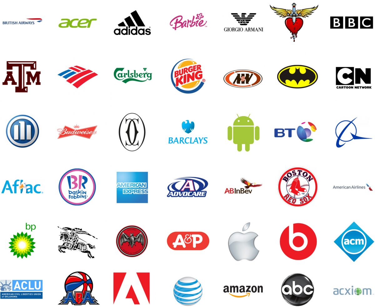
A logotype is a company’s name or words that are designed in a certain way to represent a business. It is essentially a logo consisting mainly of typography without images or icons. Logotypes can be made from geometric shapes that can create abstract letterforms visually or by customizing a pre-existing font.
The idea behind logotypes is that a symbol or an image is not needed for effective communication. Using only typography in a logo can convey what a company is all about directly and clearly. The uniqueness of a typeface and letter styling in a logotype also makes people immediately associate them with a specific company or brand.
The effectiveness of a logotype is based on the styling of the letters that match a company’s identity. For example, black letters written boldly are used to suggest a dependable, strong, and capable brand. Colorful and organic cursive letters would better suit a more friendly and approachable company.
While logotypes might seem easier to design due to them only having text, they could be potentially harder than making logos with images. Both need design skills, such as working with composition and sizing as well as picking colors. However, logotypes require you also to know how to properly deal with typographic styling to make them look good and presentable.
The Advantages of Using Logotypes
Logotypes stand out and instantly make themselves memorable and associated with a certain company compared to other types of logos. They are great for getting a company’s name out there and brand awareness. Their straightforward nature also gives them zero risk of brand confusion and can provide additional information about a company. Moreover, the use of text allows the opportunity for puns and wordplay.
The Disadvantages of Using Logotypes
Logotypes are a great way to get your brand’s name on the radar of the general public, but some downsides come with only using text for your logo. Using text alone makes it hard for it to be translated into different languages. Logotypes also do not work well for long or difficult brand names. They tend to have limited options for creative logo designs as well.
Logomarks: Images to Remember a Brand By

A logomark is an identifying image or icon that does not contain a company’s name. It is essentially a logo without typography that relies on images and icons to represent a business. Logomarks are considered more “abstract” than logotypes. Their nature allows for more creativity to be implemented into their design.
Logomarks can convey the specific ideals or concepts of a company. They have an iconic and memorable nature to them and heavily rely on the power of visual communication. They have more freedom when it comes to conveying ideas and portraying brand identities compared to logotypes.
Logomarks convey different messages through visual manipulation. For example, using different shapes such as a circle and a square will result in different interpretations. Circles give a more friendly and approachable message, while squares give off a more orderly and stable feeling for your audience. Different interpretations are also possible from other visual elements such as color combination, sizing, and negative space.
The Advantages of Using Logomarks
Logomarks are used by small businesses for their products and services because they are an easy and cheap way to promote their brand. They also allow highly personalized and unique designs for branding and do not limit creativity due to their “abstract” nature. A well-designed logomark can capture and convey even the most complex of ideas.
The Disadvantages of Using Logomarks
While the use of logomarks allows the expression of emotions and complex ideas, the clarity of a message behind a design might suffer if the execution is done poorly. They are less direct in their communication compared to logotypes and this may result in multiple interpretations for your audience. If your message is not clear enough, your audience will only end up being confused by your logo.
Logotype vs Logomark, Which One Is for You?
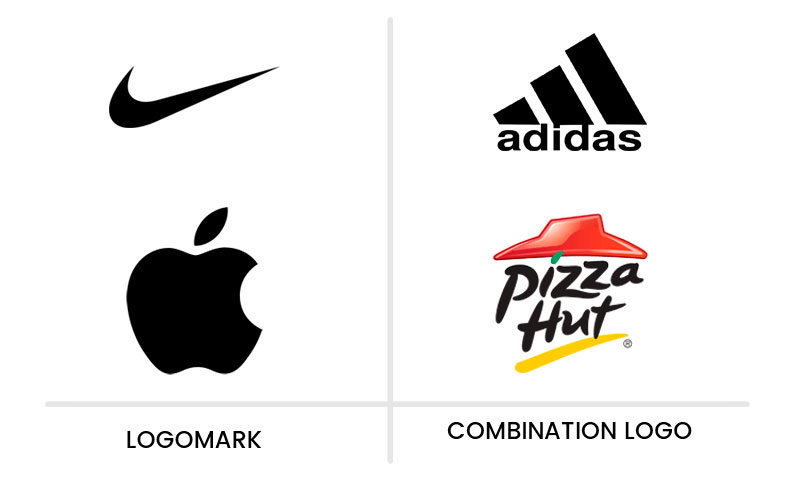
Each of them has its strengths and weaknesses. From a general point of view, neither of them is better than the other for every single project out there. According to your needs, however, one might be more suitable to represent your company and brand.
Logotypes are suitable for newly established brands that want their name to be known by the general public. They are also suitable for brands with names that reveal some information about what they do, such as a law firm. Formal industries and brands going for a sophisticated and or historical approach would benefit greatly from using logotypes.
Logomarks work better for emerging brands looking for drastic changes in their rebranding. They also work great for companies or brands that have an animal or object as part of their name. Brands with services or products that require explaining would benefit greatly from using a logomark with an image that can demonstrate what they do.
Is Combining Both of Them Possible?
It is possible to combine a logotype and a logomark into a combination mark. Most of the time, combining them both creates a logo that functions more effectively than each on its own. However, in some cases, you may lose the advantage of using only one of them. You can always create more than one logo design for different occasions to solve this. Having one that is a combination mark might come in handy in the future.
The Advantages of Using Combination Marks
Using combination marks can boost a brand’s name recognition while still allowing the use of an image to represent them. Logotypes and logomarks can also be creatively combined for wordplays done visually or to convey a more detailed message. All in all, you get to have the benefits of both when combining them into one.
The Disadvantages of Using Combination Marks
Joining logomarks and logotypes into a combination mark usually results in a bigger design than when you make them separately. This might make it hard to read and even see in smaller sizes. The legibility and clarity of your message may suffer because of this. Using them in streamlined locations can also make them less appealing.
When Do You Use Combination Marks?

Combination marks are great for newly established brands that want to build brand awareness while still using an image. They are also great for established brands that want to rebrand but are not looking for drastic changes. Companies that can creatively combine them into a unified logo will also benefit greatly from combination marks.
Creating a Good Logo for Your Company
Whether you end up choosing a logotype, a logomark, or a combination of both for your brand, there are a few things you should know about to create the perfect logo that can represent your business.
The most essential step for a company is to create a logo that can perfectly capture its essence and represent them. The process of creating one may need some time and proper research, but commitment can give birth to a good logo that differentiates you from the rest.
Online tools are available for you to experiment with and take inspiration from when designing a logo. A good logo consists of consistency and simplicity. The two combined reduce the risk of your audience being confused by your brand and makes it more memorable for them. Your logo should be bold but still has a clear message.
The colors you will be using on your logo should also be taken into account. Colors play an important role in successful branding strategies. Different colors can convey different things to your audience. Understanding them is how you pick the right colors for your logo. Choose the colors that can represent the essence of your brand perfectly.
A good logo does not just convey a brand’s story, but can also develop an emotional relationship with your consumers. If you have a rough idea for a logo but are not sure how to develop it into a unique identification for your brand, try hiring a professional logo designer. They can help create a logo that can speak to your audience.
Last but not least, do not be afraid to be bold with your logo. It is beneficial for your brand to have a memorable logo that consumers can always distinguish from others. Create a bold and striking design that immediately draws the eyes of those who see it. The last thing you want is to have a generic branding profile that people can easily forget.
Creating a Good Logotype: Do’s and Don’ts
To maximize the effectiveness of a logotype and create a good design for it, you must first learn more about typography. Try to understand concepts like leading, strokes, kerning, and ligatures to learn how to use them effectively in your logo.
Don’t forget to test your logotype at different sizes to make sure it is always legible. Legibility is important for logotypes as they are meant to be read. People won’t be able to know the name of your company or might even misread it if it is not readable.
Create a monochromatic version of your logotype. This will prove to be handy if you are printing your logo on marketing swag or paper.
Creating a Good Logomark: Do’s and Don’ts
Instead of immediately creating an original icon, try to first review popular icons and symbols to see if any of them can already represent your brand the way you want. From there you can then customize those symbols to suit your specific needs.
Consider creating creative combinations of images for your logomark. Taking the Bluetooth logo as an example, it incorporates the initials of Harold Bluetooth in Viking runes. You can do something similar with your brand’s logo to give it a unique touch that exclusively belongs only to your brand.
Try maximizing the use of symbols to convey your company’s values, theme, and products. Combine them into one unit that is a logomark to create brand storytelling that can be understood by your audience when they see your logo.
Lastly, try to match a certain artistic style to your brand identity. This can create a visual association for your consumers and make your logo more memorable to them. Using a consistent artistic style also doesn’t confuse your audience about the kind of branding profile you are going for.
Creating a Good Combination Mark: Do’s and Don’ts
When creating a combination mark, you should proactively look for ways to merge the two into one. Think of creative ways like extending a stroke or arranging the letters to become a part of the logomark. You should also use consistent colors and styles to give the impression of them being in unity. Try experimenting with how you “stack” them. You can play around with the visual elements to create a good composition for them.
Additional Tips

If you are planning to hire a professional to design a logo for your business, then be sure to determine your budget. Hiring one could be expensive depending on your needs. Logomarks are generally more expensive when it is done by a professional due to their complexity and the creativity needed to create one that exactly matches your business.
Regardless of whether you want a logomark or a logotype done, be sure to always check out the designer’s ratings and reviews in advance to get the most out of your money. If you are on a strict budget, you can try out free sites instead where you can get yourself various sorts of possible logos for your company at no charge.
You should also consider your competition when designing a logo. If you see that your competitors are using similar icons or concepts in their logos, try to make something different. Creating clear visual brand differentiation gives potential consumers the impression that you are different from others and might be able to offer something that they can’t.
An Afternote
Logotype vs logomark, which one is better for your brand? The answer to that question depends on your brand’s needs. A combination of both might even be better than only going for one of them. Whatever you end up choosing, remember to make a logo that can represent the essence of your company. Good luck!
