Modern logo ideas can be found everywhere. One of the ways is by looking at updated or new logos from various car manufacturers around the world. Car technology is always refreshed for this modern era, so those who handle that kind of technology have to follow the era with some refreshments, one of which is the logo.
New Era, New Logo
There are at least five car manufacturers, that can be an inspiration for modern logo ideas, who change their logos in this digital era. Those car manufacturers are General Motors, BMW, KIA, Nissan, and Volkswagen.
General Motors

Unlike other car manufacturers in this article, the logo of General Motors does not appear on any car they make. It is because this American car manufacturer is the parent company of many car brands like Chevrolet, Cadillac, and others.
The old logo of General Motors is a dark blue square with white underscored uppercase ‘G’ and ‘M’ in the middle. For the new logo, they use a white square with blunt corners. The dark blue is replaced by much lighter blue for the outer line of the square and the new underscored lowercase ‘g’ and ‘m’.
BMW
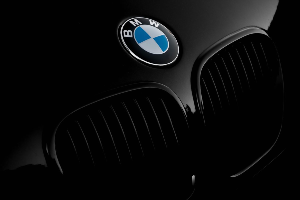
BMW change its logo from three-dimensional to two-dimensional. The German car manufacturer also removes the black circle to be transparent. The uppercase letters ‘B’, ‘M’, and ‘W’ are still on the top part of the logo, but they use a darker color to support the transparency.
The signature blue and white propeller remains at the center of the logo, but there are no more black lines separating the two colors.
KIA
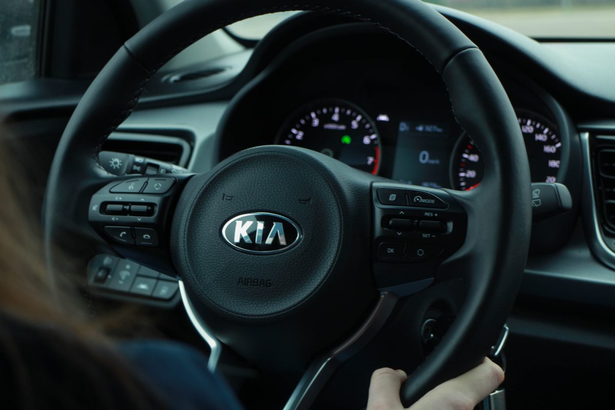
KIA has total redesigned its logo. Before, the logo of the South Korean company was a white oval with a black outer line and black uppercase ‘K’, ‘I’, and ‘A’ written in the middle. The new logo is just the same letters with a handwritten signature style. That style of the letters can be used as one of the modern logo ideas.
Nissan
Similar to BMW, Nissan’s new logo is two-dimensional. The Japanese company has replaced the signature three-dimensional chrome gradations with two simpler and thinner spurs above and below the name ‘NISSAN’, which has a minute modification but is still placed at the center of the logo.
Volkswagen
Volkswagen’s logo is also changed to be two-dimensional. This one of the biggest car companies in the world uses the refreshed version of its classic logo as the new logo.
The letter ‘V’ on top of the letter ‘W’ has not changed, but the white and blue colors are inversed, so blue is used for the letters and the outer circle, while white is used for the background.
The Recipe for Modern Logo Ideas
All of the five car manufacturers use simpler and digitalized designs that can be modern logo ideas. It is due to the digital era that makes those logos appear not only on the cars but also on the internet or gadgets. A company like General Motors, which does not use its logo on its cars, is an example of why modern logos need to match the digital era.
Simpler shapes and font styles also make a logo more recognizable and memorable. Like BMW, Nissan, and Volkswagen, using simpler styles is not necessarily removing key details that are considered the main identity of a company.
The color choice can also be decided for modern logo ideas based on the future goals of a company. For example, one of General Motors’ goals is to make electric vehicles reduce carbon emissions, so they use a shade of blue similar to the LED used in most electronics.
Modern logo ideas can also be found in other technologies, as long as those technologies follow the modern era. Modern logos nowadays are usually simple, flat, without sharp edges, and use specific colors to match the digital era.
