Description
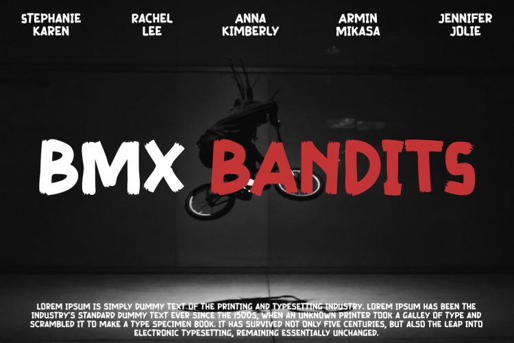
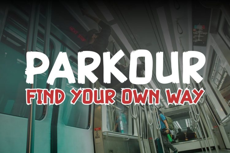
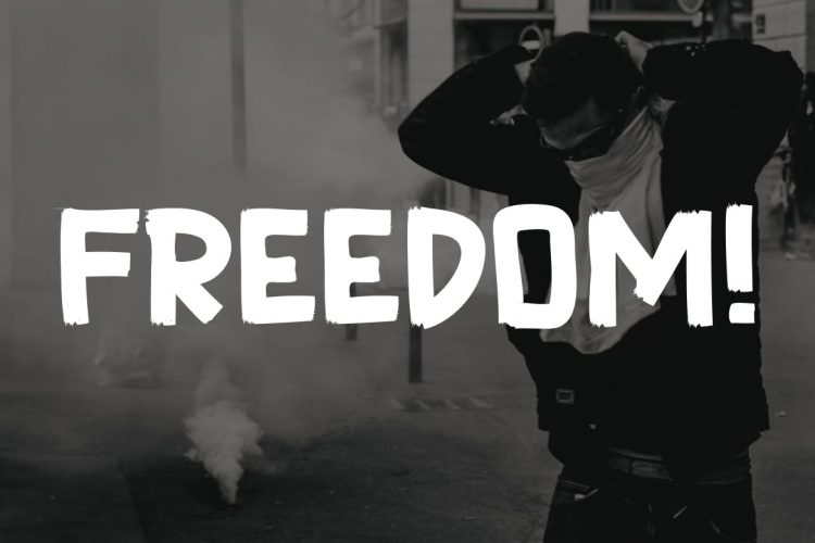
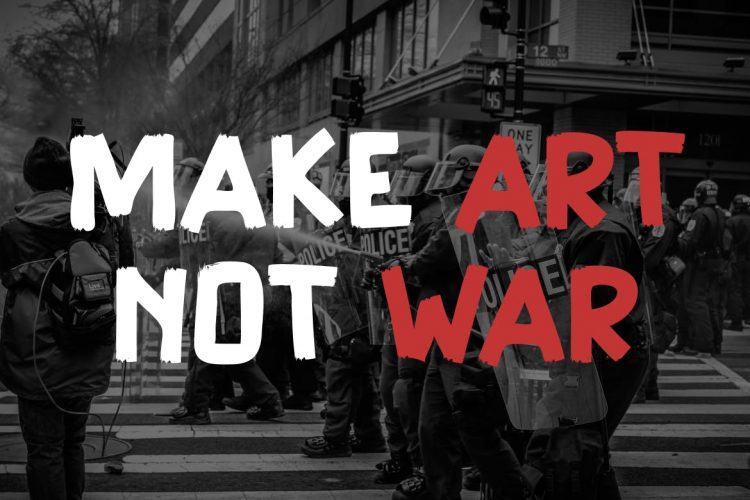
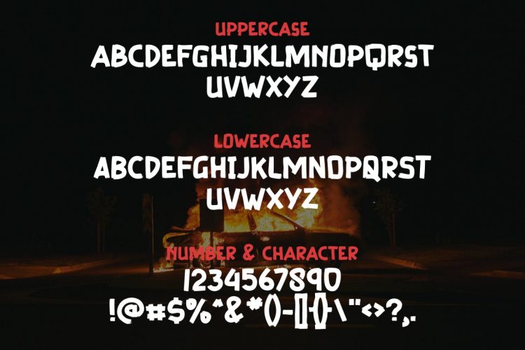
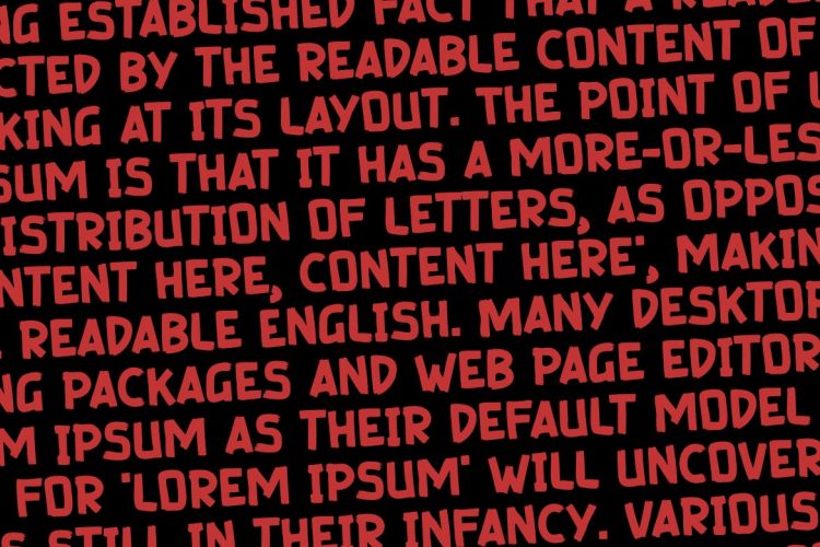
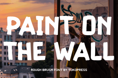
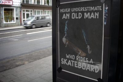
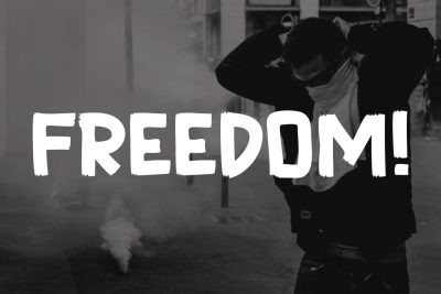
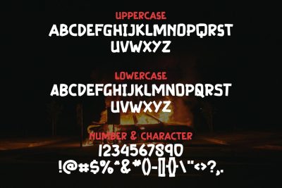
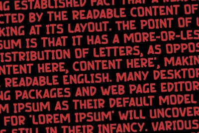
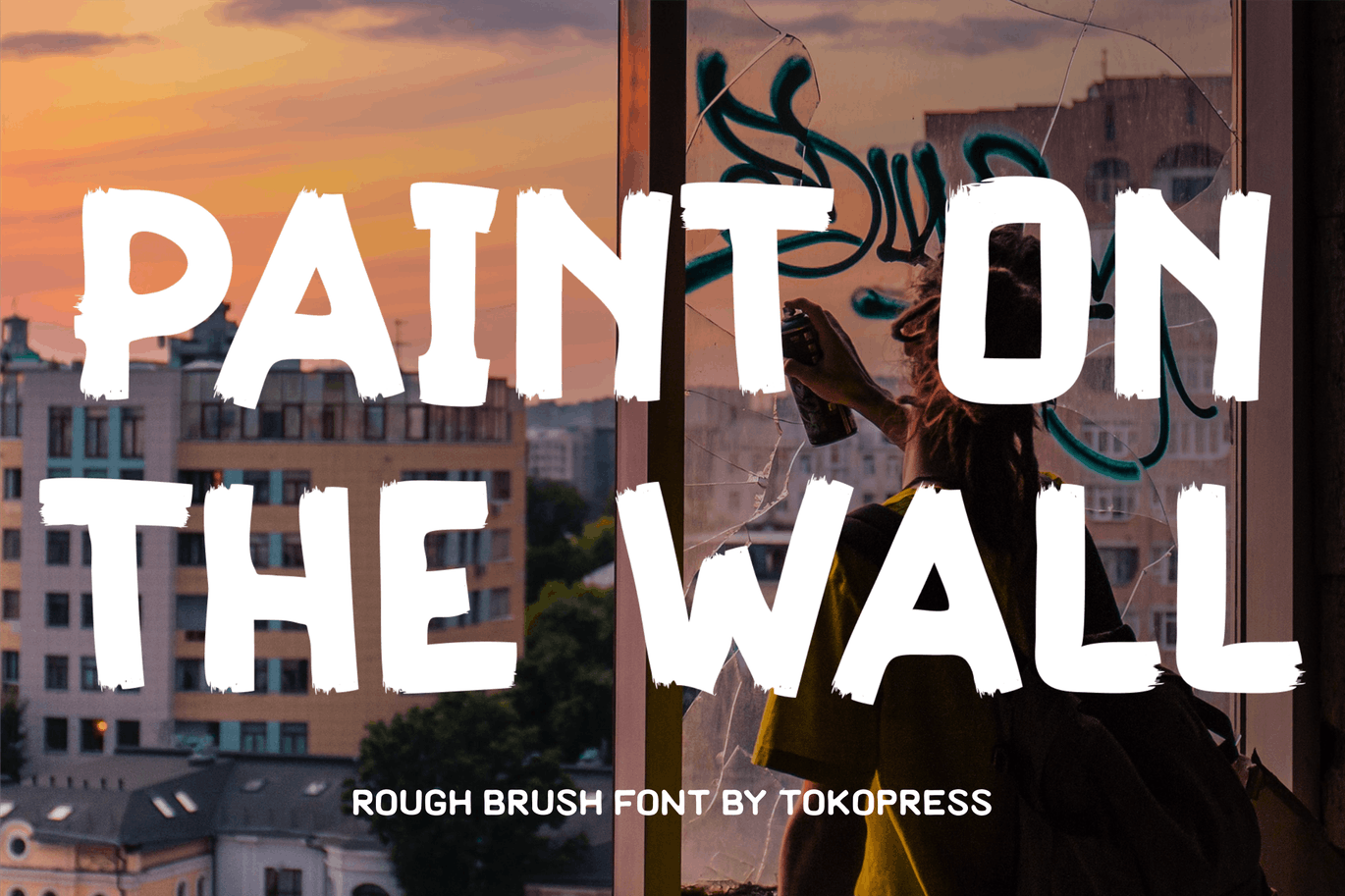
Graffiti Font Paint on the Wall is a bold typeface inspired by the raw energy of street art. With its rough brush strokes and rugged edges, it closely mimics the look of graffiti on urban walls. Each letter’s thick, distressed lines give it a unique, hand-painted feel, instantly catching the viewer’s eye. Additionally, the font’s irregular form adds a burst of energy to designs, making it ideal for creating a strong visual impact. Its large shapes and striking style make Paint on the Wall perfect for titles, posters, and album covers. Furthermore, its adaptable design works well with various color schemes and backgrounds, allowing designers to craft visuals with a distinctly urban and edgy vibe. In short, this font doesn’t just stand out; it demands attention and adds a layer of authenticity to any project.
Graffiti Font Paint on the Wall Best Use Cases and Target Audience
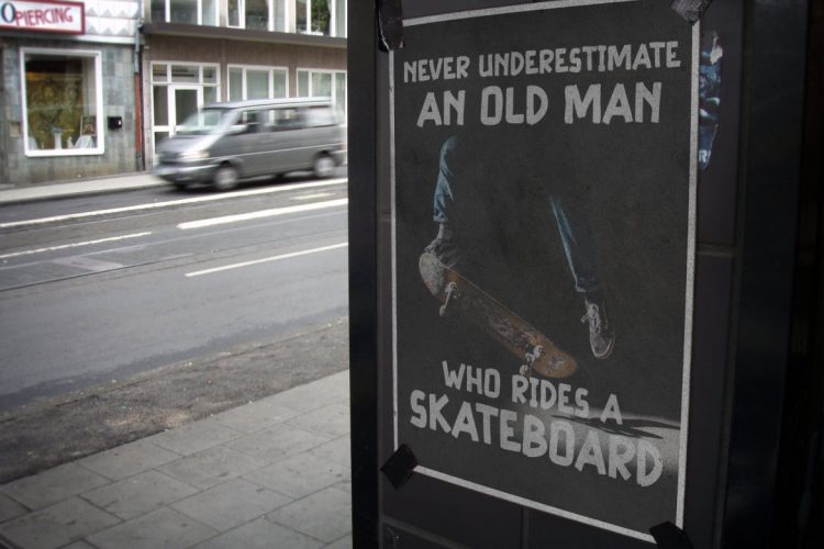
Paint on the Wall is a fantastic choice for artists, designers, and brands targeting a youthful, trend-conscious audience. Specifically, it works well for urban branding, alternative art scenes, and projects rooted in street culture. For instance, brands in music, fashion, and entertainment can use this font to connect with audiences who value individuality. Moreover, designers working with hip-hop, punk, or alternative music genres will find it perfect for posters, album art, and merchandise. It’s also ideal for event promotions, skateboard graphics, and clothing brands with a strong urban appeal. Additionally, social media influencers focused on streetwear, travel, or the arts can leverage this font to add a gritty, authentic touch to their visuals.
Overall, this typeface communicates energy, defiance, and individuality, making it perfect for projects that need to stand out. Whether used in branding, creative designs, or personal projects, Paint on the Wall captures the raw spirit of street art, bringing a bold and genuine feel to every piece.

