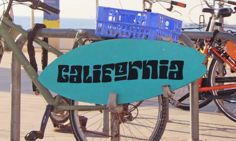
Some many font types have grown in popularity in recent years, one of which being retro font. What is retro font? As the name implies, retro fonts are a typographic style influenced by the 50s to 70s design trends. These fonts can be distinguished by their blocky shapes with serifs and other decoratives.
Retro font plays an essential role in today’s design. One of the main reasons is that the font can make designs have personality, a particular aesthetic, and a sense of nostalgia. For designers, nostalgia has the power to appeal to their targeted audience on a positive level.
Nostalgia is able to create a sense of community and connection to past positive experiences and memories. Hence, designers employ retro fonts as one of the means to create nostalgia in contemporary designs that can entice audiences.
I. Nostalgia and Design
Nostalgia is a fundamental aspect of the human condition regardless of how much life evolves. It makes people—preferably Generation Ys and millennials—crave the good ol’ days. Therefore, it’s understandable if they quickly fall for products that include nostalgic components.
Nostalgic aspects are employed by designers to tap into the audiences’ desire to feel a sense of security, significance, and belonging. The result is a product with an emotional and sentimental quality that can resonate with the targeted audiences.
Dr. Filippo Cordaro, a University of Cologne researcher, asserts that recalling positive memories puts people in a more positive mood and makes them feel more connected with others. Thus, many brands have continued to include nostalgia in their product design to draw in customers who like to reminisce about the old times.
Using retro fonts is one of the means to insert nostalgia in designs. This is one of the typography trends that is currently on the rise, not without reason. As briefly mentioned above, retro fonts can give any design project a solid sense of nostalgia and connection. These old-school fonts can also provide a sense of comfort and familiarity. How come?
Numerous retro fonts have been used for years and have grown recognizable in their own way. These design components have merged into our culture; hence, they are easily distinguished. When people see a specific retro font style, they are immediately brought back to well-known symbols of culture that people often link to good feelings.
For example, seeing a classic font of Coca-Cola can make people feel nostalgic for the times they drank cold Coke as a kid on a hot day in the summertime. In this case, the Coca-Cola font is a powerful element; it’s attention-grabbing and impactful.
The selection of typeface design trends, such as retro fonts, can also be a vehicle for narrative. They enable designers to draw on shared cultural references and arouse fond memories, making them an essential tool for producing engaging and unique design products.
II. Exploring Retro Font Styles
Retro fonts are used to evoke nostalgia because of their classic look. Despite being so, most retro fonts today come with modern features. There are at least two styles of retro fonts according to their use: script and display. Read on to know the differences.
Retro script fonts
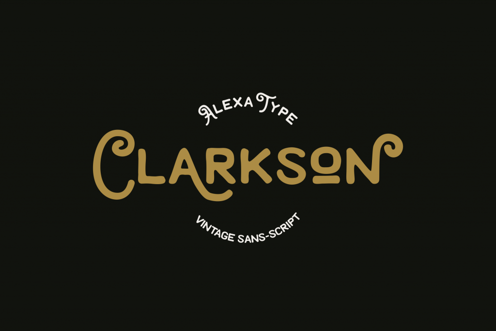
Script fonts can be referred to as typefaces that resemble cursive handwriting. It is also often called handwriting fonts, calligraphy fonts, or cursive fonts. These fonts come in a variety of styles, from playful and casual, to formal and sophisticated. But what about retro script fonts?
As the name implies, retro script fonts are a typography type that mimics vintage handwriting. They can be characterized by their cursive-like shapes and elaborate features. Here are some of the popular font trends in retro script style:
- Brush Script: This font was widespread throughout the 50s to 60s. It can be recognized by its brush-like lines and is frequently employed to convey a lighthearted, informal vibe. Because of its antique appeal, brush script is still used in today’s vintage-inspired projects.
- Edwardian Script: It’s a retro script font first introduced in the early 1900s. It has an elegant look with flowing curves and is frequently employed to add elegance and sophistication to designs. Due to its timeless design, the font is still used for making formal invitations.
- Mistral: Popular in the 50s to 60s, Mistral can be characterized by its calligraphic shapes. Much like Edwardian script, Mistral is frequently used to convey a sense of sophistication and nostalgia in vintage-inspired projects.
Retro display fonts
Retro display fonts can be distinguished by their bold and visually appealing shapes. They are designed to be noticeable and readable. Not much different from old-fashioned script, retro display fonts also have a vintage feel for their designs inspired by the past. Here are some of the modern font trends in retro display style:
- Reuben: This display font is designed with the delicateness of New York in the past. It featured thick-to-thin swashes and was famous for creating hand-painted billboards. In today’s use, it’s perfect for making a bold statement in packaging and branding projects.
- Milkman: Milkman is a retro display font inspired by the 60s. It can be characterized by its curves and strong contrast of old-school fonts with a touch of modern serif. It’s suitable for making vintage-styled logos.
- Gunydrops: This vintage, bold, and whimsical font can add a sense of playfulness to any design. The groovy style of Gunydrops takes inspiration from the pop culture of the 60s to 70s.
III. Retro Fonts in Contemporary Design
The development of graphic design font trends is almost unstoppable. However, retro fonts are still in for many reasons. They can give any design project an authentic, classic look that quickly grabs audiences’ attention. Most importantly, they are versatile to be used in any kind of design, be it classic or modern.
Retro fonts with modern design elements
Despite being versatile in any style of design, combining retro fonts with contemporary design elements takes a lot of work. But don’t fret; you can use a few techniques to create a design with retro fonts that is both unified and well-balanced. Here are the tips:
- Use contrasting typography: When using retro fonts, try combining them with modern sans-serifs to create a strong contrast that strikes a balance between both fonts. This will give the design a dynamic range and feel more modern while having unique aesthetics.
- Restrict the use of retro fonts: The rule of thumb in using retro fonts for design projects is to restrict the number of fonts. Instead, use the fonts sparingly, such as using them for titles or headlines. As for the body text, you can use modern fonts.
- Limit the use of color palettes: Another way to balance out retro fonts and modern design elements is to limit the usage of color palettes. To achieve balance, using a more subdued color palette with a small number of striking accents is advised.
- Use modern design components: The vintage look of retro fonts ought to be balanced out using modern design components. Consider using clean lines, negative space, or minimalism.
- Texture and pattern: Texture and pattern can balance the vintage look of retro fonts. It can also give any design project a sense of depth.
Retro typography in branding and marketing materials
Retro typography can be considered one of the digital font trends that can be a powerful design element in branding and marketing materials. The primary reason is that retro fonts can evoke nostalgia, authenticity, and personality. If we talk about nostalgia in design, this human condition can bring audiences to the good ol’ days simply by seeing vintage elements (retro fonts) in a particular design.
When appropriately used, retro fonts can create a sense of uniqueness and familiarity in branding and marketing designs. Thus, the designs stand out from the crowd because they are distinguishable. However, using retro fonts for branding and marketing purposes can take a lot of consideration.
It’s crucial to take the context into account when utilizing retro typography for branding and marketing purposes. Retro fonts could be good design elements for a product or business with a vintage aesthetic or a lengthy history. Additionally, the chosen retro font should also complement the values and message of the brand itself.
IV. Creating Authentic Retro Designs
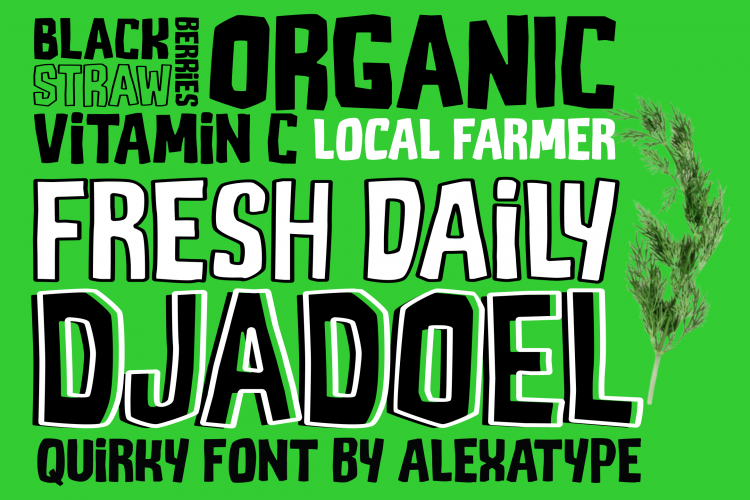
Retro typography is one of the many font trends with great benefits. It can be used as one of the essential elements for creating authentic retro designs. Like any other type of design, creating retro designs requires a great deal of attention to detail and an in-depth understanding of the design styles and historical contexts that inspired the aesthetic.
In order to create an authentic retro design, it’s essential to do research about the era that greatly inspired the design. Designers can look at design trends, music, fashion, and other types of cultural elements from a particular period to get a correct sense of the aesthetic of that time.
Yes, retro typography is a crucial component of retro designs. The question is, which type of retro font that fits the design? Should you create a design inspired by the classic game boy of the 90s, of course, you ought to look for a retro font that represents that era, preferably the game itself.
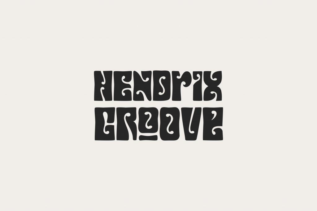
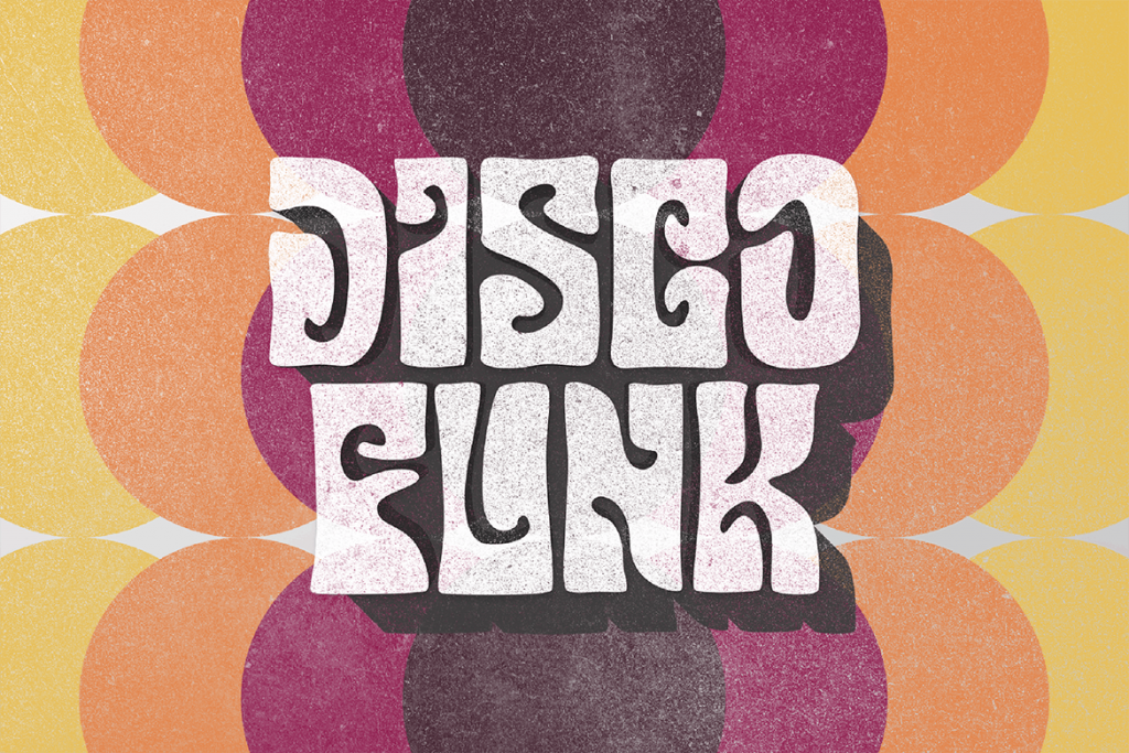
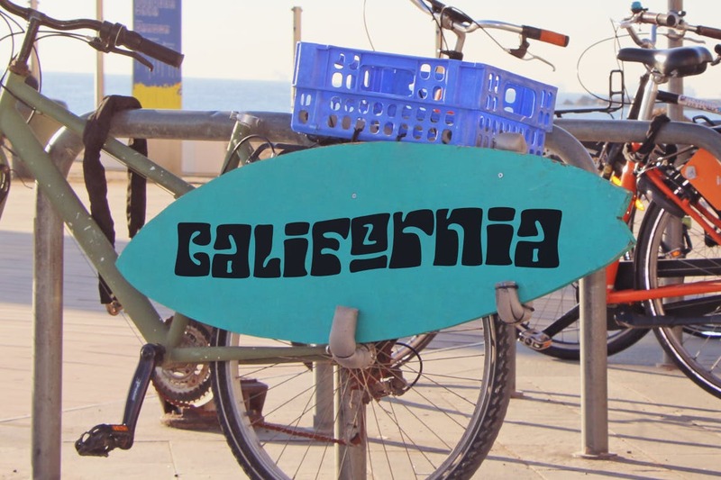
That will make the design looks authentic and rich in nostalgia. The reason for that accurate representation of a particular period is a rule of thumb in creating original retro design projects. For instance, retro fonts with psychedelic and groovy looks were popular in the 60s. In comparison, bold and geometric-styled fonts were prevalent in the 80s.
However, a retro font cannot stand on its own when used for branding purposes. There should be another type of font to complement the font. For example, branding design projects require a bold retro font. To balance it out, look for branding font trends that work well with a retro font.
However, if you use a retro font for creating a logo, you may not have to add another type of font. If you look up logo design font trends on the internet, you will see how the majority of logo font doesn’t come with complementary fonts; it stands out on their own.
Yet, retro typography can still be paired with other design elements. The aim is to create a unified and eye-catching design. Here are some ideas for combining retro fonts with complimentary design elements:
1. Color, texture, and patterns
These three design elements play an essential role in retro-inspired designs. They can complement the retro typography used in designs. Each era had its preferred textures, patterns, and color palettes.
For example, pastel shades like baby blue and mint green are popular in the 50s. Meanwhile, the popular patterns and textures include floral motifs, paisley, geometric patterns, and many more. For the color, it can be used for coloring retro typography, while patterns and textures can be used as the backgrounds.
2. Vintage illustrations
Combining retro fonts with old-styled graphics can produce a nostalgic feeling. Since the accuracy of representation is everything, consider looking for illustrations that come in the style of the font you’re using. For instance, you can pair antique vehicle illustrations with a script font of the 50s.
3. Iconography
Icons or symbols in retro style can make retro typography look more appealing. Again, you need to look for icons associated with the font’s era. For example, if you use 60s-inspired typography, you may include icons of peace signs, vintage televisions, or vinyl records.
4. Borders and frames
Want to give your project a more authentic vintage look? Consider framing the retro text with old-school borders or frames. You can choose ornate shapes, decoratives, or edges matching the font’s era.
V. Embracing Retro Fonts in Web Design
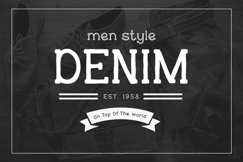
Almost all types of designs incorporate retro fonts, not to mention web design. Try searching for UI/UX font trends, and you will see how retro fonts make up the list. The reason for that is fairly close to the article’s main discussion, namely nostalgia. Exactly nostalgia plays a crucial role in web design, and this human condition can be enjoyed through the use of retro fonts.
Then, how retro fonts can be used in web design? Here are the answers.
1. Building an emotional connection
Retro fonts come with a unique charm that can resonate with the audience on a positive emotional level. When appropriately incorporated, these font trends evoke familiarity and nostalgia, giving web visitors an instant connection with the said website. Retro fonts can also enhance the user experience and leave a good lasting impression.
2. Define the visual tone
Retro fonts can help establish a website’s aesthetic tone when used in website headers and titles. Whether you use a playful old-fashioned font script or the geometric one, this typography style can assist in setting the entire web design’s aesthetic.
Of course, you cannot carelessly select complementary design elements. In order to create a user-friendly web design, every single design component must be carefully considered. Also, they all should align with the purpose and targeted audience of the website.
3. Improving branding
All brands want to stand out in a competitive digital environment. Incorporating retro typography in a web design is one of the ways to stay in the competition. Let alone if the font is consistently used across a variety of interaction points. These include logos, call-to-action icons, and, most importantly, headlines. All these will give web visitors a lasting impression.
4. Keeping readability and legibility in check
Retro fonts are one of the impactful visual design font trends. Despite the aesthetic intrigue, the fonts give off in a web design, readability, and legibility should not be overlooked. Mainly when being used as headers and titles, the readability and legibility of retro fonts should come first.
If the fonts have too increate details, web visitors may need help when reading them, especially on low-resolution or smaller sizes devices. To ensure the text is readable and legible, consider factors like font size, height, and spacing when choosing retro fonts.
5. Pairing with modern design components
The best way to allow retro fonts to stand out in a web design is by combining them with modern design components. Adding minimalistic layouts and modern color palettes will make the web appear fresh.
VI. Nostalgia and the Future of Design
It’s safe to say that nostalgia is an essential human condition that plays a significant role in shaping the future of today’s design. While design trends advance with the advancement of tech, many designers still draw inspiration from the past—all this to create exciting and joyous, emotionally impactful design projects.
Enduring Popularity of Retro Font Trends
Contemporary typography trends attest to the tangible impact of nostalgia since designers try to replicate the aesthetics of the good ol’ days while also giving them a modern touch. Retro fonts are one such trend; designers use them in their design projects to create an emotional connection with the intended audiences.
Contemporary typography can be distinguished by a fusion of the old and the new. This merger creates a balance between classic beauty and modern design. Minimalistic designs, simple lines, and geometric shapes often combine with nostalgic design elements. As a result, the fusion can cater to both audiences’ longing for the past and their admiration of today’s design.
As the future of design steadily takes shape, many emerging font design trends are embracing innovation while also paying attention to the importance of nostalgia. With the help of today’s advanced methods and tech, font designers are experimenting the aesthetics of years to come to explore the potential of font design. However, they also acknowledge the timeless appeal of retro typography and its capacity to stir up emotions and connections.
Finding a harmonious balance between nostalgia and innovation is critical to the future of design. Designers will be able to produce visually compelling and emotionally impactful designs by incorporating nostalgic components into their projects while altogether challenging the boundaries of modernity.
The Evolution and Representation of nostalgic typography
For the past several years, designers have experimented with nostalgic typography (retro fonts) to increase its appeal. They have used unorthodox typographic rules, unconventional layouts, unusual compositions, and distorted letterforms. This resulted in aesthetically captivating and intriguing designs that creatively reinterpret nostalgic typography.
The reinterpretation of the past font style has also been influenced by minimalism and simplification. All the excessive decoratives were stripped away from the nostalgic typography, leaving only clean lines with the charm of retro aesthetics.
The personalization and customization of vintage typography is another critical evolution. Thanks to tech advancements, designers can now have more freedom to develop distinctive typographic features. They create new unique fonts while drawing inspiration from vintage typography.
Finally, nostalgic typography, like retro fonts, has progressed from being only an imitation to a dynamic design element. Designers have given nostalgic typography a new life via experimentation, simplification, and customization. As a result, the reinterpretation of nostalgic typography comes with countless opportunities for designers to produce aesthetically pleasing designs that generate emotions and connection with the past and the present.
VII. Conclusion
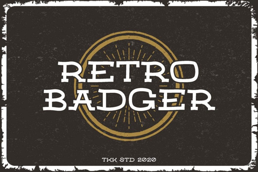
Retro font trends have unquestionably left a significant impact on today’s design community. These font trends have the ability to stir feelings, build connections, and provide aesthetically appealing designs because they take inspiration from past eras.
Additionally, these font trends have proven their versatility by blending in naturally with modern design components, providing a pleasing combination of the past and present. Designers are encouraged to embrace these font trends by exploring and experimenting with them for their design endeavors.
Retro font trends provide all creative projects with a personality, character, and distinctive visual identity. Retro fonts will undoubtedly continue to influence and inspire today and future design as long as designers continue to appreciate their timeless appeal. This serves as a compelling reminder that the nostalgic past can be a rich source of ideas for developing fresh and appealing designs.
