Visual merchandising is not only about displaying a product. It also combines science and floor plan designing to improve sales and revenue. How you display your merchandise and where you display them are some important parts of improving sales.
In this article, we are going to discuss what visual merchandising is and why it is important for sales and revenue growth.
What is Visual Merchandising?

Visual merchandising is a form of marketing practice of presenting your products or services to highlight their features and advantages better. Sometimes, it can be in the form of 3D product displays or how you organize and showcase the products in the retail space.
In a big corporation, merchandisers often work with retail marketing teams to create product displays that align with the brand’s image. However, independent retailer usually can apply their creativity more to how they want the display to look.
The Purpose of Visual Merchandising
Building interesting and attractive visual merchandising is important as it helps to attract customers and allow them to engage with the products. This will encourage them to try the products and eventually purchase them.
It also helps the products get highlighted in the store, making it easier for customers to find them. That is why developing good visual merchandising sometimes is not so simple.
Tips to Develop Visual Merchandising

Now that you know what visual merchandising is, the next step is to learn about the actionable tips you can implement immediately. Here are your five needed tips:
Use signage
Signage is helpful in directing the customer to the right place to find your products. This helps them find the right products quickly and saves them a lot of time. One of the best ways to do this is by creating an area specifically defined or themed. This way, your customer will know immediately where they should go.
If you go to a department store, you will see how this principle is implemented seamlessly. They sectioned the space into different categories where everything was clearly marked. For example, the clothing section, hardware section, appliances section, sports section, and so on.
The clearly marked and themed section helps create order among the many products displayed in the aisle. You can achieve this by taking into account the layout of the store. When you understand the layout, it will be easy to arrange the elements of your visual merchandising across the area. You can start by creating a 2D or 3D plan to better visualize the concept.
Implement enough lighting
Another important step to make sure your products are attractive enough on display is by implementing enough lighting. Not only it helps you illuminate the products and displays, but it also illuminates the area in general, which makes it more eye-catching.
The use of lighting in creating visual merchandising is similar to signage. The only difference is just that lighting doesn’t use typography. Dynamic and colorful lighting is attractive, and according to studies, it can boost sales.
Additionally, customers tend to approach an area with warm lighting. So, make sure that your displays implement enough warm lighting. However, you also need to consider how much lighting you can use. Too much lighting can be uncomfortable for the eyes and make you dizzy.
Make sure it has focal points
Despite the purpose of building visual merchandise being to attract attention, it doesn’t mean that you can just add all kinds of attractive elements to it. You need to decide on a primary focal point for the display where the attention of the customer settles upon looking at it.
By implementing a focal point, your display will still look attractive while at the same time still looking minimalistic and elegant, and less cluttered. Cluttering can be bad, and in terms of visual merchandising, it can distract the attention of your customers.
Focal points can be a display of how the products look when used. For example, for furniture products, you can create a living room ensemble in the middle of the area to showcase how your furniture products look good when put together.
Another example is displaying the latest clothing product on a mannequin in the middle of the clothing area. This will give your customers a glimpse of how good your products look and will become their main attraction point.
Pay attention to the store’s hotspots
Every store has its own hotspots where customers direct their attention the most. You need to pay attention to this and use it to your advantage. These areas are great for displaying your visual merchandising as they can greatly improve sales.
Some hotspots usually include near the dressing rooms, store display windows, and aisle ends. Place your products around these areas and carefully display them to attract your customers’ attention.
For example, displaying your latest clothing products near the dressing rooms, displaying and stacking your products at the end of the aisle, and so on.
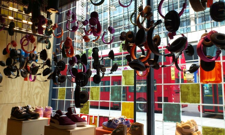
Pay attention to your window display
The window display is the first thing that will catch the attention of the passers-by. Therefore, you need to create something that makes a good first impression on them, so they are interested in walking into your store and eventually making the purchase.
Although window display has a limited place, it still can improve your sales if you manage it carefully. You can put important information or display products that are best sellers, on sale, or new products.
The window display is a stage, so make sure that what you put up there is attractive and interesting.
These are some tips you can implement when building your visual merchandising. It is important not only to understand the products but also to understand how customers move around the store. Understanding these will help you present the right brand images and eventually boost sales.
