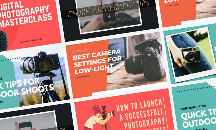
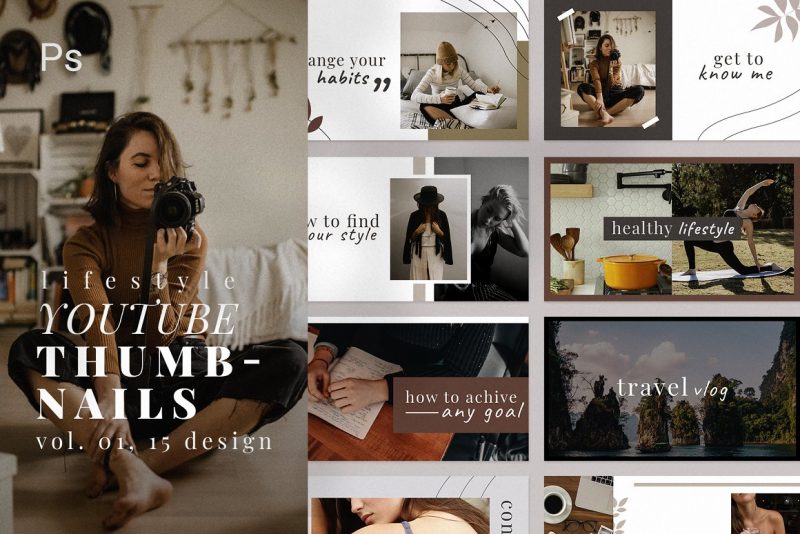
Have you ever wondered why your YouTube view count is not up to your expectations? You have put your time and resources into formulating perfect content, yet people seem uninterested even to click your videos. You began questioning whether your contents are good enough, yet the response from your viewers indicates that the quality of your videos is not the problem. A quick comparison with other similar content informs you of something they have that you do not: better-designed YouTube thumbnail.
By definition, a thumbnail refers to a still image that acts as a “cover” for digital content, especially video. Like a cover, it is supposed to give a brief representation of the content with just a quick view.
The Importance of Thumbnails
There is an old saying, “don’t judge a book by its cover”, which roughly means we cannot judge something just by its initial appearance alone. While this is true in the context of social interactions, the same cannot be said in content interactions. How could you expect people to get curious about your content if the cover is not interesting enough?
In the era of free, on-demand information, consumers are free to choose the content they want to consume. In the context of YouTube videos, title and thumbnail alone might be the deciding factor between viewing or scrolling over your video. As such, creating a click-worthy YouTube thumbnail is as important as making the content itself.
Think of the thumbnail as a billboard sign. It functions as a marketing tool for your video, so you have to make sure what you present in the thumbnails represents your content and is relatable to potential viewers. If you can achieve that, your thumbnail will serve its intended purpose of turning scrollers into viewers.
Elements of a Thumbnail
Like with all other things in life, several elements make up a YouTube thumbnail. These are the keys to gaining higher views, and therefore should be carefully planned. Keep in mind that you can utilize more than these key elements:
- Ideal size. First thing first, you want your thumbnail image to look sharp enough even after compression. The ideal size for YouTube thumbnails is 1280×720 pixels, better known as a standard HD image. Google’s recommendation is to try to use a 16:9 aspect ratio with a minimum width of 640 pixels, and should be no more than 2MB.
- Focal point. Your thumbnail should contain an object (or person) that became the focal point of that particular video. For example, if you are reviewing a new game, you should add a visual aspect of that game. It can be a screenshot of your gameplay, the main character, or the game’s title card.
- Text. Textual elements are usually used to define the context of your video. They could be the title, sub-title, or the tagline of the video. It should be simple and short; leave the longer explanation in the video description.
Designing a Well-Designed Thumbnail

After familiarizing yourself with the key elements of a YouTube thumbnail, the next step is to actually create one. There are tons of online thumbnail generators out on the internet, both free and paid. But, if you want it to be more personalized, you can always make one yourself or hire a pro. Nevertheless, whether self-made or commissioned, there are things to consider in designing a proper thumbnail:
- Authenticity. No one likes clickbait, especially if it does not represent the content whatsoever or, even worse, a straight-up fake. A clear connection between the cover and the content is crucial in gaining fresh views and subscribers.
- Consistency. It is okay to experiment with new things, but having your formula helps a lot. It eases viewers to identify which one is your content just from the thumbnails Sticking to one tried-and-true formula also enables you to save some time on the concept of your thumbnails.
- Humans are always drawn to other humans. It is how our survival as a civilization work. Putting a human’s face—whether you, your crew or your guest—will make your audiences feel more attached to your video. Just make sure the facial expression matches the tone of the content.
- If you want to broaden your viewer demographics, ensuring that your contents feature a member of said demographic is an absolute must. By presenting people from different backgrounds, you give the impression that your contents are inclusive and open to anyone as long as they are relevant to the topic.
- You want audiences to be hooked to your thumbnail so much they are willing to spend their time watching your video. Learn their behavior. What kind of content is preferred by your target audience? How can you fill the niche?
If your video is a room, then the door to that room is the thumbnail you provide. If you fine-tune the above elements to fit your content, your YouTube thumbnails will help your video gain more views.


