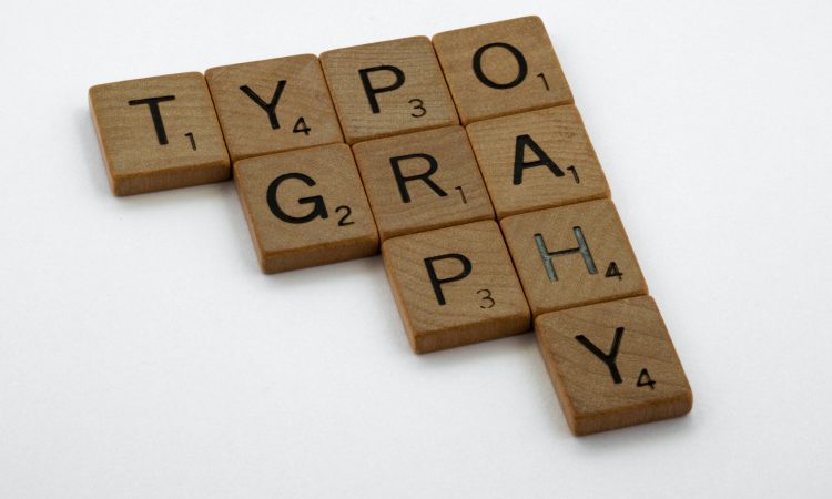
Just like fashion and technology, the trend of typography is also changing, shifting, and evolving. While in the last couple of years, fonts with reliable shapes, contrast sturdy and geometric styles have grown fans, 2023 offers a new trend.
As the world passed the pandemic and online activity rockets, designers are focusing on a more creative and innovative approach to the visual conception of digital design. Therefore, 2023 will be filled with innovation, futurism, creativity, and boldness.
This year typography will also exhibit authenticity, character, highlighting humanism, and lessened design. Ready to dig deeper? Below are emerging typography trends and predictions set to reform the creative future of typography.
Variable Fonts

Variable fonts, also often referred to as OpenType Font Variations, are considered a new font style introduced in 2016. Variable fonts offer more flexibility and customization for designers to adjust and modify the weight, style, optical size, width, and slant of the font in real time.
So, instead of playing with multiple static fonts, Variable fonts allow the designer to be more creative or strict with the contextual rules. Variable fonts present some main advantages:
- Variable fonts have one font that can manage all axes. With this, copying each style separately is not necessary.
- Variable fonts allow designers to design more creatively, thanks to the availability of many font choices.
- Variable fonts accommodate a custom font style for branding or stand-out logo.
- Variable fonts support animation effects and CSS transitions.
- Variable fonts boost the readability, flexibility, accessibility, performance, and feedback of a website.
- Using variable fonts, developers are able to totally employ the potential of RWD (responsive web design) by improving or animating the font.
Customized Typography

Although new types of fonts are still popping out, customized typography will still gain popularity as each brand or business wishes to stand out uniquely, distinctly, and recognizably. Customized typography has been used quite many as it can reflect the brand’s values and personality.
Designers may create a tiny accustoming to some basic fonts, like Tahoma, Arial, Times New Roman, Verdana, etc. However, if you want to use customized typography for your brand, you need to consider hiring a typography expert with skills in designing your own typeface.
There are several reasons why you should think about using customized typography:
- Your text will be a highlight. Creating different fonts will make your text stand out and be unique.
- Your brand identity will be recognized and identified easily. One great example of customized typography is the logo of Pinterest. The logo is prominent for its stand-out ‘P’.
- Whether you’re going to use it in printed or digital media, people will instantly recognize you.
- No boundaries on what you want to do. You can experiment and create something really unique, different, and creative about your text.
Hand-drawn and Organic Typography
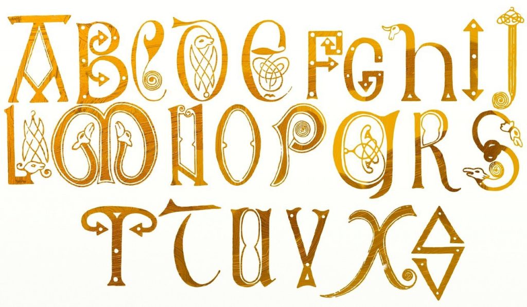
The trends of the future of typography also evolve around hand-drawn and organic typography. This font will be so much loved as more and more people are longing for typefaces that feel more human and natural.
Hand-drawn and organic typography itself is the art of drawing letters—no limitations on the design. You can employ organic shapes, imperfect strokes or lines, as well as different sizes. The most important thing is that hand-drawn and organic typography offers personality.
So why do you have to consider using hand-drawn and organic typography? Here’s why:
- It appears warmer and friendlier. Although many logos and brands exploit digital feel, you can add the humanity feel by choosing this font.
- Even though this style may feature imperfection aspect, it presents craftsmanship and quality at the same time.
- Hand-drawn and organic typography is undeniably 100 percent unique and ownable. A computer is not able to digitally replicate unprompted and delicate imperfections created by the human hand.
3D Typography
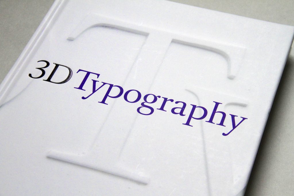
3D typography must be listed in the future of typography with the rocketing popularity of augmented and virtual reality. What makes 3D typography so special is it can add depth, dimension, and realistic effect to design, making it more alluring.
There are some main characteristics of this three-dimensional font. Some characteristics are titling, use of shadow, use of sharp text, adding textures, lighting changes, long solid shadow, and clear layering between text and background.
3D typography offers some benefits for your business and brands. What are they?
- 3D typography makes your brand or logo more visible and stands out even from various angles. Using this style, your customers will be impressed with what they see.
- 3D typography offers light and natural shadow. This will work great, for example, if you own a restaurant and your business operates at night. The light from this 3D font will improve visibility and strike.
Minimalism
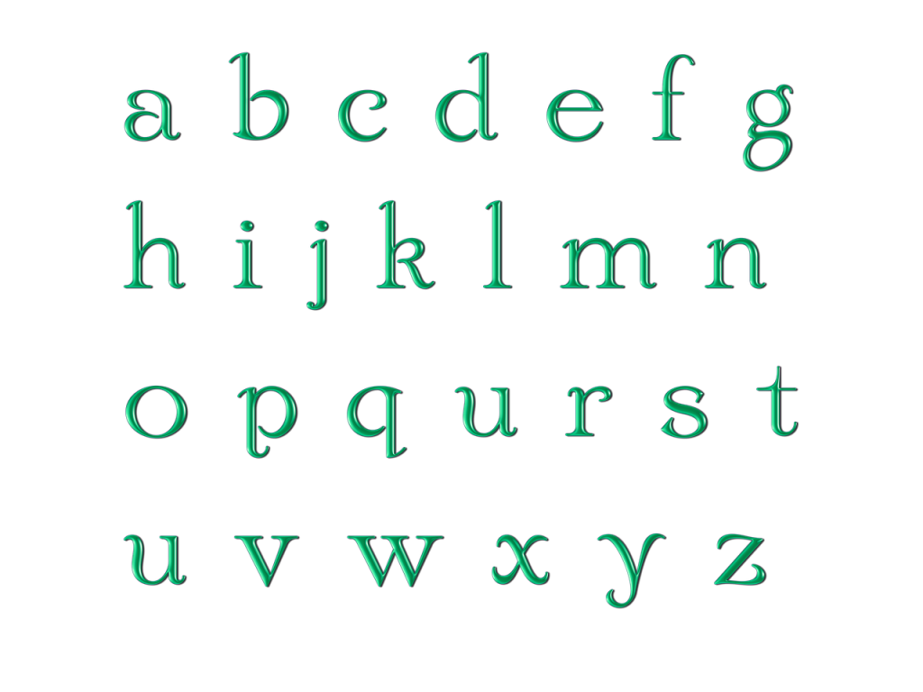
Minimalist fonts have been used for a while, and they will continue to be the ace in the world of typography. Minimalism never fails to create a simple yet readable and powerful style for any text.
Although available in many shapes and forms, minimalist font offers an aesthetic, gorgeous, modern, and versatile look. It focuses on geometric shapes, straightforward, clean lines, and no decorative aspect. After all, keeping it simple is the best.
There are some main characteristics of minimalist fonts:
- There is the use of white or blank space which will intensify your text and layout.
- Focus on clarity and readability and broaden letters for a comprehensible and brief message.
- Increase kerning and add space between letters to produce a spacious view.
- Clear out any needless design elements.
To help you find the perfect minimalist fonts, here are the recommendations for you:
- Geonica, is a futuristic and abstract geometric Sans Serif that emphasizes clean curves and line strokes.
- Minimaly, is a classic, and composed font that suits perfectly your minimalist need.
- Larosa, has wide letterings with a whimsical and aesthetic vibe.
- Vista Nordic, fonts with wide kerning, highlight the simplicity and stylish look.
- Univa Nova, is a simple and well-rounded typeface that features delicate clarity and closed apertures.
- Pacardo, bold and powerful fonts with clean geometric style and open spacing.
- Esthete, a font style that looks so modern, elegant, and unique. It has a tall height and narrow strokes.
Serif Sans
Serif Sans have dominated the world of typography for a while and will still be listed as the future of typography. With its versatile look, Serif Sans never fails to add elegance and sophistication to any design and make them stand out.
What makes Serif Sans so popular? Many designers love using this font because of its legibility and clarity for branding, advertising, and other display use. Some of the most popular Serif Sans are Helvetica, Gilroy, Avenir Next, ITC Franklin Gothic LT, Heading Now, Larken, and Sofia Pro.
There are actually lots of top-notch brands using Serif Sans. For example, Microsoft, NBC News, Spotify, BuzzFeed, Red Bull, Nike, PayPal, Gillette, WordPress, Ikea, and many more. Many brands love to use Serif Sans, especially for digital publications, due to its lack of decorative addition.
Conclusion
The future of typography will continue to evolve as the art and technique of designing type to make the text more legible, readable, and appealing. Adapting to technology and culture, the world of typography is continually growing for innovation.