Amid the abundance of information sources on the world wide web, magazines still have a special place inside the heart of loyal readers out there. Some people might prefer browsing through the internet, but nothing beats the feeling of satisfaction when you are flipping the glossy pages of a magazine. It will be even better when you find the issues of your interest or look at a great magazine layout design which makes it harder to put down.
You got that right! Regardless of the main issues—fashion, food, fitness, you name it, a magazine will stand out more when designed in an incredible layout. In fact, a proper placement from the front cover to the back is proven to be a good investment for successful publication.
If you are in the designing business and needs to produce a striking magazine layout, you come to the right place. As you scroll from this point to the end, you will find practical tips and tricks to work with magazine layout design at basically any point, from cover to content, from fonts to figures. Have a look at them and get ready to breathe in ideas you are about to find out!
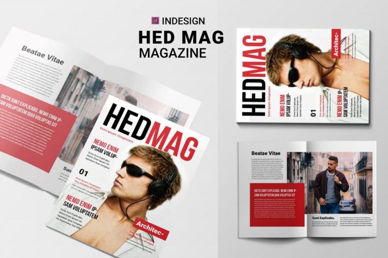
1. Start Confidently with the Design Cover
What’s the first thing that readers see in a magazine? It’s the cover, of course! The main reason why it is presented in the front is to grab your readers’ attention. Therefore, the best way to get started when designing a magazine layout is by managing the cover.
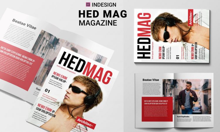
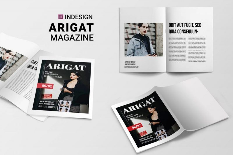
The cover should attract a lot of attention, but assembling colorful features and a full-packed layout on one single page of the front cover is something you must avoid at all cost. You need a balanced proportion consisting of strong headlines, suitable subheadings, simple graphics, and stylish photography items representing the magazine’s main issue.
A better thing to do is stick to the simple rules of ABC: A for heading or the title of the magazine, B for subheading or the focus issue for a certain edition, and C for a collection of other interesting stuff you offer inside. Just focus on those three elements and combine them with compelling photos and typography.
2. Play Convincingly with Pops of Colors
A good magazine layout design is not one filled with colors. Besides, combining many color spectrums in one layout can be difficult if you don’t have a strong background. You need to find the balance for every shade while placing them alongside the content or photograph.
If you are not sure about the choice of colors, one of the most convenient tricks is restricting the variation. Start with a simple yet more effective touch by adding some pops of colors here and there. Bolder and brighter colors—regardless of the shades you choose—will complement monochrome backgrounds or black-and-white texts.
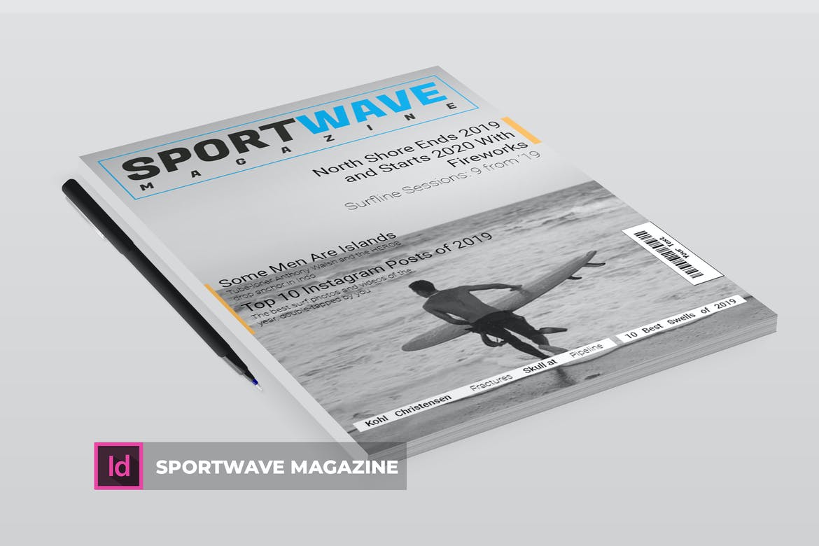
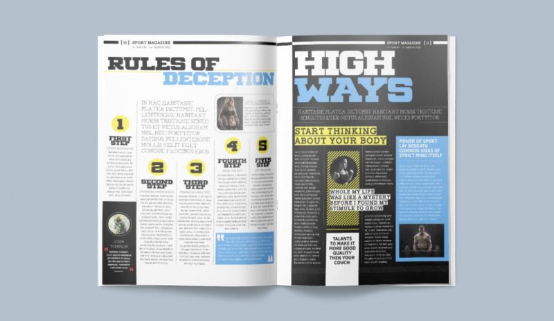
Take a sports magazine as an example. Focusing on fitness issues, this type of magazine often features old-fashioned photographs in black and white. It aims to achieve a sense of stylishness and simplicity at first, but its monochromatic theme is dangerously close to boredom in a broader perception.
This is when a pop of colors come in handy. Simply present yellow or orange shades on the headline, and you can create an impression of optimistic content. Alternatively, you can give a cooler shade by popping some subheadings in sky blue or additional golden background behind the photographs.
3. Concentrate on the Contents Page
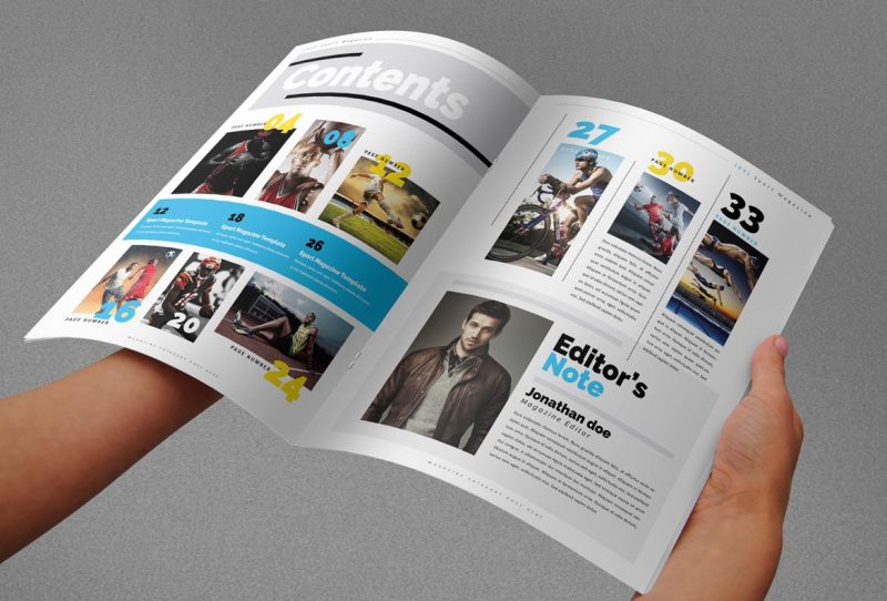
Right after the cover, the next important thing in the magazine layout design is the contents page. After all, this page provides the highlights of issues that will be presented in later sections. For this reason, the contents page should not only beam with functionality but also needs to offer interesting styles and convenient layouts.
The first thing to take into account is the number of pages you need. If your magazine is filled with lots of content, you need more than a page to highlight all the articles and sections. Taking double pages is not necessarily excessive. By doing so, you will have plenty of room to improvise your creativity in layout design and feature some inviting texts and images.
As soon as you stick to a particular number of pages (single or double), it’s time to consider the structure. A high-quality magazine always comes with a well-organized contents page, whether it features the traditional table of contents, the stylish grid layouts with pictures, the structured column coverage, or the right combination of all three.
4. Involve Illustrated Graphics
Not only on the cover, but the illustrated graphics also play an important role in improving the overall look of magazine layout design on the inside. It serves as a great alternative to popular photographs or general images mostly used in common publications. With illustrated graphics, the design of your magazine will look more unique and stylish at the same time.
Focusing heavily on design, illustrated graphics in vector images are considered a fantastic cover choice for arts or tech magazines. They can also be used to complement the layout of promotional magazines for retailers, airlines, or companies. Both unique and lovely, the abstract nuances offered by these graphics will be easier to spot among other magazines that feature photographs on their covers.
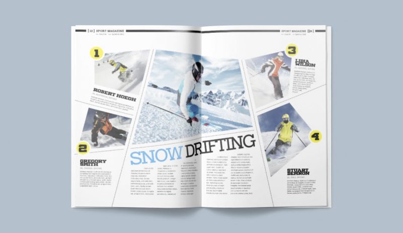
5. Provide Infographics to Enhance a Digital Look
Inspired by websites and eBooks, infographics are currently a trending feature for modern magazines. They make the magazine layout look more exciting while at the same time, give the page a digital impression. Some popular mags, such as Esquire and National Geographic, often use infographics to replace traditional layouts relying heavily on texts. As a result, the information presented on the page appears more engaging and interactive for readers.
An easy way to start including infographics on your layout is by dividing the article into several points. Give corresponding images for each point, and you will get some pieces of information ready to set up on pages. Besides pictures or illustrations, other features—such as shapes, borders, arrows, maps, or pie charts—can be used to create infographics on your magazine layout. They will come in handy when you are dealing with text-heavy articles.
6. Add Pull Quotes Here and There
In the context of magazine layout design, pull quotes for articles are like the cover for the entire magazine; both of them give readers a glimpse of what will come next and what they should expect. As for the article pages, the addition of pull quotes can prevent the whole text from appearing monotonously. Pull quotes that are properly adjusted also have a big portion to grab the readers’ attention.
Along with the title of the articles, pull quotes are responsible for piquing the readers’ interest the second they lay eyes on them. Therefore, this feature should be presented with larger fonts or even different colors than the rest of the text on the article body. Choose some engaging statements, inspirational lines, or interesting citations for your pull quotes. Next, all you have to do is putting some effort to make them stand out on the page.
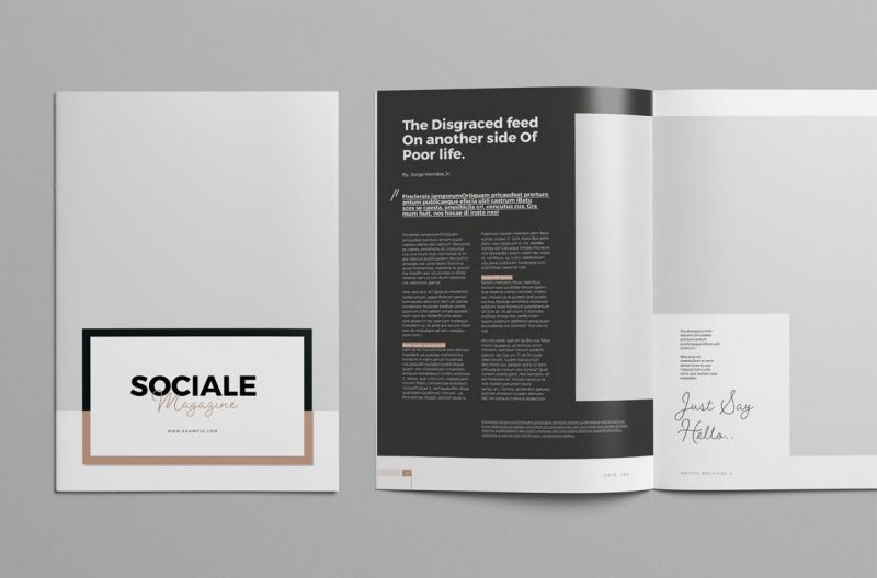
7. Go Minimal is not a Mistake
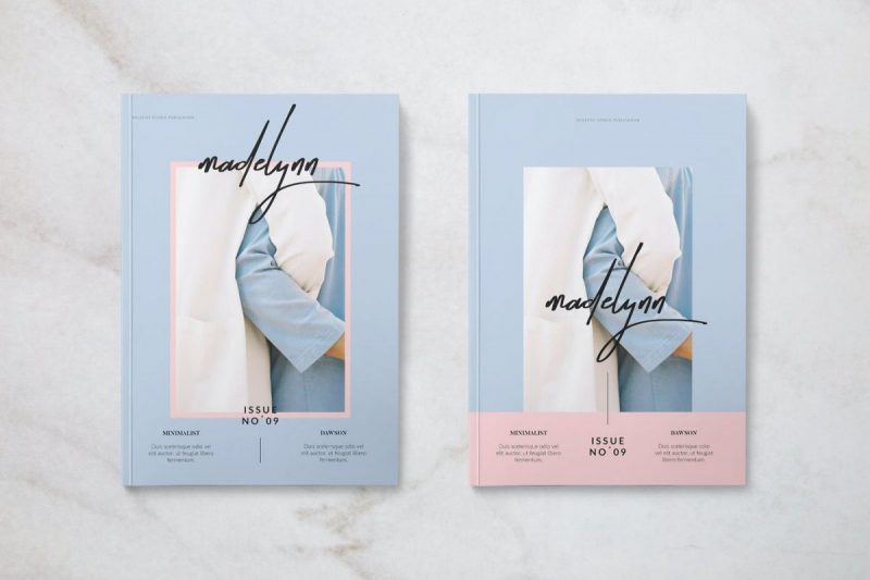
Keep in mind that going minimal is the right choice to get the optimal result in some cases of magazine layout design. This concept usually applies to fashion or lifestyle magazines that require the layout to be on-trend and aspirational. Besides, minimalist layouts serve as an effective blank canvas to put fashion images, outfit photographs, or stylish shots of the models.
For the minimal layout of a fashion magazine, the focus is mainly on photos. You can put them against a backdrop with neutral colors of soft pastel shades to emphasize their prominent look. Moreover, to make a stylish impression, you can feature typography in black and bold letters.
The automotive magazine often uses another minimalist layout focusing on images. While avoiding relying heavily on texts, this type of magazine lays out some larger pictures with similar style or color themes. They will look appealing for the readers and serve as a fun variation to text-heavy articles.
8. Tone Up the Typography
Typography is one of the most important elements in magazine layout design. Therefore, you must put effort into it to create a stronger and firmer layout. This essential feature is also closely linked to your magazine’s mood and identity, so whether you want to offer a cool or grand impression, you have to choose the right style that can represent it.
Despite its powerful effects, choosing the right typography for your magazine is not as hard as you think. A great way to go is taking the mag’s genre into account to decide which type of fonts or letters will match it perfectly. For instance, if you are working with fashion magazines, then you need simple yet elegant fonts. Meanwhile, for titles under techs and sports, bold and solid typography is more preferable.
Unlike color combination and image arrangement, the choice of typography will be used without change for every issue of your magazine. That being said, choosing the right one should be based on careful consideration.
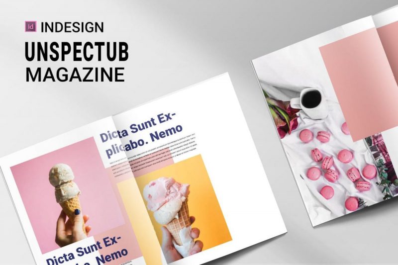
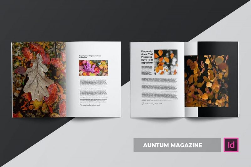
9. Feature Interesting Photos as the Main Focus
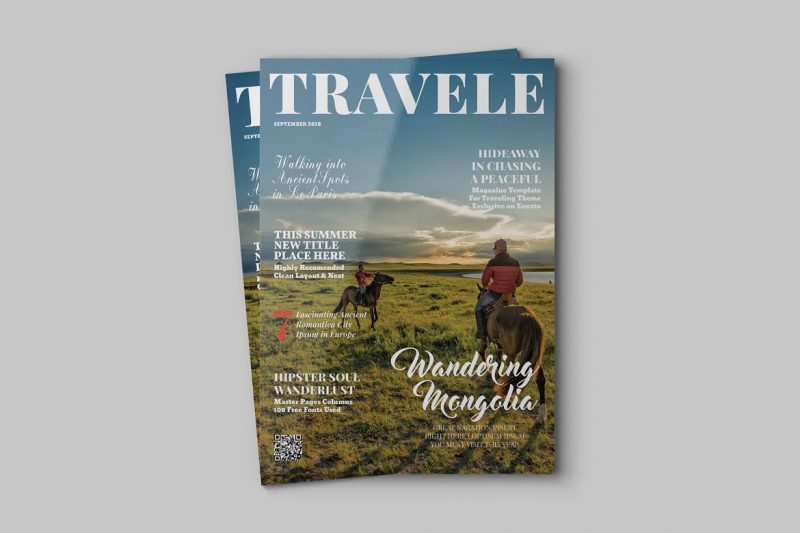
The layout of the magazine is not all about texts and contents. In fact, interesting photography is what most readers are looking for when buying a magazine. This case is more relatable for magazines about fashion, nature, or travel.
Pick one beautiful photo for starters, then put the rest of the magazine layout design around it. With photos as the main focus, the page will look fantastic at a glance and make your readers interested to dig deeper. Alternatively, you can scatter some striking photos with similar themes while assigning each of them with eye-catching captions.
When featuring photos as the main focus in your layout, you don’t have to stick to the traditional square or rectangular frame. Instead, try to loosen up by shaping the photos in a circle, adding some interesting borders, or taking out the background to blend with the page.
10. Stick to a Constant Style and Theme
Magazines with constant elements are highly regarded as a well-organized publication since it adds some points of professionalism. Therefore, consistency is needed in magazine layout design. It allows your entire content to go hand in hand from the front to the back cover.
Thematic features should be your main focus here. Take note of some design elements on the cover and pop them up on the inside contents. That way, the readers will be indulged in a consistent presentation, making your magazine is easy to remember.
Applying constant style and theme can also be done by choosing particular tones, color schemes, shapes, or typography. You don’t need to do the same for all; what you have to do is keep the consistency of the main elements. Color schemes, for instance, should be constantly used for the entire edition. If you choose a soft theme, then pastel colors should be present on every page of the magazine.
11. Spread the Layout
When designing a magazine layout, keep in mind that most readers will read it in spread instead of folding it into an individual page. For this reason, the layout should be designed accordingly. You have to think in spreads—in this case, two-page spreads—and not just focus on designing the layout for a single page. That way, the entire spread will look aesthetically pleasing.
Creating layout in spreads will be easier when you use the Facing Pages format on Adobe InDesign. The app will automatically present the working layout in the spreads format, giving you the readers’ point of view. From that point, you can work more effectively when designing the contents for a two-page layout.
At this point, you’ve got the idea of a good magazine layout design. More importantly, you will know what to do next when it comes to designing a magazine. With those practical tips in mind, creating a stunning layout for your magazine will surely be a lot easier. Once it’s done, you are ready to publish the mags and make them stand out among other sources of information.