Every year, the demand for new fonts from designers and illustrators doesn’t seem to diminish, even for just a bit. Not only as a process of testing one’s creativity, a designer sometimes needs to design new fonts to fulfill their graphic design projects and many more. Because of that, at times, graphic designers pay attention to available typography design tips to know where to start when they design new fonts.
By designing new fonts, seasoned illustrators can regularly improve their work resume and artistic worth. As for new illustrators and newcomers in general, making new fonts can be a starting point for them to add some new skills and work history to their work profile.
The Typography Design Tips
Since a work portfolio is everything for designers and illustrators, they should do everything to enrich it and certainly follow typography design tips to make some decent fonts.
So, what are some typography design tips that designers (and pretty much everyone) can follow and do to make some fine-looking new fonts? Here are the tips!
Make a Design Brief Firsthand

All font-making processes need to start somewhere. To kick off this typography design tips list, the first thing that everyone can do is to make a design brief for the new font. To make an actually good font, you should determine a clear vision of what your new font will look like.
Like any other activity, having an opening phase will help you engross yourself in those particular activities. In this particular phase, you can do anything, like making random scribbles or text to define your future project.
You can actually step into the subsequent phases of making a new font, but having a design brief can help you in having some basis for your new project.
Be Mindful of the Kerning Process
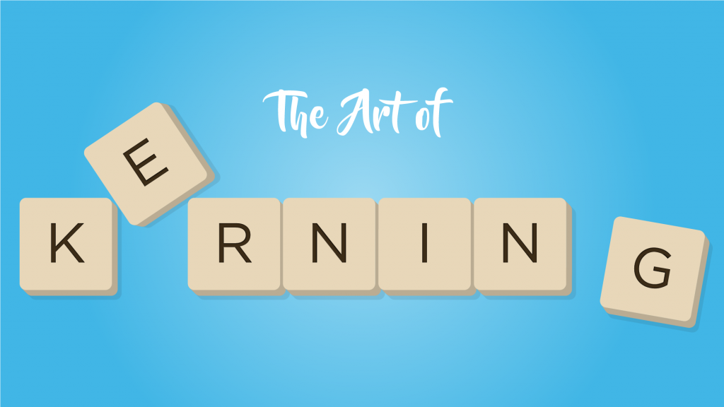
If you’re not familiar with the term “kerning”, it basically means the adjustment of the space that exists between two letters. In this regard, the space between two letters can make or break a design simply from the size of the space itself.
While the kerning process isn’t really mandatory, especially if your font is already neat from the get-go, there’s no harm in following this example of typography design tips if you want to double-check your typography design.
Though the space between letters isn’t immediately visible to everyone, having a properly aligned space between letters can make the audience unconsciously feel that the typography design is a well-made project.
Learn from Other Brands

One of the most followed typography design tips out there is actually learning from other brands. Big brands have managed to get to this point of success thanks to their elaborate marketing strategies, right? And from that success, gaining inspiration from their mainstay fonts can be useful.
Take a look at their success. Is it because of their memorable logo font? Catchy ads? Mesmerizing social media posts? Ass-kicking typography? Anything and everything they do, you should learn something from them.
However, don’t plagiarize their copyrighted fonts under any circumstances, as it’s no longer gaining inspiration, and it’s plagiarism instead!
Determine Your Audience
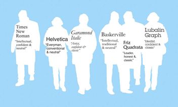
This is actually one of the most apparent tips out there, but unfortunately, people can get focused on their working process so much they forget who their audiences are. To make sure that doesn’t happen in the future, determine your audience first before making the new font.
Take students, for example. You can’t generalize students as a singular demographic group when, in fact, that there are elementary school students, middle schoolers, and high schoolers in this regard.
As a result, you need to differentiate each demography in order actually to have fonts that feel relatable to your target audience.
Learn a Bit About Font Families
Currently, there are more than 200,000 fonts out there that there are in active use. To save yourself from a lot of trouble in researching all of them randomly, be sure to learn a thing or two about font families.
Generally speaking, the major font families are sans, serif, cursive, fantasy, script, and monospace. While there are other font families out there that would be too much to be listed, starting from these font families is a great start as they have their own subfamilies as well.
By understanding the characteristics of each font family, you’ll have an easier time categorizing your new typography and learning the properties of each family that you can use on your new font.
Define the Font’s Mood
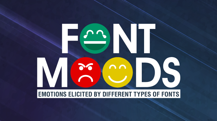
Whenever we see texts made with Comic Sans font, we feel that the text is made to make the text sound playful and comedic. It’s the same thing with Times New Roman, which invokes a mood of formality in any font text.
That’s what mood is within a font. By having the “right” kind of emotion within it, a font is guaranteed to be able to impress its audience entirely.
Familiarize Yourself with Design Software
One of the most persistently helpful typography design tips is the decision to familiarize oneself with numerous design software. While you can have someone else convert the hand-drawn font sketch into its digitized form, you’ll learn something new as well if you familiarize yourself with the proper software.
Understanding how to use the software can also help you in getting to know how the whole process works. For that reason, there is no harm for you to learn a thing or two about how many design software work to make your work easier.
Design the Headlines Beautifully
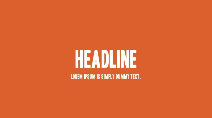
There is a reason why people can be somewhat obsessed with outward appearance. No matter how appetizing a particular dish is or how good a novel is, if its appearance is simply not interesting enough, people won’t be interested in them at all.
In this way, designing a beautiful headline is essential for graphic designers. By having a palatable and beautifully-designed headline, fonts used for that headline can make the headline look truly mesmerizing.
To do so, ensure that each letter’s kerning and spacing are properly set. This way, the audience will get hooked on your project’s headline in no time.
Scale Down the Font if Needed
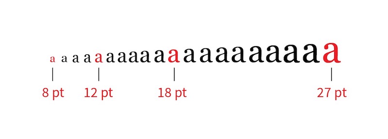
Large and legible letters are some things that the designers want to make their design look more appealing and visible to the audience. However, scaling down the font at times is a particularly useful example of typography design tips that everyone should do.
By making the font have different standardized scales, the font can be used for different purposes and ensure legibility, especially in different graphic design projects.
While following this particular example of typography design tips is not mandatory, make sure to be aware of moments in which you need to scale down the font to make your work look more appealing.
Design Additional Special Characters
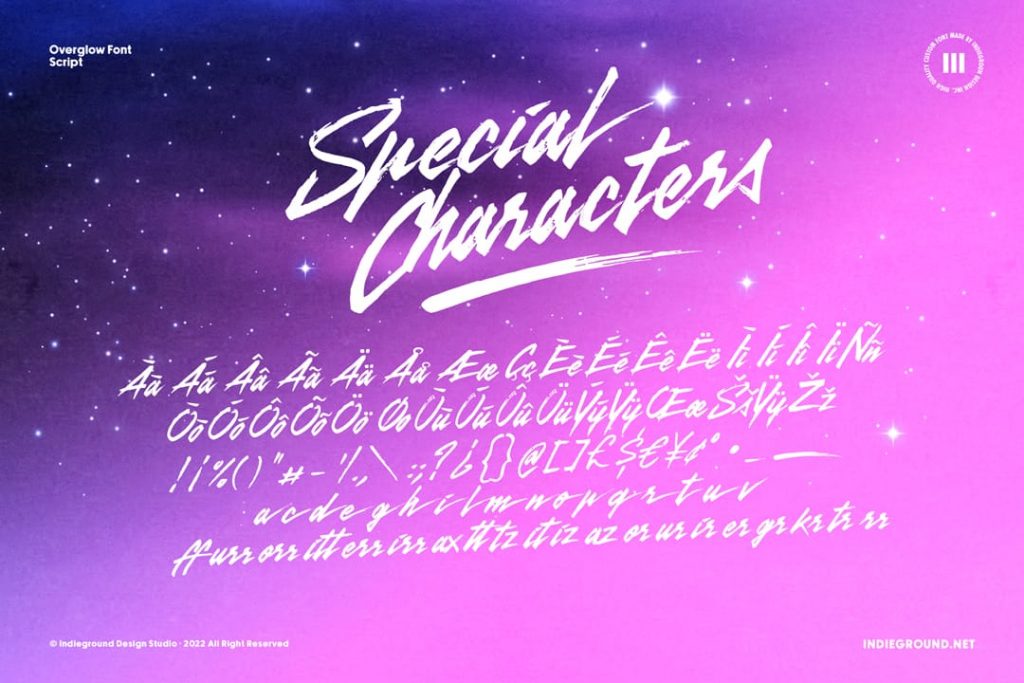
If you look closely, a font type is not only equipped with letter characters but special characters as well. Usually, these special characters are inserted as well to convey specific contents that cannot be described with textual letters.
Special characters like hearts, circles, stars, and many more are commonly inserted into different font types to make sure that they fit the aesthetic nature of their parent fonts.
Make Different Weights, Widths, and Styles
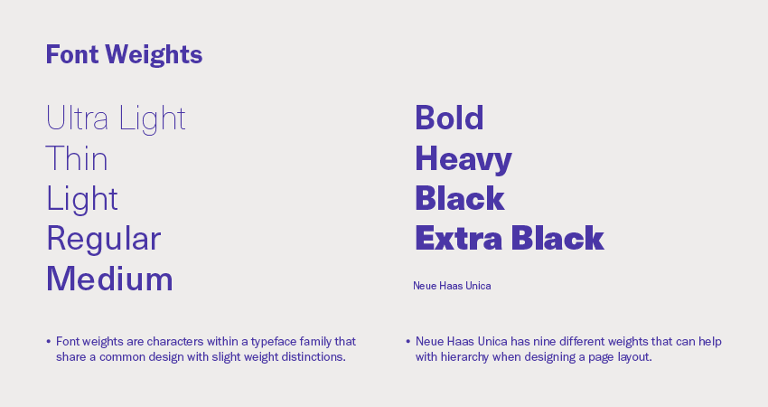
While this example of typography design tips seems somewhat similar to scaling down the font, it’s not actually about scaling down. In fact, this tip mainly discusses having different weights, widths, and styles in a font.
Why does a font need different weights and widths? Because a font is designed to be able to convey messages for different purposes, a single font can have different styles within itself to make it more useful for everyone.
It might look hard because of more work. Still, designers who follow this example of typography design tips often realize that having different styles have made other people realize the worth and usability of that font.
Check Out the Spacing and Alignment
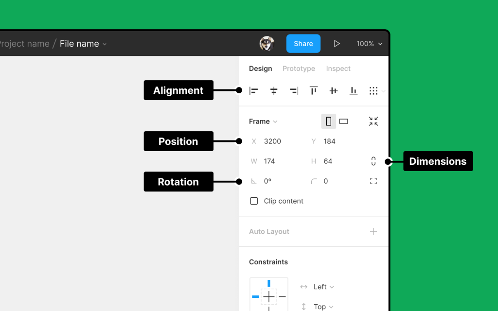
Proper spacing and alignment can make a font look so pleasant to look at when it’s used to make a sentence. On the other hand, improper spacing of a font can make the audience feel confused and unimpressed when they see a typography work.
As such, this example of typography design tips suggests you check the spacing and alignment of the font before moving on with the work project.
The flow of the design can be enhanced or shattered entirely by the font’s spacing and alignment, so be sure to check them out properly.
Use the White Space
An empty white space isn’t always a bad thing. In fact, if you know how to set up the visual effects of your work by using white space, your typography work in the project can look so dashing.
If analyzed closely, there is a reason why this example of typography design tips shouldn’t be missed out. When appropriately used, the white space can increase the design’s clarity, readability, and the audience’s attention to the design.
Pair the Suitable Ones
The contrast between two different fonts can enhance both fonts’ readability and artistic worth, and this is a tested instance of typography design tips.
Much like how the colors black and white can complement each other despite having entirely different appearances, this logic can also be applied to fonts. Lora and Montserrat fonts, for example, can enhance each other simply despite both coming from either sans or serif font families.
Conclusion
Designing typography can be pretty challenging, and we won’t deny that. However, by following the typography design tips above, we dearly hope that your work in the future will be greatly helped by using these tips. Hard work is necessary, but working smartly is equally essential as well. Have a good day!
