Typographic advertisement is a crucial tool to represent and increase the legibility of your brand. Choosing the right typography can convey the message you like to share to grab more attention from the customer to purchase your products.
Why Typographic Advertisement Matters

Typography plays a significant role in your branding. The font and typefaces that you choose will convey the values and tone of your brand. It also helps increase your brand recognition because they take a significant role in your brand’s visual identity. So, make sure your advertisement is readable by taking a closer look at your visual aspect and the words you choose to deliver the messages. Usually, people will take a quick look at the advertisement, but if your ads use attention-grabbing typography, they will take more time to take a closer look.
How to Select the Perfect Font for Your Brand
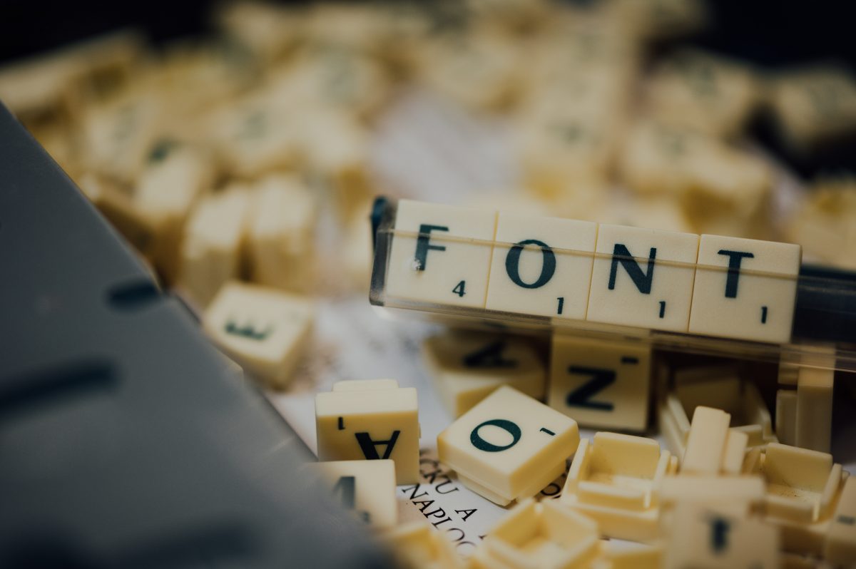
Choosing typography for your ads sometimes can be as important as choosing the outfit to wear on your first date. To make sure your typographic advertisement is thriving, you need to create the right style, point size, colors, and letter spacing. You need to make sure your font choice has a clear hierarchy so the reader can get the information quickly. Remember, less is more. So, try to avoid using much-colored text, and using too much bold, italic, and underlined text can lead the audience to lose interest.
Here are four attention-grabbing typography for you to use as a reference for your next design
a. Replicate & Experiment with Other Materials
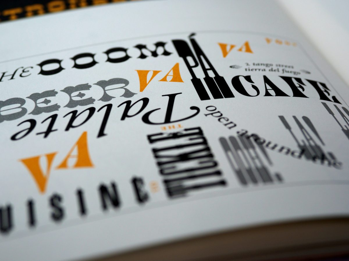
Try replicating your brand’s unique side; replicating and experimenting with the material will let your brand shine and be eye-catching. Even typographic advertisements are often flat, but; they do not mean them. You can combine your typeface with the materials around you. Play with the tone and background to make the type pop.
b. Create a Visual Story
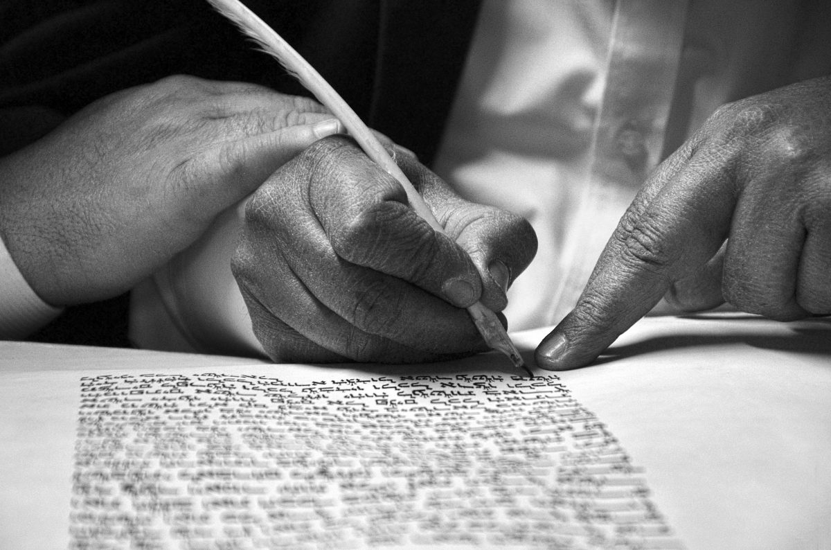
Telling a story is crucial when making a typographic advertisement. A good story opening will make people curious about something you want to tell next. Your typography also could tell the story if you design them in a scene. You can play with the tone and background to create a nice ambiance.
c. Create 3D Typography
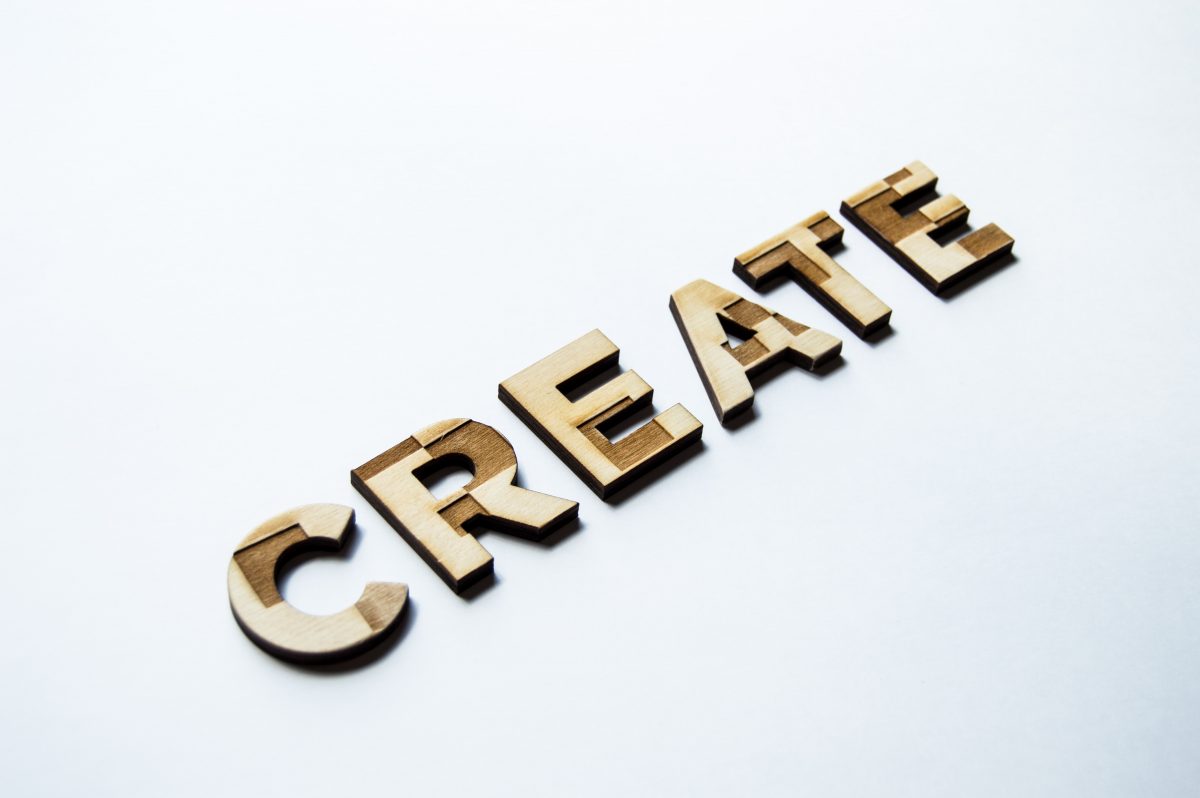
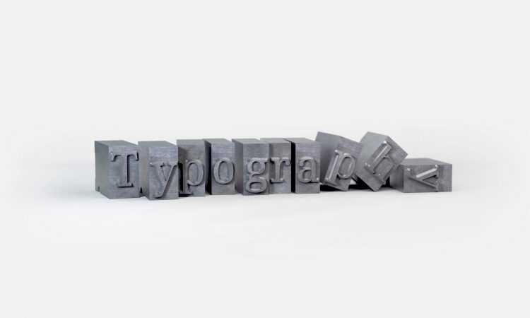
It’s not a secret anymore; making your type 3D will add some realistic effect and make your advertisement pop. It will lift the type, but it will also raise your advertisement overall. Also, 3D typography’s lettering style has intensity, making people feel that they can touch the letters and sense the variances in form, curves, or hard edges.
d. Be Clever but Don’t Hang Up in Perfection
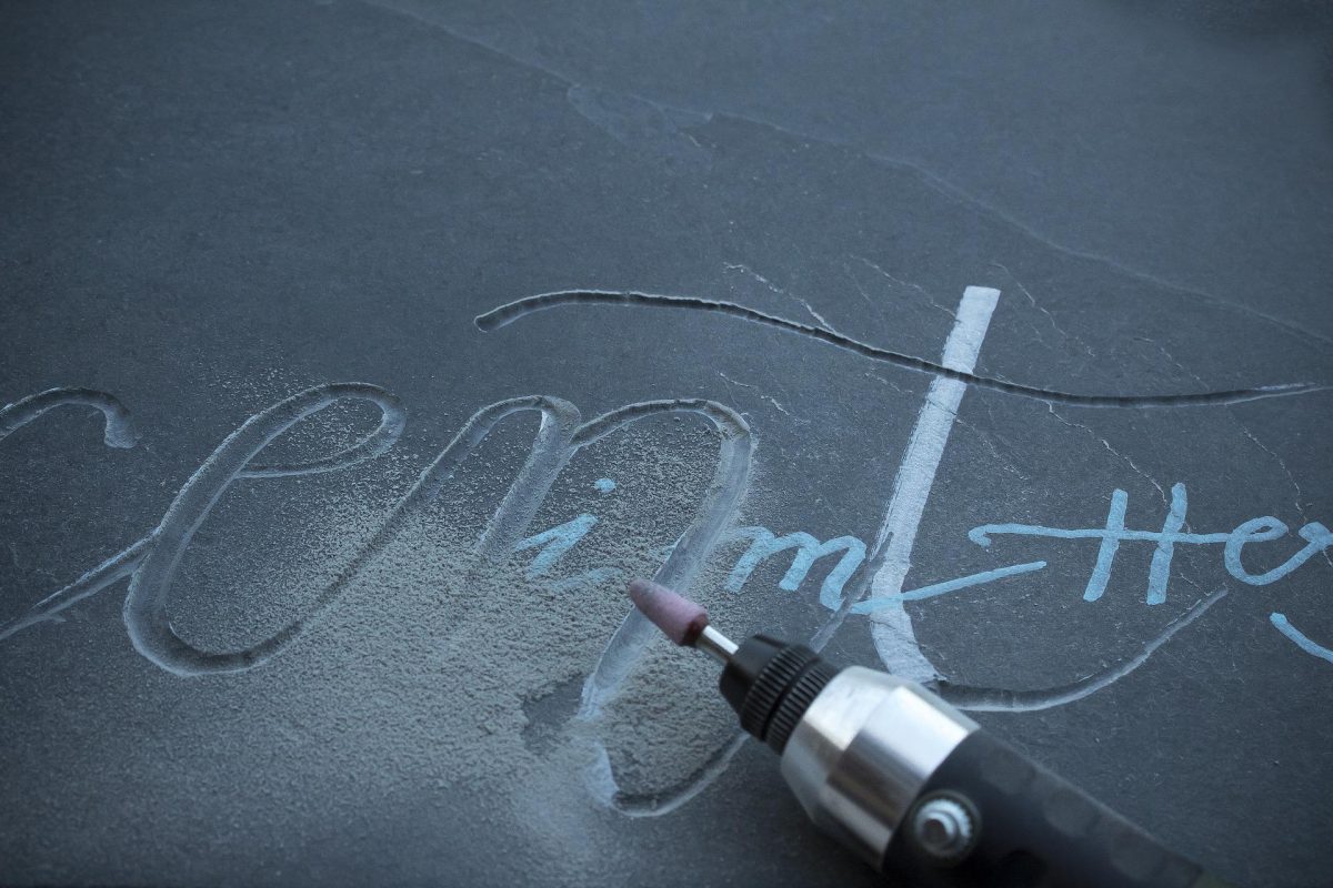
You can be clever in your ads by making your typography like the thing you want to sell. You can create something out of the ordinary. It may look incomplete, but if you can find the piece of the type and make something out of it, it is sure to be something unique that could catch the eye of your audience.
Combining typography with various concepts and themes is now being widely used to strengthen the imparted message of a brand. If you approach typography in a definite way, it will radiate in your brand, and people will surely want to buy your products or services.
One Comment