
Increasing conversion rates is a goal in e-commerce strategies, and there are many ways to do it. Attention to font trends is one of them, especially since visual aspects are important in drawing visitors to your websites or online stores.
Introduction
Since the invention of modern print in the 14th Century by Johannes Guttenberg, typefaces and fonts have been developing in diverse varieties, font trends also keep changing, and designers, business owners, publishing houses, and writers must adapt.
The digital era has also created new fonts, and a new trend pops out almost every year. For example, in early 2023, digital typeface design company Monotype officially added new collections to their libraries. Dubbed Paulo Goode and Milieu Grotesque, these families combine classic and modern eras.
Understanding font trends are important to create successful e-commerce campaigns. Fonts affect customers’ behaviors and impressions of your brand. They also serve as communication tools, delivering your message in a way that affects user experiences.
Fonts in e-commerce campaign materials can affect customers’ behaviors in a technical way (some fonts are easier to read than others) and a psychological way (certain fonts create different emotional responses based on cognitive bias). Understanding font trends and how they affect your customers will benefit you in e-commerce marketing campaigns.
Key Font Trends in E-Commerce
Depending on the era, typography trends reflect what people appreciate or lean toward, translating into the aesthetics and visuals that make them experience certain emotions. The year 2023 and the post-pandemic era saw the rise of several unique typography trends in e-commerce, such as:
- Accessible Fonts
Discussions on accessibility are growing, including using specific typography and fonts in ads. Many current font trends emphasize large, clean, no-nonsense designs, focusing more on messages and clarity. Examples are large typefaces with open kerning and even strokes.
Brands that use hard-to-read typeface designs now tend to attract negative attention. Aside from the unclear messages, such designs are hard to read by neurodivergent or dyslexic people.
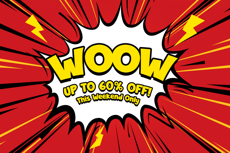
- Retro Mashup Typography
The 80s and 90s have made their way into current design trends, affecting typography and fonts. Brands may use retro aesthetics like “arcade billboard” fonts. In Spotify’s Wrapped ad campaign, the sensible sans serif typeface combines bright, neon colors reminiscent of the 80s.
This combination of retro and modern allow people to be nostalgic but with a touch of modernity that keeps our mind connected to the present and possibilities in the future.
- Modified Futura
Created in 1926, Futura is a typeface created to push back against 19th-century typeface influences. Its forms were based on simple geometric shapes and even strokes. When released, it quickly became a symbol of industrialization and modernity. Futura was even used to create a commemorative plaque on the moon’s surface in 1969.
#/media/File:Apollo11Plaque.jpg)
The revolutionary meaning behind the creation of Futura makes this a perfect modern font trend. Based on Futura, the Future typeface adopted geometric shapes and avant-garde elements. It is modern, attractive, and futuristic, with good readability.
- Stylized Sans Serifs
Sans serif typeface does not need to be all-clean and straight-looking. Many brands can benefit from stylized sans serifs, which infuse creativity, fun, and quirkiness into fonts without sacrificing readability. You can, for example, create playful typography without using Comic Sans or other designs associated with childishness.
One example is the “warm sans serif,”; any sans serif typeface with a slightly humanist touch. Classical font’s influence adds warmth and casual touch to otherwise serious-looking sans serif type. Popular examples of such fonts include Cabin and Merriweather Sans, but there are many newer font trends with this style.
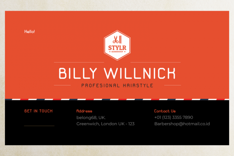
- Handwritten Fonts for Professional Branding
Handwritten fonts still get recognition in professional branding. Depending on the design, they can add a classy, casual, playful, or modern touch on the brad. Handwritten fonts are also good for promoting food and beverage establishments since they add a personal, inviting touch. The current trend will see handwritten fonts for branding, customized for unique purposes to attract positive emotions from the target markets.
- Mobile-centric UX Design
Mobile-centric UX design is a given trend, thanks to the prevalence of mobile phones among the general public. Many transactions are conducted through mobile devices, so UX design elements (including fonts) must follow suit. When prospective customers experience difficulties browsing through mobile phones, they are more likely to leave early, reducing conversion rates.
One way to improve mobile-friendly design is by choosing the right font and typeface. A font could be good enough for a desktop but difficult to read on a mobile phone. Ensure the font is compatible with the mobile-centric design and can deliver your messages to prospective customers.
Enhancing User Experience with Fonts

Choosing the right font trend is crucial in enhancing user experience, making them develop positive sentiments with your brands, and doing actions that you aim for (purchasing, renting, signing up). Let’s find out how you should do that using typography and fonts.
Considering Font Legibility and Readability
Legibility and readability must always be number one when choosing any typeface design trend. This is because they affect the messages you want to deliver to your customers or web visitors.
Legibility is different from readability! The first is about how recognizable a character is, while the second is about how well readers can decipher the messages behind the texts. While they are not the same, legibility does affect readability.
Choosing the correct font is important when creating a brand campaign. Consider how well readers can decipher the messages when choosing contemporary typeface designs. Are the letters fused and make reading difficult? Do readers have trouble telling the difference between your “P” and “R”?
Regardless of any font or typeface you choose, if your texts are not legible and readable, that’s your clue to scrape the entire thing off.
Creating a Visual Hierarchy
To clarify your message, consider visual hierarchy, especially when matching different font style trends. Creating a visual hierarchy in typography helps readers distinguish between different parts of the texts, allowing them to focus on the most vital information.
How do you create a visual hierarchy with fonts? By combining and modifying these elements:
1. Size
Size is the most obvious element of visual hierarchy. Generally, the bigger the font, the more important the text looks. Readers will automatically have their eyes on the texts with the biggest font.
2. Color
Colors and their elements, such as the contrast between the texts and their background, can make a huge difference in the visual hierarchy. Depending on the combination, some colors will attract more attention than others.
3. Weight
The font’s weight is related to the thickness or thinness of the lines. Usually, the bolder the fonts, the more prominent they look. This is why bolder fonts are typically used for headers or titles.
4. Alignment and Position
Sometimes, visual hierarchy is all about where you put the texts. You can draw readers’ eyes (and interest) by placing texts in certain ways. For example, placing the header or important quote at the center of the page will instantly attract readers.
5. Kerning
Kerning is the distance between two individual characters. This space is important because it affects the comfort of reading texts. Proper kerning also makes your texts visually pleasing, which affects customers’ emotions and conversion rates.
Adjusting kerning depends on font types, sizes, and the design context. Too narrow will make the texts hard to read, while too wide makes your readers lose perception when reading. One useful tip: try blurring the text after adjusting the kerning. If you can still immediately recognize what the text says, your kerning will likely be proper.
Choosing the most visually pleasing font is not just about trends. Even if you stick with the most popular font trends, you will not achieve effectiveness and strong emotional impact without proper visual hierarchy design.
Reflecting Brand Personality
Typeface and font are visual elements that communicate your brand personality. To give you famous examples: Didot is associated with fashion magazines like Vogue and Elle, while Futura infused strong personalities onto brands like Nike, Absolut Vodka, Domino’s, and Red Bull.
Each of these names customized the typeface and fonts to fit their personalities, a part of modern branding font trends. Instead of sticking with the font as it is, different brands customized them to better suit their images, ad campaigns, and other factors.
When choosing the perfect font for your brand, consider the psychology of font. Various logo design font trends can uniquely impact your readers or customers. For example, bold fonts can look powerful or too loud, depending on how you utilize them in the branding strategy.
Boosting Conversions with Typography
How can you utilize typography and font trends to increase conversion rates?
As previously described, choosing the correct typeface and font can evoke specific emotions and cognitive bias in people’s minds. You can utilize it to encourage your readers, web visitors, and prospective customers to alter their behaviors, resulting in conversions.
Here are several ways you can do that.
Building Trust and Credibility
You can use the font to communicate credibility and reliability, making people trust your brand and more inclined to purchase, sign up, or subscribe. The list of the World’s Best Airlines 2023 by Skytrax is a perfect way to illustrate it.
What do you notice from the name of the airlines listed here? Most of them use various modifications of a sans serif typeface. For example, Singapore Airlines, ANA, Japan Airlines, Air France, and Korean Air all use bold, minimalist font trends under the sans-serif umbrella. Sans serif, especially the bold types, communicate clarity and assurance, characteristics people would want from airline companies.
Sans serif is not the only typeface that reflects trust and reliability. Some companies, especially the ones with a long history, use handwritten font trends that are both elegant and recognizable. For example, Coca-Cola, Disney, and Ford have distinctive handwritten text-based logos. They are parts of established brand identities and communicate longevity and dedication, which make people trust them.
Fostering Emotional Connection
We are used to hearing that certain fonts are “elegant” while others are “loud,” but do you know that combining typography, colors, and design can foster emotional connection?
Many innovative typography trends play around with unique color combinations, shapes, sizes, alignments, and font types. The goal is to find which combination can cause pleasant emotions or activated responses while avoiding the ones that cause unpleasant emotional reactions.
A survey in Aetherpoint compared the reactions between respondents when seeing different combinations of typography and colors. A simple text in bold font and black color, paired with white and pastel background, results in a positive emotional response, likely because of the perfect balance between the contrasts.
On the contrary, a design with thin, scraggly font against bright yellow background, with uneven character heights and thin strokes, elicits more negative emotional responses. This shows how negative reactions can happen simply because you use the wrong combination.
When choosing font trends for your brand campaign, test them with multiple people. You can also do a public poll to garner their level of attraction toward certain brand identities, such as text logos or label typography.
Increasing Call to Action (CTA) Effectiveness
Call to Action (CTA) is the final gate of conversion. CTA consists of elements encouraging target markets, readers, or website visitors to finally conduct purchases, subscriptions, or sign up. Choosing proper UI/UX font trends is one of the keys to creating a compelling CTA.
Here are some ways you can modify fonts and typeface for attractive CTA.
1. Pick Big, Noticeable Font
When it comes to CTA, especially in the form of a button, stick with big, bold, clear font. Your audience must immediately notice the CTA button and easily complete the action. Whether it is a subscribe, buy, or sign-up button, the most noticeable font will always be the safest bet.
2. Keep the Font Legible and Readable
Any form of CTA will be useless if the audience cannot understand what’s written there. Pick a font with good legibility and readability so everyone can immediately know what you expect them to do. You can make the CTA part slightly bigger to ensure higher readability.
3. Pair Font with Visual Element
CTA can be a sentence, but it is better to incorporate a visual element with your font. For example, create a big button underneath your content. Or, you can add an icon that depicts the conversion activity, such as a cart next to the “Purchase” CTA.
Alternatively, place the CTA inside a designated space, such as in a large box underneath the content. Pair it with a relevant photograph or illustration to remind the audience what they will get if they perform the conversion. You can use the photos of your products or even relevant stock photos you can get cheaply.
With a visual element, your audience will immediately see the CTA and feel more compelled to act.
4. Play with Button Color and Shape
Putting your text inside a button is a common CTA tactic, and you can make the button look as attractive as the font. For example, you can use a rounded-ed button to make it look softer. Rounded edges are softer and sleeker, while the square button looks bolder.
You must also consider the contrast between the button color and the font. The audience must be able to see the button a mile away and understand what’s written there. Choose the strongest contrast to distinguish between the text and the button color.
5. Pair CTA with Unique Typography Design
Use stylized visual design font trends to enhance the look of your CTA. Stylized designs usually have a risk of being hard to read in the form of body texts. However, since you focus on CTA, you can get creative with the typography and font. Ensure the audience immediately knows where to look and what to do, using the interesting and stylish visual as the clue.
6. Choose a Good CTA Placement
CTA placement should be where visitors can naturally see (and act upon). Some popular placements include the end of a blog post, the top center or right of your webpage, the hero image, or the middle of a long post.
What about pop-ups? While it is also a popular option, some visitors may develop negative reactions when a pop-up suddenly appears and breaks the “flow” of the reading. Therefore, you must focus the CTA on the webpage, not just the pop-up.
The placement of CTA is not limited to a webpage or online store. You can put it in your e-mail marketing. The CTA placement here must be treated as a mini version of your webpage. Make the CTA elements (font, typography, color) compelling and consistent.
7. Conduct A/B Testing
A/B testing helps you compare two or more options, gauging them to see the likely results before you launch them to the public. Create several versions of the CTA designs you have in mind, and release them as a gauge test. See which one the public responds positively to, and ask for their opinions about which is more attractive or compelling.
You can also conduct the test with smaller group participants selected from your target demographics. Gauge their opinions about what attracts them to click certain CTA designs, from the fonts to the colors and the language.
Staying Ahead of the Font Trends
Following digital font trends is one way to improve conversion rate. You can make your website or online store look fresh and attractive by ditching ubiquitous fonts and searching for contemporary ones.
Font resources offer a font database you can browse based on the newest and trending collections. Here are some font libraries you can visit to check out trending fonts.
- Google Fonts
Google Fonts is a notable font source with multiple categories for advanced search. You can check out the newest font trends by changing the sorting category into “Trending” or “Newest.”
- FontSpace
FontSpace is a font database that offers easy browsing thanks to its quick feature and category system. FontSpace was designed for font designers, and many of them have quite an extensive catalog in this font database. You can search for fonts based on the designers, and there is a search feature based on the newest upload.
FontSpace also has a feature where you can see simple previews of a designer’s portfolio. Therefore, you don’t need to visit many different pages just to see all their work.
- FontBrief
FontBrief is an ideal typeface resource to explore graphic design font trends. This resource catalogs font families and categorizes them based on “personalities.” You can search for fonts using elegant, expressive, warm, loud, daring, and many more keywords. Want to see the newest collections? Just go for the “Fresh” menu.
- DaFont
DaFont is a font library that categorizes its collections with fancy, decorative, retro, horror, and classic themes. Many of these fonts are free, and popular designers have font catalogs you can browse easily. A perfect resource to look for trending and popular font trends.
If you are looking for specific new trends, follow the graphic design and digital news to understand more about the current typography and font trends. However, avoid blindly following every trend you come across. The best font to support your conversion rates depends on what your brand needs to better represent its values and visions.
Conclusion
Font trends play important roles in e-commerce and conversion rates because they draw specific emotions from customers. Positive impressions and emotions encourage customers to conduct their desired actions, like purchasing, subscribing, and signing up. Improve your target customers’ user experience with the right font trends and see your business raking up conversion rates!