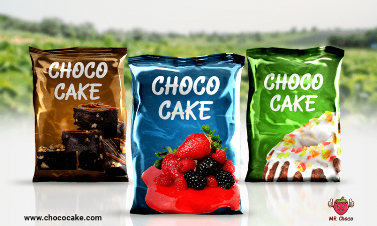
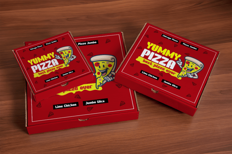
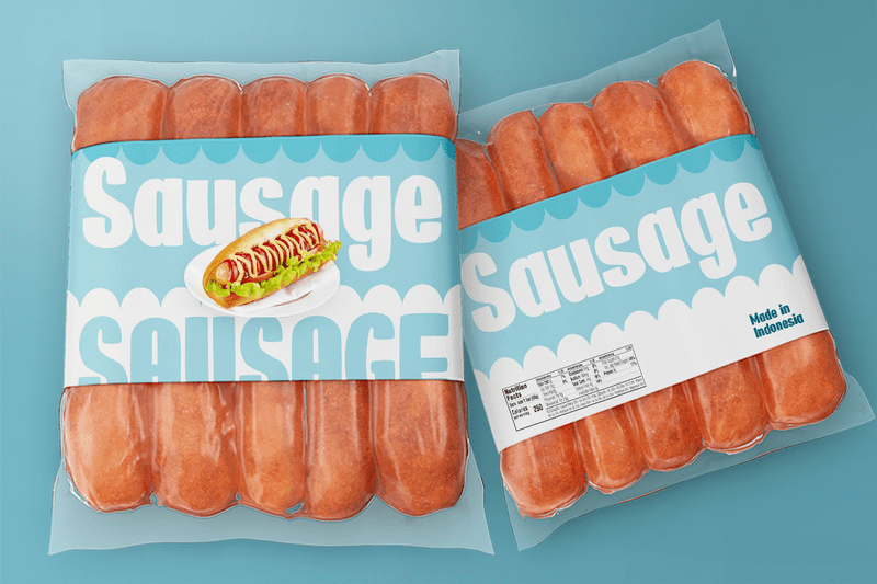
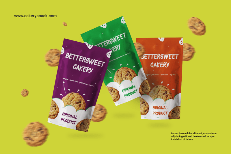
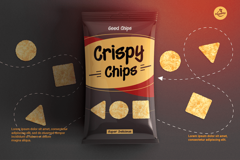
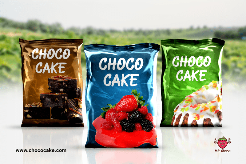
If a picture really speaks a thousand words, then why do we need a caption? Unfortunately, you may find it different with packaging. When it comes to that, balance in design may be required. We need to create an equilibrium of visual elements alongside written material.
Introduction
What are font trends? Before we get to that, let’s check out the definition of ‘typeface’. According to Google Fonts, a typeface is an underlying visual design that can exist in various typesetting technologies. One of these implementations is called ‘font’. In short, whether a typeface or font, it is what you all see.
Font trends change from time to time. They often do that quickly, although they still leave you plenty of options. Their significance in packaging design lies in their ability to attract customers. Whether these customers are existing or potential, the fonts should attract them to your product from at least three feet away.
Since font trends always offer more than one option, your challenge continues beyond there. You must choose the right ones for the impact you wish on your product. If you fail to choose the font that speaks volumes of your brand, then the attraction may not be there.
So, what is the role of typography? Typography works to maintain a balance between the texts and the visuals. This way, typography will work wonders in creating memorable and impactful packaging. Since packaging usually has plenty of information regarding the product, it takes work to go on a bare minimum when it comes to creating the text for it.
Key Font Trends in Packaging Design
Not only support the visuals, but typography trends are also important in packaging design. They are what makes a strong visual hierarchy stay established. They also provide a graphic balance on the website and set the overall tone of the product.
If you choose the right typography, it will help as a guide and an informative element to your users. It will also help them in terms of readability and accessibility. Last but not least, the right typography will also help to ensure your user experience in an excellent way.
How do we get the correct fonts or typography for our packaging design? The answer is obvious: start exploring. Check out the current font trends, especially those specific to packaging design. It is alright if you have not found the kind you want the first time. Keep searching and exploring.
Meanwhile, some of the current font trends specific to packaging design include these:
- Fun and Functional Serif Fonts.
Although serif fonts are often considered typical and boring, their latest versions have returned with a twist. They are more fun, yet also functional.
Some of these examples look even more exciting. Leida offers a historical-looking typeface designed by Dutch masters. It is also very readable, whether digitally or even on a printed version. Gorgeous from Envato also offers a nice balance of fun and functionality. It makes a perfect choice for packaging design.
- Expressive Typography.
Exploring expressive typography is a cool strategy to form an instant emotional connection (hopefully!) with the audience. You should do this if you are a designer, business owner, or marketer. By exploring more samples of expressive typography, you get to find and add an approachable feel to your brand and content.
For example, you would like to promote a skincare product brand. You can use delicate typography to speak volumes of the product’s softening and soothing properties. Complete that with the combination of rich red background to complement the dark glass and bottles of the skincare product.
- Accessibility
If your packaging design is meant for corporate levels only, then Accessibility might be your best option. With clear lettering and combinations of scaled-back colors, the typography will be very readable. Consider the font choices carefully to make it even more readable since corporate people need to be able to read and understand the text quickly.
Some the examples of Accessibility Typography are these:
* Let’s Wine.
The logo is minimal and almost not there. The background allows for the simple sans serif font to exist simply.
* Clarity.
Just like the name, Clarity offers something simple, neat, and in order. It makes a quick read and will save you time.
* Cupping Room.
Monochromatic is basically timeless. You can always go right with this type of style, especially in typography. There is a distinct hierarchy and enough white space to make everything readable here.
How can font choices influence brand perception and consumer appeal? To alter the old idiom “Action speaks louder than words”, you may say that is basically the same with typography. As long as you choose the right one, it does speak louder than words.
For example, the legendary sports shoes brand Nike. With Trade Gothic and Future as their fonts, Nike represents the journey from today to tomorrow. It speaks volumes in minimalism, which represents the modern spirit. The additional tick in the logo and the famous tagline “Just do it” have a greater impact on the brand’s emotional appeal to customers.
In short, each font choice gives different vibes or influences, which will affect consumer appeal. These are some of the examples:
- Classical fonts.
Since classical often means timeless, then these fonts project a strong personality.
- Modern fonts.
Opposite to classical fonts, modern fonts offer a much cleaner and more neutral look. They tend to get more dynamic and may change from time to time, except for one thing: their simplicity.
- Bold fonts.
As the type states, these fonts are often used to make a statement. They are made to capture the readers’ attention – right from the start.
Enhancing Visual Appeal with Fonts
Humans are visual creatures, so what attracts them to the eye is the first they pay attention to. From this fact alone, we must know how to enhance visual appeal to our audience. Not only with graphic images but fonts are also equally important. The right fonts for this are not only readable but also aesthetic-looking to the eyes.
This is why you should start checking out contemporary typography trends. To grab the potential audience, remember to include popular font trends in your search list too.
Let’s start with contemporary typography trends. In 2023, here are some of the examples to consider:
* Hand-drawn Fonts.
Many designers have used hand-drawn Fonts due to their sense of ‘exclusivity’. Although they have been mostly used by certain brands, businesses, or industries, Hand-drawn Fonts are back in the market with a more inclusive vibe. Grungy edges and bold lines are the most favorites so far.
Hand-drawn Fonts are also an all-time favorite for promoting beauty brands. Yes, it is because they offer feminine vibes too.
* Serifs.
The new Serifs in town are different from the strict, boring kind. In the days, these fonts may have often been used for corporate-level brands and in a formal environment—for example, something for government offices or other formal businesses.
These days, Serifs are often used by web designers. They are turning up with thicker strokes for different lettering styles. You can even outline them and use some space to make these fonts appear more unique. You may even claim that these are Serifs with more authenticity.
* Outlining of Fonts.
Fonts with outlining are also something to consider here, especially if you create web pages. Sans serif typefaces in all caps are some of the favorite options, paired with filled lettering. In some homepage designs, you may see oversized text elements. These are done to emphasize some key phrases of the website.
There are three (3) things to consider when outlining your fonts:
– Placement.
– Colour.
– Contrast.
Considering these three things, you can ensure that your lettering will not lose its impact.
Meanwhile, here are some font trends in 2023:
* Mall Goth Fonts.
This trend started in the late 1990s when Nu-Metal music and mall-goth cultures were popular back then. It has found its fame once again through a TikTok resurgence. The style combines two opposite elements: macabre and fashionable.
* Liquid Chrome.
Inspired by the Y2K scare in 2000, Liquid Chrome came up in 2023 with complete metallic sheens. The letters might remind you of something melting in 3D shapes. This font combines futuristic themes, like aliens and the sci-fi world – with a modern twist.
* Vintage Narrow Serifs.
The year 2023 is also the year of the Serifs. Inspired by the vintage print fashion magazines back in the 1980s, Vintage Narrow Serifs offer a nostalgic vibe – but with a touch of something new. They show something familiar and unique at the same time. They combine a sense of strength and gentleness.
So, what does typography do as a visual element in packaging design? In general, typography functions as something to communicate the marketing message on a medium of three dimensions. In detail, here are the purposes of typography as a visual element in packaging design:
- As an aid in your brand positioning.
What do you want to sell? How do you wish for people to perceive your brand? This should help you in choosing your typography.
- As a helper in differentiating your brand.
Customers mostly recognize different products and brands by different lettering. Make sure that the typography of your choice is different from a twin flame to an already popular product or brand.
- As something to define your product better.
This is as tricky as finding a soulmate. Once you find the right typography for the visual elements, you can define your product better.
- As a grabber for your customer
As mentioned earlier, ensure that your typography grabs their attention from at least three feet away. If not, then your stuff will only get ignored.
- As something to affect customer preference.
Once again, readability and accessibility are the main keys. Make sure that the typography is easy to read. The most effective typography is the kind that influences your potential customers to buy something and feel the need to do so.
- As something to uplift the packaging’s appearance.
Let’s just face it, most buyers are attracted to a product based on how it looks from the outside. The three (3) elements that attract them include images, color, and typography. The arrangement of fonts should be in different ways in terms of varying purposes. This will create diverse effects.
- As a creator of hierarchy design.
The hierarchy design functions as a director to your audience’s gaze. It will help them to focus on what stands out the most before the rest of the content. For example, bold typography is often used as a website name.
How do we use fonts to create a cohesive and visually-pleasing package design? These are the helpful strategies for you:
- Choose a color palette that is visually appealing and consistent with your brand.
- Do not use too many fonts all at once. Two fonts are the maximum
- Forget stuffing too much information in small spots. Be strategic with your white space.
- Ensure the design is really on brand and appropriate for the company and target consumers.
Communicating Brand Identity through Typography
The next step is how to communicate your brand identity through typography. To make this possible, your next search list should involve branding font trends and also logo design font trends.
These days, branding font trends are mostly back to the oldies. We have known that serifs are back in town with a twist. We also have seen some examples with the 80s or 90s look to them.
That is the same thing for logo design font trends in 2023. For example, in the fashion world, some classic brands are back with tweakings to make them look fresh and young again. Burberry, Ferragamo, and many more are to name a few.
The old “I ❤️ NY” logo, created by Milton Glaser in 1976, has been renewed into “We ❤️ NY”. Burberry has also developed its new logo, which consists of a serif logo. Burberry was not the only one with this step because both Ferragamo and Phoebe Philo has revamped their old logos with sans-serifs.
To match the fonts with your brand personality and values, here are some tips for you:
* Get to know and also learn to understand your brand personality.
* Make sure that you understand each font category’s personality trait.
* Know your budget and requirements regarding licensing.
* Choose two fonts that fit your brand personality and values.
* Make sure your brand is flexible and able to be present well in terms of packaging design, external presentations, and also as social media images.
Another point to remember is to keep your audience connected to your product or brand. This only works by creating consistency across various packaging designs. That way, your customers will not forget your brand easily.
Creating consistency across various packaging designs of your product means building dependability and trust through brand consistency.
I. Font Legibility and Readability in Packaging
Legibility and readability are two important requirements to be met when you choose your fonts. Especially in packaging, you need fonts easily differentiated from letter to letter. You also need fonts that are easily read by your audience. The last thing you want is for them to give up on getting to know your products because of the hard-to-read fonts.
You also need to consider sizes and various platforms when choosing font legibility and readability. The right fonts have to be readable at various sizes and also look good on various platforms, whether they are printing media, digital media, or other types of packaging.
To make sure that you get font legibility and readability in packaging, start browsing for minimalist font trends and handwritten font trends.
As mentioned earlier, the minimalist and handwritten font trends are more nostalgic vibes. Art Deco Revival, a font trend back in 1920, has returned as one of the minimalist font trends.
Hand-drawn or handwritten font trends like Grape Nuts and Homemade Apple Fonts are also the favorites of many. Their designs are timeless, readable, and suitable to match any type of visual.
II. Eliciting Emotions and Connection
Emotional connection is very important in keeping your customers loyal to your brand. As mentioned earlier, different fonts mean different emotional impacts or interpretations.
Is it possible for fonts to elicit emotions and connection? Of course. There are various elements that evoke emotions and connection. For example, the weight, the texture, and the shape joined to create a powerful message. This helps people to perceive the text better.
Nowadays, there are innovative typography trends to help you to use typography effectively. From here, we can find that the right fonts also need to consider certain types of customers, like:
- The kind of scrutinizing everything from end to end.
- The kind of getting smitten enough by the package design to buy the product.
- The kind to only care about the insides, like the quality, design, function, and how long the product lasts.
These types of customers are not to be avoided or afraid of. In fact, we need to find out how to win them over with the right typography and other effective approaches.
III. Font Trends for Different Packaging Types
There are several factors regarding font trends for different packaging types. Before you decide to browse for graphic design font trends and digital font trends, here are those factors:
- Product type.
A consumer product or for business? Luxurious or high-street? Different product types require different types of fonts, whether graphic design or digital.
- Package shape or size.
Small, medium, or big, you need to choose carefully from the current graphic design font trends or the digital ones.
- Product labels.
What hues and shapes are the labels on your product? There are certain labels that need special requirements, like food, drug, and beauty products.
- Target markets.
This is the most vital part before you start browsing for digital font trends or graphic design ones. Consider the age, gender, language, culture, and personal preference of your target markets.
- Design imagery.
Where you put your logo, photos, charts, icons, and many more will affect the structure decision of a text.
There are many samples of food packaging for beverages. For example, Tropicana has been popular with the picture of an orange with a straw attached to it. When they decided to change the orange with a glass of orange juice, their loyal customers protested. So they changed it back to their original design.
Meanwhile, most beauty brands use sans serif fonts as their packaging design. Whether they are geometric, old-style, contrasted, or else, sans serif fonts are suitable for beauty brands.
Standing Out with Unique Font Choices
What makes fonts unique? To answer that you must start exploring unconventional font choices and combinations. Unique fonts still have to be able to balance creativity with legibility and brand consistency.
To find them, let’s take a look at some UI/UX font trends and also visual design font trends in 2023. For example, UI/UX fonts these days are all about increased personalization, accessibility standards, increased cross-device access, and the use of AR (Augmented Reality).
Regarding visual design fonts, it is best to stick to two fonts maximum. To make the fonts more unique, choose two fonts that are opposite of each other – but still with colors that match.
IV. Conclusion
Choosing the right fonts in packaging design is important to create impactful visuals. Among the font trends, choose carefully. Dare yourself to leverage typography to create visually appealing and impactful packaging. That way, you will get a satisfying boost to your brand or product.
