Colors play a huge role to elicit people’s interest in the designs you make. Be it logos, posters, or even PowerPoint presentations, it needs the right color to make it alive and radiate the power to convey the message to your audience. Playing with colors is fun, but your design will be tacky if you do it wrong. Lucky you! This article will give you the five best color combinations for your design that you can try.
1. Cozy and Warm – Red and Brown
Do you know that colors can represent mood and emotions? It is all because of the psychological effects of colors. Warm colors, like red, evoke feelings of comfort and warmth. The same thing also happens with earthy colors, like brown. Therefore, this combination of colors can give you a nuance of warmth and coziness for your designs. This is perfect for a brand’s logo of a company with a cozy and warm identity, like a teddy bear doll company.
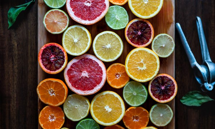
2. Green Fields – Green and White
Everything never goes wrong with green! Green is often associated with nature and serenity. Combined with white color that promotes cleanliness and simplicity, these two combinations of colors can make your designs look fresh and relaxing. You can use these colors if you want to make a design related to nature, such as environmental awareness posters and presentations.
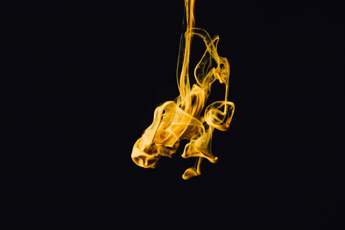
3. Day and Night – Yellow and Blue
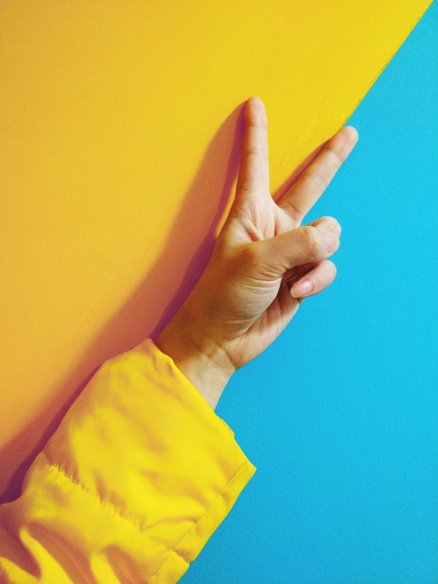
Now we are talking about contrast. Radiant colors, like yellow, gives us the impression of being energetic and cheerful. Yellow surely can grab anyone’s attention. Meanwhile, the blue color is associated with calmness and sincerity. This color combination will make your design looks powerful but not going to give you a punch in the face.
However, never use these colors if your design is related to foods because the blue color will make your foods look less appetizing. Not only that, the yellow color will not make your foods stand out because the yellow will overpower the whole design.
4. Cosmopolitan – Brown and Pink

If you want to make a modern design, these color combinations will be the best colors for you. Earthy colors like brown paired with a medium bright tone of pink, such as blush, will give your design a feeling of warmth and neutrality. Giving an additional color of light blue will make the brown and pink color stands out.
5. Classic Metallics – Black and Gold
It’s time for elegance! The black color is technically not a color because all light in the color spectrum is absorbed by black. However, it is where the uniqueness came from. Black is such a powerful and versatile color to use. Black is largely associated with boldness. Using black itself will make a powerful nuance in your design.
Now, let’s talk about gold. This color comes from a yellowish-orange color, which is a radiant color. We all know that gold represents luxury and extravagance. It’s not easy to pair gold with other colors since gold itself is a really flashy color that can stand alone.
The only appropriate color that can be paired with gold is black. Black will not overpower the gold but still leave a trace of its boldness. These two colors will definitely make your design looks exclusive. If you want to make a fancy party invitation card, just go with this combination!
Color combinations will help you to communicate the message of your design and, of course, make it more attractive. Using only one color is acceptable, but playing with more than one color is definitely a powerful movement to bring life to your design.