A strong impression of your brand can be conveyed through color and fonts combination. Fonts are believed to communicate brand goals and identity, while colors will radiate emotions. However, choosing the right color and font combination that will effectively deliver your messages within your brand is not easy: there are too many color shades and font types to pick.
Nevertheless, there is always a way to do when it comes to picking the right colors and fonts for your brand. Take a look at some ideas on how to choose the best color and fonts for your brand and audience.
Find the Best Colors Which Suit Your Brand Personality
The diverse spectrum of colors can be complicated and exhausting to limit to create a decent color set for your brand. Moreover, color and font combinations can be as much challenging as the attempt to convey the brand’s purposes.
Nonetheless, there is one basic idea to apply: set only a few colors and shades. Limiting your colors can effectively help identify your brand persona to your audience. Meanwhile, too many colors will result in confusion in brand design and conveying brand messages.
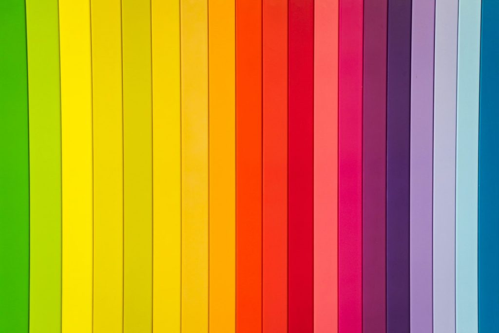
Worry not. Here are several core colors and each association you can adopt for your brand personality. Different colors scientifically associate different emotions and impressions, so choose wisely the colors to convey certain feelings and messages to your customers.
Red
Red is commonly associated with energy, passion, excitement, and danger. This color is easy to get noticed from afar and makes the audience’s impression more memorable. That is why red has become one of the most favorite brand colors. Some companies adopt this bold color and its shades for their logos, including Ferrari, Kentucky Fried Chicken (KFC), Red Bull, and Virgin.
Green
If your brand personality is related to health, freshness, nature, or rejuvenation, green is the best color to pick. You can also use various shades of the color in your brand color. The lighter, the more liveliness and energy conserved. Meanwhile, the darker green shades represent prosperity. Popular brands like Starbucks, Animal Planet, and Heineken adopt this color for their brand logo and persona.
Blue
To give the sensation of tranquility and harmony, blue can be your top color to choose from. This color is the color of the sky and the sea. It radiates a sense of competence, steadiness, and trustworthiness, making it one of the most popular brand colors. Some famous companies have adopted this color, including Facebook, Volkswagen, Paypal, and the General Electric Company (GE).
Yellow
Yellow radiates a sense of friendly, joyful vibe, optimism, happiness, and fun. Many companies which use the color choose bright shades of yellow for their logos. Dark shades of yellow are less attractive because they tend to portray dull, morbid hues. IKEA, Subway, and Nikon are three internationally-recognized brands that use yellow for their brand logo and persona.
Purple
Purple best portrays strength, luxury, royalty, and sophistication. Purple is often considered an expensive color as the purple fabric was affordable only for monarchs and wealthy nobles. Moreover, there was a rumor that Queen Elizabeth I only allowed the closest royal family members to wear the color. That is why the color is relevant to royalty.
Some companies, like Yahoo!, Cadbury, and Taco Bell, incorporate purple for their brand color and logo. This color also embodies creativity and mystery.
Grayscale
Monochrome color shades, like grayscale and black radiate elegance and minimalism. Some people also believe they portray authority and power. Several brands have also attempted to add their grayscale shades to their existing brand logos for more variants to reach more audiences. They are Apple, Honda, and Squarespace.
Find the Best Fonts Which Convey Your Brand Identity
To find the best fonts, the best thing you can try is to limit your options to three parts: the heading font, the sub-heading font, and the body copy font. Too many fonts will result in a redundant look for your brand interface and will be such hard delivery for marketing your content.
On the other hand, a single type of font will make your clients difficult incorporate messages and find the difference in information between the body part and the other parts. Furthermore, the disconnection will allow your content to lose the impact it should do.
Now after selecting several options from so many types of fonts, start deciding the most appropriate fonts that suit your brand business at their best. It is also important to identify how different fonts could convey distinguished purposes delivered by a brand. Below are some basic font categories and how they communicate brand identity, including Serif, Sans Serif, Slab Serif, Script, Handwritten, and Decorative fonts.
Serif fonts
If you are looking for a high, classic personality, Serif fonts can be the best option. This font category has been established since the 15th century, and it makes it the oldest type among the other font categories.
Serif fonts are commonly stylized with a traditional look. The timeless identity carried by Serif fonts allows them to promote numerous well-known brands in the world, including Tiffany & Co., Time Magazine, and Abercrombie & Fitch, which occupy their logos in the fonts.
Serif fonts do not only showcase refinement and high class for international brands. For those who work in fine-dining restaurants, using this type of font category in the menu design will effectively match its purpose. Some examples of Serif fonts you can pick are Times New Roman, Garamond, Baskerville, and Century. These fonts will appeal to traditional but are long-lasting for your brand personality.
Sans Serif fonts
Unlike Serif fonts which appear traditional and classic, Sans Serif fonts offer a sleek, modern look. Sans Serif fonts are generally younger than Serif fonts. The modern appeal in Sans Serif fonts establishes minimalism as well as simplicity. While Serif letters appear more traditional and stiffer, Sans Serif letters are considerably more spaced out and intriguing. It makes the brand content easier to convey messages.
Many world-class brands like Calvin Klein, Facebook, and Google use Sans Serif fonts for their logos. Optima, Helvetica, Roboto, and Open Sans are examples of this type of font category. They are ideally used for a sleek, clean, and modern brand personality.
Slab Serif fonts
Another traditional Serif font is Slab Serif which is more eccentric and braver compared to the original version of Serif fonts which are more classic and refined. Slab Serif fonts exhibit authentic, bold quirkiness, which still represents traditional values.
Famous companies like Sony, Volvo, and Honda occupy this type of font category for their logo. You can incorporate Slab Serif fonts, like Courier New, Museo, Arvo, and Didot, to be applied to your brand identity. This version of the font category will effectively work to create strong confidence and a brave statement for the consumers.
Script fonts
If your brand personality needs to highlight its elegance, choosing Script fonts can be a great pick. This type of font category is similar to handwritten fonts, but it has different features to offer.
Script fonts are the font style of cursive handwriting which makes them charming and unique. Popular brands, like Instagram, Coca-Cola, Johnson and Johnson, as well Cadillac, adopt Script fonts to represent their distinctive characteristics. Some examples of Script fonts are Pacifico, Allura, Thirsty Script, and Belinda.
Today some people might consider these choices of fonts old-fashioned, but the artistic element of Script fonts are perfect for displaying the elegance and creativity of your brand personality. Now think about Instagram, which uses the type of font category, and consider how uniquely amazing it looks. It is not that old-fashioned, isn’t it?
Handwritten fonts
Handwritten fonts are similar to their cousin, Script fonts. However, unlike the Script fonts, which hold their unique cursive handwritten style, handwritten fonts tend to literally mimic the handwritten style, although they are not handwritten.
To give an effect of an informal and unusual look, adopting handwritten fonts can really work. Unlike the other types of font categories, which have already been adopted by many internationally recognized brands, handwritten fonts are less popular to be used by well-known companies.
However, if you adopt these fonts, your brand performance might look more distinctive. Goudy Text, Caveat, Permanent Marker, and Lombardic are a few examples of handwritten fonts to incorporate. Use these fonts to appear more playful and easier to be approached if such personalities are to convey to your customers.
Decorative fonts
Decorative fonts generally offer an extremely stylistic type of fonts that promotes authenticity and creativity. Companies normally design this font category and set copyrights for their use.
Some examples of companies that occupy decorative fonts are Lego, Disney, and Toys R’ Us. Several decorative font samples you can try to establish an authentic personality for your brand purpose include Fredoka One, Berliner, Rosella, and Lobster Two. These decorative fonts will definitely preserve your brand’s playful and creative style.
Pair the Color and Font Combination Based on Your Brand Purpose and Target Audience
Those are several ideas on how to choose the best color and font combination for your brand. The core concept of pairing color and fonts is to match your brand purpose and your target audience.
For example, if you are looking for an idea for your fine-dining restaurant business for high-class audiences, you can use Serif fonts in black. The color and font combination will help you portray elegance, high class, and refinement. Or, if you have a nursery business with younger target audiences, you can use decorative fonts in green that establish a natural vibe and youth.
Fascinating, aren’t they?