
For many web designers, creating an accessible website involves a lot of guess works. Fortunately, more accessibility tools are available to help them create ideal websites for people with color blindness. Color.review is a tool that is not only useful for correcting the design palette, but also streamlining the designer’s work in real time.
What is Color.review?
Designed by Anton Robsarve, Color.review is an interactive color-correcting tool to find the best palette and contrast level. Unlike other numerous similar tools, Color.review features the simulation of the webpage when you are working on it. You can immediately access it on the browser without having to download anything.
Aside from web designing, Color.review is useful for reviewing and evaluating an existing website. You can use it to make sure that the website is compatible with the newest accessibility guideline.
Main Features of Color.review
Color.review has a simple interface, designed for a streamlined and direct adjustment work during the web designing phase. The main features include elements like:
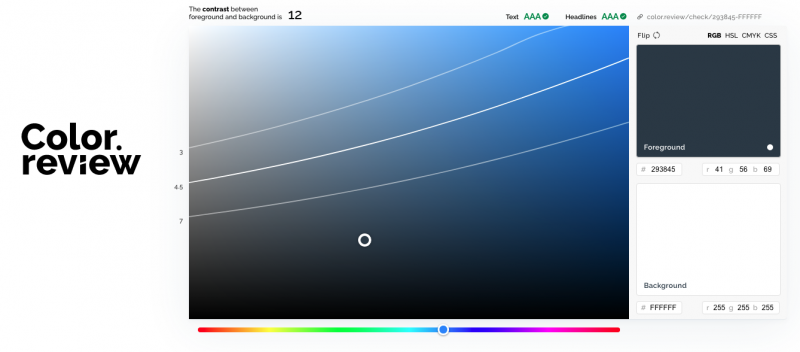
1. Color Toggle Screen
This is the biggest feature you see when opening Color.review. You will see a large color hex screen with a toggle bar underneath. Use this screen to adjust the shades until you find suitable foreground and background colors.
2. Foreground and Background Previews
Color.review’s interactive style means you can see the previews for foreground and background immediately when adjusting the colors. They are available as two smaller screens on the right, along with the hex codes.
3. Contrast Scores
Ideally, an accessible website with AA standard must have 4.5 contrast score for the regular text, and 3 for the large text or headline. Meanwhile, the stricter AAA standard requires 7 for regular text and 4.5 for the headline or large text. You can see the contrast scores on the left side of the large screen while adjusting the color toggle.
The other informational elements are placed around the screens in a clear but unobtrusive way. For example, the corner part of the large screen shows the contrast point based on the text size. The other part shows whether the simulated contrast is for AA or AAA standard website.
The best thing about the contrast point? When your color combination is not ideal, it will replace the words AA or AAA with “Fail”. Therefore, you know what to fix immediately.
Benefits of Using Color.review
Color.review is a streamlined, easy tool to design an accessible website. This is due to its web-based nature, which means you can forget downloading something into your software. Since the preview is real-time, you can use adjust and change functions easily during the period of building the website.
Once your contrast score shows the right numbers, you can just copy the hex code and other information featured on the screens. You can experiment with various basic palettes to find the right colors that are most accessible for your web design.
Conclusion
Color.review helps web designers create websites with the right visibility for the color blind. With real-time preview screens and simple adjustment toggle, this web-based tool encourages more designers to design accessible websites for everyone. Use Color.review to simulate the best color combo and contrast points before choosing your palette.