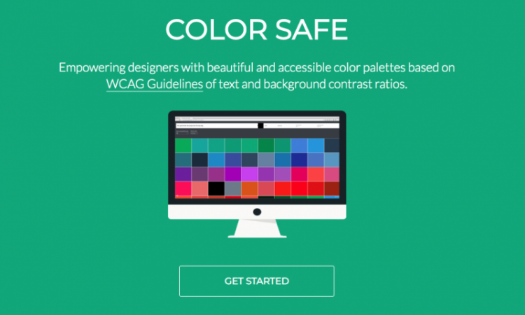
Building accessible websites requires combining certain colors to create the right palettes. Color Safe is a tool that helps you create an accessible color combination based on your original palette. Convenient and quick, this tool immediately presents web designers with several suggestions to cater for the color blind.
What is Color Safe?
Color Safe is a web generator designed by product designer Adrian Rapp and Salesforce UX engineer Donielle Berg. They designed the tool as an easy way for web designers to create an accessible website. Designers can open the tool on their browsers and use it without downloading anything.
When designers open Color Safe page, they will immediately be greeted by boxes to enter details of their design elements. Afterward, they can calculate the accessibility level with just one click of a button. There are no embellishments or other useless details, making Color Safe easy to use.
Main Features
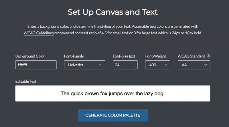
Color Safe page has a short description of accessibility standard and a link to Web Content Accessibility Guides 2.0 page for references (updated regularly). Underneath, web designers will see a row of boxes where they can input design categories for calculation purposes. The categories consist of:
1. Background Color
Designers can type in the hex color code or use the color picker box that automatically appears when they click in the box.
2. Font Family
This section comes with a dropdown menu that consists of standard fonts.
3. Font-Size
Designers can type the font-size numbers manually.
4. Font-Weight
Describing the thickness level of the font. Designers can choose from series of dropdown menu options.
5. WCAG Standard
Available options for this category are AA and AAA. General websites must have at least AA standard, but government websites and various companies or organizations often demand AAA standard.
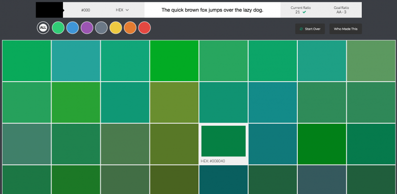
Designers can put the line they want to test by typing in the Editable Text box underneath the previous categories. Afterward, choose the Generate Color Palette to create several accessible palette examples based on the original info. The resulting palette options are grouped into various color schemes, so you can choose one that fits your aesthetic.
Why Using Color Safe?
Color Safe is especially useful when providers like WordPress have started to impose stricter coding standards regarding accessibility factors since the mid-2010s. Designers must conform to various new standards when creating webpages, templates, plugins, and themes, especially regarding readability.
What does the new standard look like? One of them is related to contrast. According to Web Content Accessibility Guides 2.0, the minimum contrast ratio must be 3 for large text and 4.5 for the smaller one. This does not include choosing the right color palette. Using Color Safe makes it easier to determine the ideal contrast and palette.
By using Color Safe, you can find various palette alternatives that conform to accessibility standards. Simply click on each resulting color square to choose the most ideal one. You can also use the Start Over button to calculate different design elements.
Conclusion
Following the accessibility standard is mandatory for web designers. Color Safe is a simple tool that streamlines web designers’ works by reducing the guess works. With simple calculation steps, you can find the right palette and immediately adjust the webpage you are working on.