Web designers who already have a color palette in mind often experience difficulties adjusting it for a more accessible website. Guess works and inaccuracy are common when determining the best color contrast for accessibility. Luckily, simple tools like Colorable fix your trouble in real time. This straightforward helps you to change the palette with toggling actions.
What Is Colorable?
Colorable is a “contrast tester” tool developed for helping web designers follow the Web Content Accessibility Guide. This web-based tool uses toggle actions to adjust the color contrast until you find the right one.
Colorable was designed based on the newest version of Web Content Accessibility Guidelines (Version 2.0), especially point 1.4 about Distinguishable elements. Based on this guideline point, web designers must make sure that the contrast meets the minimum requirements for all types of visibility.
What if the contrast requirement is not followed? Website visitors, especially those with color blindness, will have trouble in distinguishing texts and lines. They may see blurred lines or unclear texts, reducing the web surfing experience. Colorable is a tool that web designers can use to reach this standard contrast level.
Main Features
Colorable consists of two columns of toggle actions, which regulate different parts of the website related to contrast. They are:
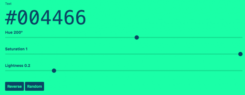
1. Text
This column deals with the foreground text. There are three parts of the text that you can adjust with toggle actions: the hue, saturation, and lightness.
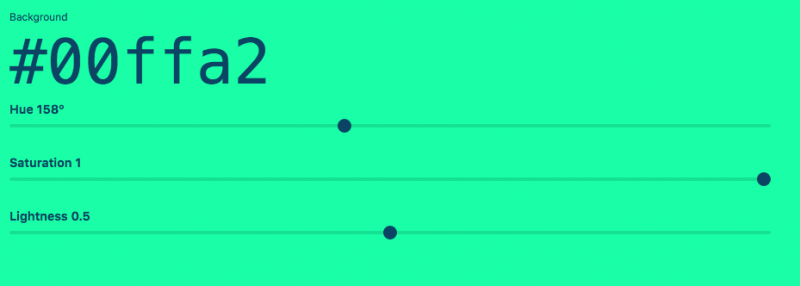
2. Background
This column deals with the background color, in contrast with the text. It also has three toggle bars for hue, saturation, and lightness.
3. Reverse and Random Buttons
Two smaller buttons for “Reverse” and “Random” are available under the toggle bars. You can choose them to immediately get other alternatives if the resulting combinations are unsatisfactory.
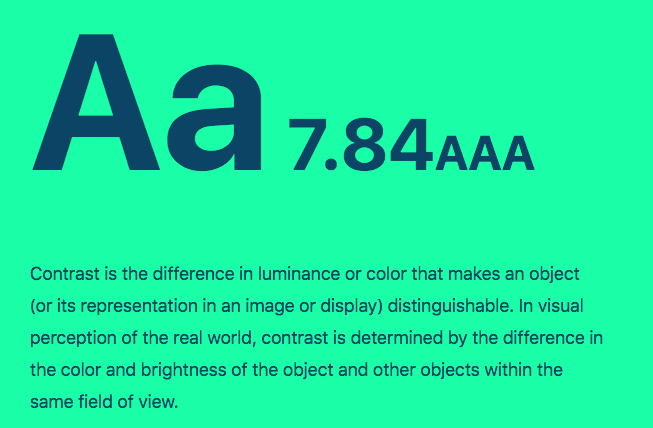
4. Contrast Score
The contrast score is available in a large typeface above the toggle bars. You can pick between AA and AAA standards; the latter is stricter and more common for government or institution websites than the former.
When you drag the toggle bars to the left or right, you will see the change on the webpage. The real-time function makes it easier for designers to adjust until they find the right combination based on the existing palette.
Why Should You Use Colorable?
Adjusting contrast and color combination can be hard if you already pick the palette for the website. Colorable helps you changing or finding a new palette based on the existing one. All you need to do is dragging the toggle bar to create several new combinations and choose the most suitable ones.If you want to choose different color combinations, you don’t need to start over. The Reverse button will change the resulting combinations into options that are completely different. Meanwhile, the Random button gives you other alternatives that are still compliant to the accessibility guideline.
Conclusion
Colorable is a light, simple, no-fuss tool to adjust color and create the right contrast for a more accessible website. It finds color combinations based on an existing palette, making your work easier. Try Colorable to find the most accessible contrasts and color combinations based on your projects and make the websites more accessible for everyone.