In the design systems, the choice of colors plays an essential role in representing the brand identity, theme, feedback, as well as interactive affordances. Therefore, selecting color combinations for a particular design should be done with great attention. You have to be able to adjust different, yet well-balanced colors for text, border, background, and interactive state while complying with the color accessibility standards at the same time.
This is when a color accessibility web tool, namely EightShapes Contrast Grid, comes in handy. It offers a set of comprehensive features to help you deal with your design’s contrast color and assess its level of accessibility.
What is EightShapes Contrast Grid?
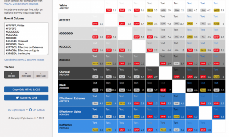
Developed by EightShapes Design Systems, Contrast Grid is an online checking tool that provides an insight into contrast accessibility for web and digital products. Through its features and real-time presentation of color graph, this tool will help you foresee how the choice of color combination for your design will look like on its application.
Contrast Grid can visualize various combinations of text and background colors while giving you a grading score of color accessibility based on the minimum contrast requirements of the Web Content Accessibility Guidelines (WCAG) 2.0.
This useful web tool also allows you to experiment with those color combos by adjusting the color degree or discarding shades. That way, you can test the combination of foreground and background colors as many as you like to find the one that mostly complies with the WCAG standards of minimum contrast.
How to Use It
The features of Contrast Grid are quite clear and easy to use. All you have to do is input the colors’ names or HEX values into the Rows and Columns box on the left side of the tool. You can choose to use the same values for both background (rows) and text (columns), or use distinct options by entering the values separately on each box.
One thing to note when entering the HEX values is that you have to enter only one color per line. Alternatively, you can input optional color labels in addition to their values by separating them with a comma.
As soon as your input is done, your choice of colors will be automatically displayed on the grid. You can see different combinations of text and background colors along with their WCAG accessibility grades and contrast ratio.
Do pay attention to the highlighted grades. Most of the time, the grid will show the following grades:
- AA and AAA Grade in gray highlight, meaning that the color combination meets the WCAG standard of minimum contrast with a ratio ranging between 4.5:1 and 7:1. You can safely use the color combos with this grade on your websites, apps, or other digital products.
- AA18 Grade in yellow highlight, indicating that the color combination barely passes the standard, as long as you use it with large texts. The ratio of this grade usually falls between 3:1 and 4:1.
- DNP in red highlight, stands for Does Not Pass. It means that the color combination does not comply with the WCAG standards because its contrast ratio falls below 3:1. Color combinations with this grade should not be used for your website.
In addition to those main features, Contrast Grid provides a tile size option to adjust the size of your text. You can also copy the Grid HTML/CSS into web-based documents and share it with other collaborators.