Many web designers use Mac as their main operating systems, so finding compatible tools is important. It also applies when designers are creating accessible websites for people with various types of color blindness. Contrast is one of the newest accessibility tools designed for web designers who use Mac.
Contrast and Accessibility Guidelines
Currently, all web designers are expected to follow standards in Web Content Accessibility Guidelines (WCAG) V. 02, which covers website users with various sight conditions. Colorblind people need to access a website with specific contrast scores. There are four categories of color contrast scores described in WCAG, which are:
1. Fail
“Fail” refers to a website that has a contrast score below 3.0. It does not have enough contrast between the foreground and background, which causes problems such as blurred lines and illegible texts for the colorblind.
2. AA Large
“AA Large” refers to the minimum contrast score for typeface 18 and larger, usually for titles and headlines. The minimum score is 3.0.
3. AA
“AA” is a standard contrast score for regular texts in general. The minimum score must be 4.5.
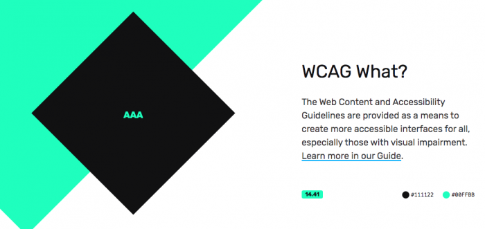
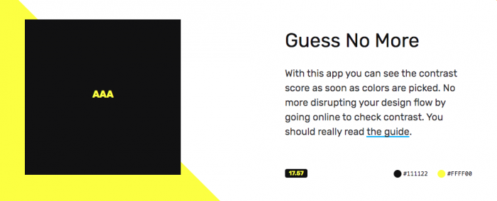
4. AAA
“AAA” applies for super enhanced contrast, usually in websites for governments, large institutions, and some companies. The minimum score must be 7.0.
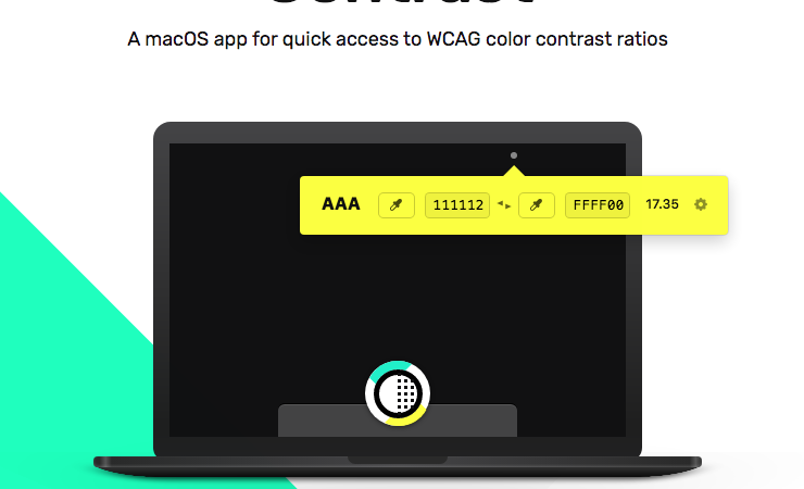
If you use Mac as the operating system for designing the websites, Contrast is the right tool to conform to these accessibility guidelines.
Main Features
Contrast is available to download at Mac App Store, and you can immediately get access to contrast ration information on the screen. The app provides contrast score simulation when you drag it around the screen. It consists of several simple but useful features, such as:
1. Drag Option
Contrast app is available as an icon in the menu bar, but you can drag it around the screen to check on different parts of the website. Use the cursor to move it around.
2. Brightness Input
Brightness input allows designers to change the brightness value, creating a website that is easier to discern by people with color blindness. You can use Up and Down arrow buttons for each input to create a manual brightness level.
3. Hex Code Adjustment
The tool can instantly find the most ideal color combination and contrast. However, you can adjust it manually by using Up and Down arrow buttons.
Aside from the preview, you will see the contrast scores when adjusting the color schemes and brightness. Make sure to fulfill the minimum requirement of contrast score by referring to these numbers.
Why Using Contrast?
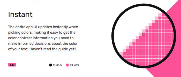
Contrast for Mac allows web designers to quickly adjust color and contrast schemes when working on their projects. The app is small and non-intrusive, and you can drag it around whenever necessary. Adjustment is quick and simple, and you can immediately see the results on the webpage, along with the contrast score.
Accessible websites bring advantages for any companies, businesses, institutions, or individuals that own them. They reach more visitors and increase traffic, and they get more leads, inquiries, or profits. You can even use Contrast with Photoshop, Figma, XD, and Sketch, making your work easier.
Accessibility has become the gold standard in modern web designing world. Download Contrast as a contrast correction tool for your Mac system, and improve the accessibility level of your website in real time.