Every professional must learn and master everything related to their job. Designers should learn about designer tools and skills. Nowadays, UI/UX design is one of the most wanted jobs because of start-up emergence, which usually offers products and has a website that requires beautiful design. So, designers have more chances to have a job.
Which designer tools and skills should you master before a real job?
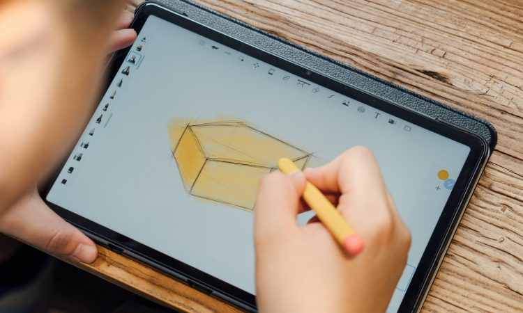
Early-Stage Sketching
When we were kids, we usually drew anything on the surface, including walls, floors, beds, etc. We were doing the basics of designing. It is called sketching.
With technology development, is sketching on paper necessary? The answer to the question is yes. Why? Because writing and drawing with a mouse and pen are quite different.
Imagine you are taking notes by typing or writing them. It is easier to memorize by writing rather than typing. In other words, even a pencil and paper can still be called designer tools.
Moreover, the mouse and keyboard are rigid compared to paper and pencil. With the pencil, you also train your pure drawing skill. On the other hand, you don’t need to deal with the program’s difficulty and train to master it.
Before going to the digital platform, drawing your sketch with your pen on paper is better. It usually spawns creativity, and you will feel drawn to it.
A good designer wants to learn more and can master the digital and analog ways of designing. Either by paper or computer, they will still make a brilliant design.
By mastering analog and digital design, you have a bigger chance of being recruited by a big company because mastering two design skills and tools is proof of your worth.
To put it simply, the more skillset you have, the bigger your chance that you will be hired for a job.
Design Program
As we mentioned before, a good designer should master designer tools, either analog or digital, even both of them.
There are many design tools that you should learn, but it is better to become a specialist in a bit of the program rather than become a jack of all trades. Figma may be one of the basic tools that you should learn.
Don’t be hasty and take a slow step but be consistent. No one masters everything only in one day (unless the person is gifted). Learn from your mentor or by yourself. You can study it in the manual book on the program’s website or by watching tutorials on YouTube. After you learn the designer tools/programs, you will know which program is the most suitable for you.
Nowadays, everything goes digital, so you must understand vector and pixel. The effect of the pixel can strengthen your design, so you must study it well.
Here are some of the designer tools/programs that you can learn:
- Paint
- CorelDraw
- Adobe Photoshop
- Figma
Paint and CorelDraw are designer tools usually taught in school, while Adobe Photoshop and Figma are self-taught and used more in professional design.
Tuneful Typography
Not only a writer that is fond of text but also a designer. In this world, many designers are specialized in typography. If the writer knows how to play with words, the designer knows how to make an artistic font.
Typography affects the meaning behind the text. For example, if you use caps lock in text, everyone may think that you are in anger and shouldn’t be approached. The bolded text means the text is important/highlighted.
Don’t worry. You don’t need to understand all the typography but must know the meaning or reason behind the font. Each font has a different meaning, so if you work in marketing or PR, you can use typography to tell the readers what you imply.
Choosing the best type of font is the main duty that needs to be worked on as a designer. The font’s boldness, size, model, height, and texture will determine its psychological meaning. Knows your target market/reader, and you will find the best typography for them.
If you are interested in learning typography, you must think with type. It covers all the basic to the high-level principle of typography with ideas on grid structure and the content’s positioning.
Color Matching
The designer tools you will use contain color schemes that are important for every product, logo, and package.
A drawing without color is dull and only suitable for the formal occasion in which everything needs to be in serious mode or during a sad event like a tragedy (black and white).
Since you are a designer, you should know how to organize colors within the design, but this isn’t an easy task. You need to learn and gain experience in organizing colors. More experience means you will have a ton of ideas to do a color matching/scheme.
Choosing the best color for products, words, etc., is one of the main jobs of the designer. Color makes the product aesthetic, not only having a practical value.
Even though at first, when you are a newbie in design, color isn’t the first subject you will study. It would be best if you studied design basics before learning about color specialization.
Composition of The Design
The design has a strong bond with content, so the composition is an essential part to be learned by the designer. For example, the composition of text and illustration must be balanced according to the brand voice and target audience.
The composition of the design can be learned by benchmarking or looking at a great designer, but there are benefits if you learn about the design’s composition and how it works.
Like words, design is meant to deliver a message, tone of voice, or even a certain mood. For instance, the emotion of black color is different from light color, and so is the font type.
The composition of the design is what you see as a whole in the design. It considers everything in the communication aspect, such as relationships, balance, and rhythm. In other words, the composition has a connection with the user experience.
If you build a landing page or sales page, the composition of the design will determine whether the customer journey will be great or destroyed (high bounce rate and engagement).
A great composition will make a great customer journey, thus increasing leads and closing.
Here are examples of the composition of the design.
1. Single Visual
Have you ever visited a website with only a large photograph in it? That is an example of a single visual. Furthermore, a single visual composition usually has a large portion of white space and simple typography.
Even though a single visual might be the simplest composition, don’t underestimate its impact. A 10% conversion rate landing page has a simple design that is better than a colorful page but only gives a 3% conversion rate.
2. Z Layout
The Z of the Z layout represents the eye movement of the reader of the design. Usually, the Z layout is implemented in the news website.
The news website contains an image, a title related to the story/read more, and it’s content. So, the eye movement will usually be from the top left to right, then down diagonally, and lastly, go across.
Why is the Z layout important? It is because you can think where is the best place the design to improve user experience.
Don’t just use the theorem. Keep going on research to get the best result of Z layout.
3. Rule of Thirds
Does the rule of thirds mean in a sequence of the image, the number three is the most important? The answer is no.
The rule of thirds is a principle that is usually used in photography. The image should be split into nine equal parts that align with each other. The rule is great to give the best proportion and layout in your design.
Even though the balance is not an obligation in designer tools and skills, the rule of thirds offers a balance in your design. Furthermore, a single visual can be synced with this type of composition.
4. Golden Ratio
Are you going to design major because you hate math? Surprise! The golden ratio is one of the composition’s designs and uses math as its basis.
The golden ratio is one of math’s miracles in which a lot of elements in nature have a correspondence with the number (1,618).
Because the golden ratio can be found often, it becomes more recognizable. Thus, you can use the golden ratio in your design to create a harmonious landing page.
For the implementation example, if you have a 1000px area, divide it by 1,618. The answer is 618px. You should use that amount for the main content.
The second calculation uses the number above (618px). Therefore, the sidebar or aside is 1000px-618px=382px.
Master The Designer Tools and Skills to Have a Better Chance!
Nowadays, the world is full of competition, and designers have the fiercest battle to have a client or job, so mastering designer tools and skills is essential.
Learn the designer tools and skills to have a bigger chance of being recruited. The more versatile you are, the greater your value.
Lastly, the designer will have many opportunities in the internet era, so don’t worry about fewer job openings and focus on learning designer tools and skills. The designer will always be needed.