Creating beautiful design requires more than just inspiration or a fantastic concept; it also requires a grasp of the subject’s basics. Although it is easy to spend years studying the subtleties of design and the many different perspectives on how to be good at it, there are a handful, or two, of basic elements of design that any designer should be aware of before embarking on any project.
These are the building pieces you’ll need to put together your design. Furthermore, these principles are key notions that can aid in the organization of the basic structural components of a page.
In this section, we’ll look at seven of the most fundamental design aspects that may help you enhance your ability to communicate through design.
What are the Basic Elements of Design?
The number of design components has long been a source of contention. Nonetheless, all of these are required for you to assemble components visually. Each element is an important aspect of a visual statement, and their combination influences how the design is viewed. Depending on what you want to create, you may utilize these components alone or in combination.
Here are the basic elements of design:
- Line
- Color
- Shape
- Form
- Value
- Space
- Texture
- Scale
- Balance
- Unity
- Type
Good knowledge of these ideas allows you to comprehend your design components and those you come across. You’ll be able to deconstruct a design component and discover what goes on behind the scenes. As a result, let’s take a deeper look at each component to know better how they function and how to use them.
The Basic Elements of Design
Form
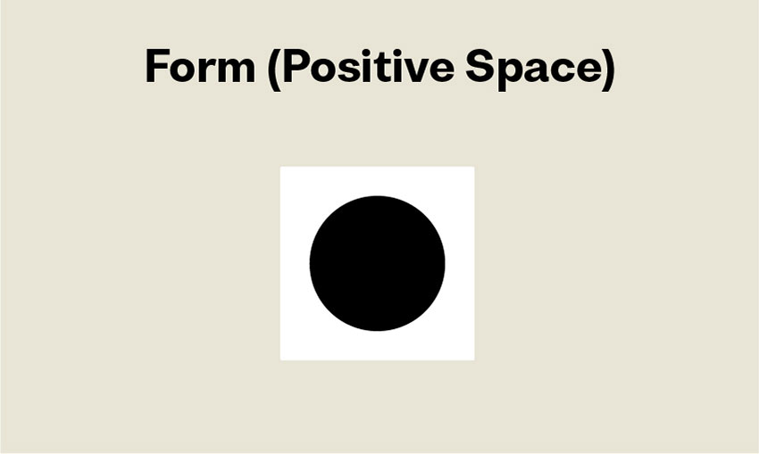
The form is the positive element on a page, whereas space is the negative element. When placed on a page, a dot, line, or shape is a form. Unfortunately, the terms form and shape are sometimes used interchangeably. A form might be three-dimensional or two-dimensional. Many people assume that form is a three-dimensional shape, while the right phrase is volume.
Form and form are inextricably linked because changing one affects the other. The spatial connection between form and space may provide tension to your design while also adding 3D characteristics. Form and space will give the design a lot of visual movement, which will help keep visitors interested. You may add shadows, stack several pieces, or experiment with color to create a 3D effect in your design.
Value
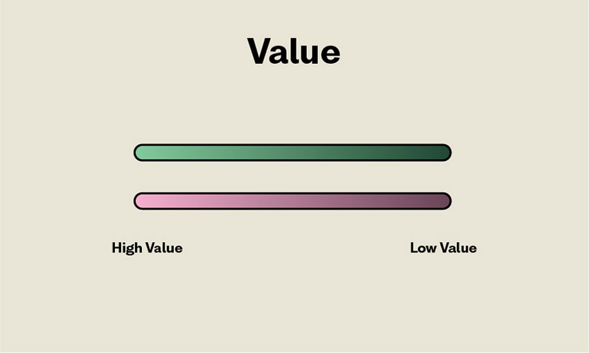
The degree of brightness and darkness of a given color is referred to as its value. Because it is closer to white, yellow has a greater value than purple. On a page, value changes generate contrast. Because the black material contrasts with the white background, you can read it.
In photography, value is also essential. You’ll note that high-value photos are light and airy, whereas dark-value images are weighty and dramatic. The spatial connection between components is also defined by value. If the color values between the elements and space are too near, the design will appear flat. If there is a lot of contrast, the shape will stand out even more.
Space
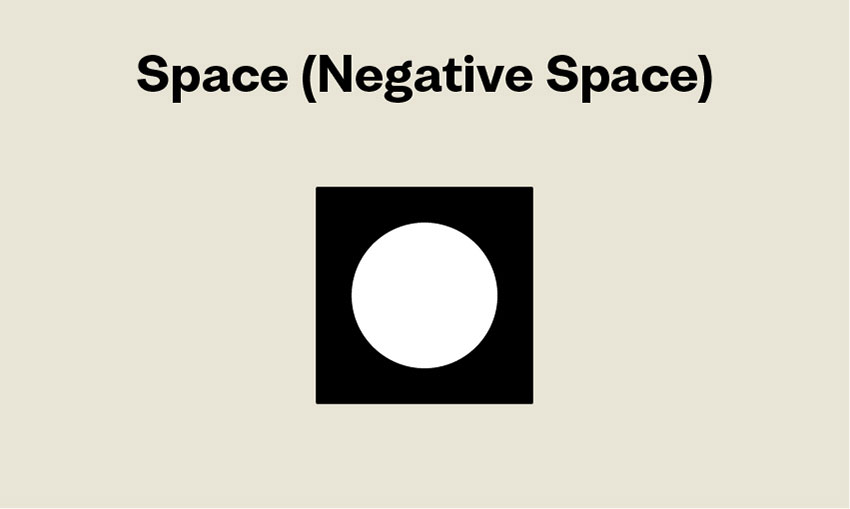
The region surrounding a shape is referred to as space; it produces a form inside the space. Consider it in terms of music: space is the quiet between the notes of a song. If all of the notes were played at the same time, the result would be cacophony.
The negative space in a design piece is the region that is not filled by any elements. In essence, what you can see is the backdrop color. A layout with a lot of negative space, for example, creates an open and light background. A crowded design might come from a lack of negative space. A layout requires room to create a level of clarity within the design. Negative space is an extremely crucial factor to consider while developing a work.
Texture
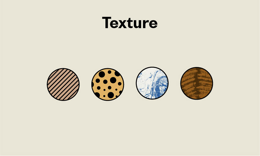
The feel of a surface is defined by its texture, which might be hairy, smooth, rough, soft, sticky, or shiny. Most graphic designers must visually express texture by employing illusions to simulate how their work would feel if visitors could touch it. The texture is a crucial aspect in making designs seem polished and refined.
The purpose of texture is to impart depth to a two-dimensional surface. Texture can be applied graphically in patterns, which can be either digitally produced or images that resemble the desired pattern. Highly texturized patterns, on the other hand, can visually communicate the sensation. Textures may also be physical—for example; laser cutters allow you to build several forms to increase the intensity of a tactile reaction.
Distinct textures emit alternative vibrations; if you deal with physical forms, consider different materials. Consider utilizing soft textures, such as felt, for children’s books. If you enjoy photography, you may learn how to incorporate photos into your backdrop. Change the color saturation and transparency levels in your photo to see how it impacts the atmosphere of your design.
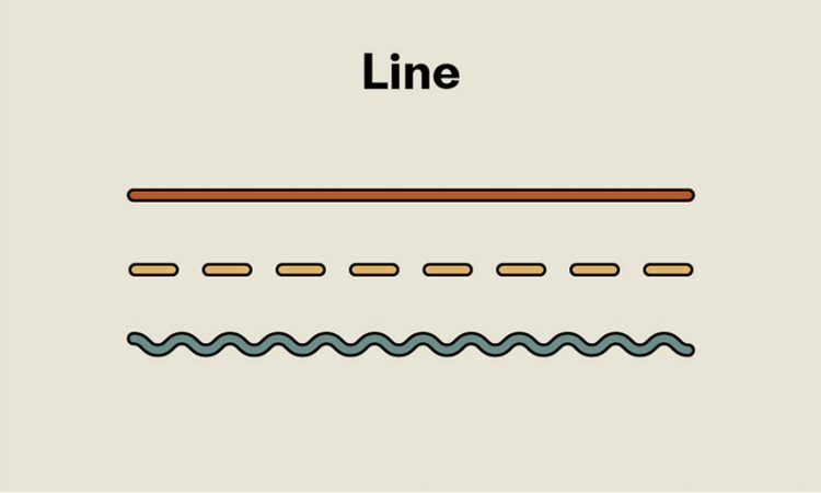
Line
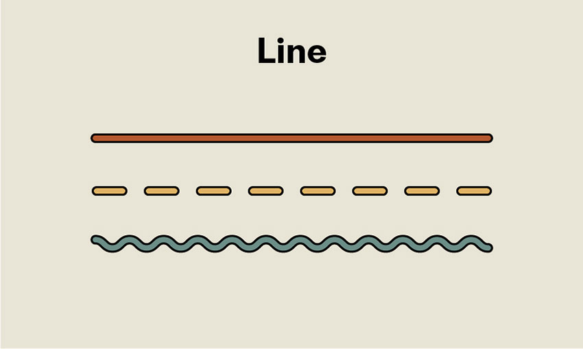
Lines are the most fundamental design components. They come in a variety of forms, thicknesses, and colors. Grids will begin to appear all around you as you begin to notice them. Lines have direction; they can be visible or invisible, and they can assist guide the eye to a certain location. The thickness of a line can also convey information. Bold and thick lines can catch the eye, whilst tiny lines do the reverse.
Consider the kind of lines you encounter in your daily life and the signals they communicate to you. Depending on their context, heavier black lines might indicate highlight a threat or stability. Lines scribbled might convey enthusiasm, perplexity, or disorder. Wavy lines convey fragility, grace, or doubt, whereas zigzagged lines might convey fury or energy.
Color
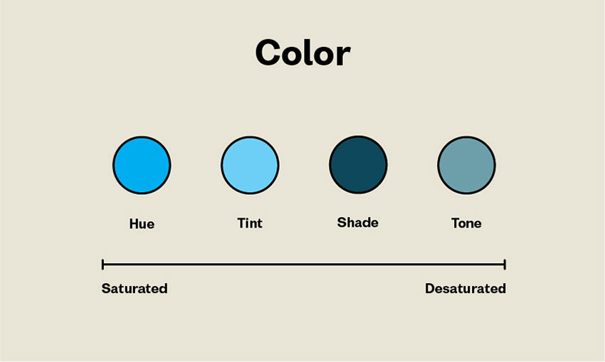
Color may be an effective technique for eliciting an emotional reaction from your audience or conveying a mood. Color wheel and the color theory are useful tools for graphic designers who want to use a single color or harmoniously blend many colors—or purposefully discordant.
Color can be divided into three main categories:
Primary Colors
Primary colors are the primary pigment colors from which all other colors are created. There is no method to get yellow, red, or blue by combining other colors. However, when you mix them, you get a wide range of colors.
Secondary Colors
Secondary colors are created by combining two main colors: yellow and red create orange, red and blue create purple, and blue and yellow create green.
Tertiary Colors
Tertiary colors are the six hues produced by combining a primary and a secondary color.
Understanding three types of color aren’t enough when you want to be a professional in this field. You must know how to create a color that is harmonious with each other. Here’s a guide to starting understanding color harmony.
Complementary Color
On the color wheel, complementary colors are located directly opposite from one another. They are very contrasted and, depending on how they are utilized, can communicate vibrancy and vitality or be visually disturbing. The colors red and green are complimentary.
Square Color Scheme
Square color schemes use four colors to form the color wheel shape of a square. They also provide a variety of design results but should always be applied in a balanced manner.
Tetradic Color
Two complementary color sets are used in tetradic or rectangular color schemes. Tetradic schemes, since they employ four hues, provide designers with a plethora of options and consequences.
Split-Complementary Color
Split color schemes make use of a base color and two colors next to its complementary hue. They create excellent visual contrast without being startling, which is why they are so popular among designers.
Analogous Color Scheme
Colors that are adjacent to the color wheel are used in analogous color schemes. They are visually appealing and may provide harmony and serenity to a design. However, if applied poorly or without other contrasting components to invigorate them, they might appear boring.
Triad Color Scheme
Colors that are evenly distributed across the color wheel are used in triad color schemes. They are extremely vivid and require balance to be aesthetically appealing.
While you’re thinking about color schemes, you should also evaluate which tint and shade are acceptable for your project. Pastel hues might appear unconfident or soothing, but bright colors can express happiness and joy —or, in the wrong context, appear cheap. Darker colors imply professionalism and seriousness, but they may also come across as melancholy or dull if used incorrectly.
Additionally, there have been numerous research correlating colors and psychological responses, for example, red means anger and impulsiveness, blue means sorrow and calmness, or white means serenity. Picking the right color won’t only support your project aesthetically but also how the public perceives it.
Shape
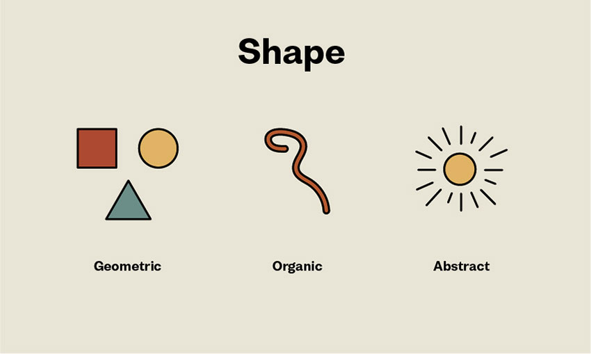
Shapes in graphic design are understood as forms or figures bounded by a border or outline. Every graphic designer should be familiar with two sorts of shapes: geometric and organic.
Geometric shapes can be three-dimensional or two-dimensional. They are generally abstract and simple and are made up of a series of dots connected by curved or straight lines. Triangles, pyramids, squares, and spheres are examples of geometric forms.
Organic forms, on the other hand, are considerably less regular, proportionate, and well-defined. They are either symmetrical or asymmetrical. They might be natural shapes like leaves and vines or abstract shapes like blobs.
Scale
Changing the size and scale of your objects, shapes, typography, and other components adds interest and emphasis. What would a symmetrical webpage with identically sized components seem like? Very boring.
However, the degree of variance will be significantly influenced by the content. Subtle distinctions favor professional material, but stark distinctions favor creative businesses.
Unity
Everyone has seen a design that appeared to merely slap components on a page with little concern for how they interacted with one another. Consider a newspaper that employs over 10 typefaces on a single page.
The term “unity” refers to how effectively the parts of a design interact with one another. In a design, visual elements should have obvious relationships with one another. Unity also ensures that concepts be presented clearly and consistently. Designs with good unity look more ordered, of greater quality, and have more authority than designs with weak unity.
Balance
Every design element—typography, colors, pictures, forms, patterns, and so on—has a visual weight. Some components are strong and grab attention, while others are lighter and less noticeable. The arrangement of these components on a page should give a sense of balance.
Balance may be classified into two types: symmetrical and asymmetrical. Symmetrical designs place equal-weight components on each side of an imaginary center line. Asymmetrical balance employs parts of varying weights, which are frequently arranged in reference to a line not centered within the overall design.
Type
Whether you’re choosing a typeface or creating your typography for a graphic design project, the type you use must be intelligible and relevant to the subject. Because type affects the overall tone of a design, think about whether your letters should be print or script, and if they should be rounded or sharp.
Your typeface’s weight is also a crucial aspect. Large or thick letters typically reflect the importance of the words they express. However, if you are not cautious, they might appear heavy-handed or disturb the equilibrium of a design.
Conclusion
Elements of design must be understood to produce a good design work. Not only that, but as a professional working designer, you must be able to articulate design components for client presentations and higher-ups. Training your eyes can help you improve your design sense and evolve as a designer.
Once you’ve mastered the fundamental components of design, it’s time to move on to the design principles. There, we’ll go through principles that can be applied to the elements of a design layout. These ideas are critical to having your design component operate properly.