Font choice has a major impact on readability. Moreover, when the content is weighty and lengthy, uh, wait to let the reader leave the page immediately by choosing unfitting fonts.
The aim of creating content is to deliver the information to the reader. Thus, you need to select the font wisely to give the target audience convenient reading and eventually receive the intended message of the content.
We have covered all you need to know about a brief overview of readability and legibility, factors that contribute to readability, the best tips to choose easy-to-read fonts, and lastly, the example of readable fonts for you.
Get to Know Readability Vs Legibility
The difference between readability and legibility may still be unfamiliar to some people. Shortly, legibility is the element of readability.
Readability is how the reader can move along the line easily, process what they read, and finally decipher the information. The choice of fonts greatly impacts how readable one text is.
Meanwhile, legibility is how the page layout is neatly arranged following the correct use of typography elements. Good typography will avoid suffering to see cramped spaces between lines or letters. It will encourage the reader to read until the last word.
Factors Affecting Readability

Some notable aspects contribute to how the understanding of the text:
Serif vs. Sans Serif
In this digital era, more people are switching their reading from printed text like books or newsletters to smartphones or PCs. It is stated in some studies that sans-serif typefaces offer higher readability on screens compared to serifs. Serif typefaces like Times New Roman are more suitable for printed text.
Nevertheless, researchers argue that even though sans-serif has a cleaner, more minimalistic, and screen-friendly look, it does not conclude that all serif fonts are less readable. Times New Roman is very much recognized and used widely. Other than the familiarity, this serif font family might be preferable for certain readers.
Hence, adjust the font to the medium where you want to share the content, whether on social media or printed posters. Test your font and see if there is any improvement needed. Remember, it is about your audience, so make sure to always pay attention to the elements of readability and legibility over insisting on the fonts that you prefer but not-easily-to-read.
Font Size and Weight
The font size, if it is too small, will discourage readers. It requires them to squint their eyes or zoom the screen, which is uncomfortable. Subsequently, bigger or bolder letters should only be placed at titles, headings, quotes, or other essential information. Other than that, use normal size for the body text.
Line Spacing
The spacing between lines, individual letters, and a range of letters should have an adequate distance. Consider the x-height (the distance between the text’s baseline and the tops of the lowercase characters in the body) in your typography design to make the text look tidy and not squeezed into one another.
Text Alignment
There are four types of alignment; left, center, right, and justified. Have you ever found and read a right-aligned text? Don’t you think it is counterintuitive with the normal text alignment and makes it harder for you to perceive the content of the text?
The most commonly used text alignment is left-aligned or left-aligned justified. It is used for body text. Then, for headings, you can use center-aligned.
Color Contrast
A striking and too-bright font color will not grab the reader’s attention. It will hurt the eyes and create inconvenient reading. The regular standard for color contrast is a black text color over a white background.
Hierarchy
Organizing the hierarchy adds contrast to the text. Hierarchy is important to differentiate the heading and the body paragraph. Without establishing the hierarchy, the text will appear dull and disorganized.
Tips for Choosing Easy-to-Read Fonts

Here are some ideas on how to choose readable fonts for your content:
Consider to Choose Simplicity
There is an abundance of fonts that can be found and applied to your writing nowadays. However, choosing the commonly used font is recommended for simplicity and familiarity.
Why does it matter? Because unfamiliar fonts will consist of foreign letters, readers have to stop moving along the line to ensure that they are reading it correctly.
When the fonts are familiar—Times New Roman, Calibri, Arial, it helps them to scan the text relatively quickly. Simple fonts are also better for lengthy text because adding extra ornaments in letters will reduce its aesthetic goal and leave the reader puzzled.
Avoid decorative or script fonts
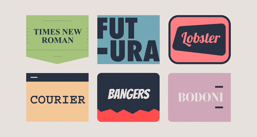
Decorative fonts are suitable to grab readers’ attention for their unique appearance. Yet, it applies to a small number of letters. When it uses too much, such as in a body paragraph, it will create confusion. Aside from the unfamiliarity; the font needs to be more appropriate and readable for long text. The font should be used only for decorative purposes.
Next, script fonts are a font drawn that resembles handwriting. It consists of two styles: formal and casual. Although it’s exciting to experiment with script fonts, longer blocks with small text using this style will tire the eyes. The reader has to stop and examine to make a better look constantly. Apply formal script font for letters such as an invitation for its elegant look.
Choose Fonts with Easy to Distinguish Letters
Consider whether the font has similarly shaped letters or numbers. This can be the reason to slow down the reading speed and how people receive the information.
Gill Sans is an example where some of the shapes of letters and numbers look similar. The uppercase “l”, the lowercase “i”, and the number “1”, in the font are hardly distinctive.
To avoid confusion, choosing fonts that the letters are easy to distinguish is suggested. For instance, Tahoma and Verdana.
Limit the Font Variation
Your font choice should be limited to three options for one text. It’s a common rule that 2 fonts are fairly enough; one extra font is fine to add the ornamental elements of the text.
More than 3 fonts will make it chaotic, less interesting, and unprofessional. Besides, the brain will develop the feeling of laziness upon seeing the text with many fonts, let alone trying to discern the content.
It’s important to note that it is better to avoid fonts that are too similar or too diverse from one another. It will fail to give the best visual you wish to deliver to the reader.
Choosing the same fonts from one family typeface can be considered since they are similar but have a variety of styles. It can create a harmonious and cohesive text.
Adequate Spacing Between Characters
Spacing between letters is prominent for readability. Accordingly, you have to choose a font with enough space between letters.
By default, some fonts may have less spacing and make them appear packed. Each font has a different width. It is better to avoid condensed fonts for large numbers of text. The reader will certainly not enjoy reading squeezed letters because it will make them dizzy.
On the other hand, when the spacing is too large, it is also inappropriate for legibility. Thus, organizing typography elements such as tracking (spacing between letters) is needed.
Balance the Legibility and Accessibility
After you have found some legible and readable fonts, consider the availability for major users. The element of legibility is not only that it is readable but also needs to be accessible.
Microsoft fonts such as Calibri, Cambria, and Times New Roman are easy-to-read and also accessible to many prospective audiences.
Examples of Easy-to-Read Fonts

As we have learned about the tips on choosing the right fonts that are readable. Here are 5 lists of accessible and easy-to-read fonts you can use for your content. The 5 fonts mentioned below are the most famous and widely used in the world. Especially because they are accessible to most users, another reason that makes them popular is the appearance of the fonts—simple with no extra decoration that is convenient for the eyes.
Arial
Arial is one of the well-known sans-serifs; it has open counters and natural strokes that make it look natural. This font has an open design and makes it appear great in web design even though it was created as a print font.
Calibri
Calibri is an easy-to-read font belonging to the modern sans-serif family. It is designed for Microsoft, and its proportions enable a strong effect in closely spaced lines of both large and small text. It offers a decent distinction between most characters despite having a modest x-height.
Verdana
Another sans-serif typeface, Verdana, has easy-to-distinguish characters, and open counters have become the reason for its popularity. It is designed by Microsoft for monitors; it will work just fine for digital documents and web pages.
Helvetica
Helvetica’s impassive and neutral style has attracted many designers to use it. This sans-serif typeface offers a tall x-height that makes it easier to read, even from afar. It’s available on the latest Windows version, Unix, and Mac.
Times New Roman
Times New Roman shows that the serif typeface is also readable. This typeface has become the default font for many web documents and printed ones. It’s often used in newspapers, documents, and books, as the thin, sharp serifs and the small x-height make good legibility.
Font choice not only creates a beautiful and well-organized text but also provides the intended reader with the information easily. There are six tips to guide you in choosing the easy-to-read font and the font examples that will engage more readers in the content. Test and refine your font and ask for feedback before spreading it to the public. It helps to point out what’s lacking, so you can deliver the best quality content to the reader!
