Typography is one of the most widely implemented techniques in design. It’s relatively simple yet contains a lot of potential when done right. Typography is so potent that even UI and UX designers often turn to this technique to improve their products. Part of the typography itself is choosing the right font for the product. However, how exactly can font choices in UX design impact the actual users’ experience?
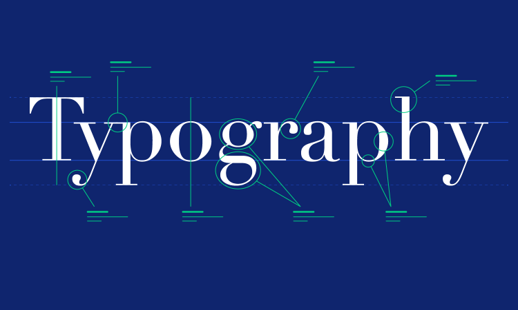
Okay, So What is Typography?

According to Encyclopedia Britannica, the term ‘typography’ means “the design, or selection, of letter forms to be organized into words and sentences to be disposed of in blocks of type as printing upon a page”. The art of typography is perhaps as old as human civilization itself. However, the history of modern typography dates back to the 15th century when the mechanical printing press was first invented.
Typography as a technique is closely related to the use of typefaces and fonts. To put it simply, a typeface is a visual design, while a font is a style of letters. Typography utilizes typefaces by implementing certain fonts to achieve a desired visual appeal in a design. More than one typeface and font may be implemented in a single design.
The goal of typography is to make written or printed text more legible, readable, and visually appealing. The aforementioned visual appeal is presented through the use of varying point sizes, line lengths, and spacing of a typeface. In modern settings, the use of colors may help typographers in their craft.
Typographical aesthetics are also aimed to affect viewers on an emotional level. Certain typefaces are often associated with certain feelings, so the use of a specific typeface in typography is meant to evoke that feeling in viewers. Key elements designers and typographers utilize to achieve this goal are leading (line spacing), kerning (letter spacing), alignment, layout, and font choice, as well as font size.
As a technique, there are fundamentals in typography that a designer or typographer must pay extra attention to. Five of the most important fundamentals in typography are:
-
Contrast
In short, the balance between two distinct characteristics. In typography, contrast refers to the balance between the darker and lighter colors on your page, usually between the font and the background. A good contrast will help in the overall readability of the text.
-
Visual Hierarchy
Visual hierarchy refers to the manner of stressing a specific part or information due to its importance of it. Mastering visual hierarchy means you know which information must be given first to the viewers. Ideally, you want the most important information to be delivered first.
-
Grids
The way you put each and every aspect of the design in relation to each other is crucial. Using grids to evenly distribute texts, graphics, and vectors across the canvas will help in the logic and visual harmony of the piece.
-
Font combinations
Having just one font will be boring. Font combination is great, as it can help your design feels more unique. However, combining too many fonts together will be too chaotic and crowded. Ideally, you don’t want to include more than three fonts in a single canvas. Anything beyond that will feel like a jumbled mess of barely legible texts.
-
No distortion
This last one is, quoting a certain fictional pirate, “more of a guideline”. Never, ever distort a font. Make sure you don’t—in any circumstances—stretch your fonts out of proportion. If it doesn’t fit, choose a different font instead. Or, if you’re brave enough and can’t find a perfect fit, you can always design your own font.
User Interface and User Experience

In today’s digital era, design principles are often implemented when developing both user interface and user experience. Both of these terms are closely related, but they are focused on different aspects of a product, in this case, websites, and mobile apps.
User Interface (UI)
User interface (UI) is focused on how the visual and interactive elements of a product are presented to users. The responsibility to design the desirable, attractive, and intuitive interface based on those elements falls into the hands of UI designers. These elements include—but are not limited to—buttons, menus, icons, and other on-screen elements users interact with.
User interfaces are not limited to what you see on the website or mobile application, though. Anything you use to interact with a product may be considered a user interface as well. Some examples of these kinds of UI include:
- Remote control,
- Computer mouse,
- VR headset,
- Steering wheel,
- Automobile pedal,
- Gamepad, etc.
In terms of web and mobile UI design, visual appeal alone is not enough. The interface is expected to help guide users through various actions within the product or service. The interactive and intuitive aspect users experience when using the product is the focus of our next topic, user experience (UX).
User Experience (UX)
As the name suggests, UX focuses more on the overall experience of users as they interact with the product or service. UX design includes the entire process starting from initial user research all the way to the actual use of the product. UX is closely related to UI, in which a great and effective UI would improve UX as well.
However, great UI doesn’t necessarily mean equally great UX and vice-versa. These are quite unlikely, but it does happen. There are reports of a product having terrible UX despite having an ideal UI. There are also reports of less-than-ideal UI that are still able to generate positive UX.
Ideally, UX designers must address all aspects of user interaction. While visually appealing UI is one of those aspects, UX designers must also consider other aspects, including how easy it is to navigate, how well it satisfies users, etc.
Font Choices in UX Design

We’ve learned that typography is a design technique utilizing fonts and typefaces. As such, UX designers have often implemented this tried-and-true technique in their products. In fact, it’s one of the most important aspects of UX design, considering the majority of online information is in text form, including this article.
As such, it is important that UX designers indulge themselves in the mastery of typographic wonders. Do note that typography goes beyond picking a font, though it is one of the early steps of improving UX with typography. It is also important to note that typefaces are divided into several categories.
Main Typefaces Categories
The main categories of typefaces are based on the overall look of the fonts themselves. These categories are:
1. Serif typefaces
A serif is a small stroke attached to the end of larger strokes of a letter. The actual shape of the serif itself varies across different individual fonts. Some fonts in this category are considered as ‘formal’ and sometimes even ‘antique’.
2. Sans Serif typefaces
It means “without serif” and refers to typefaces that don’t have that smaller stroke. The fonts in this category are widely regarded as more ‘modern’ and ‘refined’.
3. Decorative
The typefaces that fall in this category are mostly used for, you guessed it, decorative purposes. They usually have more elaborate designs and are not suitable for body copies due to their low legibility. However, they are excellent for shorter texts like headers or titles.
Choosing Fonts for UX Design
As typography is typically utilized to set a mood or evoke certain feelings in the viewers, UX designers need to have a clear vision of what they want users to experience when using the product. Font choices in UX design are directly related to that vision, so once you have a clear aim of what feeling, vibes, or message you want to convey, you can start choosing fonts.
While choosing fonts, some things you may want to consider are:
- Is the font easy to read, even at a smaller size?
- When using different font sizes, weights, and styles, how can it help guide users?
- Is the typographic style consistent across different parts of the web or app?
- Will the font hinder people with visual impairments?
- Is the font you’re choosing align with the brand identity?
Some tips we can offer when choosing a good font for your needs are:
1. Don’t conform to trends. If you want to distinguish yourself from the already crowded online medium, maybe don’t just blindly what everybody else is doing. Choose the ones that are the most aligned with your vision. This can also help build your own brand image and identity.
2. Narrow your typeface category. Remember, consistency is one of the keys to improving UX through typography. If you choose more than one font, make sure they still have similar feels to each other. Again, find the ones that are aligned with your brand image.
3. Limit your combination. Ideally, 2-3 different typefaces, one a single design. Any more than that will only make it appear inconsistent and hard to digest.
4. When on budget, go free. Some fonts are premium; some are free. Either way, if you or your team are on a tight budget, consider choosing fonts that are available for free. Most of the time, users will not notice the difference between paid and free fonts anyway, as long as it’s legible.
Bottomline
Typography is an old design technique that focuses on how texts are presented in a visually pleasing manner. The implementation of typography goes beyond printed media, as UI and UX design can also benefit from it. Subtle yet elaborate typographic techniques, when done right, will certainly improve UX in the long run. Font choices in UX designs are just the tip of the iceberg but also one of the most important steps.
Overall, font choices should be intentional and serve the needs of the user and the goals of the product or service. By selecting fonts that are legible, create hierarchy, are consistent, accessible, and align with the brand identity, designers can create a positive user experience that enhances usability and engagement.