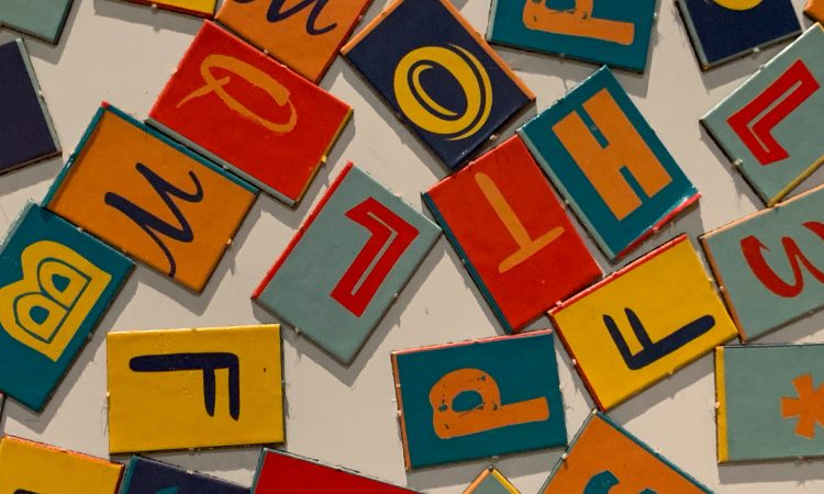
In a world of designs, branding, and advertising, style is as important as words. That is why typography or font families play a major role; the message itself sometimes cannot convey better than when it is made with style.
Just take a look at posters from horror movies. The movie titles are created with style to make them look creepier, more terrifying, and more frightening. Just imagine if the creepy style is applied to romantic films. The message received by the audiences will be far different.
Now you understand that fonts or typography matters a lot, right? However, picking the right fonts is not an easy job. Some of you may not know that there are over a half million types of fonts in existence. Choosing one or two fonts from over a half million? Yes, that’s going to be quite a job.
Luckily, you don’t have to jump into the never-ending fonts list. There are actually some font families that are most popular and have been used in many famous brandings or logos. Find out what are the most popular font families and what makes them special below.
Serif Fonts
This classic font never fails to create a sense of tradition and elegant. The strokes on the ends are what make the Serif font stands out. One of the most popular and most used Serif fonts is Times New Roman. In advertising, these are the five most popular Serif fonts:
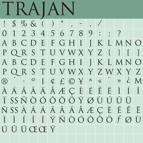
1. Trajan
This font was created by Carol Twombly for Adobe Originals typeface in 1989. Trajan has been used in many blockbuster movie posters, such as TITANIC, A Beautiful Mind, Sex and The City, and Hotel Rwanda.
Although the style is pretty standard with its straight lines, Trajan is an elegant and sleek font. Besides being used for movie posters, Trajan is also well-suited for books, magazines, and billboards.
2. Minion
The type designer of Minion is Robert Slimbach. Inspired by the old-style font of the late Renaissance, the first version of this typeface was made known in 1990. What makes Minion so popular are its high readable quality, extraordinary flexibility, and typographic control.
The full Minion Pro family, which was released in 2000, features two widths and three weights. Although Minion looks rather simple, the style evokes feelings of retro, elegance, and superior. Minion is a great font for book covers, classical music concert posters, and movies. Minion contains many ligatures, from regular to bold Italic subheads.
3. Copperplate
Copperplate was designed by Frederic W. Goudy and published by URW Type Foundry. This font is an edgier and more stylish version of Serif fonts. Copperplate is only available in capital letters. For that reason, Copperplate is rarely used for long text but mainly for headlines in the newspaper, logos, business cards, or ad headings.
Many restaurants, law firms, and banks use Copperplate on their offices’ glasses. Copperplate evokes feelings of power, strength, comfort, forcefulness, and confidence.
4. Mafins
Mafins was designed by Donis Miftahudin and published by Nathatype. Mafins is a combination of classic Serif fonts and bulky displays. The bulky display is beautified with thin lines and tiny hooks on each character, creating a more dramatic look.
What’s great about Mafins is it comes with many ligatures and are compliant to various size. So, you can use it for titles, subheadings, or long text. Mafins is well-suited for posters, logos, newspapers, magazines, printed products, social media, and more.
5. Monalisa
Monalisa is designed by Bluestype Studio. It offers a more stylish, modern, joyful, yet also unique and elegant look. Monalisa is often used for T-shirts, fashion brands, watermarks, magazines, wedding invitations, photography, and women’s brandings.
Monalisa offers various alternatives of uppercase and lowercase. But if you wish to keep it classic, simple, and gorgeous, you can always opt for the original style.
Sans Serif Fonts
Compared to Serif fonts, Sans Serif fonts look more edgy, modern, and clean, thanks to their simpler ends without strokes. Because these font families are so elegant, readable, and versatile, many popular brands use these fonts. Here are the six most popular Sans Serif Fonts:
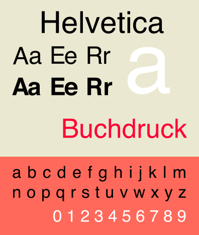
1. Helvetica
Helvetica was designed by Max Miedinger and Eduard Hoffmann in 1957. These Sans Serif font families have been used for many famous and popular brands’ logos, like BMW, TOYOTA, Harley-Davidson, Kawasaki, Panasonic, Lufthansa, and JCPenney.
The design is so simple and elegant. At the same time, it also raises a sense of power, stability, timelessness, reliability, and strong. For that reason, Helvetica works great even when you don’t put it together with images or striking colors. The striking style itself says, “Look at me!”
2. Univers
Univers was designed by Adrian Frutiger in 1957. It is famous for making any writing or ads very easy to read and giving the impression of steadiness. It also features a stripped-back look. Many recognized brands employ this font. Some are Western Union, eBay, UNICEF, FedEx, and SWISS.
Just like Helvetica, Univers is also timeless. There are still many famous brands that use the two fonts. Their simple look speaks loud for their brands. Univers font families come in 27 font styles.
3. Futura
Futura was designed by Paul Renner. It was first introduced by the Bauer Type Foundry in 1928 and repeatedly considered a great typeface evolution released from the Bauhaus movement’s Constructivist orientation in Germany. What makes Futura so characterized is its geometric shapes, particularly the circle.
Its round shape shouts modernized, sophisticated, relevant, and conceptual clarity at one time. It also speaks power and strength. Some famous brands that use Futura are Red Bull, IKEA, Gillette, Louis Vuitton, Supreme, and Calvin Klein.
4. VAG Rounded
VAG Rounded Font Family was designed by Volkswagen in 1979. This modern geometric Sans Serif features sharply rounded terminals with a friendly and stylish approach. The design, used as Volkswagen AG’s new corporate font, was released for public use in 1989. Eventually, many computer users use the VAG Rounded font.
Ever since then, VAG Rounded has been used for many brands, advertisements, logos, and other designs. The style is rather friendly and welcoming. VAG Rounded is great for food or beverage logos, automotive brandings, posters, banners, and invitations.
5. Calibri
Calibri was published by Microsoft Corporation and consisted of six styles and weights, namely regular, bold, light, italic, bold italic, and light italic. Calibri was designed by Luc de Groot and made public in 2007.
Since its release, this font has made a hit. This font is a modern Sans Serif family with narrow roundings on trunks and corners. Calibri looks great in different sizes, from small to big text. That is why you can create headings and sub-headings using this font.
6. Arial
Arial is part of Sans Serif font families that has become the most widely used style. This font was drawn by Robin Nicholas and Patricia Saunders in 1982. With a stick and sturdy, strong character, Arial gives a sense of contemporary, staple, clean, and simple.
Arial is so popular because of its clarity and legibility. Many printed media like advertising, magazines, and newspapers use Arial.
Slab Serifs
Slab Serifs are font families that assemble both Serif and Sans Serif but rather look more similar to Sans Serif. Below are the seven most popular Slab Serif fonts:
1. Egyptian Slate
Egyptian Slate was designed by Rod McDonald. Emphasizing their sturdy and block-like Serif, this font contains six styles and weights with complementary italics. Egyptian Slate evokes a sense of versatility, uniqueness, and superb.
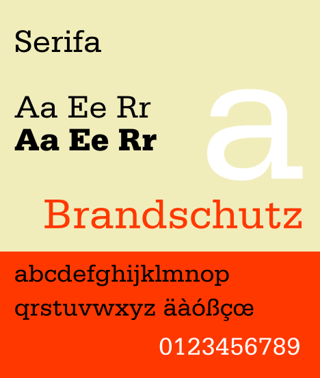
2. Serifa
Serifa was designed by Adrian Frutiger. This font is extraordinarily readable and robust. Serifa offers geometric linear forms and timeless impressions, making it suitable for various uses.
3. Glypha
Glypha was designed by Adrian Frutiger in 1977. After designing Serifa in the 1960s, Adrian came up with a condensed extension of the font. Compared to Serifa, Glypha offers a taller x-height and oval curves. Glypha is exceptionally great for magazines, catalogs, and advertisements.
4. Rockwell
Rockwell was designed by Monotype Studio and contained nine styles. This font has a large x-height, an open counter, and clean character shapes. Rockwell evokes senses of warmth, modern, resilient, and robust, making it a great choice for both printed and digital textual content. One notable example of Rockwell is the American fast food chain Arby’s.
5. ITC Lubalin Graph
ITC Lubalin Graph was designed by Edward Benguiat and Herb Lubalin in 1974. With its liberal x-height and overall tight fit, this geometric slab serif typeface is suitable for both short and long text. The main characteristic of ITC Lubalin Graph is its tight space.
6. Memphis
Memphis was designed in 1929 by Rudolf Wolf for the Stempel foundry. Memphis emerged as the early Egyptian revival font. Because of its geometric basis, Memphis is frequently considered a technical field typeface. It works best for giving a rational and purposeful impression.
7. Soho
Soho was designed by Sebastian Lester and became the latest addition to the increasing number of typefaces from him. This font consists of nine weights. Each weight offers condensed and compressed widths as well as classic lines and style. That is why Soho is versatile.
Conclusion
Fonts play a huge role in designs because specific fonts provide different moods and perceptions. By learning the most popular font families above, you will be able to make a better decision in creating a certain look and evoking a certain feeling or reaction. So, no matter what type of design you are working on, choosing the right font will give the best finishing touch.