What colors come to your mind when you are thinking about babies? How about macarons? I bet you must think of subtle colors, such as baby pink or pale blue. Yep, those colors are called pastel colors. This is the kind of color that will add a soft look to your design. Let’s talk about it further.
What are pastel colors?

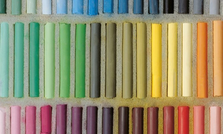
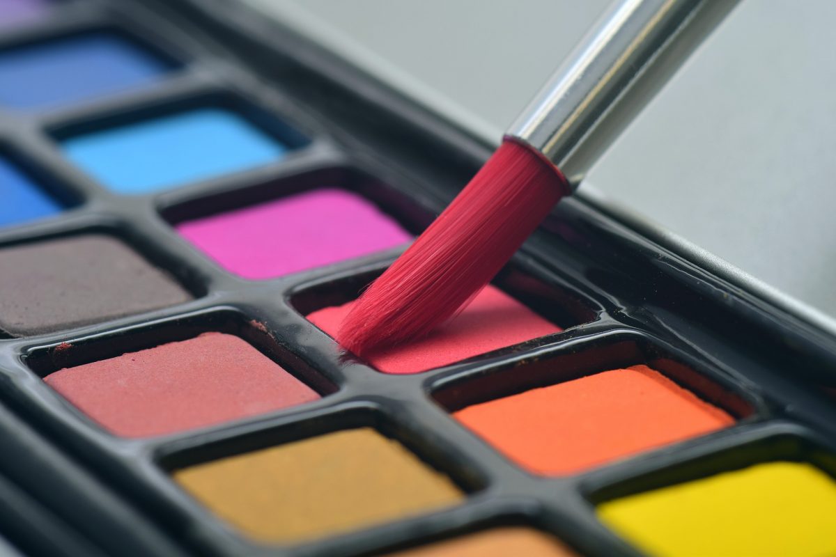
Pastel colors are a pale family of colors that are produced by adding white color to any solid colors. For example, if you add white color to red color, it will become pink color. Then, if you add more white color, it will become a baby pink color.
So, the amount of white color you add to a solid color will determine how light the color will be. Another example is mint color. The mint color is a pastel of green. The same thing also goes for peach color that comes from orange color.
What is the impression of pastel colors?

This kind of color primarily promotes calming and joyful vibe because they have a softer look than the solid kind of colors. This is important if you want to make a design that delivers the mentioned vibe.
Using only one color of pastel will create a soft look for your design. In contrast, if you combine several colors of pastel, or make it into a gradient look, your design will have a youthful and exciting look. It’s all about playing with colors!
Which kind of product goes well with pastel colors?
Overall, pastel colors are suitable for designs related to:
- baby products
- skincare products
- sweets products
- beauty products
Let’s break it down one by one.
Baby products
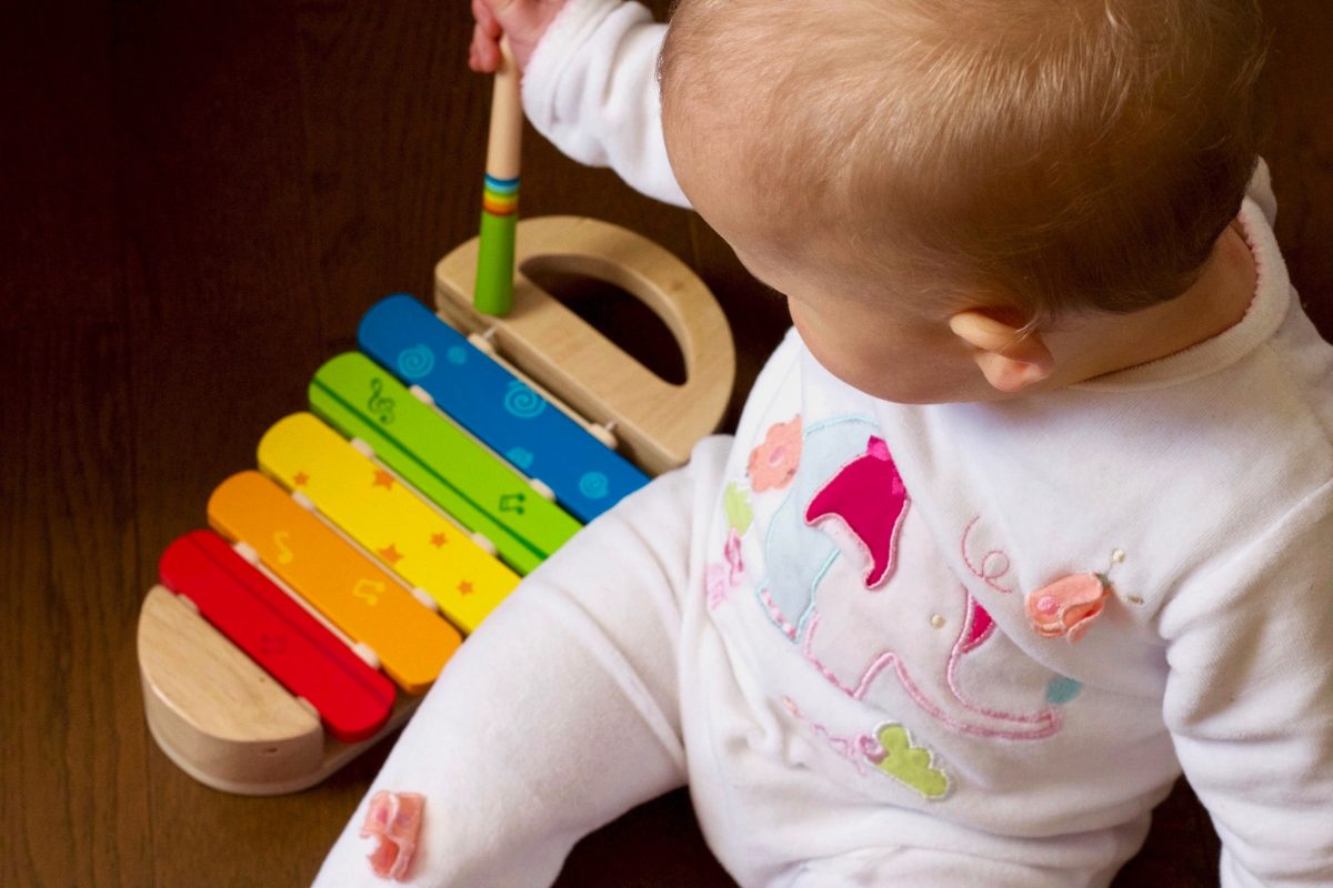
We can’t think about babies without thinking about pastels. Pastel colors promote calmness and purity. That’s why it is really suitable for designs related to baby products. The traditional assumption about blue belongs to baby boys, and pink belongs to baby girls may apply, but you can combine these two colors or choose other pastels to make your designs more general.
Skincare products
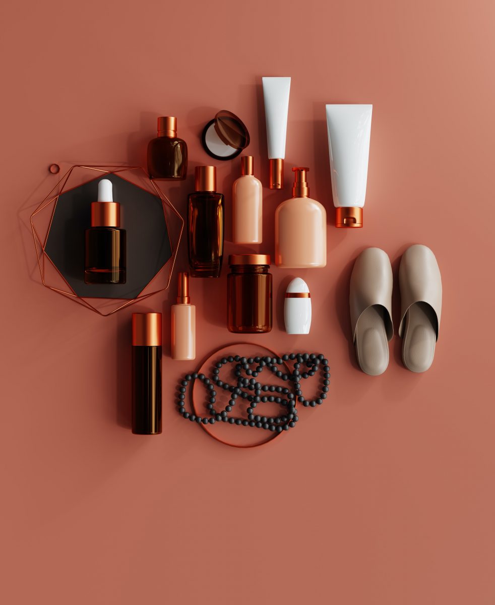
Skincare is a product that always keeps improving over time. Many skincare companies try to make their products different from others. Of course, it affects the design of the product. Skincare products that claim to use natural ingredients tend to use earthy colors, like pastel brown or green. Meanwhile, skincare products that target teenagers tend to use cheerful pastels, such as pink and blue.
It is a good move because it will be convenient for the buyers to eliminate the products they aren’t preferred. It is also beneficial for the company because it will help them to position their identity of the products to buyers.
Sweets products
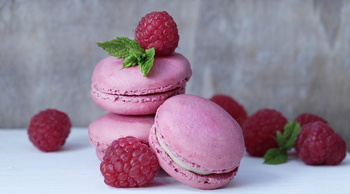
Have you seen a cupcake using solid colors? I don’t think so. Cupcakes and other sweet products are often associated with purity and happiness. This impression goes well with pastel colors. You can design the packaging or logo with pastels, such as pink or yellow, to add more vibe of happiness. Say no more; pastels are destined for sweets!
Beauty products
This kind of product has its own place in the industry. Beauty products always play with colors, including pastels. The use of pastels in the packaging can make a calming sense to the products. Tips! If you add silky looks to the packaging, it will create a luxurious impression.
Not only for packaging, but pastel colors can also be used for logos, cards, and posters because of their versatility. Every kind of color has its own purpose and place. It is important to use the right color for your design so it will have the ability to radiate the desired message you try to convey in your design.