The digital marketing profession is one of the most promising professions in today’s digital era. Almost every day, a digital marketer is demanded to spawn fresh ideas for the benefit of marketing campaigns that subsequently lead to brand awareness. Unfortunately, because this job runs in a fast-paced environment, it is not rare for the details of how the writing or typography looks in the copy to be neglected.
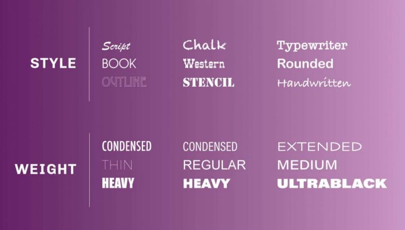
In fact, each typeface has a distinct appearance and feel that makes it render the ability to captivate attention, evoke emotion, and reinforce your brand message. Some typefaces are bolder, while others are thinner, bigger, or smaller. However, because there are hundreds of typefaces available, selecting the correct one for your venture might be challenging.
For this very reason, in this post, we will explain the simple steps on how to choose fonts for your marketing campaign. That is, without further ado, let’s dive into the strategies to find the right fonts to portray your overall organizational tone as part of a marketing and promotional strategy.
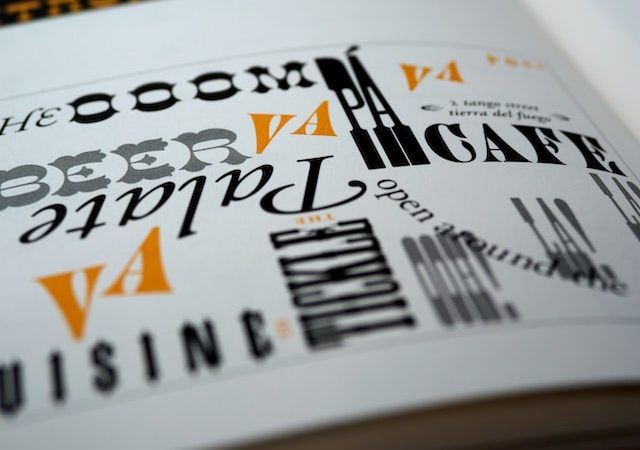
Speak the Voice of Your Brand – Match Your Brand
![]()
First and foremost, always keep the brand voice in mind. Is your brand fun or sleek or modern or something else? By always sticking to your core values, it will be easier for you to create suitable copy, either in accordance with the target market or the objectives of marketing.
Some designs are more perfectly suited to specific businesses. A flowing typeface would probably look better in a school dance than in a construction project. The nature of your company will dwindle down your font choices, making your job a lot easier.
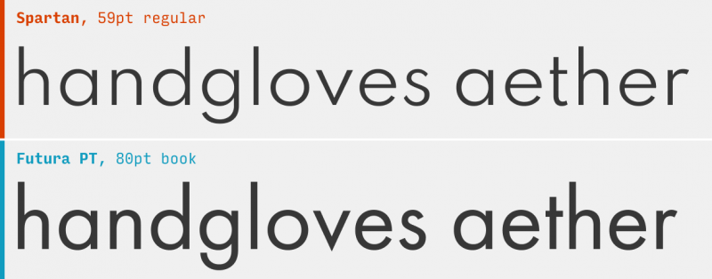
Learn and Find Inspiration from Others
Draw inspiration by window shopping at designer showcases. Visit online shops or marketplaces that provide a large range of fonts. By doing so, it will be a lot easier for you to find the perfect font for your project. Here are our top-rated typography resources:
- welovetypography.com
- creativerepository.com
- typophile.tumblr.com
- dribbble.com
These sites provide a selection of excellent typefaces for cards, flyers, billboards, and many more. They all have a highly professional aesthetic and a unique sophisticated tone. Skim through professionally produced marketing materials to learn what typefaces designers use.
Moreover, you could also look through the work of other designers to see which typographic qualities “fit” for your branding. It is not a mistake to look at the work of other creators for inspiration; even the most famous designers and artists get inspiration from one another.
Pick Font Subscription
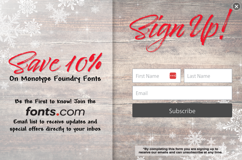
If you want to use your brand’s lettering continuously throughout the online platform, you must choose a font supply service. The most prevalent are Typekit, Google Fonts, and fonts.com. These subscription-based services grant you entree to gigantic font libraries, supply fonts to your web properties, and guarantee that fonts display smoothly in every internet browser and gadget.
Once you’ve settled on a font delivery source, you can start pinning down your option of viable fonts from their catalog. Most of these sites offer simple ways to filter fonts based on typographic qualities, compare fonts side by side, and store your preferred fonts for future analysis.
Compare Fonts Beside One Another
Create a menu card that compares all of the alternatives once you’ve narrowed your selections down to a limited list of probable font combinations. Having all of your options side by side (on display and on paper) will help you compare one combination to another and focus on the perfect typeface for your business.
Proceeding through the font selection process in black and white enables you to concentrate the decision on the font’s features rather than being misled by how color influences the attraction among one font above others. Colour scheme has a profound influence on viewers’ psychology and behavior. As a reason, picking typefaces and selecting colors are two distinct stages in the marketing design phase.
Whenever selecting typefaces for your work, keep the objective of your design in mind. Fonts have their own soul or tone. Some look to be classy, while others appear to be humorous. Exuberant and curved fonts are perfect for a birthday party letter but not for a professional newsletter.
Under certain scenarios, polarities also gravitate. To attain harmony in your graphic, choose typography with a strong presence and pair it with something more moderate and conservative.
Determine the Visual Hierarchy

In many cases, a design requires at least two fonts. The first one is for the headline and the second one is for the heading, but sometimes it even requires three for the body text.
The goal is to direct your readers’ eye to what information is key and what should stick out at first looks, such as the brand, special deal, or headline. The most vital part is normally the thickest and heaviest. As a way, it may contain weights, color changes, or two whole separate font families.
This is very significant for digital marketers. Rather than reading every word on a page, internet users frequently skim the headlines and fixate on what intrigues them first.
Old marketing, such as newspapers and magazines, provide the finest examples of visual hierarchy in typography. In print advertising, fonts are used to aesthetically distinguish components such as headings, subheadlines, body copy, and captions. Size, weight (boldness), and spacing (whether between lines or characters) may affect how attention should traverse the page and which information catches notice first.
Choose Designs that are Liable
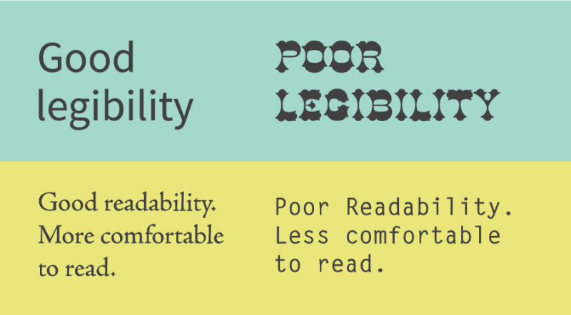
Legibility is about how a typeface is structured and how effectively one particular character may be recognized from the other. It also relates to how clearly defined the word formations are.
This means that fonts used for headlines may not be suitable for content copy. And vice versa. For this reason, it is therefore important to pay attention to the liability of the fonts used. Is it easy to read and differentiate whether it is a particular part of the copy?
The shape of the characters is another component that contributes to typeface liability. You’ve probably heard of serifs and sans-serifs. Both types are commonly used for the headline and the page content.
Serifs and sans-serif typefaces work nicely together because they generate contrast. Contrast combines several design elements, such as hierarchy and how typefaces complement one another.
Work On the Readability
The readability comes next. Readability refers to how word groups are organized on a page and how simple it is for the audience to read the text and make sense of the substance and design.
Once you’ve formed your visual hierarchy and selected header and body fonts for specific use cases, you may start thinking about how they affect readability. Text size, word spacing, line level, and paragraph spacing are all technical aspects of typography that relate to how clear a design is.
The Proper Font Size
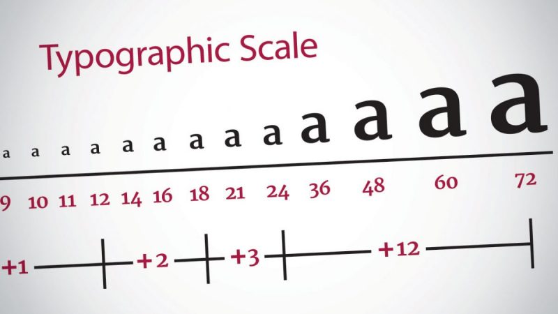
The size of your font is equally as significant as the font type you select and its size in relation to the total area of your marketing medium. Font size is strongly influenced by the screen or surface on which the message will be shown. When writing multiple-line paragraphs, set the body font size at 45-70 characters in each row.
The sizing may vary based on the font type you select, so try out different proportions until you reach what looks great for your web page or printed docs.
Take Note of Line Height and Paragraph Spacing
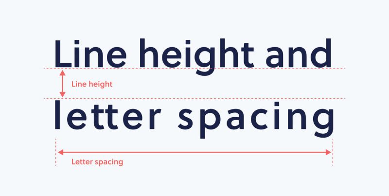
The space between each line of text, like font size, may considerably influence how simple it is to understand your text. The margin between lines of text, technically called “leading,” should be, at most, the letter size of the type. For your reference, the majority of online artists prefer a leading size that is at least 150 percent of the font size.
Make Contrast
It may seem simple, but contrast is a compelling feature of typography readability. Space and color are used to create juxtaposition. Dark text on a pale backdrop is used for blog posts and books because it allows the reader to read more significant chunks of content more pleasantly. Titles and display text should use colored font.
Style, weight, size, color, and spacing are all techniques to generate contrast. Given that they are so dissimilar, a bold typeface works wonderfully with a light one. The deviations gave each font a strong identity, allowing them to stand out as peculiar compositions.
Test Its Readability and Liability On Various Platforms
The other thing that should be considered in the process of choosing fonts for marketing copy is testing the readability and liability of fonts on all devices and platforms. Don’t let it be off because it will affect many things, such as the website’s responsiveness and search engine scoring. If readability and liability are not met, it also can affect the audience that can be targeted.
Don’t Mix and Match Identical Fonts
Try to avoid using similar typefaces. This is done to make it easier to separate the font display and to create a noticeable hierarchy. So, how do you deal with it? Set the fonts next to each other on your computer, move a few inches back, and squint your eyes. If you think the letters appear identical from this angle, it’s a warning that you need to add more variety to your work.
Understand the Context
In addition, another step you can follow is to understand the context in which the copy will be displayed. For example, if you choose to display the ad on the street, then you need to make it clear and character. Choose a font that is easy to spot from a mile away.
Another example is tickets. Usually, the font on the ticket is printed in caps lock with very wide spacing. This is to ease the reading process and support readability.
Avoid Caps If Possible
The other tip is to use Caps Lock blindly. Caps lock in this current era is synonymous with harshness or forcefulness. For this reason, as much as possible, do a combination. Use a font that is right for caps lock without creating an intimidating vibe. Otherwise, your audience will feel like being judged, and they will flee.
Play It Cool
As you build the typeface that is best for you, experiment with the patterns inside the text. Conceptual design from words may be an eye-catching touch to your advertisements and publications. If you do not want to look as foolish, strive to be delicate.
Furthermore, determining whether types complement one another might sometimes feel like a guesswork game. You’ll most of the time count on your intuition and emotional reactions. It’s ok. Constant practice equals perfection. You’ll soon be able to pinpoint which ones are working and which have not.
The Conclusion
All in all, remember that your typeface should fit the personality of your organization, whether you’re printing flyers or banners. You might select the most appealing fonts available, but if it does not reflect your brand, your audiences will most likely recognize your wonderful typography but not your brand.
To simplify the task, you may use a brand guide to make these judgments. Please consult a brand guide if you have one available, as there may be limitations on font type, style, space, and weight. They typically specify the preferred and alternate fonts, as well as where to activate each. Make your own brand guide if you don’t have one to turn to. When you’ve discovered the perfect typefaces for your brand, stick with them. Your audience will enjoy the cohesiveness, which will help keep your brand on track.
Lastly, as several design ideas are relatively common, putting them into practice in a way that is effective and appealing for your business involves some trial and error. To make it simple, the process of choosing fonts will be pretty bumpy, but worth it.