Colors are an important part of a design as they are the main attention grabber that can catch viewers’ eyes. They are often the reason people want to look at your work. Knowing this, you might wonder what colors would best suit your design or are perhaps having trouble getting the right color scheme.
Worry not, this article will teach you how to choose the right colors and all there is to get the right color scheme for your design. Let’s delve right into it, shall we?
Understanding Colors and Their Meaning
Every color has a story behind them and you can use this to your advantage when incorporating them into your design. Colors are proven to have a psychological effect on their viewers and bring out a specific emotion in them. This is especially useful to know when you want to convey a certain message through your design.
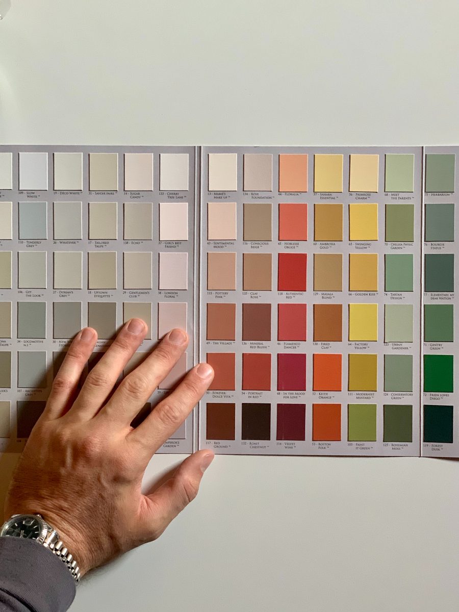
Knowing what each color means can help you figure out the right colors for your design. Below is a quick summary for you to get right into:
Red is the color of love and passion. It is also often associated with danger, importance, and excitement.
Orange is associated with creativity, vitality, and being cost-effective. The color can give off a fresh and adventurous look.
Yellow is optimistic and full of energy. It is associated with playfulness and happiness.
Green can represent sustainability and give off a natural look. It can also be associated with wealth and prestige.
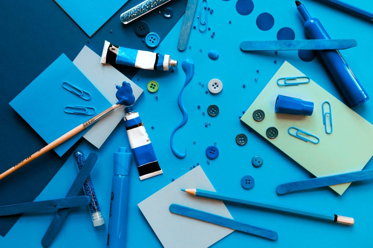
Blue represents calmness and trustworthiness. It is also sometimes associated with depression.
White can be used to show simplicity and innocence. It is often used in minimalistic designs.
Black is used to show formality, luxury, and elegance. It can also be associated with sorrow.
Now that you know the meaning of some of these colors, have you gotten an idea of which one to use for your design yet?
Determine the Essence of Your Design

The essence of your design is an important thing to consider when you’re choosing your colors. What do you want to convey through your design? How do you want it to be perceived? Who is your target audience? Knowing the answers to these questions can help you narrow down your color scheme.
Does your design contain something important that you want everyone to at least spare a glance at it? Try using red. Do you want your design to exude happiness and energy? Try using yellow instead. Perhaps you’re targeting nature lovers? That means green is the right color for you to use.
To summarize, the color representing your design’s essence should be used as the main color. What about the rest of the colors in your color scheme? Surely you can’t make a design with just one color, can you? We’ll get right into that soon.
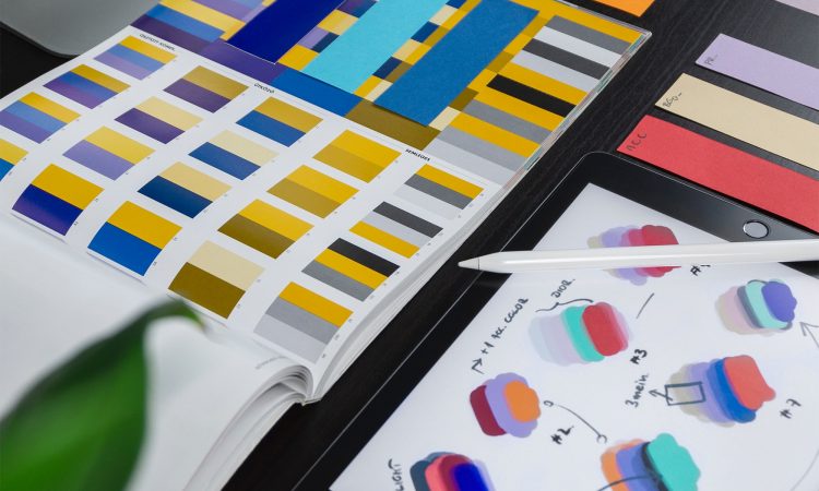
How to Choose the Right Colors: The Complete Guide
You might have a general idea of the main color to use based on your design’s essence already, so the next step is to complete the color palette you’ll be using. The easiest way to find the rest of the colors is to refer to the color wheel and find your main color’s analogous and complementary hues.
It’s worth noting that this doesn’t guarantee that you’ll find the perfect color scheme right away. The idea is to get a sense of what colors work well with each other and from there, you can experiment further with similar colors.
Another useful tip is to use the 60-30-10 rule in your design. This means is that your primary color should cover 60% of your design, your secondary color 30%, and your accent color 10%. This rule helps give a sense of balance to your design.
Now that you know how to choose the right colors for your design, it’s time to get right into designing, don’t you agree?
One Comment