
Deciding the best font for a website can take time and effort. One of the main reasons is that font plays an essential role in the user’s experience and engagement, not to mention in presenting your brand identity. Accordingly, how to choose the right font is essential – it might be somewhat overwhelming yet doable.
As all designers know, a font can make or ruin a design project. The right font may help you nail your website’s visual messaging. It can generate a particular feel, convey the intended message, and attract any audience’s attention.
However, on the flip side, a wrong choice can ruin even the whole design. Indeed, it requires an extra effort to pick the most appropriate font since there are endless options with all their beauty and complexity.
Fret not! Know the basics and learn some of the tried and true rules and combinations. Let’s figure out more things to consider for choosing the right font for any of your creative design projects.
What is the soul of the project?

It means you must identify or know the core elements of any creative design project. After that, you can come up with the most suitable or even standout fonts.
Those elements can be in the form of a visual motif, a theme, a feeling or an atmosphere, and the like. Once you’ve identified the theme, for example, you can find any font that works or against it.
Also, you must know about the brand messaging before choosing the appropriate font. Does the project have an established brand message? It’s because the font you choose will be essential in communicating the message and having a great impact on how the audience perceives not only your design but also your brand and even your business.
Determine your goal

What is your design goal? Or else, what is the purpose of the font you select? You need to have a picture or objective in your mind about how you wish your audience will react to your font or texts.
You can use fonts for various goals, such as to communicate or relay information, to express a complex message or even a theme or an emotion, and more. For example, a book needs to have fonts that are easy to read. Meanwhile, a music or movie poster needs to have more expressive fonts.
In other words, you must clearly understand what the fonts will achieve, what problems they will solve, or even how you will use them.
Font vs. Typeface
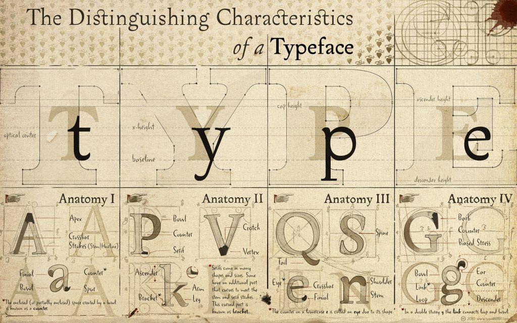
We have mistakenly used the terms ‘typeface’ and ‘font’ interchangeably when they are somewhat different.
A typeface is a family of related fonts – or the entire family of fonts (of different weights). Three common categories of typefaces are serif, sans-serif, and decorative (script).
As for font, it is a member of a typeface, referring to the weights, widths, and styles that make up a typeface.
Legibility and Readability

Often used interchangeably, there is something different between legibility and readability, especially in choosing the right font for any creative design.
Legibility points to the design of any typeface – the width of the strokes, the presence of serifs, the existence of new type design elements, etc. For example, we can say that typefaces used for newspapers or novels have a high level of legibility as they are meant to be read at length.
On the other hand, readability is the type, style, size, leading, color, tracking, and other properties that interact dynamically to create a whole impression. For instance, Times New Roman is one of the most popular serif fonts considered highly readable.
Primary, secondary, and tertiary fonts

Less is more. Using multiple fonts or even typefaces for a single website design may lead to an overwhelming result or even the so-called cluttered interface. It is recommendable to choose primary, secondary, and tertiary fonts from the same family.
Primary fonts are mostly found in headings, larger texts, or even logos since they are the most visible font on your website page. Reflect your brand identity; they can be artistic and bold.
You can use secondary fonts as the body of any description or article on your web page. Therefore, it needs to be clean and easy to read.
Meanwhile, also known as accent font, you can apply tertiary fonts for specific website elements, like the navigation menu or call-to-action button. It has to be subtle enough not to clash with the primary and secondary fonts. Still, it must be noticeable enough to capture attention and relay important information.
A balance between artistic details and practicality

When deciding on a particular font for a certain creative design, it’s crucial to balance aesthetic flair with legibility and readability. It will be unfortunate or useless to have a gorgeous typeface, yet one cannot read it.
For example, most display typefaces are great for headings, yet they are difficult to read in paragraphs. Accordingly, it would be best if you balanced it by combining display and text in a design – the artistic details with readability.
A practical example would be combining serifs, sans serifs, and script fonts to achieve balance in your project. Also, wisely use the same family’s primary, secondary, and tertiary fonts, as mentioned earlier.
How to choose the right font – 7 practical tips

Consider the following tips as a checklist of thoughts you can tick off when looking for the most suitable font for your website.
1. Understand the brand personality and tone
Unlimited options of fonts available on the web can mean two things – the possibility to find unique typography and overwhelming complexity. Therefore, it is essential to reflect on the brand identity, product or service to offer, and also the target audience.
As for the tone, how do you wish the audience perceives when they first visit your website? Do you want to, for example, have a friendly, high-end, or more serious atmosphere? Do you want to have a more visually-driven – more graphics like animations, pictures, and videos – or a text-driven website?
Another example is if you consider the brand or business as ‘modern or innovative, you may go for a sans-serif font. Or else, if you think the brand personality is ‘whimsical or even quirky,’ you can opt for a script font.
2. Look for inspiration
Get inspired. You probably already have a font in your mind to use. Still, it is worth looking up to others, especially the most well-known (trends) or the ones you admire.
Nowadays, the Internet, not to mention social media platforms, is packed with limitless websites for fonts, providing you with more inspiration and various recommendations to fuel your creativity.
You can also learn how different lettering styles may impact different audiences by looking at them.
3. Go for versatile and scalable fonts
Make sure that the font you choose is versatile – it is consistent across your branding strategies, ranging from outdoor advertisements to desktop to mobile interfaces.
For example, opt for a highly legible font if your logo design has a phrase. Choose bolder yet legible font at a larger size if you design a billboard or signage.
Also, it is important to ensure that any font you choose is scalable since you will apply the typography to various user interfaces. Some fonts are easy to see when passed, especially larger, whereas others tend to crack even at a smaller resolution.
Also called outlier or vector fonts, scalable fonts are editable – you can enlarge or reduce them without distortion. In addition to the numerous sizes of each font, these scalable fonts can make the most of the resolution of any output device. For example, the higher the resolution of a monitor, the better the scalable fonts look.
4. Narrow down the font choices
Decide on a few fonts at first to start. For instance, you can narrow down the options into three different fonts and then compare how your website or brand looks on each. Look at them individually and side by side.
5. Consider the font loading times
Try to choose fonts or typefaces that are web browser friendly. In other words, be very attentive to the font load times since slow loading times may harm any website’s user experience.
A trick here is using commonly used font libraries like Google fonts that provide web-based font files you can render perfectly in a browser without any problems. Still, do not download – styles, character sets, or languages – more than needed. Or else you will suffer from excess weight.
6. Get feedback
Show your chosen fonts – mock-ups of the potential fonts – to others (or target audiences) and get their honest and sound feedback. You can also get a second or even third opinion if necessary.
7. Think out of the box
Break the rules only after you master the basics of typography – what rules to break and the way (how) to break them. Or, you can break the rules with a specific intention.
By mastering the knowledge of design conventions, you can brush up on the typographic rules and create experimentally unique designs. It means creating eccentric designs that push beyond boundaries yet still are grounded in fundamental technique.
Picking the right font for any design can be two things – make or break the project. Therefore, how to choose the right font has become one of the crucial elements. Designers need to carefully consider many things, like the brand’s personality, the audience, the products on offer, etc. The right font holds all UI design elements together, thereby the user’s experience and engagement.