A color is a powerful tool that can make your designs eye-catching. Who wouldn’t want to have millions of people look at their designs? The problem is that you might have a general idea of how important colors are but can’t find the ones you want to use for your design and don’t know where to get inspiration.
If this is you, then you have come to the right place. Not sure which colors you want to use for your design? Have trouble finding inspiration for your color palette? Here’s what you can do to effectively find the color inspiration you need.
What Kind of Emotion Do You Want to Convey?

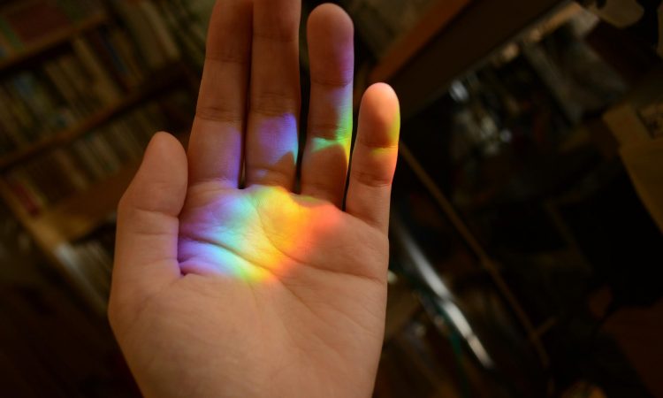
It is the very first and most crucial step. What do you want to convey through your design? Colors are often associated with emotions and have proven to have a psychological effect on those who see them. Depending on the colors you choose, they can deliver different messages to the viewers.
For example, warm colors such as yellow, orange, and red create feelings of passion, happiness, enthusiasm, and energy. On the other hand, cool colors such as blue, green, and purple give off a calmer feeling.
If you want to create a design that can draw attention and provoke action, then red is the color you want to use. For designs that highlight cheerfulness and happiness, yellow is the right choice. For specific uses, you can use green if your design is related to nature and purple if you want a sense of royalty in your design.
After figuring out the emotion you want to convey through your design and choosing the main color of your color palette, you’ll have a better idea of what other colors you’re going to use and the kind of inspiration you’re looking for.
Finding Color Inspiration for Your Design

There are many ways to find color inspiration for your design’s color palette. One way is to manually take photos of beautiful colors you find and use them as a reference. Another is to use the color wheel to find your main color’s analog and complementary colors.
What’s the use of knowing analog and complementary colors? Analog colors can create depth in your design and function as the secondary color. On the other hand, complementary colors can be used as an accent to the main color to create contrast and make your design more eye-catching.
These two types of colors will be important in deciding your color palette. After finding out what these colors are, you can make yourself a color mood board to see if they work and fit with the idea of the design you had in mind.
Tools That Can Help You
So now you know what kind of emotion you want to bring out with your design and the main, secondary, and accent color of your color palette. Still not sure what to do from here? Not to worry, these tools and websites can help you clear your doubts and inspire you further.
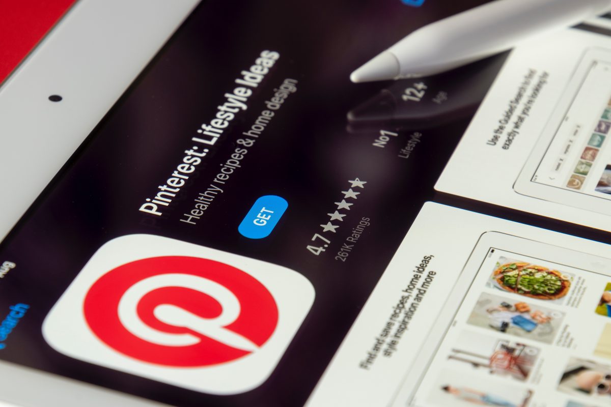
Pinterest has become a popular website for artists and designers worldwide to find inspiration from. You’ll be able to find more color palette examples to be inspired by and see how they are effectively used in a design. You can also pin these sources of inspiration and create your mood board, all on the same website.
Muzli Color Palette Generator is another useful tool to get inspiration from, perfect if you already know exactly what colors you’re going to use in your design. The tool generates color schemes based on your chosen colors while also giving you other color recommendations that might suit your fancy.
Now that you know the steps to finding color inspiration effectively, what are you waiting for? Create that design that can catch the eyes of millions now!