Shoko Mugikura is a designer based in Berlin, Germany, but originally from Japan. She usually works on book designs, and her interest is particularly in the history of Japanese and European typographies. She recently wrote for Smashing Magazine regarding the Japanese writing system that most people in the world think is very complex—which is reviewed in this article.
When asked about how her native language is difficult to learn, she will always say it is actually not. Yes, it is true that Japanese is such an exotic language for many western people. Compared to other native languages used in Europe, Japanese may seem more difficult because it has no relation at all to their own languages. Based on her experience learning German and English, she confidently thinks learning verbal Japanese is somehow easier.
Japanese grammar is simpler than in many European languages. For some examples, we need to learn grammatical genders and articles in Japanese. However, when it comes to the writing system, Japanese is certainly complex.
In many typography discussions, we mostly focus on problems found in the English language, which is actually natural as most design material in the world is written in the language. Nevertheless, much can be obtained from viewing other languages used as a component of design and communication. It helps give context and a different perspective.
The Scripts of Japanese Writing
Modern Japanese writing is described in a combination of three basic scripts: Katakana and Hiragana, both phonetic alphabets or syllables, and Kanji—Chinese ideographic symbols. While Katakana and Hiragana have 46 characters, Kanji has a few thousand characters.
Even though there is a fundamental rule for the context in which we use each script, we still have to deal with many exceptions, leaving some words in Kanji often come in several pronunciations—depending on the use of conjunction or context. This makes the Japanese native speakers feel that it is rather hard to pronounce the words right in every conversation. Let alone the non-natives who are still in the process of learning the language.
From top to bottom: while Kanji is particularly used for lexical components such as nouns, adjective stems, verb stems, and so on, Hiragana includes round-shaped letters mainly used to indicate grammatical elements of a sentence like particles, noun suffixes, and auxiliary verbs; and Katakana has a more angular shape of letters, often used to assimilate foreign words and emphasize the purposes of each word.
Historically, there is a hearsay that the “incident” began when Japan decided to take the Chinese writing system and inscribe it into their language back in the 3rd century. However, Japanese is basically different from Chinese, just the way a language is towards languages in general. This means that merely using the Chinese writing system was insufficient, and more proper Japanese writing was required.
Some Chinese characters then started to be used genuinely for the value of their phonetics, not for their interpretation. Later on, in the following six centuries, Katakana and Hiragana scripts were gleaned from the simple version of Chinese characters used to write phonetic Japanese. Although more than three scripts are required, Japanese typography is written in vertical and horizontal layouts.
The Kanji–One Meaning for Each Symbol
In Japanese writing, kanji is widely known as the most challenging hurdle for all Japanese learners—even for the natives. It is actually a logographic system where every symbol matches a block of meaning.
食 = eating
活 = vivid, lively
生 = life, birth
Why is it called the “block of meaning”? Well, it is the best phrase to explain what it is, no wonder, as each kanji symbol is not merely one single independent “word.” A kanji has to be combined with another to really make a single word as well as to convey more complicated concepts, such as:
生 + 活 = 生活 (lifestyle)
食 + 生活 = 食生活 (eating habits)
If the above examples sound complex, remember that you also learn similar principles in other languages, especially English. A single word like ‘telephone’ in English can be broken down into two essential components of words derived from Greek:
‘tele’ (far) + ‘phone’ (sound) = telephone
There are a lot more of those kinds of words in the kanji system, but in giving more sense to each of them, we can always start with categories, one of which is ‘pictographs’, which resemble the objects they symbolize.
So, what is the role of kanji in Japanese writing? Their main role is to represent concrete/tangible concepts. You will find kanji mostly used to express nouns as well as stems of adjectives, verbs, and adverbs.
The ‘Kana’–One Symbol Representing One Sound
Both katakana and hiragana consist of 46 characters each, to be exact. Every character corresponds to a combo of five Japanese vowels, a, I, u, e, and o, as well as the nine consonants, including k, n, m, h, s, t, r, y, and w.
Hiragana is known for their round-shaped characters and their three functions:
1. Particles are used to point out a word’s grammatical function.
は wa (topic indicator)
が ga (subject indicator)
を wo (direct object indicator)
2. Changing the meaning of adverbs, verbs, and/or adjectives, which have a root scribed in kanji.
増えています fuete imasu = are increasing
急速に kyuusoku ni = rapidly
3. Original Japanese words that are not handled by the other two scripts
どんどん dondon = more and more
それでも soredemo = nevertheless
Meanwhile, katakana in the Japanese writing system is recognizable for sharp corners and straight lines. This type of script functioned as:
1. Loaned/foreign words assimilated from other languages.
ハンバーグ hanbaagu = hamburger
エスニック esunikku = ethnic
2. Expression of foreign names.
アジア ajia = Asia
イタリア itaria = Italy
Apart from the aforementioned functions, katakana characters are also employed for emphasis (equal to italics and/or underlines in English) and for words related to the scientific topic, such as minerals, animals, and plants.
Horizontal Vs. Vertical: The Japanese Typography’s Unique Case
Another frequently questioned case in Japanese typography is “horizontal or vertical?” Most Japanese designers themselves have subconsciously questioned that many years ago. Without even having to answer it, the skill of putting Japanese script in either a horizontal or vertical direction is considered normal, though. This explains why native speakers of Japanese never really wonder about the history of the contrasted writing orientations.
The same text piece is in horizontal orientation (left) and vertical orientation (right). Vertical setting means the text is read in lines that go from right to left and top to bottom, while the horizontal one is read normally from left to right, just like in most languages in the world.
Then, how do we differentiate between the two? Well, in general, the two contradictory writing directions come in different usage: the horizontal way is for anything modern, scientific, foreign, business-related, and such, while the vertical one is for writing more Japanese, traditional, humanistic, fictive (such as novels and poems), and so on.
Once the main script is horizontally set, the bookbinding starts on the left-hand side so that the pages make progress to the right, just like Latin-scripted books. Meanwhile, on the contrary, traditional books in the vertical layout are bound from the right-hand side, and the pages progress to the left-hand side. Therefore, when you take care of a book in Japanese writing, be distinct between the back and the front of the book.
A particular page of a paperback novel in Japanese adopts a vertical layout setting. Ogai Mori (1913), “Abe Ichizoku”, Shincyo-bunko.
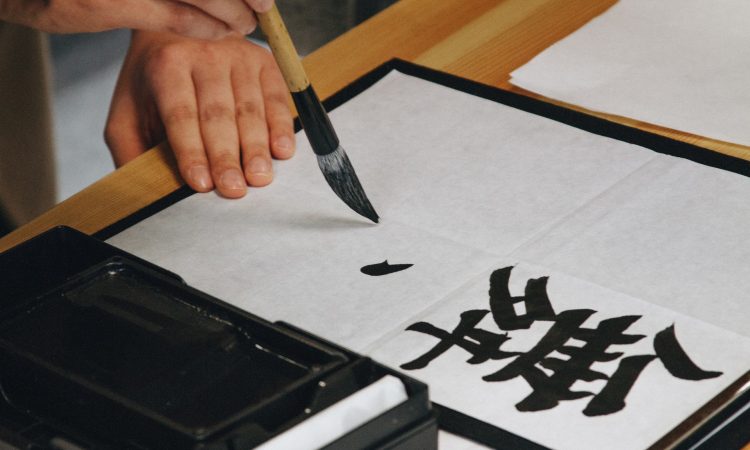
It is safe enough to say that traditional Japanese calligraphy has always been done in the vertical direction. Each character, with different widths and heights, is naturally connected to each other from top to bottom. This must be connected and realigned in a horizontal layout. Calligraphy is written by Keiko Shimoda, 2011 (tsukushidesign.com)
Japanese writing in a horizontal setting can usually be found in texts related to mathematics, science, and language—in which “loaned” words and phrases from foreign scripts as well as signs are included; they are simpler to be arranged in a horizontal layout. The above example is taken from a Japanese-English dictionary (Pocket Comprehensive English-Japanese/Japanese-English Dictionary, 2000, Obunsha).
In Japanese magazines and newspapers—where space efficiency is highly-required, both horizontal and vertical orientations are usually combined. Even though it looks a bit too “crowded” or cluttered, especially to foreign readers, the two directions indicate different text types on a page. The horizontal setting is usually for headlines and captions, while the vertical indicates the main or body text.
A typical layout of a Japanese newspaper—the body text is vertically set while the headings, captions, tables, and diagrams are in a horizontal layout.
The precisely similar newspaper excerpt as above, but its texts are highlighted in two different colors to indicate the use of the two contrasted layouts: blue is for horizontal text while orange is for the vertical one. © The Nikkei (May 8th, 2009).
At some point, the two directions are comparable to what we call “typographic variants” in Latin typography. You may see characters in italics or bold and/or different types of font to indicate different elements in the text. Most publications or advertising also supports complex text, and the two-orientation way may be great for it, allowing highly-flexible layouts that can visually give a strong impact.
You can even see the extreme level of the typography that focuses on space efficiency on informational stuff such as signages and diagrams. The Tokyo Metro Map is a perfect example of this “exploitation” of the two orientations in the Japanese writing system. Both vertical and horizontal directions are used properly, making all the characters optimally fit the limited space.
The map of Tokyo Metro (Japan’s modern public transportation)
Taken from the signage of the Tokyo Metro route map. The station’s name and the metro line typed on the top of the signage are horizontally set, while the transit station names are vertically arranged.
While it is true that, in most cases, the two-direction layout looks pretty messy and inartistic to the eyes used to neat designs, it is easy to respect its power and visual effect. It reminds you gently that interesting informational designs do not always have to appear neat and “in order.”
Letters sent to Ms. Mugikura by her friends: handwriting usually depends on personal choices or mere indication of one’s “mood.” Regardless, more formal letters or letters to the elders are more suggested in a vertical setting.
Japanese Typography on Screen-Based Media
Thanks to horizontal writing in a Japanese writing system, printed media has effectively applied both writing ways—and even better, in ways both complement each other. Nevertheless, another question is, “what happens to screen-based media?” With some exceptions, like TV or film subtitles and word-processing machines, Japan’s media on screen has always been in the horizontal direction.
The greatest example of that is websites, where the horizontal way has been exclusively used. Ms. Mugikura testified that for the past 15 years of her life, she has yet to find a website with a vertical direction. She believes that because of the relations between operating systems, hardware, and user interfaces that have been normalized, all of them have been designed to be compatible with the horizontal setting.
It is unnecessary to say that technical restrictions (the vertical setting support on browsers has just been recently introduced) have also contributed to this. Being underrated, the vertical setting has probably not been applied for media on screen because the horizontal direction has been considered “modern.”
A captured screen of the Nihon Keizai Newspaper website. Contrary to the printed version of the newspaper that applies vertical orientation on the main text, the web one sets its entire text horizontally.
As far as we have learned, even website content in Japanese that informs us about a tea ceremony will more likely use a horizontal setting (accessed on January 20th, 2012).
Will Japanese Vertical Writing Eventually Decline?
So, eventually, the biggest question of all is whether the vertical orientation in the Japanese writing system will die out or will it be back to being applied as in print-based media and signage. Either way, today’s advanced technology has become much friendlier towards using the vertical setting. If you love reading Japanese e-books, there are a lot of e-book apps on gadgets that apply vertical settings.
Thanks to its intuitive navigation on the screen, the e-book apps make it comfortable enough to read Japanese e-books within the vertical setting. Ms. Mugikura said she had spent some time reading those e-books and felt glad about how the apps were user-friendly and how the e-books were easy to read. Even though you still have to scroll the screen horizontally, reading vertically on the apps has always been more comfortable.
As a matter of fact, the gadget apps work out better for novels and manga (Japanese comic books) as well. You would even feel these books would feel “inappropriate” in a horizontal orientation. However, some reading gadget brands like Amazon’s Kindle have not yet supported the Japanese language but are working on it so that Japanese readers can enjoy their products as well.
An e-book extract of Soseki Natsume’s “Sanshiro” (1908) seen on iPhone.
A manga excerpt titled Kotobuki Shiriagari’s “OSHIGOTO” (2010) is displayed on the iPhone.
Meanwhile, on the Web, the circumstances also seem to be gradually changing—some people have made exciting efforts to adopt vertical typography layouts on their web pages. One of which is Taketori, which positions itself as a translation tool like Google Translate. It works when you type in a web page URL to get the vertical setting of the page done. Another tool that can help you with this is Kagetaka, a software that can turn any web text into a vertical version.
Despite the good news, Ms. Mugikura as an expert in the typography design of the Japanese writing system does not really convince herself that this vertical orientation will get support from normal Web users. She felt that the chances could have improved if the web page navigation had been redeveloped or a new version of the browser enhanced with a more advanced UI existed.
She also expressed how flexible and diverse the Japanese writing system is despite people complaining a lot about its difficulty. The “complexity” itself, she said, has been such a benefit, at least to many native speakers of the language for decades. The mixture of the three scripts and the “dynamic duo” of very contrasted layout orientations allow Japanese people to express a much more efficient communication.
In the meantime, foreigners learning the complexity of the Japanese writing system can also benefit as they get to grasp a new typography method (of course, “new” here means something different from what many non-natives have learned before). Therefore, it is a shame if these unique methods die out over time. There should be more attempts to maintain the existing development of the two orientations on screen-based media.