Pairing fonts is essential for designing good typography. Whether you make it for a poster, logo, advertisement, invitation, website content, or others, it’s important to make sure that the font combination suits the type of event, is readable and is aesthetically pleasing.
What makes it so important to choose complementary fonts? To name a few, there are some merits of the art mix-and-match fonts, such as engaging the reader to keep reading the text, representing and building a strong impression of your brand to the audience, and it helps to establish a hierarchy in the text.
This article will cover the introduction to typography, typeface vs font differences, the importance of font pairings, and tips and tricks on pairing different fonts.
What is Typography

As a designer, the objective when creating written content is to convey the message to the reader and audience and make them interact with your products, events, or anything you attempt to market. Failing to design the typography will impact the traffic on your website or reduce the audience’s interest in your content, slowing down the progress of your business development.
So what is typography? Typography can be defined as the methods used to select, design and organize written text to make it both readable and well-structured text visual. It is about the appearance and style of the text displayed on a page.
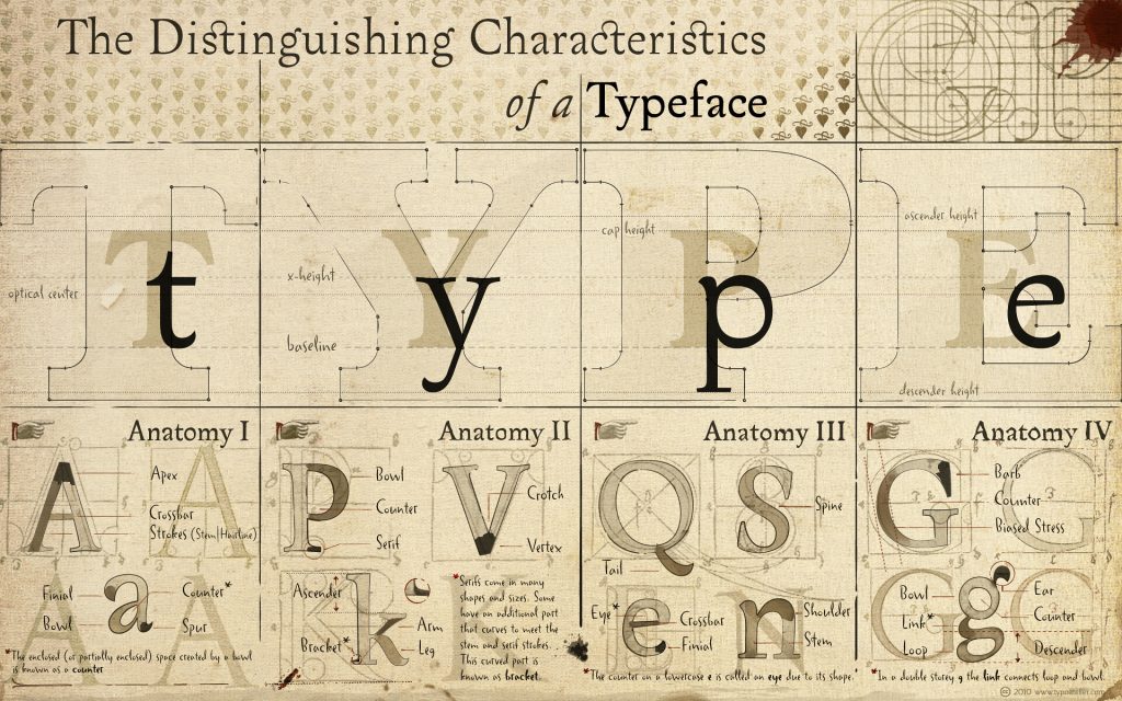
One of the most important elements in typography is to choose the right fonts and combine them to create legibly pleasing content. Some factors, such as leading (space between lines), tracking (space between a range of characters or letters), kerning (space between individual characters), and alignment, are also necessary to spend time organizing.
The Difference Between Typeface and Fonts
Before getting into the tips on mixing and maxing font styles, let’s take a brief overview of typefaces and fonts. The two terms have distinct meanings, even though the two are closely related.
Even if it is not a big deal to use the term interchangeably, for graphic designers, or typographers, you need to know that typeface and fonts are different.
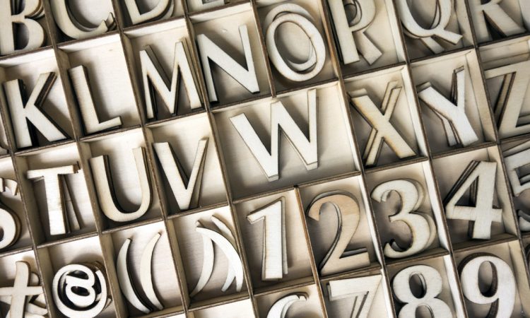
A typeface is an entire family of fonts comprising various related fonts in various widths, weights, and styles. Serif, Sans-Serif, Script, and Decorative are the three different typefaces used in typography.
- A serif typeface is appropriate for lengthy written text such as news and articles. It is signified by the tiny strokes at the ends of the letterforms and is considered a formal and old-fashioned d-fashioned d-fashioned typeface. Times New Roman, Georgia, and Garamond are examples of serif typefaces.
- A3 sans-serif typeface suits more casual, modern, and minimalist written text. Compared to serifs, it is signified by its clean, modern, and rounded details. Arial, Helvetica, Calibri, Verdana, and Open Sans are included as sans-serif.
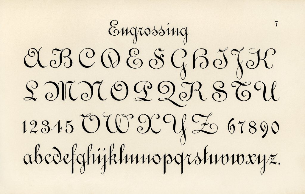
- Script typeface resembles handwriting. The styles consist of formal ones that appear like stylish calligraphy and casual ones that look like cursive letters written by hand.
- The last one is a decorative typeface; its unique look is often used to grab the reader’s attention. Typically found to make a logo, the title of an invitation letter, a book cover, or other written text which require only a small number of letters.
To make it more understandable, let’s take Helvetica as an example. As mentioned above, Helvetica is a sans-serif typeface and not a font. Since fonts are categorized by their design, thickness, or size, thus Helvetica Light, Helvetica Medium, Helvetica Italic, and Helvetica Black are the name of the font within the Helvetica typeface.
The Importance of Font Pairings
Here are some benefits of combining the right fonts:
- It affects how the reader perceives the information.
When your content is lengthy, ensure that the fonts you choose are easy to read. Otherwise, let alone receiving information, the reader will immediately close the page and move to another site for easier information.
- It helps to represent the brands.
Make sure to select the fonts that are best suited and aligned to the purpose of your design products. Create a great combination of fonts, whether unique, bold, or fun, to engage the reader with the products.
- It organizes the text hierarchy.
Establishing the text’s hierarchy helps emphasize what information matters most to be conveyed to the reader. The part-like headline and call to action usually require an eye-catching font style.
Tips to Choose and Combine Different Font Styles

Below will explain 7 considerations, tips, and tricks for putting fonts together.
Align to the Context of Your Design
Before choosing the font, you need to consider what kind of tone and mood to evoke from the content. It has to be aligned to the type of events and support the intended message of the content. The font selection is truly essential in typography; the art of pairing font styles enhances the beauty of the text.
Each font has its own personality and characters—they can be formal, casual, modern, traditional, serious, playful, and more. That said, you should not be mistaken to use casual font when writing for business-related text and vice versa.
Pairing fonts have to create balance; you can mix and match introverted (conservative) and extroverted (strong) fonts together. Find fonts that complement one another. Here are two examples of complementary fonts for your consideration.
- For resumes, it is recommended to use heavy headers to accentuate the major information. It makes the letters appear thicker and bolder. Then combine it with clean text to create noticeable contrast. Thus, the heavy headers will stand out and make it easier for HR to spot the important details.
- For social media ads, consider combining a stylish header with crisp text. Social media, where millions of content are available to look after, is not easy to grab people’s For this reason, your social media advertisement design has to stand out among the others. To hook the reader’s attention, you need a bold lavish header and use crisp text for further details.
Limit the Fonts Used; 3 are Maximum
Two fonts are fairly enough—one for the heading and the other for the body. However, one additional font can be used for certain text needs. More than 3 fonts within one text will be too complex and messy. It will reduce the aesthetic appearance. Keep it minimal and clean for a convenient reading experience.
Combine Superfamilies Fonts for Neat Blend
Superfamilies consist of the same font with distinct styles, widths, and weights. It is a safe way for beginners to mix and match fonts! This method will give you a simple yet cohesive font arrangement.
Fonts from the same typeface will make it easier to adjust the styles to your needs. Since they are very familiar to one another, here, the thing to note is that you have to make the contrast visible. It can be done by choosing variations of different sizes, widths, weights, cases, or styles like extended, condensed, or italic.
Ensure the Fonts are Styled and Used in the Right Part of the Text
This may be the basic thing every commoner is aware of. Establishing hierarchy, put the right shape and size on your text.
Every font has its role to play in typography. Choose a strong and captivating font for larger text where the essential information is located. Then for the body text, make sure the font has high readability. So it will be fine for your reader, or worse, skip your content.
Take a Look at the Example from the Designer
Don’t worry if you feel stuck out of ideas or even need help figuring out where to begin. You can take it step by step by taking a look, sorting, and putting it into practice.
Firstly, typography can be found everywhere, such as on websites, social media, posters, and newsletters. It is effortless to find it in daily life. Take this as a benefit to see and learn how typographers create the design by combining fonts. This routine will help you develop the skill to see what combinations work and what doesn’t.
After that, sort out some of the designs that you think can be helpful for your project. Try to mix and match fonts following what the designers already did. Keep learning and practicing.
Pay Attention to the Legibility and Readability of Your Target Reader
The factor contributing to legibility is how you arrange the elements of typography to look neat and readable, such as the spaces between lines, spaces between letters, the hierarchy, and more.
For readability, the chosen fonts play significant roles. Some studies have found little difference in how quick and readable a text is when reading using a serif or sans-serif typeface. However, for online text, sans-serif is still considered a better choice for its readability.
It said that the serif typeface failed to be displayed properly on computer screens. When used as a font for body paragraphs, it will result in not-so-clearly visible written text. Due to this reason, sans-serif is preferable.
Decorative types might be used to emphasize some parts with a small number of words, such as heading, since too many decorative font types will reduce the neatness of the text.
Keep Practicing to Hone your Mix and Match Fonts Pairing Skill
Practice is applied not only to beginners but also experienced designers. Try to be as creative as possible when combining the fonts. Trial and error are needed to find the one that finally wins your heart.
Even Though the internet provides plenty of recommendations of perfectly matched fonts, you can always make innovations. Be creative while maintaining what your brands want to tell the world.
Trust yourself; lots of practice in pairing fonts will help to get used to encountering a variety of font styles. Which means it will be easier for your next project when combining fonts.
The right choice when pairing font styles can greatly impact your target reader’s interaction with the content. That is why typography elements, such as combining fonts, should be considered wisely. Above, we have covered 9 tips and tricks that you can follow for choosing font types for your design. Try to practice pairing the fonts to elevate the quality of your design!