The great number of fonts style shows how important fonts are. Fonts can evoke certain feelings. That is why choosing the right fonts can be stressful. By choosing the right fonts, you are ready to make your readers feel specific emotions.
For this reason, people refer to this as the psychology of fonts. It is about how font choices affect readers’ perceptions. So, what is the psychology behind font choices? How does font affect the reader? What are the most important factors when choosing a font? Keep reading. Here’s everything you need to know.
What Is The Psychology of Fonts?
Basically, the psychology of fonts is how you feel, respond, and act visually and emotionally for the font you are seeing. Font style can give a reaction to readers as 90 percent of the information processed by your brain is visual.
As mentioned in Albert Mehrabian’s Rule of Personal Communication, nonverbal play 93 percent of personal connection. In other words, non-verbal, whether it is images, layouts, or colors, can illustrate ideas or values simpler and easier. Your thought, action, and emotion may react in different ways depending on what you are seeing.
Here’s an example. When you see a slimming brand about how to lose weight using their supplement or pills, and the font used is slender, then customers will see that font and imagine something slim, thin, and trim. This sense will then also be linked with the slimming brand.
Typography
In short, typography is the art of building a sense and meaning in a way that can be visually satisfying and amusing. So if you want to evoke the thought of a playful and high-spirited psychology effect, arranging the uppercase or lowercase and the spacing may affect readers’ ideas and perception of the font and brand.
Shape and Color Psychology
In the psychology of fonts, shapes, and colors are also important. Specific shapes, like the example above about slimming products, will elicit a certain feeling from the customers. This also applies to colors. Specific colors can cause particular emotions, ideas, or responses to occur. For this reason, colors for your brand should represent and communicate the brand’s value.
Why is Font Psychology So Important?
By understanding font psychology, you are able to choose the right and best font for your design. Font psychology offers you a big control over how the shape and color of your fonts are viewed and accepted by your viewers.
Let’s say you have to design a promotion for a luxury watch or fancy clothing line. You want your customer to feel classy, tasteful, and sophisticated when they look at it. To level up your design, Serif and Sans Serif fonts are going to spark the response and perception you wish for. Meanwhile, a script like Calligraphy and Retro fonts may look rather playful.
The point is, when you acknowledge font psychology and know the particular emotion you wish to attain from your audiences, you will have full control over choosing the perfect fonts. For that, your design will not only look stunning but also inspire the specific emotion and response you are looking for.
In creating a logo, poster, advertising, or branding, applying the psychology of fonts will make your brand notable and memorable. This is especially important for designers and businesses. The right fonts should also be married with perfect size, height, spacing, and colors.
Important Things to Remember When Choosing Fonts

There are some factors to consider when selecting fonts for your design. Here are some key factors to follow:
1. Branding
As mentioned above, your fonts should embody the value and character of your brand. For example, bold fonts are likely more suitable for fitness brands.
2. Legibility
Although you want a unique font, making it clear and legible is also crucial. Not being able to deliver your message because your fonts are unreadable is the last thing you want. Don’t let readers give extra effort and time just to understand what is written.
Choosing fonts that work well in multiple sizes is also vital. You probably want to use the same fonts for headlines or titles and body text. Also, consider how your designs will look on the smaller screen.
3. Serif vs Sans
The next key factor is determining whether you’re going to use Serif or Sans. Serif fonts are great choices for lengthy text and long lines. Sans, in the meantime, is preferable for readers who are just learning to read.
These are safe Serif and Sans to start with.
Safe Serif:
- Times New Roman
- Lucida
- Georgia
Safe Sans:
- Tahoma
- Arial
- Verdana
4. Font Family
A font family is a group of fonts that share similar designs. The fonts are commonly divided by style, weight, and size. There are five generic font families:
- Serif
The Serif font family is used in many printed books or media. Some popular Serif fonts are Times New Roman, Palatino, Garamond, and Georgia.
- Sans-Serif
Sans-Serif is mostly used in digital wordings. Some famous Sans-Serif are Verdana, Gill Sans, Arial, Helvetica, and Trebuchet MS.
- Cursive
Cursive gives a handwritten effect because of its conjoining stroke. Examples of Cursive fonts are Sanvito, Comic Sans MS, Zapf-Chancery, and Adobe Poetica.
- Fantasy
Fantasy fonts have a non-cursive attribute and are more fashionable. Some popular Fantasy fonts are Alpha Geometrique, Cottonwood, and Critter.
- Monospace
What is interesting about the monospace font family is they share the same width, creating a sense of text typed with a manual monospaced typewriter. The fonts included in the monospace family are Lucida Console, Courier New, Everson Mono, Monaco, and Consolas.
5. Limit the number of fonts in one design
Remember to restrict your fonts to two or three fonts only in one design. Using too many different fonts can disorient your readers with so many visual transfers. Instead of using another font in the same design, you can play with different sizes, weights, or colors. When you decide on three kinds of fonts, the three font rule is the title, the subhead, and the body of the text.
6. Avoid using identical fonts
There’s no point in using too similar fonts and having the same classification. Example of two identical fonts is Avenir and Akzidenz Grotesk, Times New Roman and Merriweather, or Georgia and Garamond. As a matter of fact, two identical fonts are likely will clash.
7. Employ decisive contrast for different fonts
When choosing fonts, make sure they present distinctiveness. Even though the different fonts create a decisive contrast, they should also create harmony. The contrast may be seen in the thickness, stroke, or angle of stress.
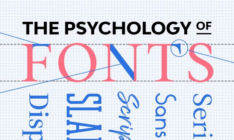
Emotional Responses Behind Each of the Major Font Categories

After learning the definition of the psychology of fonts, why it is important, and how to choose the best font for your design, now let’s move to the psychology behind the major font categories.
1. Serif
This classic and traditional font delivers an established mood, such as formality, respect, authority, trustworthiness, and reliance. That is why most financial businesses, law firms, and insurance companies rely on this font.
Some famous brands and logos using Serif are Vogue, Wikipedia, HSBC, CBS News, Tiffany & Co., and Rolex.
2. Sans Serif
One of the most famous brands using Sans Serif is the logo of Google. Sans Serif is great for creating a sense of modernity and coolness. Sans Serif is also a great choice if you wish to evoke a feeling of sleek, advanced, trusting, straightforward, innovative, and tech-savvy. Some popular fashion brands and tech companies use Sans Serif.
3. Script
The iconic Coca-Cola logo uses Script. The characteristic of this font is it replicates handwriting, evoking a feeling of elegance, sophistication, and personality at the same time. Whether you want to use it for modern or retro design, Script is unquestionably versatile.
Some emotional responses raised from Script fonts are personal, whimsical, creative, joyful, elegant, and traditional. Great numbers of food and beverage brands as well as fashion brands, use Script fonts.
4. Slab Serif
Slab Serif has a bolder and huskier form than Serif. It associates with some emotions and interpretations like strong, masculine, stable, powerful, and traditional. A lot of car manufacturers and electronics companies choose Slab Serifs to deliver their sense of vigor and power.
5. Modern Sans Serif
Modern Sans Serif us Sans Serif fonts that are popular in the early to mid-20th century thanks to their more modern style. Some popular Modern Sans Serif are Futura, Helvetica, and Avenir. This font psychologically associates with futuristic, chic, luxurious, and elegant.
Some famous brands using this font are Dior, Chanel, and Calvin Klein. Modern Sans Serif is also perfect for evoking a sense of naivety and cheerfulness. That is why some children’s brands use this font.
6. Display
Display is great when you are looking for something powerful and harmonizes perfectly with a certain graphic image. Display is mostly used for the headline but hardly ever for standard text.
This font can create a sense and perception of being unique, novel, exciting, resilient, and adaptable. Famous logo designs using Display are Lego, Oreo, Yahoo!, NASA, Subway, MTV, and Warner Bros.
Conclusion: The Power of Psychology of Fonts
By learning the psychology of fonts and how important it is to your viewers, you can create designs that can speak better about the value, vision, or characteristics of your logo and brand. Understanding font’s psychology helps you apply its principles and attain the effect you are looking for.