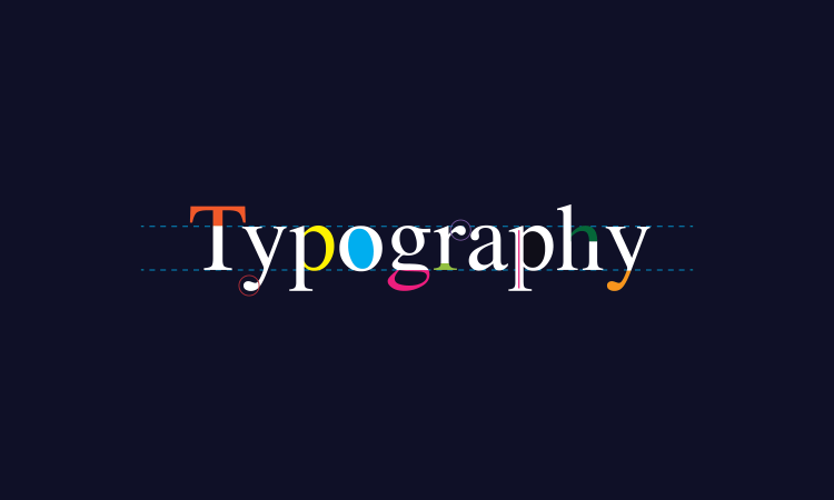
Typography is more than something related to texts. It is an art form, a way for humanity to express themselves through printed texts. Much like any other art form, a master in typography can exploit their talent to make money. This typography guide will give you basics on designing a memorable font, and a peek at how to make money with typography.
What is Typography?

Typography is making a text appear gullible using a series of techniques and making the text easily readable. In simpler terms, a typographer arranges letters, texts, and other elements to give a beautiful look. The goal of this arrangement is to deliver a message and invoke the audience with certain emotions or feelings.
In modern times, the internet has awakened typography’s creative aspect through another (arguably) contemporary art form: web designing. The wide array of font and typesetter options make present-day typography more diverse and visually appealing.
Types of Typography
As an art form, typography is divided into several types. Identifying which font belongs to which type is crucial for creating an impactful design. The styles range widely, from classic to modern and simple to ornamental. The four base types of typography are Serif types, Sans Serif types, Script types, and Decorative types.
Serif Types

The most defining feature of serif-type typographies is the small stroke attached to the end of a larger stroke in the letters. This typography style can be traced back to the era of Roman antiquity. Fonts in this category include, but are not limited to:
- Old Style, the “standard” style in the Holy Roman Empire from the 15th to 18th
- Transitional, the bridge between Old Style with the younger Neoclassical serif styles.
- Neoclassical & Didone Serifs, an abrupt contrast between thicker and thinner strokes.
- Slab serifs, the “blocky” and very heavy and bold font popular in the 19th-century advertising industry.
- Clarendon Serif is a bold typeface created in the 19th century with text composition in mind.
Sans Serif Types

Meaning “without serif,” this type of typography is an evolution of serifs that omitted their iconic small stroke and is generally viewed as the “modern” typeface. The fonts include:
- Grotesque, utilizing the contrast in strokes as their defining feature.
- Square is Grotesque but with a more squaring and defining end.
- Humanistic, the modern font with the proportion of Roman inscriptional letters.
- Geometric, the construction basis of all sans serif typefaces.
Script Type

Script, or Scribe style, refers to fonts or logotypes that appear as hands write them. This characteristic makes these fonts appear more organic and humane than the above two. Examples of these fonts are:
- Formal, the origin of all Script style typefaces traces back to the 17th
- Casual, the informal cousin of Formal.
- Calligraphic is another fancy way to write letters and texts.
- Blackletter and Lombardic were designed to look like a manuscript.
Decorative

As the name suggests, decorative style typefaces focus more on the aesthetical aspect of the letters rather than readability. They are typically used for headlines, signage design, or even tattoos. Compared to the other three, a Decorative typeface is a better tool to express your cultural identity, state of mind, etc.
The Most Important Rules

Just because typography is generally used to express and invoke emotions does not automatically mean a typographer can do whatever they want. Rules were made to ensure that a designer is well-versed in the art. Five of the most important rules are as follows:
-
Understand contrast
In typography, contrast refers to the balance between the text color and the white spaces on the page. Using kerning, font size, leading, and margins, you can manipulate contrast.
-
Use visual hierarchy
The manner of stressing the importance of specific parts or information in the texts is called a hierarchy. The commanding visual hierarchy will help your viewer navigate your design effectively and regulate the information they receive.
-
Understand and use grids
Using a grid in typography is crucial to ensure that everything you put on the canvas is placed with other design aspects. By doing this, you are giving the piece more logic and visual harmony.
-
Limit font combinations
Combining different fonts is fun and will help make your design more unique. However, too much combination will lead to a chaotic design mess. Avoid using more than three fonts in a single design.
-
No distortion
It is more off an unspoken rule instead of an actual rule; never distort a font, ever. If the font doesn’t fit, use a different font instead of stretching it out of proportion. Or, if you can’t find a perfect fit, you can draw the font yourself.
Making Money with Typography

Like many other art forms or design genres, typography will help you make much money when done properly. Generally, you can generate income using typography in three ways: selling, licensing, and commissioning.
Selling
It is one of the easiest ways to generate revenue using typography. If you have a stock font sitting in your computer folder for a while, why not try selling it online? You can go to the design or template marketplace and put your font for sale there. Remember, you might be billed a platform fee or required to pay a monthly service charge before selling anything.
Licensing
Just like selling, but what you’re selling is the license or special rights to the fonts you made. The licensee will take care of selling and marketing the font. You will be given royalty payment on either a monthly or yearly basis based on the sales made on your font.
Commissioning
You take a custom order from a client. This method, by far, has the highest chance of landing you a hefty paycheck. Most clients will be corporates, and they’re more than willing to invest much in a customized typeface.
Afterthoughts
This typography guide on the basics of typography and how you can monetize them is just a glimpse of this huge industry. We are more than happy if this can be a help for you. Cheers!