What do we mean by typography guide? Have you noticed how typography designs are so varied? From elegant top-notch watches brand logos, spooky horror movie posters, and chic fashion women ads to fun and colorful cereal boxes. Why are they so different, and why do they have to be made different?
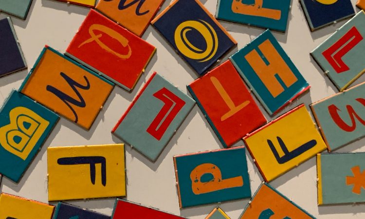
Realize it or not, typography can spark certain feelings and offer a different perspective. Even one typography design will be different if it displays dissimilar colors and weights. Weight here means how thick or thin the letters are.
If you are ever working on a design project, you probably understand how crucial it is to pick the perfect typography for your design. For example, when you want to connect with Gen Z, they are likely interested in something playful, extensive, and bold.
To understand further about this, here’s a complete typography guide, from history to terms and rules. Enjoy!
What Is Typography
In this typography guide, let’s get started with the most basic one: What is typography? Merriam-Webster Dictionary defines typography as letterpress printing, the style, arrangement, or appearance of typeset matter.
In general, typography presents written messages with an artistry touch to create a readable framework and aesthetic feeling. It carried fundamentals of design elements, including shape, colors, framing, and type. That is why people often refer to it as the art of arranging letters and text. The purpose is, again, to create text or sentences that are visually attractive and clear.
When it comes to typography, it isn’t only the fonts that matter, but the structure and appearance play important roles. In short, typography gives life and soul to your text.
Short History of Typography
While some of you might think that designers create their own typefaces for their works, those creators are using existing fonts. Still, picking the perfect and suitable font for a certain work from billions of existing letterforms is not something easy and trouble-free. Once they decide on one style, they still have to adjust kerning and character spacing which will emphasize their design.
With so many advanced technologies nowadays, selecting and using fonts can be done using computers, laptops, and smartphones. Along with that and the high demand regarding styles and designs, many typography artists are also improving and creating more unique and attractive typefaces. Of course, this is something we probably couldn’t have imagined years back.
Even so, it’s not actually all about technology. Typography’s evolution and growth were invented in the early 15th century. We should credit Johannes Gutenberg and their transformed typefaces for giving us chances for printed materials and massive creations.
Even before the mass printing techniques was innovated, people were so persistent in creating books or type-based banner or announcements. They simply used their hands and their commitment. Limited convenient writing appliances or papers never stopped them. In fact, ancient civilizations chiseled their glyphs on caves, wood, and wood.
Subsequently, today typography has two kinds of tools and techniques. The first one is hand-crafted typography, and the second is machine-made typography. Or people often refer to it as organic and geometric even if there are two approaches; the two complement each other and fuel a continuous cycle of typographic expansion.
The Importance of Typography
Typography is not only about selecting the most appealing fonts. Getting deep about typography is a crucial factor in User Interface Design. UI Design itself is a vital subset of UX (User Experience), something we use to interact with a certain brand or product to gain special interaction and feeling with the audience.
Good typography will set up a strong visual grading, give a graphic balance to the website, and leave a certain feel to the product. Good typography must guide and advise your readers, boost readability and approachability, and build the utmost readers’ experience. Here is the breakdown of the importance of typography:
- Building Brand Recognition
Good and successful typography will improve your text, sentence, or website personality and form a better engagement with your product or brand, thanks to the featured typeface. Outstanding and consistent typography will also catch larger followers, build trust, and take your product or brand onward.
- Determining Influences Decision
Perfect and suitable typography delivers a great outcome on how readers or customers understand and think of the message behind your design text. For that, appealing and head-turning font types are more persuasive than plain or weak fonts that mostly fail to shout out the message of the text.
- Creating Memorable Attention
There is a difference between readers who look at your text at a glance and read your text and message thoroughly. To gain that memorable attention and visually stimulate interest in your audience, picking the right and captivating fonts is vital.
Basic Rules and Elements of Typography Design
Our next typography guide will take you to typography design terms you should recognize. Here are the essential ones:
Style
When discussing the typography style, many specifications might appear, like how they look, what inspires them, for what purpose they are used, and what era they emerged. To simplify it, the typography style is divided into three major groups, each of its smaller categories.
- Serif
Traditional calligraphy influenced serif fonts. This typeface is referred to as Old Style or Humanist. The things that stand out from this style are its smoothness, rounded shapes, and thin variations. Later, in the middle of 18 century, serif’s new style, which we now call Transitional, arrived.
The transitional style is how the Humanist style changes into the Modern style. It is the combination of the two characters. Afterward, radical serif-style techniques emerged in the late 18th and early 19th. The round shapes were replaced by sharper weight contrast and slender serif.
In the 19th century, advertising was advancing, during which Slab or Egyptian Serifs were made known. These styles were preferable thanks to their bold and bulky style. The appearance was considered more suitable for advertisement.
- Sans Serif
Moving to the 20th century, sans serif font ruled the era. This style was affected by calligraphy, and we now refer to it as Humanist. Delivering a warm feeling, this sans-serif’s weights are slightly varied. Different from the Humanist, Helvetica, which emerged in the middle of the 1900s, was a uniform. It is also stiffer than the previous typefaces. That is why Helveticadid doesn’t display a hand-crafted touch.
Furthermore, typefaces that are more similar to Modern serifs are Geometric sans serifs. They have strong and pointed edges like the letters A and M, while the O features flawless round. That is why they are called Geometric.
- Cursive
The next typeface in this typography guide is something recreating handwriting and script. These cursive styles are quite varied, from playful and elementary appearance to sleek ones. The cursive style also has what is called Brush faces. These typefaces are influenced by brush characters which appear stronger and only have a slight touch of elegance. Moreover, there are also Gothic styles of Blackletter.
Gothic Blackletter styles are similar to handwriting and calligraphy, which were often used in the middle 12th century. This style is so unique and exquisite as it was developed as the common calligraphy in the medieval European period. The lines are exquisitely sharp, direct, and pointed.
- Decorative
This typeface has a function like a name itself, which is decorative. Decorative typeface focuses on aesthetic value instead of readability. Subsequently, decorative typefaces mostly appear in brand logos, names, and short titles.
Simply watch commercial breaks on the television or the internet, and you will see a bunch of decorative typefaces jumping out at you. These kinds of typefaces are perfect for drawing people’s attention by being stand out and unique.
Font vs. typeface
Do font and typeface have two different meanings? A typeface is a font family. The typeface contains several font forms.
When you look at a typewriter, you can see fonts in the form of existing letters, numbers, and punctuation marks. Meanwhile, in digital technology, fonts are in the form of software with numerous types and can be downloaded when we need to use them.
One typeface can have numerous font styles. There will be fonts that are slim, super slim, bold, strong, wide, or super wide. All of those fonts have regular types and italic types. It wasn’t only that. Some typefaces feature small caps, meaning uppercase alphabets that just broaden to the x-height.
Moreover, typefaces also contain lining numbers and non-lining numbers. Sometimes, typefaces also offer several additional alternate characters. So, you can imagine how much that is.
Anatomy
The anatomy of the alphabet is very compound. Each tiny detail and part conveys its own term. Some of the anatomies of letters are cap height, ascender line, X-height, baseline, and descender line. There are also ascender, spine, bowl, stem, aperture, shoulder, crossbar, terminal, descender, counter, leg, arm, and eye.
Besides the alphabet’s anatomies, there are different types of punctuation marks. Four of them are parentheses, square brackets, braces, and chevrons. These four are punctuation marks that are mostly used. Parentheses are mostly applied when you need to add a further description.
Square brackets are mostly used when we need to add direct quotations, clarification, or authorial comments. Braces are mostly applied in physics or math formulas and web development. Chevrons have the same function as braces.
Font types also have their own period, comma, colon, and semicolon. In addition, different kinds of quotation marks differ according to the language used. They are exclamation marks, question marks, and hyphen, which appears between words or phrasal adjectives, em dash, which is used when separating parts of one sentence; and en dash, which is used to specify a range of value. Other marks are at sign, hashtag, ampersand, and asterisk.
Contrast
Contrast is similar to hierarchy. By emphasizing contrast, you can show which idea or message is stronger than the rest of the text. By playing with contrast, texts will appear more meaningful, interesting, and notable.
Many designers experiment with different contrast using different typefaces, colors, sizes, and styles. The goal is to come up with something impactful and dazzling.
Consistency
It’s okay to use varying typefaces only when you are certain that your designs are not ending messy and confusing. That is why you need to stick to consistency. When transporting information, it is important to stick with the same style. This is preferable because you want your readers to immediately acknowledge what they are reading and follow the pattern you’ve created.
Again, it is fine to play around with contrast to some extent, but sticking to the consistent hierarchy of fonts or typefaces will leave a better experience for your readers. Be consistent with your headings and subheading.
White Space
White space is also called negative space. It is the space between text and graphics. While most people neglect and ignore this white space, using the proper space produces texts that are easier to read and have an uncluttered interface.
When used accurately and perfectly, white space can charm and highlight your text and deliver aesthetically delightful engagement with your audience. White space mostly appears as padding, margins, and or just non-text parts.
Alignment
Alignment is the technique of merging or combining, and forming texts, images, and graphics. Alignment is also used to guarantee there is matching size, space, and distance between each element. Many User Interface Design designers generate margins to ensure that their headings, logos, and body text are aligned jointly.
When applying alignment in your user interface, it is proper practice to zero in on industry standards. For instance, aligning your text to the right will appear contradictory to readers who are accustomed to reading from the left.
There are four common alignments. They are flush left, flush right, centered, and justified.
- Flush Left
Flush left is the alignment that is commonly used because it follows the normal flow of many languages. To build a natural vibe, make sure to pay attention to the right edge as well. Make sure the alignments are balanced. Then, avoid using solo words on one new row.
- Flush right
Even though most languages follow natural left alignment, some still go against the natural flows of most written words. Since this flush right is quite uncommon, be careful when using it in long paragraphs. Avoid using too many periods or commas at the end of the rows when you really want to use this alignment style.
- Centered
Some posters and banners use this centered alignment. However, if it is used poorly, your text will rather look boring and sloppy. But if you manage to arrange centered alignment with full attention, your design will look elegant and dynamic. Two important elements that should be noticed carefully are the row’s lengths and overall balance.
- Justified
The justified alignment will make your text look sleek, elegant, and modern. Still, you must be careful when using it because there are chances that awkward spaces will appear between words. Therefore, make sure your whore rows occur nicely and evenly. If the awkward space shows up, you can anticipate it by changing the text size, the distance of the text box, and the kerning.
Color
Another important element in the typography guide is color. It is actually the most playful element in typography. Selecting a color is a moment of creativity for designers. Perfect color successfully takes your interface to the next level.
However, you need to carefully select colors when it comes to text. Perfect colors can highlight your message, but improper ones may end wrong. Unsuitable text color can make your design messy and even clash with the whole design.
Three basic elements in color are value, hue, and saturation. Good designers must know how to balance those elements to create dazzling and clearly legible text. Balancing the three is also necessary for visual impairments in a design.
Oftentimes, designers will examine whether they have applied the three elements balance by seeing the text without color or greyscale and creating a twist if the text will be too dark or too bright against the setting tone.
Hierarchy
In typography, setting the right hierarchy is very important. Hierarchy is very useful to establish which of your text should be noticed first and which texts follow the highest hierarchy. By setting a clear hierarchy, your readers will know which part of the text should be read first and which ones are the descriptions.
The highest hierarchy of the text is hoped to draw people’s attention in the first place in a short period of time. With that instant moment, readers are able to consume the important information you want to deliver. For example, in a newspaper story, one story usually consists of a primary heading, a secondary heading, a tertiary heading, and a body text.
Most people consider hierarchy can only be built using size. Aside from size, you can create a hierarchy using contrast, color, and even alignment. For example, if you see one text with a bigger size and radiant red color than the other text, you can tell that that text places a call-to-action role. Some designers also take advantage of the exclamation mark in their hierarchy.
Even so, most typographical hierarchy is divided by size. That is why you know the term headings, which must be larger than the subheadings or body text.
Tracking
Besides alignment and white space, there is also tracking. Tracking of letter spacing is the process of modifying the whole space between characters. Most designers prefer more gaping and airy compositions. Normally, the bigger the text, the less space will follow, and the tracking should be lessened. The same thing happens when you use smaller text. The tracking should be increased.
Increasing the tracking is quite challenging, actually, because most of us tend to use tracking more than we really need. A little advice for this typography element is that capitals or uppercase letters allow a bigger tracking while lowercase letters require less tracking.
Kerning
Kerning deals with reforming the space between each character and letter. While most of the time, applying to track is more than enough, in some cases applying kerning is needed to tweak the space completely in the middle of two specific letters. Kerning is mostly used when relating to letterforms such as A, W, V, and T.
Another difference between tracking and kerning is that tracking adjusts the space size between letters of a whole word in equal addition, while kerning pays attention to creating more readable and pleasing text. Some typefaces don’t feature spaces that designers need. That’s when manual kerning plays its part. Also, one kerning might be suitable for one work but doesn’t suit another project.
Leading
Leading is the space between two lines. By arranging to lead, we can add some color or texture to our paragraph so that we can build different hierarchies and attract more interest. The maximal size of the leading depends on several things, like the number of texts, the display proportion, or simply the feeling we want to ignite.
Grids
Another important element in our typography guide is the grid. Generally, a grid is a framework of spaced bars that are aligned or crossed. Grid is very varied from simple to complex. We can literally frame the information on one page using grids.
Because we can arrange a grid, we can freely manage the elements on our page. With the perfect and suitable use of grids, we can make a more understandable and acceptable design to viewers. According to our need in our design, you can choose whether to use simple and plain grids or intricate and complicated ones.
Choosing the Perfect Typeface for the Website
Now that we know what typography is, its importance of it, and the basic rules and elements of typography design, let’s move to choosing the right typeface for our website. Just like choosing a typeface for different designs, picking the right typeface is more difficult than we might think at first.
There are numerous choices of typefaces and fonts we can install and use. Still, making a choice is not as fun as it looks. To avoid making mistakes in the process of selecting the most suitable typefaces for our websites, here are the key rules:
Consider Personality
Typefaces and fonts can create a certain feeling in your viewers. Therefore, be certain about how we want our viewers to feel when they visit our website. Do you want to build a professional mood, dynamic feel, or friendly atmosphere?
As mentioned earlier, typography can portray the personality of products and the personality they represent. In the beginning, try to define the basic characteristic of our brand or product and then gather typefaces that mirror those characteristics. Hence, we can start to observe a trend.
Think About Tone
The next rule when selecting the perfect font or typeface for a website is considering how they harmonize with the text’s tone. For example, if your products are meant for kids or teenagers, more decorative and stylish fonts will be more legible and may attract those youngsters instantly.
Never Skimping on FunctionDon’t just aim to look pretty. Your font should also be legible. If the typeface leads to unclear or even wrong instruction, then we sure pick the wrong style. That is why when making sure which typeface will be used in your interface, first set the style and be certain it’s attractive. Then, reflect on if the font is readable, accessible, and legible.
Reviewing Performance
Most designers seek fonts that are web browser-friendly. What is a web browser-friendly font? It is fonts that are included with most operating systems. Some of the best web browser-friendly fonts are Arial (sans-serif), Verdana (sans-serif), Tahoma (sans-serif), Times New Roman (serif), Trebuchet MS (sans-serif), and Georgia (serif).
Getting Inspired
Some of us probably don’t know where to start or what to pick. To get started, why not look at other websites and get ourselves inspired? Look thoroughly at which fonts look best and which fonts fail to make a highlight. Or, you can search for typography that is on trend right now.
Testing
Now that you’ve selected your fonts, it’s time for some testing. Do we need to test? Yes, it is very vital. By collecting important feedback from real users, we will be able to analyze which interface works and which doesn’t. We can also see which one looks great or perhaps look rather awkward.
Optical Illusions in Typography Design
Now, let’s move to recognize typographic illusions. Some letters can be turned into something more dramatic and eye-catching with typographic illusions. In typography design, these are some optical illusions:
- Illusions 1
In the first illusion, the top letter is smaller than the letter behind it, but it can only be seen if we rotate the front letter 180°. This illusion creates a stronger and more confident feel.
- Illusions 2
Illusion 2 gives the visual appearance of two letters that look almost the same size. One letter is slightly bigger than the other letter. We will only be aware once we notice the different heights of the baseline and cap height.
- Illusions 3
In illusions 3, play with inconsistent weight. For example, place two O letters, with one O a little thicker than the other one. Here, we will see one O has a thicker top and bottom.
- Illusions 4
Do the same trick as in illusion 3 but this time, try with a different letter, say A. When two A’s have different weights, you can only notice the difference when flipping it horizontally. This is, of course, to create more appealing typography.
- Illusions 5
Illusion 5 is made when we put two letters, T, horizontally and vertically. We will be able to see slender upstrokes, thick downstrokes, and slender cross-strokes. This illusion must be applied to the most simple and geometric letters.
- Illusions 6
We will see Illusion 6 when you put two same letters upside down or opposite. For example, imagine putting two E letters face to face. Or, try putting two A Letters backward.
- Illusions 7
Get illusion 7 by combining letters that are sister shapes. For instance, when we put P and B altogether, they will fit into one another. However, one letter should be slightly thinner than the other one so we can see the illusions we want.
Six Elements of Designs
In addition to the typography guide above, a good design must have all the magic and charm to be a powerful and impactful one. To create a perfect design, we should combine six crucial elements in designs. Here are the six elements of designs.
Line
Lines can spark a certain mood in the design. For example, a straight line is more suitable when we wish to create a sleek and elegant design. Meanwhile, diagonal lines deliver energetic vibes.
Color
Just like in typography, color also plays an important role in a design. Careless color choices will make your design look sloppy and unpleasant.
Shape
Shapes like ellipses, triangles, and squares are geometric shapes, while bubbles, blobs, or striking signs on the posters are organic shapes. Make sure the shape we use represents the mood we want to build.
Texture
The texture here means the textured background. For example, when we want to create comfort and a soft feeling, then nothing can describe better than a cotton textile background.
Framing
Frame groups information and constructs hierarchy in the eye of your viewers. Besides making your design more captivating, frames can also define shapes in a blank background.
Type
Besides typography, type is also great at communicating your message.
Conclusion
Typography is essential in many designs, whether it is invitations, banners, posters, advertisements, logos, websites, and more. UI designers must master the typography guide completely to create effective and appealing designs. Perfect and suitable typography is also able to deliver an influencing message.