In the world of graphic design, typography is essential and gratifying. This is one of the components that you need to know first. Even after you have learned a thing or two, let’s not stop there. There are specific typography rules that you need to learn. That way, you get to develop your skillset better.
For starters, why do we need to learn and remember those rules?
Why Do We Need To Learn and Remember These Guidelines?
There are many reasons to do so, and it has nothing to do with humility. It is more to enrich the meaning of your design. Once the ins and outs of typography have become more familiar, you get to free yourself a bit. Break some of the rules and improvise. Give your clients a nice surprise. Hone your skills from time to time.
Check out these typography rules to help you achieve better in graphic designing:
Learn the most fundamental
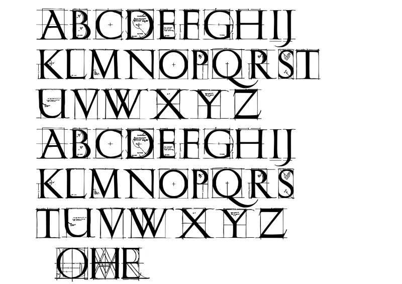
Learning the basics helps you realize that graphic design is not that simple. This is most critical for all newbies in this field. The typeface composition consists of these three (3) things:
- Specific vocabulary
- Accurate measurements
- Central specifications
These three ought to always be identified and taken into consideration. Before getting creative, learn everything by heart. Spend some time studying and learning the art of typography. It is highly crucial for you to get to know and familiarize yourself with different design forms.
Jot down the font communication
Psychology plays a vital role in the selection of typefaces. You cannot just choose any typeface randomly. You have to make sure that your option speaks the message louder to your audience. It is not only because you think it is cute and that you like it. The font and the design have to be appropriate to the context.
For example, rainbow-colored fonts are only perfect for fun stuff, like birthday invitations or musical promotional posters. They will look out of place if you put them in a law firm brochure or a corporate-styled event invitation. Do your research thoroughly.
Gain understanding when it comes to kerning
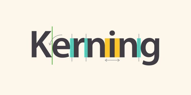
Kerning is a very challenging typography element to notice when you are unsure what to look for. Kerning is tricky, but it does help to train your eyes to spot details in your design. It involves spacing between letters. Each font results in different gaps between letters.
Gaining understanding when it comes to this technique requires time, patience, and persistence. Make sure that each space between letters looks aesthetically even. If you feel it may take too much of your time, there are programs to help you to do it faster and easier. For example, Adobe Illustrator. Still, you have to keep practicing this technique.
Still, you would probably get away with bad kerning when making headlines or logos.
Do the font limitation
Yes, you have a lot of options when it comes to typography. However, this does not mean you can use them all – especially all together. One of the most important typography rules is to limit your font use to just two to three typefaces. Have the body with one font and size. The other two types can be for the header and the subheader.
This does not mean you cannot choose different fonts from different typeface families. Just make sure that your options go together with each other. If you choose two different fonts that look somewhat still similar, it may look like your error in making choices at work.
Practice aligning the fonts
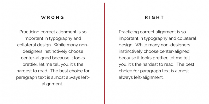
Many non-designers opt for Centre Aligned or Justified when it comes to text designing. The problems? Your paragraphs look hard to read. Many who use Microsoft Word are probably already familiar with these text alignments:
- Left Aligned
- Center Aligned
- Right Aligned
- Justified
Left Aligned—or the left alignment—is also known as The Flushed Left. It is most commonly chosen because it is the easiest to read. The other twin, Right Aligned or the right alignment is also known as the Flushed Right. It only works wonders for the eyes if the alignment is used properly.
Justified may not be a favorite to many designers. You might want to be careful with ragged lines if you prefer Center Alignment. If it is used incorrectly, the structure might get choppy. To tackle that, adjust the length of lines.
Make use of the visual hierarchy
This is one way to make sure your readers recognize the significance of certain lines of types. By size, thickness level, and the font of your text, you guide your audience’s attention in order. People usually notice the biggest and thickest font first before the rest – down to the smallest and thinnest. That is how you decide which font to use for the most important information.
Do the grid work
The appropriate grid work on your design helps you to place every bit on the page related to logical and visual harmony. Doing this will result in a cohesive, interconnected design.
However, this does not mean you have to do the grid work all the time. One of the most important typography rules is to understand how this works. Once you get the hang of this, you have enough ammunition to get creative next time. In short, this gives you more options in graphic design. It is not mandatory, but still essential to know this.
Practice with smart pairing
Once again, remember not to use too many fonts at once. They will create nothing but a distraction. The last thing you want is for confused audiences to recognize which information is more important in the text.
Once again, use a maximum of two or three different fonts. One is for the header, another is for the subheader, and the last bit is for the text body.
There is an exception to this golden rule, though. If your text is too long, you may add another one or two different types of font.
Choose an attractive secondary font to complete the pair
To make the pairing work, choose an attractive secondary font to complete it. Your header and subheader work better with two different typefaces to complement each other. Establishing a visual hierarchy is important for the text’s readability.
Still, doing this can be tricky. If the two fonts are too much alike, they will not work. If the fonts are too different, they might contradict each other. The trick is to find something in between but still stand out from one another.
This may take a while, but it is still worth it. You need to find a secondary font equally captivating to the first. Make sure the combo does not sacrifice the uniformity and consistency of the whole design.
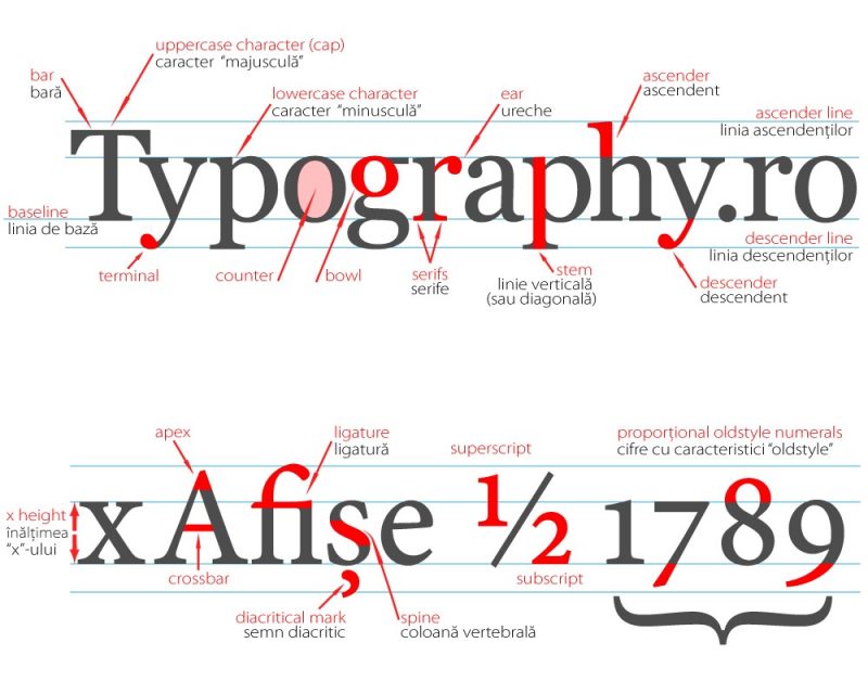
Learn to do the measuring
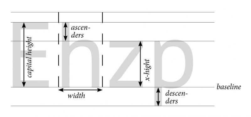
Measuring the font is also one of the important typography rules here. Not all fonts are in the same sizes. Some may take up a different space than the ones you normally use. This is why you need to pay attention to “x-height”, which means the height of the character.
Make sure that both fonts have the same “x-height” to have that compatibility. Another thing to recognize is “set width”, which is to measure the width of the character. This means you must consider the entire body of the character and the space it takes up.
Last but not least, let’s pay attention to the “point system”. This is the term that is generally used to do measuring on fonts.
Put readability first
Yes, you get to be creative, but please put readability first. For example: having a dark background with almost dark text is a bad move. A striking design only looks good to the eyes, but what is the point if people cannot read the message anyway?
Carefully pick your font palette
For this rule, learning about color psychology will help you to get the idea. For example, orange is often used in designs to promote fast food joints. Why? Because this color has been thought to increase appetite.
You can still challenge your creativity, but make sure that the font colors do not cause your readers headaches just by looking at them. They may not get your message that way.
Identify and take out “widows” and “orphans”
Wait, what does this mean? A typographical widow is a text line as a part of a paragraph, but it has shifted to the next column by default. A typographical orphan is almost the same as a widow one. What makes it different is that it is a single word left alone.
Several techniques can be done to deal with these widows and orphans accordingly. You can edit the text manually to modify the long lines to get rid of the problems completely. Another way is to use a text box to adjust the column size.
Make sure the stretching fonts do not happen
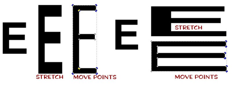
It is unfortunate that many designers tend to overlook this matter. That includes the already professional ones. Generally, the creation of fonts involves meticulous attention to the details of every letterform. Yes, this includes shapes and measurements. Efficiency and value may go out of the window if you let the stretching fonts happen.
The reason why some designers decide to stretch the fonts is to make them look taller or/and wider. However, that comes at the cost of appearance called ‘distortion’. To avoid that, choose other fonts with the right height or width that you need. The choices are endless online. Some are free, and some others require payment.
Do not confuse the white space with the empty space
White space is a distinctive tool to bring out unique traits from your design. There are several benefits when you use this valuable tool. For starters, you get help to set your focus more on a particular part of your artwork. A level of sophistication gets added to your design without a hassle.
A white space without additional elements may convey multiple meanings to the design. For example, you are working on a noise-canceling headphone ad. A headphone is a single object placed on the canvas, and there is nothing else besides that. You can expect the only focus of your audience to go straight to the headphone.
The white space shows a clear message that the product cancels out outside noise. Mission accomplished. It is plain and simple, yet more effective and powerful.
Make typography an art
Another one of the typography rules to follow is this: stop thinking that it is just fonts. In reality, typography is actually part of art. If you know how to carefully fashion them, you have picked up a level of artistry. This can be a valuable advantage for your design.
It is important to consider this to make something aesthetically pleasing with your fonts. Make sure they are eye-catching and can be the hero of your entire design. You can choose any font according to what you need. Explore your work through additions like swirls, textures, lines, and many more.
Once again, remember: the font choices are endless. Do not limit yourself when it comes to work of art.
Hold yourself back from using design fads
Just like fashion, design trends come and go. This also includes fads and gimmicks. The problem with this fact is that you ought to keep up. What you like right now may not be relevant tomorrow. Some of your past projects that were meant to last for a few years may look dull once the trend changes.
So, what do you do about it? Monitor the trends and the changes. Which trending styles that dominate your niche? Do not forget to check why some things last longer than the rest. Find out what makes people like them. The ability to predict trends will help you to become better and more professional in designing.
This is tricky and might take a while to find your footing. However, it is not advisable that you just follow whatever is trending right now blindly. Consider what you need and your artwork context as well.
Use the right tools
Just like the fonts, there are many options for the right tools to work with. There are also tools you should not even touch. Adobe is one of the popular brands that may give you the right tools.
Since some tools require payment, you might want to do your research first. That way, you can decide which tools you can bypass and which you can invest in. Based on what you need for work, some tools might be expensive but are still worth the price.
Do not ignore grammar rules
Grammar rules do not only consist of spelling, capitalization, and anything related to the wording. They also include these things:
- Ampersands
- Double spaces after punctuation
- Hyphens and dashes
They may look insignificant to the common eye. However, if you consider them in your design, your work can look more professional. Adhering to grammar rules is a subtle but potent tool. Doing this means showing them your high-level skill of paying attention to details.
No worries; many tools are equipped with design-specific sentence structures.
Find your inspirations for work
This is what every designer must always know and practice. Study the already existing typefaces and other illustrations. Find out the traits that make them engaging and effective. Read online articles related to designing and what inspires it. Just like the fonts, you have a lot of options.
You can always discover spot fonts and graphics that can help to elevate your work. All you have to do is look and have the willingness to step up your game. Do not stay in your comfort zone too long, or you will not progress.
Last But Not Least: Practice Makes It Even Better
Perhaps it is not wise to rely on this idiom: “Practice makes perfect”. Why? That will limit you from aiming to be better. Once anyone feels their work is already perfect, they may feel that they do not need to do more.
It is better to believe that practice makes your work even better. This helps you to realize that constant practice is essential. It helps to sharpen up your skills and tone down your ego. The first step is to get to know and understand the basic typography rules. The next one, which you must always do, is to practice and keep practicing them.
Consider your work as not just art but also a journey. Through our journey, we always learn something new, whether we realize it or not. This also goes with graphic designing. Starting from your very first project, you will soon realize that there are still more ways to go. Every project always bears new challenges to face.
The Conclusion:
So, those are the basic typography rules that you must follow before sharpening your skills. To make them more effective is to keep practicing them at work. This will help you to understand each rule better than before. These guidelines exist not to limit yourself but to help you find your footing in your design.
Once in a while, you get to break some rules for your own creativity. Of course, this only works after you have understood each rule to follow. You get to break the rules to gain something better, like fresh ideas other designers may not come up with. Do not do that out of randomness, but do it because you have come up with a different pattern to create something spectacular.