Did you know that typography can spread out some personality to any of your creative projects? Whether it is a private website, business presentation slides, or any branding and marketing materials, one should learn how to create the text for branding messages to look captivating on display (on the page or screen), as it is very important. Some typography tutorials may help you do this job.
Which Font and Typography are Trending in 2022?
There have been awesome fonts competing both online and offline to grab the attention of the audience, but one of 2022’s most favorite choices of fonts is the calligraphy styles that look like they are handwritten. These fonts look authentically artistic. Meanwhile, there are also nostalgic fonts with no frills attached to the trend. Sans serifs with round shapes are also proven to be popular this year.
Why Choose Font and Typography Tutorials?
Speaking of hand lettering, or any font trends, we offer you a range of assistance for free online learning, typography tutorials, and tools you may need, especially if you are a beginner in the design world.
Typography Tutorials for Newbies and 5 Trendy Fonts
We know you are new to all of this, so we provide you with the newest typography tips and trends. They cover all about how to make a font for the beginner’s level. Read and get ready to get your mind blown!
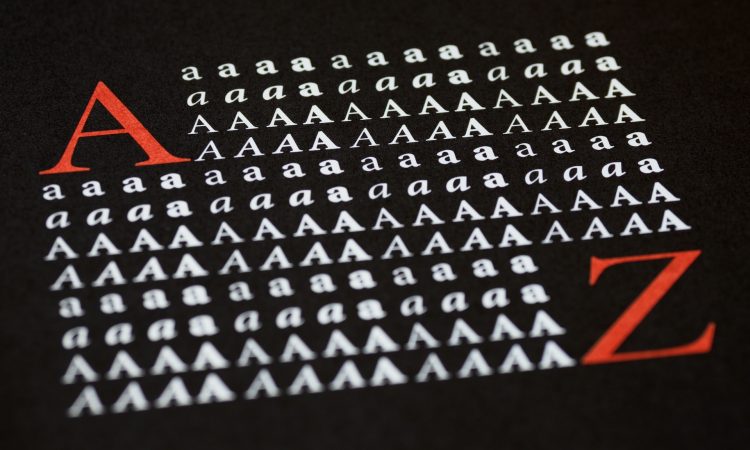
Introduction to the Basic Typography
Here are some basic typography tutorials that you may need to improve your knowledge of creating fonts:
The Top Guide to Basic Typography
Typefaces, fonts, glyphs, and characters are some words that have left you needing clarification. Fortunately, with this guide to basic typography, you will know some important terms you have probably never heard of before, like the following:
- A typeface is a collection of letters or characters that mutually share the same “ancestor,” for example, Roman and Blackletter (under the Latin script fonts).
- A glyph is a particular form of a letter; for example, in several fonts, A as a capital letter exists in some forms like small capital and swash. Use the glyph panel to put a glyph in a font.
- A font is a certain set of glyphs under a typeface. Let’s say Calibri is different from Calibri Light. In terms of weights, even 12 pt Calibri and 14 pt Calibri are also different forms of fonts.
- A ligature is a stylish character or something that ties two or more letters to form a single character for ornamental purposes. A ligature can also help with kerning.
- A kerning is a space in between a combo of two letters. There is no mathematical measurement for kerning—all you need to do is just optimally use your eyes. Kerning aims to achieve equality in distance between the characters, resulting in an evenly-spaced full word.
Typography: The Letter Anatomy
Did you know that not only humans and animals have body anatomy? One of our typography tutorials will also inform you about the anatomy of a letter. Below are some of the explanations:
- A stem is one vertical stroke getting upwards to form letters such as H, L, and F.
- An ascender is a stroke sticking upward in the distance from the letter body, while a descender is a downward stroke.
- We use uppercase letters to write places and names. Then use lowercase ones to get more casual vibes and legibility.
- An X-height is the main body of a lowercase letter.
- A serif type features an additional stroke called a foot or a tail, while a sans serif is not ornamented with detail.
The Varieties of Fonts
In these typography tutorials, you will learn about categories and collections of fonts. You will soon be bold enough to choose the right font for your design projects. Pick one or two out of these greatest fonts in history:
Addison Typeface
This typeface brings contemporary western styles together with rustic vibes. Between Circus and Addison West (under Addison Typeface), your artwork will have a one-of-a-kind and original style.
Baker Street Inline
Consisting of italic, regular, rustic, and inline, Baker Street offers plenty of Opentype features, including hundreds of ligatures connecting pairs of letters through varieties of flourishes.
Dealers
Based on old-school signage, this font has a wooden ambiance to create strong blocked shapes, contemporary serifs, and all the caps remaining.
Esther Handmade
As a handmade font, it looks so posh and sophisticated. Dedicated to you, a fan of a letter set will be spoiled with its classic yet edgy look.
Hagen
The classic yet sophisticated font keeps it great enough for posters and electronic events. Containing two weights, Hagen will spoil those with wonderful content.
Tips on How to Create a Font for Newbies
Below are the ultimate tips for creating
a font for newbies:
Tips and Tricks on How to Make Your Own Font
Need to know how to create a font? These typography tutorials allow you to learn tips and tricks for creating a new font:
- Just begin with a simple font and never try to add too many details to your font in case you still don’t know if you are motivated enough to finish your font project. If you start off with a complex one, there is a high chance you will end up feeling discouraged and giving up on making a font.
- Consider making a set of simple uppercase letters and doodle symbols for ornamental purposes. Whether it is a serif font or a sans serif one, just have fun!
- Do you still need clarification about what font you want to make? Remember that your font should be:
- trendy (make a small research on the top fonts, for example, so that you can get enlightened with what is currently trending and which fonts are with a higher rating)
- have high readability in any sizes
- handy for many different design types or multipurpose
The Basic Rules of Creating Hand-Drawn Fonts
The following basics are for typography tutorials on font drawing (if you desire to add some personal touch to your type design:
- Before designing your font, do not forget to prepare the following items:
- A piece of lined paper (even from an old notebook will be fine)
- A piece of drawing paper (should be white and with some texture to help you shape up the characters)
- A sharpened 1H or HB pencil
- A millimeter measurement ruler
- A fine-point black-inked pen
- An eraser
- Most people will have improved their handwriting over time. When you write down longer text, your handwriting is usually joined all together and turns a little bit to the right, resulting in the italicized form of cursive characters
- Back to your drawing paper. With a pencil and ruler, draw three lines to represent x-height, cap height, and baseline
- Rotate your paper just slightly counterclockwise and take your ink pen to make better contrast for the scanning process later. This is effective in preventing the arm from straining too much while writing.
- Let the ink completely dry, and take an eraser to rub the pencil lines surrounding the characters carefully. Eventually, you will have a wonderful set of clean characters.
Calligraphy and Cursive Fonts
You may see beautiful cursive and calligraphy letters when you eat out at a fancy restaurant or when you attend a wedding ceremony. Below are the typography tutorials on writing in cursive script font and some examples of it.
How to Write in Cursive Script
Embrace cursive script writing by adding a stylish component to your design. With a cursive script, you don’t even have to lift up your pen from the paper, especially after you master how to write with it:
- Do a “warming up” by practicing entrance and exit strokes. Remember that writing in a cursive script font is everything about joining letters, so all the lowercase characters are with the entrance as well as exit strokes.
- Train yourself to make the general upward stroke by writing down one or more lines on your paper. Begin it from the bottom line and lift it up to the top line.
- Now, create a line or two of the basic curvy stroke for the warming up. You can curl it up a little bit more than previously.
Top 5 Calligraphy/Cursive Fonts
After learning typography tutorials on writing a cursive script font, you may as well download the following beautiful cursive fonts.
Quenyland
Looking for a classic cursive font? Quenyland can be one of the best choices since it is great for stationery branding. This font includes PUA-encoded characters, ligatures, and alternates.
Montheylin
This set of beautiful cursive letters features real handwritten displays, stylistic sets, captivating ligatures, and multilingual support.
Butterscotch
As the name implies, Butterscotch is sweet and elegant, especially for logos and stationery.
Hargalia
Inspired by the Renaissance style, Hargalia is classic and beautiful. The font looks perfect on quotes, branding, headlines, and many more.
Ralyne
This cursive alphabet will spoil your vision with a set of both beautiful lowercase and uppercase letters, symbols, punctuation, numerals, and ligatures.
You have “enlightened” yourself with the above typography tutorials. Hopefully, they can help you improve the beauty of your art/design projects.