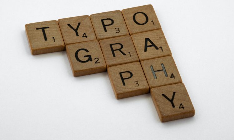
What is typography? This is a question that beginners (and laypeople) often ask in the design industry. Typography seems so important that when reading about tips and tricks about graphic design, everyone who wants to create their own designs should understand typography both theoretically and practically.
In fact, typography has always been around us. Take a look at the fonts used in refillable liquid soap bottles or your favorite instant noodle packaging. They all have logos with unique fonts. They are designed that way on purpose so that people can immediately know what kind of brand they are, even at first glance.
But as people always ask, what is typography? Jump in because typography is something more than what meets the eye.
What is Typography?
According to Wikipedia, typography is the art and technique of arranging type to make written language legible, readable and appealing when displayed. If you want other people to read your writing comfortably, your writing must certainly use a font that is easy to read and attractive to look at.
There’s no point in writing a 1,000-word scientific essay if, in the end, other people don’t want to read it because the font is too hard to read or looks weird, for example. Typography is important in making something readable or not.
With a good choice of fonts and top-notch composing techniques, the text you create can convey so many emotions and explain the meaning of the text perfectly.
Crash Course on History
Don’t worry; here, we will not explain the overly long history of typography because the main point of this article is typography in the present. But we think a little crash course on the history of typography certainly wouldn’t hurt.
Derived from the Greek words typos (form or impression) and graphein (to write), typographic techniques were first invented in Ancient Babylon in the form of cylindrical seals and movable type in the Song Dynasty in China.
However, the creation of typography and modern printing techniques is often attributed to Johannes Gutenberg in 1439. Thanks to this revolutionary breakthrough, Gutenberg’s technique continues to evolve rapidly into digital technology. Anyone can create typography without even needing to use a metal alloy like in the old days.
The Importance of Typography
Now, it looks like we’re starting to get a bit of an answer to the “what is typography” question. But we just found out its definition and a brief history of typography. Before we go any further, we must know why many jobs today will fail without typography because they are not supported by qualified typography skills.
Let’s dive deeper to discover how important typography is to our lives.
Establishes high-quality visual hierarchy
All designers working as UI designers (or anyone in the industry) should know what a visual hierarchy is.
Visual hierarchy is a fundamental principle in the world of design, where design elements and visual features are processed in such a way as to capture the attention of the audience.
Through this hierarchy, designers can design a sequence of how to read the UI on a website or application from start to finish. This can be done by having the title font set to the largest size, the content font to small/medium size, and more.
As a result, a visual balance makes the website or app easier to read.
Supports decision-making process
The decision-making and brainstorming processes are carried out routinely by all companies so that their products can be more in demand through the right and catchy marketing process.
Things like choosing a suitable font for Instagram stories, fonts for product promotion posts, and management of company social media accounts should all be discussed in the decision-making process.
Using the right fonts, the promotion you want to convey to the audience will be conveyed well.
Catches the audience’s attention
Neatly crafted and attractive typography is the key to getting the audience to continue enjoying your graphic design works for hours instead of just looking at it for 3 seconds and moving on to something else.
This can be done by choosing typographic elements that are visually stunning, easy to remember, and beautifully arranged so that they will not be bored at all.
Strengthens the brand’s recognition
Big companies are successful in their marketing process because they think about how good typography can make their brand identity memorable for everyone.
Neat, unique, and consistent typography will make it easy for people to remember the designs you made for your company brand and increase the brand’s level of fame.
Improves overall clarity
Clarity is the main reason people can like and be interested in the graphic designs you create. Illustrative and evocative color choices, neatly arranged letters that aren’t messy to look at, and aesthetically arranged image forms are prime examples of clarity in this context.
By referring to these standards, the level of clarity of your design can increase rapidly, and the audience will have no difficulty at all understanding what you are trying to convey through the art design.
Types of Typography
The question “what is typography” is not only a matter of its definition, history, and benefits but also what types of typography are used today and terms related to typography that all graphic designers should understand.
In general, typography is divided into two general types, namely serif and sans serif. These two types were then followed by other types that are also quite widely used, such as script, blackletter, decorative, modern, and many more.
Let’s start with the two types that are the most ubiquitous at this point.
Serif
If you like reading novels, chances are you often see them using fonts that look a little artsy and emphasize aesthetics and legibility at the same time. Yes, that’s the serif typeface, one of the most widely used typefaces in modern times.
Some fonts, such as Times New Roman, Garamond, Baskerville, and Courier New, are the most common examples of serif typefaces that everyone uses. They are used for formal writing purposes, which explains why they are used to write famous novels and official documents to convey the nuances of formality of this typeface.
Moreover, this typeface is suitable for long texts, which explains why many novels and text stories now use this typeface for functional purposes.
Sans Serif
As opposed to serif typefaces, sans serifs are typefaces that, you guessed it, don’t have the serifs or finishing strokes found in every type of serif font out there.
Some typefaces like Helvetica, Verdana, Futura, Public Sans, Proxima Nova, and many more don’t have serif elements in their fonts. As a result, they lack the feel of formality that serif typefaces have.
As a result, this typeface may not be suitable for official texts and is more widely used for other purposes, such as writing on blogs, social media, and so on, that are more casual in nature and are intended for the wider community.
Blackletter
Some fonts are designed to be a typeface for logos, book titles, movie names, and so on rather than for long text like serif typefaces.
This typeface is the blackletter typeface, famous for being the font that was widely used in Gutenberg’s lifetime to describe the nuances of religiosity and formality of religious institutions at that time.
Using thin and thick strokes that are dramatic and tough-looking, this typeface uses the swirling serifs that were the hallmark of many medieval texts.
Unlike serif and sans serif, fonts such as Germanica and Cloister Black are not suitable for long text. On the other hand, this font is more suitable for use with official logos (just look at the New York Times logo as an example).
Script
Of the other types of typefaces, script font is the font that is most influenced by one’s handwriting style. Its decorative and artsy feel makes script fonts perfect for text for decoration purposes, wedding invitations, event invitations, and more.
Divided into formal and casual styles, formal style script typefaces have an eighteenth and nineteenth-century handwriting style suitable for use in official documents such as invitation letters and diplomas.
On the other hand, a casual-style script typeface is not suitable for official document purposes. However, it is still suitable if you want to make writing and designs that have a more relaxed feel but still have a high-culture impression.
Essential Terms
There are many terms related to typography that make designers have to keep learning so as not to be misguided in designing typography according to their abilities. What would those terms be?
Typography vs. Font
Wait, this might be a bit too late, but do you know the difference between a font and a typeface? The two are closely related, but the difference is not what you might think.
To differentiate between the two, typographer Nick Sherman makes a good analogy: he refers to typefaces as “songs” and fonts as “.mp3 song formats”.
The point is that “song” or typeface in this context is a work of art in the form of letters that emerges from someone’s design. Meanwhile, “.mp3 song format” or font is a way to describe the artwork so that it is easier for the audience to see.
Calibri, as one of the most well-known typefaces, is a typeface that can be described by a variety of different fonts. Some fonts like Calibri Body and Calibri Light are particular ways to illustrate how Calibri would be used to write something.
Type Family
The question of “what is typography” does not stop here, not as long as we still do not know what the definition of a type family or typeface family is, which is also a major part of understanding what typography actually is.
The point is a font does not have only one font style. Proxima Nova, for example, has several different artistic styles, such as bold, extra bold, black, regular, light, light italic, and regular italic. If there can be various artistic styles in one typeface alone, imagine how many similar styles exist in other types of typefaces.
This variety of variations will allow a typeface to have consistency despite using other artistic styles – and help create the typeface hierarchy we will explain below.
Anatomy
Like the human body, the typeface also has anatomy that is divided into several parts that indicate certain functions.
There are many anatomical terms of typeface, some of which are:
- Baseline: The line on which the font rests.
- Cap height: The distance from the baseline to the top of the font.
- X-height: The distance between the baseline and the cap height.
- Bowl: The curved part of the character covers the rounded part of the font.
- Serif: Finishing stroke that ends the font character in some typefaces.
- Descender: The part of the character that juts down beyond the baseline.
- Ligature: A stroke that joins adjacent letters to each other.
- Stem: The bottom of the font (imagine the stem of a flower).
- Spine: A curvy shape found only in the middle of the letter “s”.
- Ascender: The portion of a character that is higher than the x-height and means the line of the characters in a font.
If you imagine a typeface as a human body, it will be easier for us to understand how a good typeface is built by referring to a certain structure so that it can be used neatly in the future.
Kerning
Each typeface must have a little space between each font character so that the typeface can look neat. Well, this is what is called kerning, or a small space between each font character to tidy up your writing.
Why is kerning important? The reason is that without kerning, people might not even realize they’re reading two different font characters instead of just one. Moreover, the aesthetics of your design can be ruined if there is not enough kerning between each character of the font.
Readability can be increased drastically if the kerning between each character of the font is arranged neatly and symmetrically without colliding with each other.
Tracking
In addition to kerning, there is also such a thing as tracking. Instead of tracking something, tracking here means the distance between all the font characters in a word so they can look neat without bumping into each other.
While tracking may seem at first glance different from kerning, it can drastically improve readability if done correctly. The spacing between each character of the font that is getting wider through tracking is indeed more readable than kerning that is too narrow, but this is useless because people don’t like seeing the spacing between font characters that are too wide.
To that end, treat tracking with the same degree of care as kerning to prevent your writing from looking outright illegible.
Leading
In college, lecturers must have asked you to use 1, 1.5, and 2 spaces between each line of words and paragraphs so that your coursework can be easily read. Well, this space is also known as leading.
Here, leading is the distance between each baseline font character in each line of the word, which can affect the readability of a text and the size of the paper used to load the text.
Using a leading with a scale of 1 can make you load more text, with the result that the text can look too congested and difficult to read because it seems too close to each other. That is why lecturers ask you to use leading with 2 spaces so that your coursework can be read and graded more easily.
Hierarchy
We have discussed hierarchy before, but we need to discuss hierarchy again as one of the most important terms in typography.
For simplicity, the typographical hierarchy that is widely used is as follows:
- Primary heading
- Secondary heading
- Tertiary heading
- Body text
Each of these hierarchical levels has a different function, and this hierarchy looks like storylines and images that are sequentially related to each other. In addition to using the hierarchy above, several other elements, such as color, contrast, alignment, and font size, can also be used to distinguish the typeface hierarchy used in a text.
Distinguishing typefaces by using this hierarchy will help you determine which will be the headings, subheadings, body text, and other parts of the text, which, when combined, form a unified typeface that has its own hierarchy and function.
Conclusion
So, in the end, what is typography? From the definitive guide above, it seems that we all know what typography is and how we can use the most suitable typeface for our graphic design projects to achieve successful work. By knowing typography in detail, no doubt your skills as a graphic designer can improve drastically, and you might have a chance of becoming a true professional in the future. Have a nice day!