The content is undeniably one of the most essential parts on your website. However, the way you present it—which includes choosing the layout and color combination—is not less important.
There’s a term called visual accessibility that requires a website and other types of digital tools to choose and combine certain colors for a much better user interface. It means that your website should be visually accessible for all users, including those with visual impairments.
Now, a question that usually comes up is this: “How do I make sure that my website meets the requirements of visual accessibility?”
Luckily, finding the answer to such a question is not that hard. All you have to do is make use of the features offered by a useful tool called whocanuse.com.
What is whocanuse.com?
Focusing the attention on the web visual accessibility, whocanuse.com is a practical tool that can help you combine the right accessible colors for your website. This tool is developed based on a ground understanding that the color contrast and combination can create different effects on people with visual impairments. Its main goal is to accommodate users with visual impairments, such as having a low vision or a particular form of blindness.
How does it work?
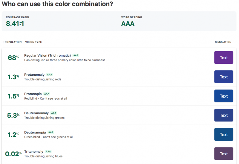
The percentage of contrast ratio and grading system of whocanuse.com mainly refers to the Web Content Accessibility Guidelines (WCAG). To make the grading and ratio system more accurate, it also uses some additional resources from colour-blindness.com and Vision Australia.
First thing first, the tool uses Chroma.js plugin to figure out the ratio and grade of your text and color codes. Then, another plugin called Color-blind from Github is used to convert the codes into different types of color blindness. Meanwhile, for other visual impairments such as cataracts, glaucoma, and low vision, whocanuse.com utilizes some personalized simulations.
What does it offer?
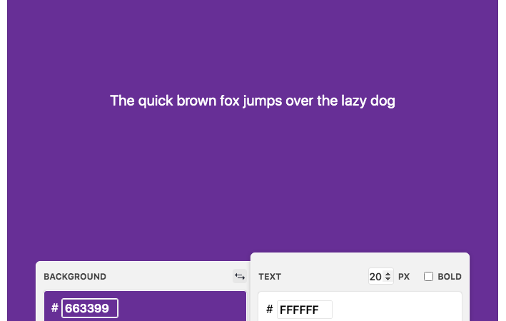
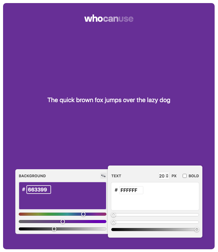
By using whocanuse.com, you can easily find the percentage of your website’s visual accessibility based on the color combinations of your choice. Once you choose certain colors that represent the text and background on your website, this tool will give you the information about the Contrast Ratio and WCAG Grading for that combination.
Along with the average percentage of the user population, you can find the simulation of how your website color choices will be seen by people with different visual abilities. The simulation is divided into several vision types, including:
- Regular Vision (Trichromatic): can differentiate all three primary colors with little or no blurriness.
- Protanomaly: having some trouble distinguishing reds
- Protanopia: can’t see reds at all
- Deuteranomaly: having some trouble distinguishing red
- Deuteranopia: can’t see greens at all
- Tritanomaly: having some trouble distinguishing blue
- Tritanopia: can’t see blues at all
- Achromatomaly: partial color blindness that sees the absence of most colors
- Achromatopsia: complete color blindness and can only see shades
- Cataracts: vision affected by the clouding in the eye lens
- Glaucoma: slight vision loss
- Low Vision: decreased and blurry vision that can’t be fixed by wearing glasses
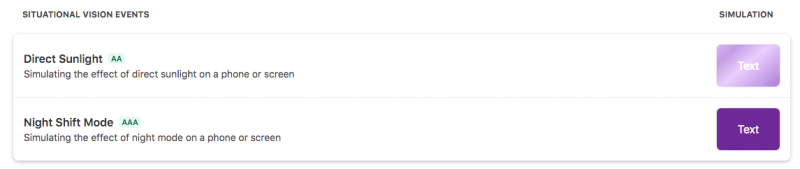
In addition, whocanuse.com provides a simulation for situational vision events, including in the direct sunlight and night shift mode. The tool will also give a “FAIL” Grade if it thinks that your color contrast or text size is not accessible for certain users. This grade means that your website is simply failed to reach users with several types of visual impairments.