
You can find many types of typography in your daily life. They exist in pages of a book, article, or blog you read on a smartphone, newspapers, posters, etc. For a blog or website owner, typography plays a big role in the reader’s decision. Either the readers will stay until the last pages or leave immediately since they can hardly read the text.
Hence, it is necessary to be mindful when designing and arranging your text. Designing good typography is a must because it leads to many merits. For instance, readers will likely come back to your website when they can easily acquire the message you want to convey in the text.
This article covers all you need about the definition of typography and 10 helpful typography tricks that will assist you in creating better and more readable text for your reader.
What is Typography

The UI designer has done a good job when you find legible written text with a pleasing visual. They successfully arrange the words and sentences that will cause a convenient reading experience.
Typography can be interpreted as the techniques to design, arrange, and select a written text to make it readable and visually appealing.
You do not want the reader to leave the site immediately because the appearance and style you used to design the website are tedious, consist of too many font types or the space between lines is disorganized.
10 Helpful Typography Tricks to Make Your Writing Readable
Define the Length in a Line
Do not let the reader skip your article because it contains too many words or characters in one line. Be right to the point to avoid confusion. About 40 to 80 characters in one line can make a good measurement.
For paragraphs, 3 to 4 sentences are adequate. The reader will only pass longer than 4 with many complex sentences because it is difficult to digest the information.
Pay Attention to the Typography Elements
Other than typefaces and fonts, there are other typography elements such as leading, tracking, kerning, and alignment. When you pay detailed attention to the smallest matter, it will elevate your design.
- Leading
You cannot captivate the reader when the paragraphs look squashed into one another. Leading is the space between each baseline. Enough spaces between each line will make it more readable and attractive.
- Tracking
Tracking refers to the spacing between a range of characters or letters. It can be adjusted in one or multiple lines. Similar to leading, giving more space for tracking will enhance legibility.
- Kerning
While tracking is spacing between a range of characters, kerning refers to the spacing between individual characters or letters. As a typeface designer, it is your job to adjust the space so it will not leave too little or too much space.
- Alignment
Alignment consists of four types: left, center, right, and justified. The most common use is left-aligned or left-aligned justified because it is easier to read. It is important to make your written text unify, well-arranged, and readable. You can use center-align for headings, quotes, or copy. Avoid using right-align because it will be counterintuitive and not acceptable to read.
Attach Hanging Quotation
The hanging quote is attached outside the margin. With the addition of hanging quotations, it will give a fresher look to your text. In addition, you do not have to worry about having a disorderly margin in the whole text after adding the hanging quotation.
Create a Hierarchy
In this era where people prefer straightforward information, UI designers should be able to provide what the reader needs. Creating a hierarchy in typography helps to make a distinction between the most and less important messages.
Headings and subheadings are supposed to be bigger than the body context. Contrast elements such as color, size, and spacing are included to create a hierarchy in the text. Bolder color, larger size, and more white space are used to convey the main information, and vice versa.

Organize the Rags
The uneven side of the paragraph can somehow make you feel unsatisfied. Thus, you need to adjust to minimize the misalignment. It can be done by measuring the words in each of your sentences—not too long or too short to make the paragraphs even.
Add Contrast to the Text
Adding contrast helps to show the prominent information, enhance readability, and make the text not appear dull. The chosen color, size, and typefaces play a significant role in grabbing the reader’s attention.
The standard rule would be a black text color over a white background. It will be easier and more convenient to read than a bright yellow font over white or, worse, a blue background. Other than the regular rules, as a typeface designer, you can bring out your creativity to pair colors.
Size, weight, or styles can be taken from different fonts that belong in the same typeface. For instance, you can use bolder font for the heading and regular font for the standard text.
Consider putting a White Space
White space around your text allows certain words to be noticeable. It emphasizes what is important and what you want the reader to know right at the moment when they open the text.
Headlines need white space around them. Too tight or crowded letterforms with no white space around them will make it less interesting for your reader. It will tire their eyes and make them decide to pass it instead.
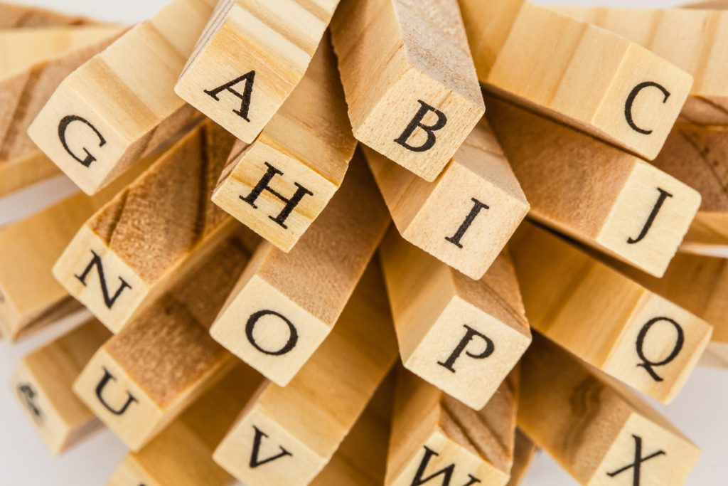
Make it Better with Images
Somehow images can give a better description to your reader. You may have explained things thoroughly with a simple vocabulary, and your reader still cannot get it. Images help to trigger the reader to understand the message.
Take an example. You are explaining the elements of typography. Someone already familiar with the term will easily absorb what you mean. Yet, new learners need to be given an example with a picture. It supports them to imagine your explanation.
Choose the Right Typefaces and Fonts
It is important to know the difference between typefaces and fonts. Basically, a typeface is a design style consisting of a collection of numerous related fonts. Meanwhile, fonts refer to specific styles, weights, and widths within the typeface family.
Take an example, EB Garamond is the typeface, and it consists of many collections of fonts such as EB Garamond SemiBold, EB Garamond Bold, etc. In addition, typefaces consist of three basic types such as serif, sans-serif, and decorative.
First, serif is characterized by its classic style. The extra strokes at the end of the letter offer a sense of integrity, authority, and tradition. Times New Roman, Georgia, and Garamond fall into this category.
Next, sans-serif, just as the name suggests this typeface does not have serifs at the end of the letterforms. It appears cleaner, more orderly, and more modern than serif. Helvetica and Arial are examples of popular sans-serif.
The last is decorative. Rather than readability, this typeface grants aesthetic results. It is often used as logos, brand names, or short titles. Decorative has the purpose of making written words memorable and show their uniqueness to the reader. Gazpacho, Cherie Bomb, and Bourton font are three of many decorative fonts available in the world.
So, how to choose the right typeface? Below there are three considerations you can think of before choosing typefaces.
- Learn about your reader
It is important to acknowledge your reader. Is your site created for mothers, children, or businessmen? The typeface should represent the message and give a suitable display to the targeted reader. For mothers who usually multitask, you need to go with orderly types of fonts.
- Choose the font that reflects the tone
The typeface you choose should be aligned with the message of your copy. You should avoid using many decorative fonts if your message has a serious tone.
- Focus on your aim
Do not pour all of your skills into making a beautiful and pleasing appearance, but neglect the other elements of legibility.
Combine Less than 3 Types of Font
Have you ever found any text containing more than three types of fonts? Will it likely make you bemused rather than entertained or informed? It is understandable if you combine all three typefaces in one passage, but decorative style should only be used for the short-word, like titles or short-length quotations.
Generally, you can combine both serif and sans-serif to make a difference in what you try to emphasize. Or you can also pick one typeface with a collection of fonts in the same family with different sizes, styles, and weights to make the text more variable. Just remember not to overuse the combination to steer clear of chaotic results.
Good typography will deliver the message correctly to the readers. Begin with these 10 helpful typography tricks to improve the design of your writing. Pay attention to the details of typography elements to create legible and appealing texts.