When people think about “graphic design”, they often think of it as just a graphic image consisting of several graphic elements. Not many people realize that, when done right, a typography can also be incorporated—even becoming the centerpiece—in a graphic design. Typographies can help your design works in many ways. It can help you convey a message more clearly. For example, it can also be the core of the design you are creating, like for a brand’s logo. We have rounded some typography tricks to elevate your design works.
Manage Your Contrasts
In a typographical sense, contrasts can be perceived not only in the context of colors. While it’s true that you need a contrasting color for the text and the backgrounds to be readable, a contrast in typography could also mean different typefaces, fonts, weight, or scale. Although, try to refrain from being too excessive, as the contrasts might backfire and make your design look inconsistent.
Contrasting Fonts or Typefaces
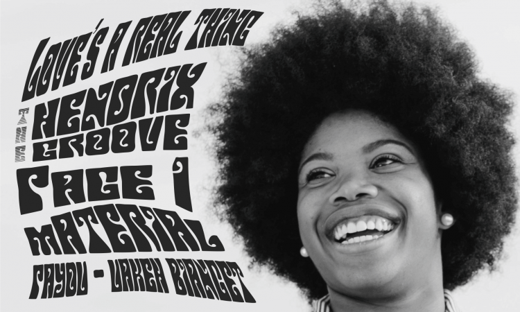
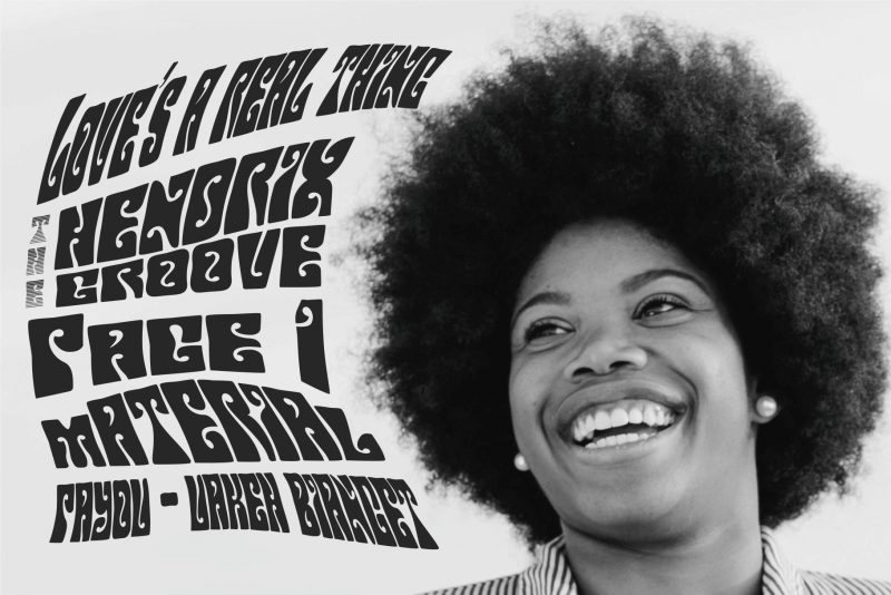
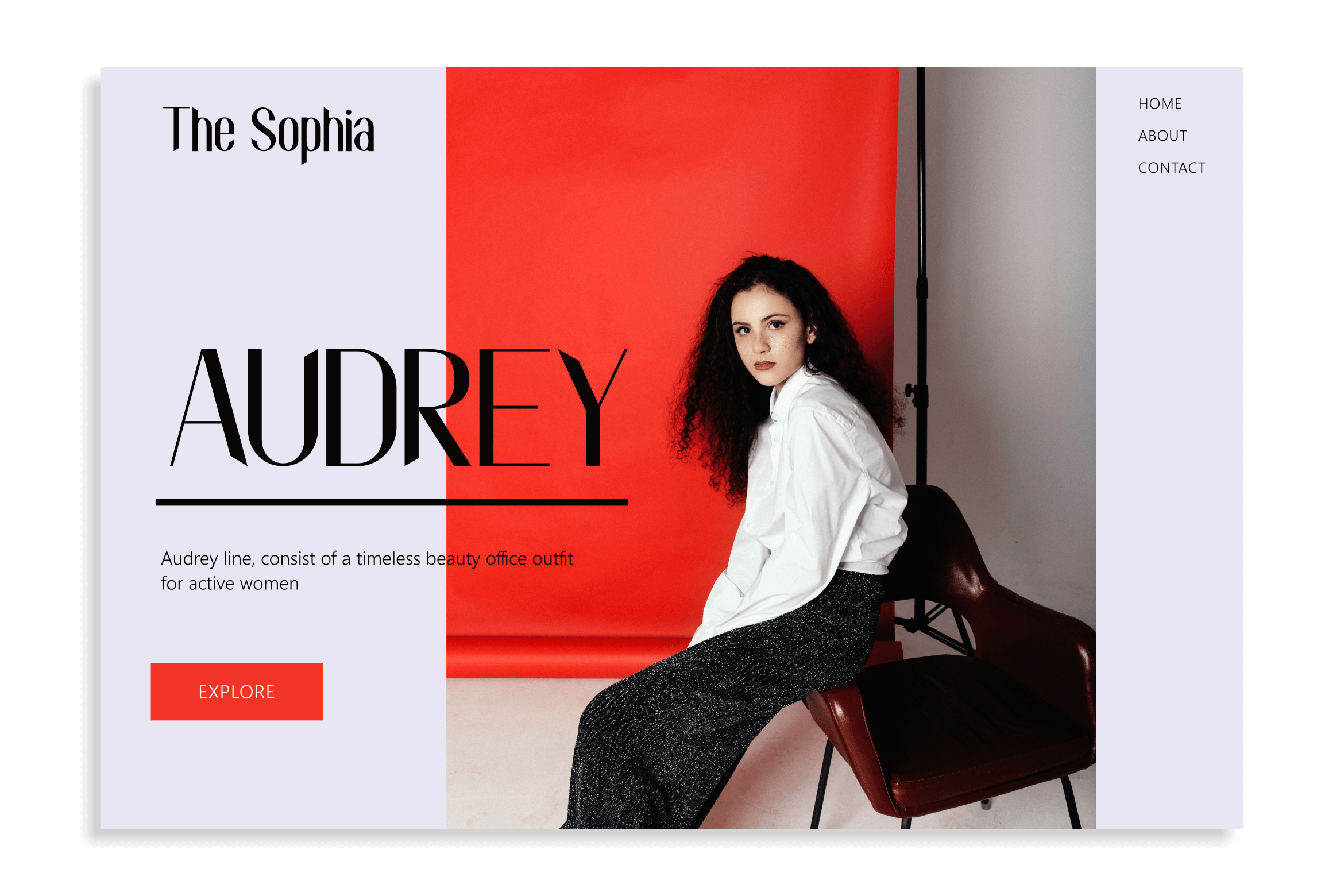
Utilizing different, contrasting typefaces in your design can make it appear more eye-catching and dynamic. Not only that, but it may also help with the readability aspect of your work. Using a combination of serif and sans serif fonts or blocky with flowy are two of the most common practices in contrasting typefaces.
Different typefaces are associated with different feelings, for example, the elegance and professionalism of serifs or the modernity and boldness of grotesque fonts. Incorporating these two contrasting typefaces can help make your design appear bold yet elegant.
Contrasting Weight and Scales
Another sense of contrast is the weight and scale of your typography. In simpler terms, the thickness and size of the glyphs. This typographic trick is the easiest and most common practice of using a bigger, thicker font for the title and a smaller, thinner font for the subtitle and body text.
Custom Kerning
A kerning refers to the spacing between two individual glyphs. Initially, kerning was used in the printing industry to minimize negative spaces in printed media. Nowadays, kerning in digital design is used mainly for aesthetical purposes instead of economical.
Customizing the kerning in your design, especially for logo, wordmarks, or titles, gives the finished product a more personalized feel. Digital designing or image processing programs usually have a built-in tool for kerning customization, making it easy for designers to utilize this trick.
Personalized Glyphs
There are millions and millions of fonts for you to play around with your design. And yet, there are only a handful of fonts that fit your current work’s overall vibe. You don’t want your design to look too similar to others, so you have to find a way to personalize your works. After a quick search, you stumbled upon one typography trick that might work: glyph customization.
The basic principle of the custom glyph is to modify one or several glyphs to create a customized look in the design. The modification could be as simple as elongating part(s) of the glyph, adding unique serifs to the letter, or removing a portion of the glyph.
Grid Mastery
Another typography trick you can use in your work is a grid system. In its principle, a grid is a system of rows and columns. In design, a grid system is a means to organize the layout. By using a grid system, you are basically dividing your design into sections. There are several types of grid systems commonly used in graphic design:
- Baseline Grid. It is the simplest form of a grid system, where the text sits in a series of parallel horizontal lanes. A simple example of a baseline grid is the ruler lines in a notebook’s paper.
- Column Grid. This system splits a page into several vertical lines, often used by web and graphic designers. You can easily find this grid type in newspapers and magazines.
- Modular Grid. The love child of baseline and column grid, modular grid divides the page similarly to Excel’s spreadsheet. The intersection of a row and a column is called a “module”, in which the design elements are incorporated.
- Manuscript Grid. It consists of a single column on a page where the text sits. Usually utilized in a book, this type of grid is often used in a purely typographical design.
- Pixel Grid. This grid is similar to a modular grid but with smaller pixels instead of modules. Digital monitors utilize a microscopic version of this grid. Highly detailed designers often edit their images pixel by pixel.
- Hierarchical Grid. This type of grid refers to any irregular grid that may or may not be completely free form. Its form relies heavily on the design concept itself, making it the most customizable grid system.
Don’t Be Excessive
While it is up to the very concept of the work in progress, incorporating typography in your design should not overwhelm other elements. Unless the design concept is purely typographical, moderation is crucial in graphic design. All of the aforementioned typography tricks will not work if the typography does not support other design elements incorporated.
3 Comments