Everyone can design a presentation with several steps, but can you make it attractive? Many presentation design tips focus on practical aspects and readability but forget the aesthetic parts. Imagine presenting an important idea or project, yet all you can see in the room is bored faces and a lack of attention!
Attractive designs not only make your presentation less boring but also engage your audience more. This guide will help you create an attractive presentation without distracting your audience.
Tip 1: Keep the Design Purposeful
You have probably heard that famous “minimalism is the best for presentation design” remark. However, it does not mean making your presentation look empty or boring. The design must support your ideas and points, even to the smallest visual elements.
Make sure every vector image, photo, layout, and font are there because they are related to your presentation. Avoid placing a design element just for the sake of “decorating.” If you keep the design purposeful, you can make your presentation interesting without cluttering the materials.
Here’s a simple example: instead of using stock photos, take pictures of people, places, or objects that you actually explain in your presentation. This way, you can adorn your presentation slides with colors and images while keeping the design purposeful.
Tip 2: Play with Color Gradients
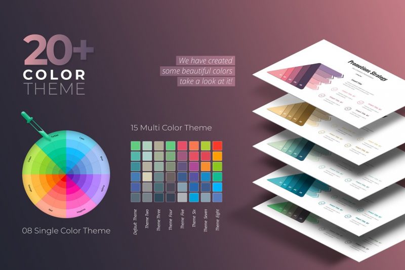
Tinkering with colors is one of the simplest but most effective presentation design tips. Using the right colors can make the difference between cluttered, boring, and interesting presentation materials. Applying color gradients make your presentation materials attractive without being distracting.
Color gradient is a great solution to create a rich visual without cluttering your design. You can attract the audience’s attention toward specific points without using different colors by creating subtle gradients. Color gradient keeps your design subtle, elegant, and easy on the eyes because you can limit yourself to one or two colors.
Tip 3: Use Font Properly

Choosing interesting fonts and tweaking them are common presentation design tips you can use without getting excessive. Since fonts are important parts of presentation slides, using creative fonts will immediately make your materials attractive. However, you still need to consider readability and legibility factors, especially in formal presentations.
Here are proper ways to get creative with fonts when creating presentation materials:
1. Consider the Accessibility
Accessibility is important, especially if you conduct a presentation for a large number of people. Common accessibility guide keeps you from using flashing, animated, or flickering text (which also looks unprofessional). The font size must be at least 24 points, and the main body text should use easily-read fonts like Helvetica, Arial, Palatino, Verdana, and Georgia. Each slide must also have a specific title to inform the audience about the content.
2. Use Display Font at the Opening
Display font is not recommended for main body text, but you can use it on your opening slide. Specific font style can inform the audience about what they can expect from your presentation. However, make sure that the font is still legible, even if you do not showcase it anymore within the slide.
For example, you can use futuristic-style fonts to present game or movie projects. Modern brush or Art Deco font is great for promoting design projects for fashion. The opening slide title should have at least 36 to 44 points of size.
3. Limit the Numbers of Fonts
When using multiple fonts for presentation slides, limit the numbers to two or three. Choose the decorative one for the main title, a slightly fancy one for the slide title, and a standard sans serif font for body text. Using more than three fonts will distract your audience.
If you want to make each slide more interesting, use slightly fancier sans serif fonts as the slide titles. Choose the one that is more demure and more conventional than the main title. Stay with the standard, legible sans serif one for the body text.
Tip 4: Get Creative with Layouts
Layouts can make or break your presentation slides. You can make your slides more interesting with creative layouts, but they must be easy to read. Here are some presentation design tips to make creative layouts without distracting your audience.
1. Image on the Left, Text on the Right
If you want to explain the main point with an image, put the picture on the left. This is because the image is easier to remember than lines of letters and texts. You also follow the natural reading flow by placing the image on the left, commanding attention immediately. Your audience can always flick their eyes from the text to the image if they need the reminder.
The key to making this works is making sure that the texts are concise. Remember, slides emphasize your presentation, but they do not do all the works. The texts should only serve as key points.
2. Embellish the Pointers
Using pointers is one of the most common presentation design tips. However, most people stop using bullet points or bold typeface. Spice these pointers by using icons instead of regular bullet points. However, make sure the icon designs are related to your explanations. Also, make sure the design is not distracting. You can use the simple Trendy Thin Hand Drawing or Hand Drawn Icon Pack, for example.
You can also create big distinctions by using one slide just for the main pointers. Use charts, bold texts, and different slide colors to distinguish these pointers from the rest of the slides.
3. Use Three-column Layout
A three-column layout is a good way to break a slide in a visually pleasing way. You can use it to emphasize your points, describe team members, or present statistics. A three-column layout is also useful in describing steps or processes using simple images or texts. The layout creates a logical progression while making your slide easier to look at.
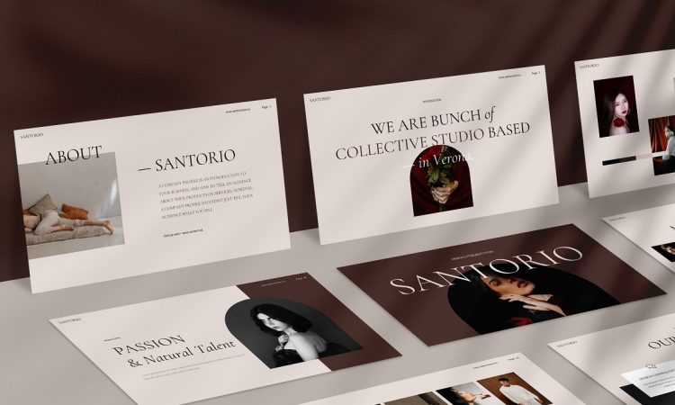
4. Incorporate Faces as Images
If possible, use faces as parts of your slide images. For example, if your topic has a certain population as subjects, use related pictures of the people. If you describe team members of your project, incorporate their professional headshots. Faces make your slides more memorable because our brain has been “hardwired” to recognize them.
There are various creative ways you can incorporate faces. You can use a figure from your presentation topic as the background or use an expressive face to emphasize a point. Make sure the image does not distract the audience or make your texts hard to read.
5. Create “Drama” with Full Bleed Images
Want to emphasize your point in a more dramatic way? Showcase a picture in full-bleed format. You can use white space with a slogan or other strong words on top of the image. It will create urgency and “force” the audience to pay attention to what you are about to describe.
6. Use Grid to Showcase Your Slides
Grid is the easiest “standard” layout you can use to showcase your slides. Grid allows you to see all the elements and make placements easier. Using a six to 12-column grid makes it easier for you to adjust your presentation materials.
7. Use Shapes on Solid Image Background
Using an image as a background is a bit tricky. Unless you use an image with a lot of empty space, it can compromise the readability factor of your texts. Solve this problem by adding shapes to the image and filling them with your texts. This way, you can create a dramatic slide with a bleed image without ruining your texts.
Tip 5: Play with Colors and Contrasts

Colors and contrasts can make the difference between drab and fab presentation slides. Here are several ways you can use them to spice up your presentation:
1. Dark Mode for Modern Presentation Slides
Looking for a fresher, bolder look for a modern presentation slide? Try dark mode for the color palette. It is great to make a conventional formal presentation look more attractive. A dark palette does not mean solid back background with white text. Many stylish templates have a cool palette or effect, such as gradient colors.
2. Play with Black and White
The black-and-white palette never goes out of style in design, including for presentation slides. You can make it more dynamic by adding shades of grey. This palette is great if you want to showcase the content without having colors distracting the eyes.
However, a black-and-white palette is a good option for showcasing bold colors. For example, if you want to showcase a main object or product, you can apply bold colors to it while keeping the other slides monochromatic.
3. Apply the Three-color Combination
Regardless of your chosen palette, the ideal presentation slide should only have a maximum of three colors. The main colors consist of background, text color, and accent. The background and the text should have high contrast so the audience can read the content easily.
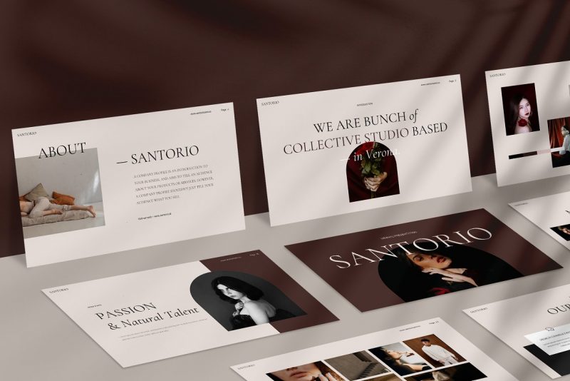
For example, greyish-black background, white text, and yellow accent create a stylish dark palette. Meanwhile, warm beige background with dark purple text and burgundy accent creates a warmer, earthy tone.
4. Use Gradients as Text Background
If you want to place text on a background image, place it on gradients. This way, you can keep the sharpness of the background image without compromising the text readability. Choose gradients from a different color palette than the image and text. This way, the color will immediately attract the audience’s eyes.
5. Beige and Gray for Content-heavy Presentation
“Use white background” is a popular presentation design tip for content-heavy slides. However, switch to beige and gray if you want to showcase content without making your slides look boring. This combination is soft and neutral enough without distracting your eyes. Beige and gray also prevent the stark contrast that can hurt your eyes, especially in a bright room.
6. Blue for “Nondescript” Presentation
Many companies or business owners have specific colors that represent their brands. However, what if you need to launch a new business or startup? Blue is often regarded as a “safe,” nondescript color for formal situations. Dark blue is a great palette to use in formal or business-related presentation slides because it is a popular formal color.
7. Purple and Coral for Hip, Modern Palette
The presentation design trend sees the rise of the non-traditional palette. Purple and coral are two unique colors with striking effects. Dark purple, for example, is great for refreshing your slides and is still generally acceptable. Meanwhile, coral tends to be a “like it or leave it” type of color, but its bright and daring tone can improve your slide design.
Tip 6: Improve Your Presentation Style
Your presentation design benefits from your style. Make sure that your speaking style balances your beautiful slide design. The most popular instruction is, “don’t read from your slides!”
Presentation slides serve as visual points, trackers, and materials to attract your audience. While creative designs help make them more engaging, they are still supporting tools. Reading from slides will make your presentation monotonous, and your audience will inadvertently follow along, which increases the risk of their mind wandering off.
Make sure to make concise texts and relevant images your presentation “trackers.” Practice delivering your ideas while using the slides to emphasize your points. This is why you should use relevant images: they make your ideas less abstract and help you memorize your points.
Additional Tip: Can You Use Other Media?
Many common presentation design tips tell people to avoid other media, such as videos, animations, and audio files. However, this is not always the case. You can use other media to a certain level if they can emphasize your points.
For example, you can incorporate short clips that describe certain phenomena you address in specific slides. You can also insert audio such as music or speech clips that explain your points. Use animated images in a limited amount as they can be distracting.
Using well-placed media is also great for a long presentation session. You can use them to draw the audience’s attention back to your explanation, such as after the first half of the session.
Conclusion
Modern presentation slide designs use a lot of creative colors, layout designs, and other visual elements to make your presentation more attractive. However, there are still rules to follow regarding readability, professionalism, and the audience’s comfort. Follow these presentation design tips and see how your session immediately improved.
2 Comments